


为了实现好看又实用的顶部导航栏,不得不自己定义导航栏样式。而自己定义的导航栏高度会因为手机的型号不同所展示的效果也就不同,所以只能通过适配高度来达到预期的效果
1.需要在page.json文件中对需要自定义导航栏文件进行配置
"navigationStyle":"custom" //取消默认的原生导航栏
2.在页面中添加占位元素
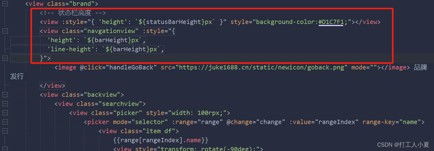
		<!-- 状态栏高度 -->
<view :style="{ height: `${statusBarHeight}px` }"></view>

 <!-- 自定义导航栏高度  -->
        <view :style="{
          height: `${barHeight}px`,
          'line-height': `${barHeight}px`
        }">
            <text>评价</text>
        </view>
3.借助钩子函数mounted完成逻辑处理
	mounted() {
			this.statusBarHeight = uni.getSystemInfoSync().statusBarHeight;
			const {
				top,
				height
			} = wx.getMenuButtonBoundingClientRect();
			// 自定义导航栏高度 = 胶囊高度 + 胶囊的padding*2, 如果获取不到设置为38
			this.barHeight = height ? height + (top - this.statusBarHeight) * 2 : 38;
		},
这样就行了,不同的设备导航栏高度就会自适应了


 1850
1850


 被折叠的 条评论
为什么被折叠?
被折叠的 条评论
为什么被折叠?
 到【灌水乐园】发言


