


*下一个博客会详细讲解题目中涉及的知识点*
一、选择题:
1.下列css选择器当中,优先级最高的是( A )。
A. .content div:first-child
B. .content>div
C. .content div
D. .content .item
2.哪个HTML5内建对象用于在画布上绘制( B )。
A. getContent
B. getContext
C. getCanvas
D. getGraphics
3.下列说法错误的是( A )。
A. 设置display:none后的元素只会导致浏览器的重排而不会重绘
B. 设置visibility:hidden后的元素只会导致浏览器重绘而不会重排
C. 设置元素opcatity:0之后,也可以触发点击事件
D. visibility:hidden的元素无法触发其点击事件
4.关于以下代码解析正确的是( BD )。
<style>
    .parent{
        font-size: 2rem;
        width: 20em;
        height: 200px;
    }
    .child{
        font-size: 2em;
        width: 20rem;
        height: 200px;
    }
</style>
<body>
  <div class="parent">
  <div class="child"></div>
  </div>
</body>
A. .parent的宽度为 320px;
B. .parent的字体大小为 32px;
C. .child的字体大小为 32px
D. .child的宽度为320px
5.下面关于CSS的说法正确的有?( ABC )
A. CSS可以控制网页背景图片
B. margin属性的属性值可以是百分比
C. 整个body可以作为一个box
D. 对于中文可以使用word-spacing属性设置字间距
6.以下哪些CSS样式可以继承?(ABCD )
A. opacity
B. font-size
C. color
D. letter-spacing
二、填空题:
1. HTML的行内元素有 a 、 input 、 span 、 i 、 em 、 img 。
2. position属性都有哪些属性值 static 、 absolute 、 relative 、 fixed 、
sticky 。
3. 弹性盒子布局可以使用 justify-content 和 align-items 属性,使内容实现水平垂直方向居中。
4. HTML标签的公有属性有哪些? class 、 title 、 id 、 style 。
5. img标签中,alt属性的作用是 在图片加载失败时候提示说明 。
6. 设置CSS属性 text-decoration 属性值为 none 可以去掉a标签默认的下划线。
三、简答题
1、说出你知道的HTML5新增特性,HTML5新增表单以及新增表单属性。
(1)HTML5新增特性:
1.h5新增语义化标签 header footer nav article aside section figure details
2.h5新增表单控件 progress range color date datetime-local url email .....
3.音视频标签 video audio
4.画布 canvas
5.web存储 本地离线存储
(2)HTML5新增表单属性:
autofocus required
pattern formaction
formmethod formenctype
formnovalidate
2、父子元素均为块元素,怎么让子元素在父元素中水平垂直居中?
(1)通过margin挤压 给父元素设置border
(2)通过padding挤压 给父元素设置边框盒子
(3)子绝父相,配合属性全部为0,margin:auto;
(4)子绝父相,top:50%,left:50% margin-left:-width/2 margin-top:-height/2
(5)父元素开启伸缩盒display:flex 子元素justify-content align-items center
(6)父元素开启伸缩盒display:flex 子元素margin:auto
3、绝对定位、固定定位、粘滞定位、相对定位怎么设置,分别有哪些特点?
(1)相对定位 position:relative
特性:不脱离文档流 原先位置保留 相对于自身在浏览器中默认位置进行定位
(2)绝对定位 position:absolute
特性:
1.脱离文档流 原先位置不保留 飘在文档流上方
2.无论有没有父元素/祖先元素,相对于浏览器视口区域进行定位
3.如果父元素/祖先元素设置了定位,相对于父元素/祖先元素进行定位
(3)固定定位 position:fixed
特性:
1.脱离文档流 原先位置不保留 飘在文档流上方
2.相对于浏览器视口区域进行定位
(4)粘滞定位
position:sticky
(5)相对定位加固定定位
特性:不脱离文档流 没达到阈值前是相对定位 达到阈值后是固定定位
4.说出你对盒模型的理解:
(1)盒子种类:
1.1 内容盒子 标准盒子 w3c盒子 普通元素就是标准盒子 box-sizing:content-box
1.2 边框盒子 IE盒子 怪异盒子 box-sizing:border-box
(2)盒子区别:
2.1 内容盒子的宽高是设置给内容区的宽高
(3)计算公式:
盒子宽:width+paddingLeft+paddingRight+borderLeft+borderRight
盒子高:height+paddingTop+paddingBottom+borderTop+borderBottom
盒子所占页面宽:盒子宽+marginLeft+marginRight
盒子所占页面高:盒子高+marginTop+marginBottom
3.2边框盒子的宽高设置给盒子本身的
计算公式:
盒子宽:width = contentWidth+paddingLeft+paddingRight+borderLeft+borderRight
盒子高:height = contentHeight+paddingTop+paddingBottom+borderTop+borderBottom
所占页面宽:盒子宽 + marginLeft+marginRight
所占页面高:盒子高 + marginTop+marginBottom
5.简述HTTP协议
(HyperText Transfer Protocol) 超文本传输协议
客户端()浏览器和服务器端请求应答通信协议
客户端发送给服务器端的数据会被封装成请求报文
(1)请求报文:
请求行:get url http1.1
请求头:content-type:application/json 浏览器内核
空行:空格 回车 分割内容
请求体:get请求参数携带在url地址栏 post携带数据携带在请求体中
服务器端响应给客户端数据会被封装成响应报文
(2)响应报文:
响应行 http1.1 状态码 200 OK 500 Internal Serve Error
响应头 content-type:application/json
响应体 {status,message:"查询成功",data:[{id,name},{}],timestamp:时间戳}
6.简述弹性盒布局
(1)核心概念: 主轴、交叉轴、弹性容器、弹性元素、弹性元素始终沿着主轴方向排列。
多用于列级布局、自适应布局、移动端布局。
1.1主轴:弹性元素始终沿着主轴方向排列、默认是水平轴,可以更改主轴排列方向。
1.2交叉轴:默认是垂直方向交叉轴。
(2)弹性容器:
使用display:flex属性容器自动成为弹性容器.
2.1容器属性:
1.display:flex
2.flex-direction 更改主轴得排列方向 row column row-reverse column-reverse
3.flex-wrap 设置弹性元素是否换行显示 默认不换行(nowrap) wrap wrap-reverse
4.flex-flow属性 flex-direction 和 flex-wrap简写 column wrap;
5.justify-content 更改主轴对齐方式 flex-start flex-end center space-around
space-evenly space-between strecth 平铺 拉伸 占满父容器高度 (height不要设置)
6.align-items 更改交叉轴对齐方式
flex-start flex-end center baseline(文字对齐 基线对齐) strecth
7.align-content 更改多行弹性元素对齐方式
flex-start flex-end center space-around
space-evenly space-between strecth
(3)弹性元素属性:
1.order 更改弹性元素排列顺序 值越大 越靠后 值越小 越靠前
2.flex-grow 当父元素有剩余空间时候 是否放大 默认不放大 默认值是0
div{flex-grow:1} p{flex-grow:2}
将父元素剩余空间分为3份 div占1 p占2
3.flex-shrink 当父元素宽度不足以放下所有弹性元素 是否会等比例压缩 默认等比例压缩 默认值1
div{flex-shrink:0}
4.flex-basis 给弹性元素设置宽度 优先级高于width 默认是auto
5.flex:flex-grow flex-shrink flex-basis 简写
div{flex:0 1 300px}
div{flex:1} 如果只给其中一个弹性元素设置flex:1 表示将父容器剩余空间分为1份
.div1{flex:1} .div2{flex:2} 弹性元素2宽度弹性元素1宽度得两倍
6.align-self 表示弹性元素在交叉轴自身对齐方式
flex-start flex-end center baseline strecth
四.代码题(每题 10 分,有 2 小题,共 20 分):
- 使用伸缩盒和浮动实现九宫格布局,写出核心代码。
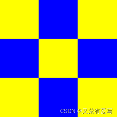
<div class="container">

    <div class="item"></div>

    <div class="item"></div>

    <div class="item"></div>

    <div class="item"></div>

    <div class="item"></div>

    <div class="item"></div>

    <div class="item"></div>

    <div class="item"></div>

    <div class="item"></div>

</div>
CSS核心代码:
.container {
width: 300px;
height: 300px;
display: flex;
flex-wrap: wrap;
}
.container .item {
width: 33%;
height: 33%;
}
.item:nth-child(2n) {
background-color: blue;
}
.item:nth-child(2n-1) {
background-color: yellow;
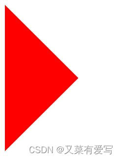
}2.利用css设计一个三角形
<div class="trilateral"></div>
答案:
.trilateral {
    background-color: #fff;
    width: 0;
    height: 0;
    border: 120px solid #fff;
    border-left-color: red;
  }
运行截图:


 1117
1117


 被折叠的 条评论
为什么被折叠?
被折叠的 条评论
为什么被折叠?
 到【灌水乐园】发言


