


有时候拿到的设计图与echarts示例得样式不太像,这时候需要修改配置,达到高还原设计图。记录一些工作中常用的配置
1. 柱状图
echarts官方示例的柱状图直接copy用来会发现很丑,很突兀融入不到我们的页面中,经常需要改的配置有坐标轴线、刻度线、背景颜色…
① y轴轴线分割段数(yAxis. splitNumber)轴线(splitLine)刻度线(axisTick)
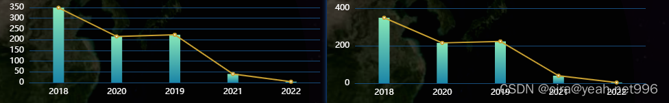
如图:配置前后对比图
代码片段:
yAxis:{
         type:'value',
         splitNumber:2
       }
 yAxis: {
          type: "value",
          splitNumber: 3,
          axisLine: {
            lineStyle: { color: "#B7CFFC" },
          },
          splitLine: {
            lineStyle: {
              color: "#00C0FF",
            //   width: 1,
            },
            show: true,
          },
        },
② 柱体颜色(series.itemStyle)、宽度(series.barWidth)自定义
series: [
          {
             data: ydata,
             type: 'bar'
             barWidth:'16px',
             itemStyle:{
                   color: new echarts.graphic.LinearGradient( 0, 0, 0, 1, [{//代表渐变色从正上方开始
                   offset: 0, //offset范围是0~1,用于表示位置,0是指0%处的颜色
                   color: 'rgba(136, 232, 184, 1)'
                   }, //柱图渐变色
                  {
                   offset: 1, //指100%处的颜色
                   color: 'rgba(27, 133, 167, 1)'
               }])
            }
         ]
③ x轴线(xAxis.axisLine)、刻度线(xAxis.axisTick)设置
xAxis:[
         {
             type: 'category',
             data:xdata,
             axisTick: {
               show: false
             },
             axisLine:{
               lineStyle:{
                  color:'#174c7b'
               }
             }
        }]
2. 饼图
echarts官方示例饼图的样式还算比较悦目,无奈我们的ui总有些新奇的想法。经常会改动的配置有文本标签的数据展示、引导线的样式等等
① 饼图填充色(color)
官方默认颜色为['#5470c6', '#91cc75', '#fac858', '#ee6666', '#73c0de', '#3ba272', '#fc8452', '#9a60b4', '#ea7ccc'] 循环取色,可自定义颜色,改写配置color,如:color:['rgb(128, 128, 128)', 'rgb(105, 18, 12)', 'rgb(18, 18, 108)']
② 文本标签(series.label)
其中字符串模板变量:
{a}:系列名。
{b}:数据名。
{c}:数据值。
{d}:百分比。
 label:{
          show:true,
          formatter:'{a|{c} {d}% }\n\r {b|{b}}',
          lineHeight:20,
          rich: {
               b:{
                   color:'auto',
                   // padding:[0,-20,0,0]
                  },
                a:{
                    color:'#fff',
                    // padding:[0,-20,0,0]
                   }
                  },
         }
点击查看rich详情
③引导线(series.labelLine)
 labelLine:{
              length:20, //短线
              length2:30,//长线
              minTurnAngle:90 //夹角
           }
3.折线图
① 自定义拐点的显示(只需要特定的值才显示拐点)
利用symbol函数实现,如:只在除得尽5的x数值上显示
 series: [
          {
            data: yData,
            type: "line",
            smooth: true,
            symbolSize:10,
            symbol: function(value,params) {
                // console.log(value,params)
                if(params.dataIndex %5 == 0 ) {
                    return 'circle';
                } else {
                    return 'none'
                }
            },
            lineStyle: {
              color: "#2bf9d6",
              width: 3,
            },
            itemStyle: {
              color: "yellow"
            },
            areaStyle: {
              opacity: 0.8,
              color: new echarts.graphic.LinearGradient(0, 0, 0, 1, [
                {
                  offset: 0,
                  color: "#007F96",
                },
                {
                  offset: 1,
                  color: "#449394",
                },
              ]),
            },
          },
        ],
效果图: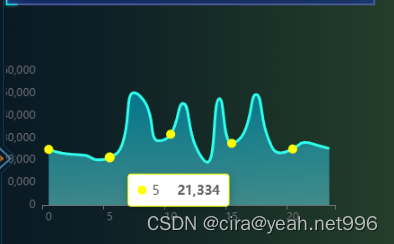
②x轴数值的显示
interval属性,0:强制显示全部 ,1:隔一个值显示,2:隔两个值显示 …以此类推
xAxis: {
          type: "category",
          data: xData,
          axisLabel:{
            interval: 4
          }
        },
4.实时更新echarts图表,无数据时显示暂无数据
myChart = this.$echarts.init(this.$refs.chart);
myChart.setOption(option)
  if (!data.length) {
    myChart.showLoading({
      text: '暂无数据',
      showSpinner: false,
      textColor: 'black',
      maskColor: 'rgba(255, 255, 255, 1)',
      fontSize: '26px',
      fontWeight: 'bold'
    })
  } else {
  	myChart.hideLoading()
  }
5.提示框超出图标区域被截断
解决:tooltip.confine = true
6.双x双y轴实现的关键配置
在series中配置对应的xAxisIndex、yAxisIndex
关键代码附上:
xAxis: [
    {
      type: 'category',
      data: ['2016-1', '2016-2', '2016-3', '2016-4'],
    },
    {
      type: 'category',
      data: [ '2015-5', '2015-6', '2015-7', '2015-8', '2015-9', '2015-10', '2015-11', '2015-12'],
    }
  ],
 yAxis: [
    {
      type: 'value',
    },
    {
      type: 'value',
    }
  ],
 series: [
    {
      type: 'line',
      xAxisIndex: 1,
      yAxisIndex: 1,
      data: [
        2.6, 5.9, 9.0, 26.4, 28.7, 70.7, 175.6, 182.2, 48.7, 18.8, 6.0, 2.3
      ]
    },
    {
      type: 'line',
      data: [
        3.9, 5.9, 11.1, 18.7, 48.3, 69.2, 231.6, 46.6, 55.4, 18.4, 10.3, 0.7
      ]
    }
  ]
7.双y轴保持轴线对齐
思路:设置两条y轴数据的最大最小值,再将其分成同等份
关键代码附上
yAxis: [
          {
            type: "value",
            name: '个',
            min: 0,
            max: set_max(Math.max.apply(null, ynumData)),
            interval: set_max(Math.max.apply(null, ynumData)) / 5,
            // axisLabel: {
            //   formatter: '{value} 个'
            // }
          },
          {
            type: "value",
            name: '万m²',
            min: 0,
            max: set_max(Math.max.apply(null, yareaData)),
            interval: set_max(Math.max.apply(null, yareaData)) / 5,
            // axisLabel: {
            //   formatter: '{value} 万m²'
            // }
          },
       ],```
    function set_max(num) {
        // 1.判断是否小数:  //判断是否含有小数点:要检索的字符串值没有出现,则该方法返回 -1。
        if (num.toString().indexOf(".") != -1) {
          //有小数点
          num = Math.ceil(num); //向上取整
        }
        // 2.向上取整数倍
        if (num.toString().length < 2) {
          // 一位数1
          num = 10;
        } else if (num.toString().length < 3) {
          // 2位数
          num = Math.ceil(num / 5) * 5; // 变成最近的5的倍数
        } else {
          // 位数--先判断是不是1000...的倍数
          var t = "";
          for (let i = 0; i < num.toString().length - 1; i++) {
            t += "0"; //'0000...'
          }
          if (num % Number(1 + t) != 0) {
            //不是100的倍数

            num = (Number(num.toString().substr(0, 1)) + 1) * Number(1 + t);
          }
        }
        return num;
      }


 153
153


 被折叠的 条评论
为什么被折叠?
被折叠的 条评论
为什么被折叠?
 到【灌水乐园】发言


