


一. Svg滤镜包括:
feBlend:与图像相结合的滤镜
feColorMatrix:用于彩色滤光片转换
feComponentTransfer
feComposite
feConvolveMatrix
feDiffuseLighting
feDisplacementMap
feFlood
feGaussianBlur:模糊滤镜
feImage
feMerge:多滤镜叠加滤镜
feMorphology
feOffset:过滤阴影
feSpecularLighting
feTile
feTurbulence
feDistantLight:用于照明过滤
fePointLight:用于照明过滤
FeSpotLight:用于照明过滤
滤镜的属性:

in属性的6个取值
svG filter中的 in属性,指定滤镜效果的输入源,可以是某个滤镜导出的 result
也可以是下面6个值:
in取值 作用
SourceGraphic 该关键词表示图形元素自身将作为<filter>原语的原始输入
SourceAlpha 该关键词表示图形元素自身将作为〈filter>原语的原始输入。SourceAlpha与SourceGraphic 具有相同的规则除了SourceAlpha只使用元素的非透明部分
Backgroundlmage 与 SourceGraphic类似,但可在背景上使用。需要显式设置BackgroundAlpha与SourceAlpha类似,但可在背景上使用。需要显式设置
FillPaint 将其放置在无限平面上一样使用填充油漆
StrokePaint 将其放在无限平面上一样使用描边绘画
feBlend滤镜的模式:
- normal — 正常
- multiply — 正片叠底
- screen — 滤色
- darken — 变暗
- lighten— 变亮
二. SVG阴影基本步骤
先写一个SVG
在SVG里面写一个矩形
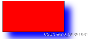
<rect x="0" y="0" width="200" height="100" fill="red" stroke="black
       " filter="url(#f1)"></rect>
定义滤镜,defs是一个定义标签
<defs></defs>
在defs里面定义一个过滤器
<filter id="f1" width="200%" height="200%">在里面写id值 让id值与矩形里的filter=url(#f1)一致
然后再过滤器里面写
<!-- 使用偏移滤镜 -->
<feOffset in="SourceGraphic" result="offset1" dx="20" dy="20"></feOffset><!-- 用来转换偏移的图像使之更接近黑色的颜色feColorMatrix 通过values属性来控制阴影颜色 -->
 <feColorMatrix in="offset1" result="colorMatrix" type="matrix"

         values="0 0 0 0 0

                 0 0.2 0 0 0

                0 0 1 1 0

                 0 0 0 1 0"></feColorMatrix>
注解:可以通过values里面的值来调阴影
<!-- 使用模糊滤镜 stdDeviation:设置模糊度 -->
<feGaussianBlur result="blur" in="colorMatrix" stdDeviation="10"></feGaussianBlur><!-- 使用混合滤镜,主要将原始标签显示出来-->
<feBlend in="SourceGraphic" in2="offset" mode="normal"></feBlend>全部过程及代码
<!DOCTYPE html>
<html lang="en">

<head>
    <meta charset="UTF-8">
    <meta http-equiv="X-UA-Compatible" content="IE=edge">
    <meta name="viewport" content="width=device-width, initial-scale=1.0">
    <title>Document</title>
</head>
<svg>
        <!-- 定义滤镜,defs是一个定义标签 -->
        <defs>
          <!-- 定义一个过滤器filter -->
        <filter id="f1" width="200%" height="200%">
        <!-- 使用偏移滤镜 -->

        <feOffset in="SourceGraphic" result="offset1" dx="20" dy="20"></feOffset>
        <!-- 用来转换偏移的图像使之更接近黑色的颜色feColorMatrix 通过values属性来控制阴影颜色 -->
         <feColorMatrix in="offset1" result="colorMatrix" type="matrix"
         values="0 0 0 0 0
                 0 0.2 0 0 0
                0 0 1 1 0
                 0 0 0 1 0"></feColorMatrix>
        <!-- 使用模糊滤镜  stdDeviation:设置模糊度 -->
        <feGaussianBlur result="blur" in="colorMatrix" stdDeviation="10"></feGaussianBlur>
        <!--  使用混合滤镜,主要将原始标签显示出来-->
        <feBlend in="SourceGraphic" in2="offset" mode="normal"></feBlend>
        </filter>
      </defs>
       <rect x="0" y="0" width="200" height="100" fill="red" stroke="black
       " filter="url(#f1)"></rect>
      </svg>

<body>

</body>

</html>
效果图
三. SVG线性渐变
<linearGradient> 可用来定义 SVG 的线性渐变,主要是定义方向和颜色。
<linearGradient> 标签一般嵌套在 <defs> 的内部。 (SVG的<defs>元素用于预定义(不会显示)一个元素使其能够在SVG图像中重复使用。)
渐变方向

实例
<!DOCTYPE html>
<html lang="en">

<head>
    <meta charset="UTF-8">
    <meta http-equiv="X-UA-Compatible" content="IE=edge">
    <meta name="viewport" content="width=device-width, initial-scale=1.0">
    <title>Document</title>
</head>

<body>
    <svg>
        <defs>
            <linearGradient id="color1" x1="50%" y1="50%" x2="0%" y2="60%" >
                <!-- 设置渐变色, 使用stop标签 -->
                <stop offset="0%" stop-color="yellow"></stop>
                <stop offset="50%" stop-color="red"></stop>
                <stop offset="100%" stop-color="green"></stop>


        </defs>
        <rect x="0" y="0" width="300" height="200" fill="url(#color1)"></rect>
    </svg>
</body>

</html>
效果:

代码解析:
1. <linearGradient> 标签的 id 属性可为渐变定义一个唯一的名称。
2. fill:url(#orange_red) 属性把ellipse元素链接到此渐变。
3. <linearGradient> 标签的 x1、x2、y1、y2 属性可定义渐变的开始和结束位置。
4. 渐变的颜色范围可由两种或多种颜色组成。每种颜色通过一个 <stop> 标签来规定。offset 属性用来定义渐变的开始和结束位置。
四. 径向渐变
<linearGradient> 可用来定义 SVG 的线性渐变,主要是定义方向和颜色。
<linearGradient> 标签一般嵌套在 <defs> 的内部。 (SVG的<defs>元素用于预定义(不会显示)一个元素使其能够在SVG图像中重复使用。)
渐变方向
实例
<!DOCTYPE html>
<html lang="en">
<head>
<meta charset="UTF-8">
<meta http-equiv="X-UA-Compatible" content="IE=edge">
<meta name="viewport" content="width=device-width, initial-scale=1.0">
<title>Document</title>
</head>
<body>
<svg>
<defs>
<!-- cx/cy:表示的是颜色渐变的中心坐标
r:表示颜色渐变的范围
fx/fy:表示的是渐变颜色的焦点坐标 -->
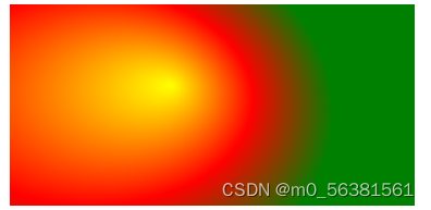
<radialGradient id="radial" cx="0%" cy="40%" r="80%" fx="40%"
fy="30%">
<stop offset="0%" stop-color="yellow"></stop>
<stop offset="50%" stop-color="red"></stop>
<stop offset="100%" stop-color="green"></stop>
</radialGradient>
</defs>
<rect x="0" y="0" width="300" height="200" fill="url(#radial)"></rect>
</svg>
</body>
</html>效果
代码解析:
1. <linearGradient> 标签的 id 属性可为渐变定义一个唯一的名称。
2. fill:url(#orange_red) 属性把ellipse元素链接到此渐变。
3. <linearGradient> 标签的 x1、x2、y1、y2 属性可定义渐变的开始和结束位置。
4. 渐变的颜色范围可由两种或多种颜色组成。每种颜色通过一个 <stop> 标签来规定。offset 属性用来定义渐变的开始和结束位置。
五. 获取地图坐标
大概步骤
先定义一个函数:用来获取用户的定位信息
function showLocation() {
//判断是否可以定位
if (navigator.geolocation) {
//getCurrentPosition()中需要传入一个回调函数
navigator.geolocation.getCurrentPosition(location_1);
} else {
x.innerHTML = "无法获取当前位置"
}
//显示获取到的用户定位中的维度和经度
x.innerHTML = "维度:" + position.coords.latitude + "经度:" + position.coords.longitude;
实例
<!DOCTYPE html>
<html lang="en">

<head>
    <meta charset="UTF-8">
    <meta http-equiv="X-UA-Compatible" content="IE=edge">
    <meta name="viewport" content="width=device-width, initial-scale=1.0">
    <title>Document</title>
</head>

<body>
    <p id="location">用来显示定位信息的</p>
    <input type="button" value="定位" onclick="showLocation() ">

    <script type="text/javascript">
        var x = document.getElementById("location");
        // 定义一个函数:用来获取用户的定位信息
        function showLocation() {
            //判断是否可以定位
            if (navigator.geolocation) {
                //getCurrentPosition()中需要传入一个回调函数
                navigator.geolocation.getCurrentPosition(location_1);
            } else {
                x.innerHTML = "无法获取当前位置"
            }
        }

        function location_1(position) {
            //显示获取到的用户定位中的维度和经度
            x.innerHTML = "维度:" + position.coords.latitude + "经度:" + position.coords.longitude;
        }


    </script>
</body>

</html>
效果图

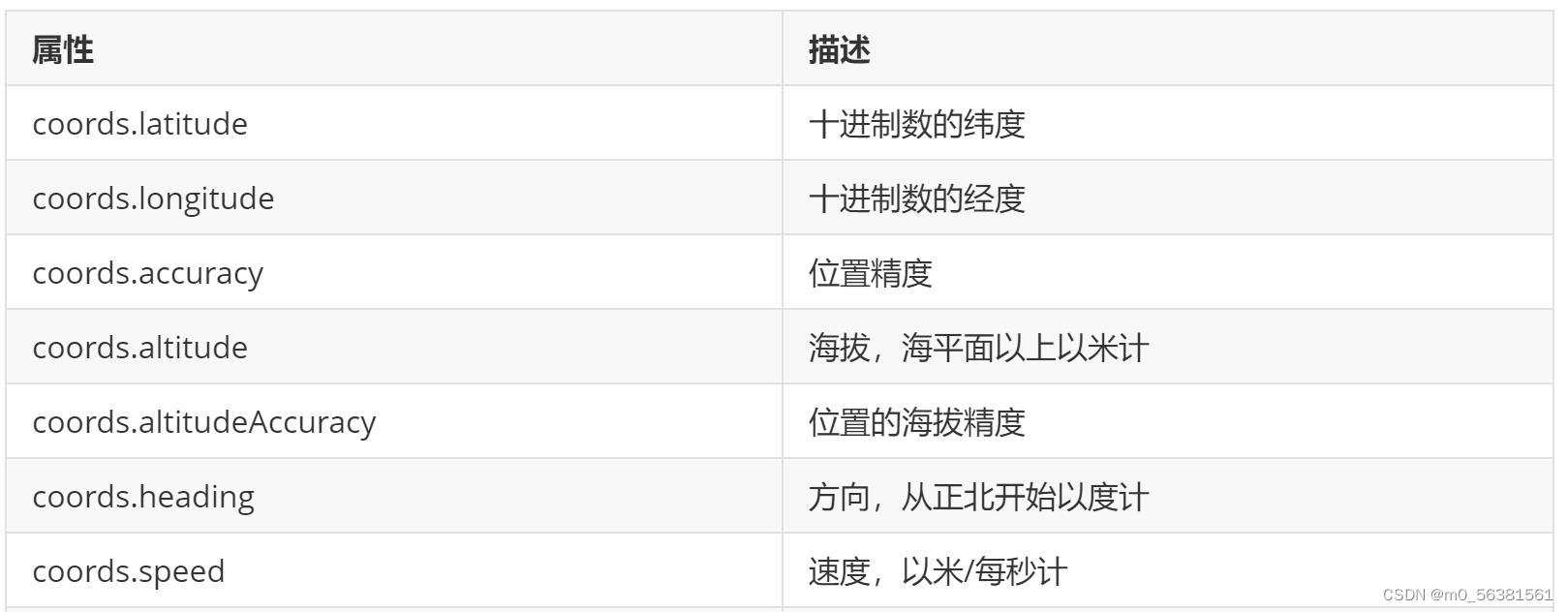
属性


 543
543


 被折叠的 条评论
为什么被折叠?
被折叠的 条评论
为什么被折叠?
 到【灌水乐园】发言


