


<link rel="stylesheet" href="font_3370507_6wbc0da8kht/iconfont.css">
<style>
    span.icon-QQ{
        font-size: 100px;
        color: rgb(19, 111, 197);
    }
    span.icon-shoucang{
        font-size: 100px;
        color: rgb(248, 78, 10);
    }
</style>
<body>
    <span class="iconfont icon-QQ"></span>
    <span class="iconfont icon-shoucang"></span>
</body>
<!-- ======================================================== -->
iconfont.css

@font-face {
  font-family: "iconfont"; /* Project id 3370507 */
  src: url('iconfont.woff2?t=1651327867214') format('woff2'),
       url('iconfont.woff?t=1651327867214') format('woff'),
       url('iconfont.ttf?t=1651327867214') format('truetype');
}

.iconfont {
  font-family: "iconfont" !important;
  font-size: 16px;
  font-style: normal;
  -webkit-font-smoothing: antialiased;
  -moz-osx-font-smoothing: grayscale;
}

.icon-QQ:before {
  content: "\100c4";
}

.icon-shoucang:before {
  content: "\100c6";
}
多列布局


    <style>
        div{
            /* 显示的列数 */
            column-count: 4;
            background-color: rgb(194, 181, 205);
            /* 调整列间距 */
            column-gap: 50px;
            /* 列边框 */
            column-rule: 2px solid green;
            /* 控制列高度统一 */
            column-fill: balance;
            /* 调整列宽  和column-count冲突*/
            /* column-width: 400px; */
        }
        div>h1{
            column-span: all;
            text-align: center;
        }
    </style>
</head>
<body>
    <div>
        <h1>好好学习,天天向上</h1>
        Lorem ipsum dolor, sit amet consectetur adipisicing elit. Itaque consequatur modi reprehenderit commodi repellat sit ullam, veritatis, pariatur, dolore et adipisci. Aliquid deleniti facere, voluptates ut quibusdam beatae molestias nam!
        Lorem ipsum dolor sit amet, consectetur adipisicing elit. A impedit atque obcaecati corrupti totam commodi possimus molestias reiciendis vel quaerat ut doloribus ex aliquam doloremque, illum illo. Sint, temporibus unde.
        Lorem ipsum dolor, sit amet consectetur adipisicing elit. Commodi quasi ducimus ullam praesentium, dolores sint itaque possimus quos ut minus explicabo nulla libero voluptate quibusdam provident ea facere veniam quam!
        Lorem ipsum dolor sit amet, consectetur adipisicing elit. Deleniti quos vitae tenetur doloribus sequi aliquam omnis nam iure fugit distinctio ex soluta, accusamus aut cupiditate excepturi enim recusandae id necessitatibus?
        Lorem ipsum dolor sit, amet consectetur adipisicing elit. Assumenda dolorem facere optio, eos aspernatur maxime a explicabo suscipit voluptatem eum odio. Aliquid accusantium aperiam rerum expedita tenetur earum corporis beatae.
        Lorem, ipsum dolor sit amet consectetur adipisicing elit. Numquam, fugiat? Asperiores aut voluptas praesentium nostrum fugit suscipit repellat dolorum quidem dolor quas. Magnam voluptates necessitatibus tempore soluta nihil eveniet incidunt!
        Lorem ipsum dolor, sit amet consectetur adipisicing elit. Nostrum maxime tempore esse possimus eligendi ut nihil harum eius temporibus voluptatum id sapiente, beatae ipsa facilis, eum quisquam vel ducimus numquam?
    </div>
</body>
响应式布局
响应式布局


    <style>
        *{
            margin: 0;
            padding: 0;
        }
        html,body{
            height: 100%;
        }
        /* 大于1000px,显示黄色 */
        @media screen and (min-width:1000px) {
            body{
            background-color: yellow;
        }
        }
        /* 大于500px小于1000px,显示绿色 */
        @media screen and (max-width:1000px) and (min-width:500px){
            body{
            background-color: rgb(9, 172, 72);
        }
        }
        /* 小于500px,显示蓝色 */
        @media screen and (max-width:500px) {
            body{
            background-color: rgb(83, 8, 202);
        }
        }
    </style>
<style>
*{
margin: 0;
padding: 0;
}
body{
display: flex;
flex-wrap: wrap;
}
div{
height: 100px;
background-color: greenyellow;
border: 1px solid green;
box-sizing: border-box;
width: 25%;
}
/* portrait 横屏显示 */
@media screen and (orientation:portrait) {
div{
width: 33.33%;
}
}
/* landscape 竖屏显示 */
@media screen and (orientation:landscape) {
div{
width: 20%;
}
}
</style>
</head>
<body>
<div></div>
<div></div>
<div></div>
<div></div>
<div></div>
<div></div>
</body>

渐变


    <style>
        *{
            margin: 0;
            padding: 0;
        }
        div{
            width: 300px;
            height: 300px;
            border: 1px solid grey;
            /* background:linear-gradient(to top right,yellow,green,blue); */
            background:linear-gradient(90deg,yellow,green,rgb(176, 16, 136));
            /* 1.支持多颜色渐变
            2.支持方向   to left, , ,to top right,
            3.支持角度的写法*/
        }
    </style>
</head>
<body>
    <div class="box1"></div>
    <!-- <div class="box2"></div> -->
</body> 


    <style>
        *{
            margin: 0;
            padding: 0;
        }
        .box1{
            width: 200px;
            height: 200px;
            border: 1px solid grey;
            background:radial-gradient(yellow 20%,rgb(14, 129, 196) 50%,rgb(176, 16, 136) 80%);
        }
        .box2{
            width: 300px;
            height: 100px;
            border: 1px solid grey;
            margin-top: 10px;
            /* background:radial-gradient(circle,yellow,rgb(37, 174, 219),rgb(176, 16, 136)); */
            background: -webkit-radial-gradient(60% 40%,closest-side,yellow,pink,orange);
            background: -webkit-radial-gradient(60% 40%,farthest-corner,yellow,pink,orange);
            /* 60% 40% 表示中心点  closest-side最近边  farthest-corner最远角
            火狐  -moz-     chrome  -webkit- */
        }
    </style>
</head>
<body>
    <div class="box1"></div>
    <div class="box2"></div>
</body>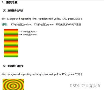
    <style>
        *{
            margin: 0;
            padding: 0;
        }
        div{
            width: 500px;
            height: 500px;
            background: repeating-linear-gradient(red,yellow 20%,green 30%);
        }
    </style>
</head>
<body>
    <div></div>
</body>
    <style>
        *{
            margin: 0;
            padding: 0;
            background-color: antiquewhite;
        }
        div{
            width: 200px;
            height: 200px;
            background:linear-gradient(white 50%,black 50%);
            margin: 10px auto;
            display: flex;
            align-items: center;
            border-radius: 50%;
        }
        div::before{
            content: "";
            display: block;
            width: 100px;
            height: 100px;
            background: radial-gradient(white 25%,black 25%);
            border-radius: 50%;
        }
        div::after{
            content: "";
            display: block;
            width: 100px;
            height: 100px;
            background: radial-gradient(black 25%,white 25%);
            border-radius: 50%;
        }
    </style>
</head>
<body>
    <div></div>
</body>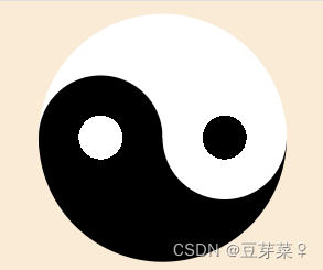
动画过渡属性

    <style>
        *{
            margin: 0;
            padding: 0;
            background-color: antiquewhite;
        }
        div{
            width: 200px;
            height: 200px;
            background:red;
            transition: all 2s linear 2s;
            /* all 所有属性
               2s  动画属性
               linear  匀速
               2s 延迟

               除了 display:none/block属性*/
        }
        div:hover{
            width: 400px;
            height: 600px;
            background: yellow;
        }
    </style>
</head>
<body>
    <div></div>
</body>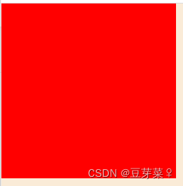

    <style>
        *{
            margin: 0;
            padding: 0;
            background-color: antiquewhite;
        }
        div{
            width: 200px;
            height: 50px;
            background:yellow;
            border: 1px solid gray;
        }
        div ul{
            margin-top: 50px;
            transition: all 1s;
            height: 0px;
            overflow: hidden;
        }
        div:hover ul{
            height: 200px;
        }
    </style>
</head>
<body>
    <div>我的菜单
        <ul>
            <li>1111</li>
            <li>2222</li>
            <li>3333</li>
            <li>4444</li>
        </ul>
    </div>
</body> 

动画过渡类型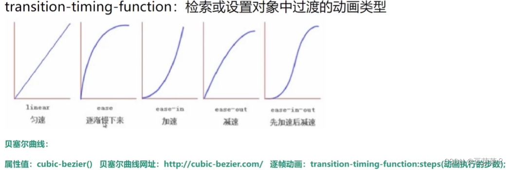
    <style>
        *{
            margin: 0;
            padding: 0;
            background-color: antiquewhite;
        }
        ul{
            list-style: none;
        }
        li{
            width: 200px;
            height: 50px;
            border: 1px solid gray;
        }
        ul:hover li:nth-child(1){
            width: 600px;
            transition: all 2s linear;
        }
        ul:hover li:nth-child(2){
            width: 600px;
            transition: all 2s ease;
        }
        ul:hover li:nth-child(3){
            width: 600px;
            transition: all 2s ease-in;
        }
        ul:hover li:nth-child(4){
            width: 600px;
            transition: all 2s ease-out;
        }
        ul:hover li:nth-child(5){
            width: 600px;
            transition: all 2s ease-in-out;
        }
        ul:hover li:nth-child(6){
            width: 600px;
            transition: all 2s cubic-bezier(.51,1.44,.81,.7);
        }
    </style>
</head>
<body>
    <div>
        <ul>
            <li>1111</li>
            <li>2222</li>
            <li>3333</li>
            <li>4444</li>
            <li>5555</li>
            <li>6666</li>
        </ul>
    </div>
</body> 
动画过渡单一属性
    <style>
        *{
            margin: 0;
            padding: 0;
            background-color: antiquewhite;
        }
        div{
            width: 200px;
            height: 200px;
            background: yellow;
            transition-property: height background;
            transition-duration: 2s;
            transition-timing-function: linear;
            transition-delay: 2s;
        }
        div:hover{
            height: 600px;
            background: green;
        }
    </style>
</head>
<body>
    <div>
    </div>
</body>


 4096
4096


 被折叠的 条评论
为什么被折叠?
被折叠的 条评论
为什么被折叠?
 到【灌水乐园】发言


