


参考代码:https://github.com/kuku2504/SummarySolution
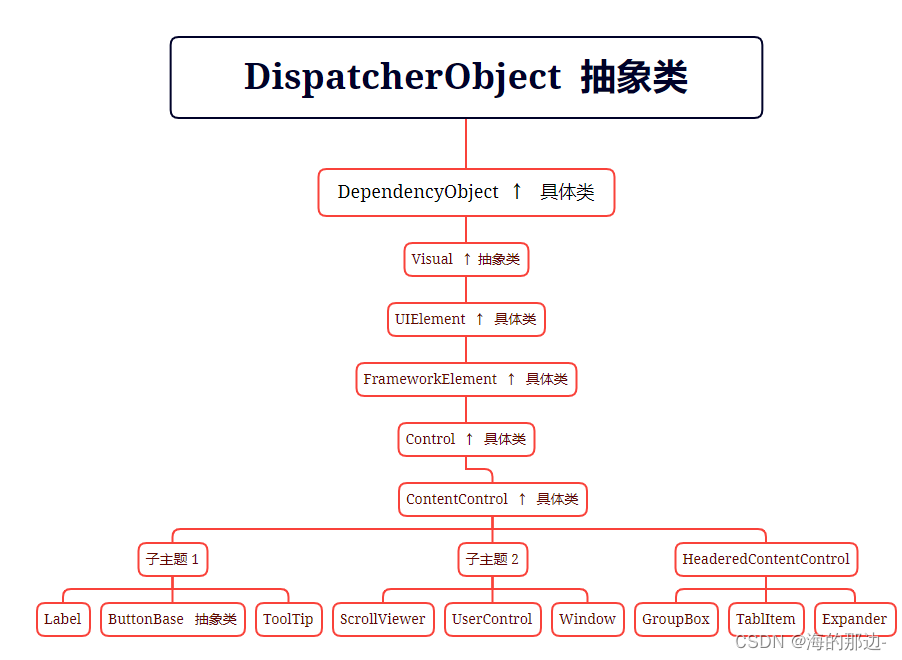
定义
命名空间:
System.Windows.Controls
程序集:
PresentationFramework.dll
表示包含一段任意类型内容的控件。
    // 摘要:
    // 表示一段单独的任何类型的内容的控件。
    [ContentProperty("Content")]
    [DefaultProperty("Content")]
    [Localizability(LocalizationCategory.None, Readability = Readability.Unreadable)]
    public class ContentControl : Control, IAddChild
继承
示例
备注:尽管该示例的可扩展应用程序标记语言(XAML)版本可以使用<Button.Content>每个按钮内容周围的标记,但没有必要。
<!--Create a Button with a string as its content.-->
<Button>This is string content of a Button</Button>

<!--Create a Button with a DateTime object as its content.-->
<Button xmlns:sys="clr-namespace:System;assembly=mscorlib">
  <sys:DateTime>2004/3/4 13:6:55</sys:DateTime>
</Button>

<!--Create a Button with a single UIElement as its content.-->
<Button>
  <Rectangle Height="40" Width="40" Fill="Blue"/>
</Button>

<!--Create a Button with a panel that contains multiple objects
as its content.-->
<Button>
  <StackPanel>
    <Ellipse Height="40" Width="40" Fill="Blue"/>
    <TextBlock TextAlignment="Center">Button</TextBlock>
  </StackPanel>
</Button>

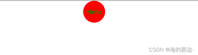
下面的示例演示如何为控件创建样式ContentControl,以便控件具有增强的视觉外观
<Style x:Key="ContentCtrl" TargetType="{x:Type ContentControl}">
  <Setter Property="Background" Value="Red"/>
  <Setter Property="Foreground" Value="Green"/>
  <Setter Property="FontSize" Value="20"/>
  <Setter Property="FontWeight" Value="Bold"/>
  <Setter Property="Template">
    <Setter.Value>
      <ControlTemplate TargetType="{x:Type ContentControl}">
        <Grid>
          <!--Keep the Ellipse a circle when ContentControl.Width  is set.-->
          <Ellipse Width="{TemplateBinding Width}"
                   Height="{TemplateBinding Width}"
                   Fill="{TemplateBinding Background}"/>
            <ContentPresenter VerticalAlignment="Center"
                              HorizontalAlignment="Center"/>
        </Grid>
      </ControlTemplate>
    </Setter.Value>
  </Setter>
</Style>
<ContentControl Width="75" Style="{StaticResource ContentCtrl}"
                Content="Hello"/>
备注:
可以 ContentControl 包含任何类型的公共语言运行时对象 (,例如字符串或 DateTime 对象) 或 UIElement 对象 (,例如或 Rectangle Panel) 。 这使你可以向控件(如和CheckBox)Button添加丰富的内容。
ContentControl 具有有限的默认样式。 如果要增强控件的外观,可以创建新的 DataTemplate控件
官网详细讲解如下链接:
https://learn.microsoft.com/zh-cn/dotnet/api/system.windows.controls.contentcontrol?view=windowsdesktop-6.0
ContentControl 动态绑定UserControl控件
1. 步骤一
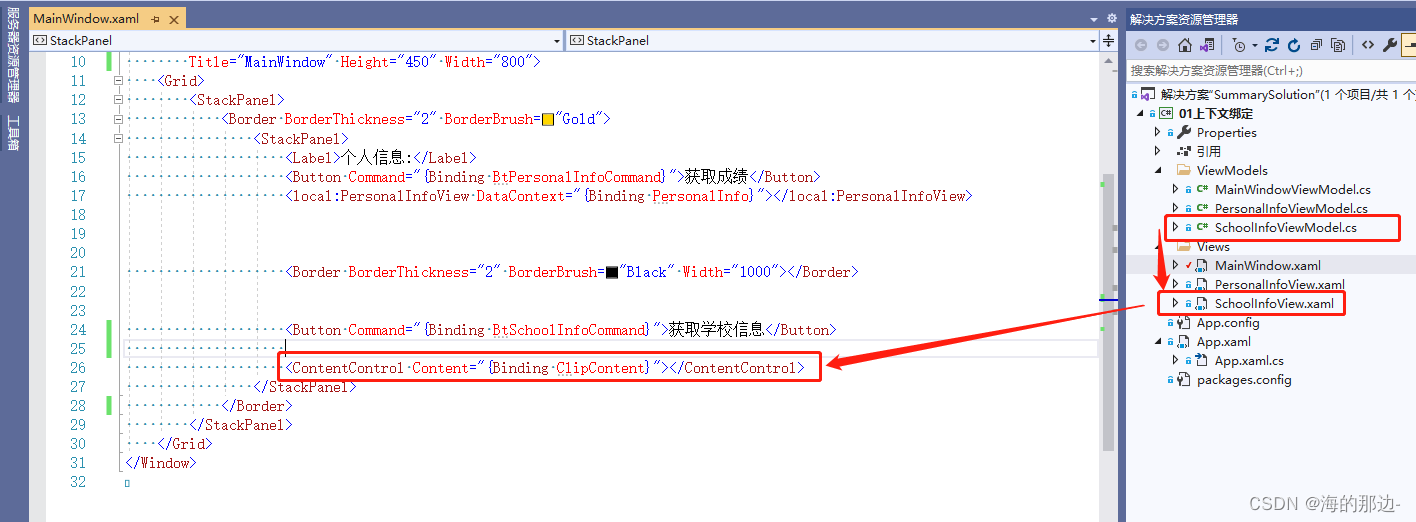
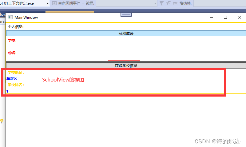
把SchoolInfoView的视图,绑定到ContentControl中
        // 摘要:
        // 获取或设置的内容 System.Windows.Controls.ContentControl。
        // 返回结果:
        // 包含控件的内容的对象。 默认值为 null。
        [Bindable(true)]
        [CustomCategoryAttribute("Content")]
        public object Content { get; set; }
把SchoolInfoView作为一个内容控件放在ContentControl的属性Content中
在父窗口对应的ViewModel中
2. 步骤二
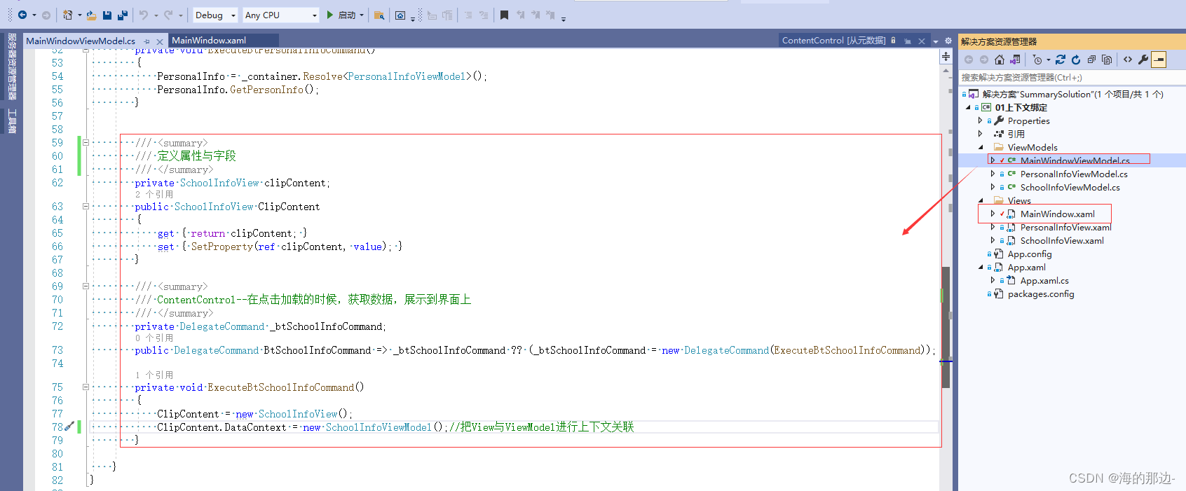
以上两个步骤,就可以把View绑定到ContentControl控件的Content中了
运行结果如下:
注:
        //
        // 摘要:
        //     获取或设置元素参与数据绑定时的数据上下文。
        //
        // 返回结果:
        //     要用作数据上下文的对象。
        [DesignerSerializationVisibility(DesignerSerializationVisibility.Hidden)]
        [Localizability(LocalizationCategory.NeverLocalize)]
        public object DataContext { get; set; }
参考代码:https://github.com/kuku2504/SummarySolution


 扫一扫
扫一扫


 1209
1209

 被折叠的 条评论
为什么被折叠?
被折叠的 条评论
为什么被折叠?
 到【灌水乐园】发言


