


论文摘要
本文介绍了一种名为Lung-EffNet的新型转移学习预测器,它基于EfficientNet架构,通过添加顶层分类头进行修改。该模型在“IQ-OTH/NCCD”数据集上进行了评估,该数据集将肺癌患者分为良性、恶性或正常三类。研究使用五种不同的EfficientNet变体(B0-B4),并通过数据增强方法解决类别不平衡问题。Lung-EffNet在测试集上达到了99.10%的准确率和0.97至0.99的ROC分数,优于其他预训练CNN架构。EfficientNetB1因其高准确性和效率,以及较少的训练参数,成为临床环境中大规模部署的理想选择。
论文结论
本研究提出了一种基于EfficientNetB1的转移学习方法,用于从CT扫描图像中对肺癌进行分类。该方法利用从大规模自然图像数据集中学习到的知识,显著减少了训练所需的计算资源和时间,同时保持了高水平的准确性。实验结果表明,EfficientNetB1在准确性和效率方面优于其他CNN架构,实现了99.10%的准确率和0.97至0.99的ROC分数。尽管该方法表现出色,但仍存在局限性,例如数据集规模和多样性不足。未来的研究方向包括探索其他深度学习架构、纳入更多临床数据以及在更大的数据集上应用EfficientNets的转移学习。
第一部分 模型的搭建与训练
阶段一:导入必要的库和模块
import numpy as np import pandas as pd import matplotlib.pyplot as pltimport matplotlib.image as mpimgfrom PIL import Imageimport seaborn as snsimport cv2import randomimport osimport imageioimport plotly.graph_objects as goimport plotly.express as pximport plotly.figure_factory as fffrom plotly.subplots import make_subplotsfrom collections import Counter
from sklearn.preprocessing import StandardScalerfrom sklearn.model_selection import train_test_splitfrom sklearn.neighbors import LocalOutlierFactorfrom tensorflow.keras.callbacks import Callback, EarlyStopping,ModelCheckpoint, ReduceLROnPlateaufrom sklearn.metrics import accuracy_score, recall_score, precision_score, classification_report, confusion_matrix, plot_confusion_matrix,f1_scorefrom sklearn.model_selection import RandomizedSearchCV, cross_val_score, RepeatedStratifiedKFoldfrom imblearn.over_sampling import SMOTE
import tensorflow as tfimport tensorflow_addons as tfaimport kerasfrom keras.models import Sequentialfrom keras.layers import Dense, Dropout, Activation, Flattenfrom keras.layers import Conv2D, MaxPooling2D, GlobalAveragePooling2D, BatchNormalizationfrom keras.applications import resnetfrom tensorflow.keras.applications import EfficientNetB0, EfficientNetB1, EfficientNetB2, EfficientNetB3, EfficientNetB4, EfficientNetB5, EfficientNetB6, EfficientNetB7from keras.applications.resnet import ResNet50from keras.preprocessing.image import ImageDataGenerator, load_img, img_to_array, array_to_img
这个阶段导入了项目所需的所有库和模块,包括数据处理、图像处理、可视化、机器学习和深度学习相关的工具。这些导入为后续的数据处理、模型构建和训练提供了必要的工具支持。
阶段二:数据集准备和探索
数据集地址:
https://github.com/Berryck/The-IQ-OTHNCCD-lung-cancer-dataset
pythondirectory = r'The IQ-OTHNCCD lung cancer dataset'  # 设置数据集路径

categories = ['Bengin cases', 'Malignant cases', 'Normal cases']  # 定义数据类别:良性、恶性和正常病例

size_data = {}  # 创建空字典用于存储图像尺寸信息
for i in categories:  # 遍历每个类别
    path = os.path.join(directory, i)  # 构建每个类别的完整路径
    class_num = categories.index(i)  # 获取类别的索引编号
    temp_dict = {}  # 创建临时字典存储当前类别的图像尺寸信息
    for file in os.listdir(path):  # 遍历当前类别目录下的所有文件
        filepath = os.path.join(path, file)  # 构建完整的文件路径
        height, width, channels = imageio.imread(filepath).shape  # 读取图像并获取其高度、宽度和通道数
        ifstr(height) + ' x ' + str(width) in temp_dict:  # 检查该尺寸是否已在字典中
            temp_dict[str(height) + ' x ' + str(width)] += 1# 如果已存在,计数加1
        else:
            temp_dict[str(height) + ' x ' + str(width)] = 1# 如果不存在,添加并设为1

    size_data[i] = temp_dict  # 将当前类别的尺寸信息保存到总字典中

size_data  # 显示所有类别的图像尺寸统计信息
{'Bengin cases': {'512 x 512': 120}, 'Malignant cases': {'512 x 512': 501, '512 x 623': 31, '512 x 801': 28, '404 x 511': 1}, 'Normal cases': {'512 x 512': 415, '331 x 506': 1}}
这部分代码设置了数据集路径并定义了三个类别标签。然后遍历数据集中的每个类别,统计每个类别中不同尺寸图像的数量,为后续的数据处理提供参考。
pythonfor i in categories: # 遍历每个类别
path = os.path.join(directory, i) # 构建类别路径
class_num = categories.index(i) # 获取类别索引
for file in os.listdir(path): # 遍历类别目录下的文件
filepath = os.path.join(path, file) # 构建文件完整路径
print(i) # 打印当前类别名称
img = cv2.imread(filepath, 0) # 以灰度模式读取图像
plt.imshow(img) # 显示图像
plt.show() # 展示图像
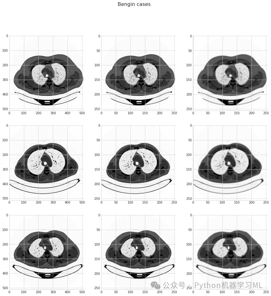
break # 每个类别只显示一张图像后跳出循环
这段代码展示了每个类别的一个示例图像,帮助我们直观地了解数据内容。
pythonimg_size = 256  # 定义统一的图像尺寸为256x256
for i in categories:  # 遍历每个类别
    cnt, samples = 0, 3# 设置计数器和每类要显示的样本数
    fig, ax = plt.subplots(samples, 3, figsize=(15, 15))  # 创建子图网格
    fig.suptitle(i)  # 设置图表标题为当前类别名称

    path = os.path.join(directory, i)  # 构建类别路径
    class_num = categories.index(i)  # 获取类别索引
    for curr_cnt, file inenumerate(os.listdir(path)):  # 遍历类别目录下的文件
        filepath = os.path.join(path, file)  # 构建文件完整路径
        img = cv2.imread(filepath, 0)  # 以灰度模式读取图像

        img0 = cv2.resize(img, (img_size, img_size))  # 调整图像尺寸为256x256

        img1 = cv2.GaussianBlur(img0, (5, 5), 0)  # 对调整尺寸后的图像应用高斯模糊

        ax[cnt, 0].imshow(img)  # 显示原始图像
        ax[cnt, 1].imshow(img0)  # 显示调整尺寸后的图像
        ax[cnt, 2].imshow(img1)  # 显示高斯模糊后的图像
        cnt += 1# 计数器加1
        if cnt == samples:  # 如果已显示指定数量的样本
            break# 跳出循环

plt.show()  # 展示所有子图
这段代码对每个类别展示了三个样本,并对每个样本展示了三种图像处理效果:原始图像、调整尺寸后的图像和高斯模糊处理后的图像。这有助于我们理解数据预处理步骤如何影响图像。
阶段三:数据加载与预处理
pythonimport cv2  # 再次导入cv2库(虽然之前已导入,这里是冗余的)
import numpy as np  # 再次导入numpy库(冗余)
from collections import Counter  # 再次导入Counter(冗余)

data = []  # 创建空列表用于存储处理后的数据
img_size = 256# 设置统一的图像尺寸

for i in categories:  # 遍历每个类别
    path = os.path.join(directory, i)  # 构建类别路径
    class_num = categories.index(i)  # 获取类别索引
    for file in os.listdir(path):  # 遍历类别目录下的文件
        filepath = os.path.join(path, file)  # 构建文件完整路径
        img = cv2.imread(filepath)  # 以彩色模式读取图像
        img = cv2.cvtColor(img, cv2.COLOR_BGR2RGB)  # 将BGR格式转换为RGB格式
        img = cv2.resize(img, (img_size, img_size))  # 调整图像尺寸为统一大小
        data.append([img, class_num])  # 将图像及其类别添加到数据列表

# Shuffle the data
random.shuffle(data)  # 随机打乱数据顺序

# Prepare X and y
X, y = [], []  # 创建空列表用于分别存储特征和标签
for feature, label in data:  # 遍历数据列表中的每个项
    X.append(feature)  # 将特征(图像)添加到X列表
    y.append(label)  # 将标签添加到y列表

# Normalize X
X = np.array(X) / 255.0# 将X转换为numpy数组并归一化像素值至[0,1]区间
y = np.array(y)  # 将y转换为numpy数组

# Check the shapes and counts
print('X length:', len(X))  # 打印X的长度
print('y counts:', Counter(y))  # 打印各类别的数量统计

X.shape  # 显示X的形状
这段代码完成了数据的加载、预处理和准备工作:读取所有图像,调整尺寸,转换颜色空间,最后将数据打乱并分离为特征(X)和标签(y)。预处理步骤包括将图像调整为256x256的尺寸、将色彩空间从BGR转换为RGB以及将像素值归一化到[0,1]区间。
阶段四:数据分割与可视化
pythonX_train, X_valid, y_train, y_valid = train_test_split(X, y, random_state=10, stratify=y)  # 将数据分割为训练集和验证集,保持各类别比例一致

print(len(X_train), X_train.shape)  # 打印训练集的长度和形状
print(len(X_valid), X_valid.shape)  # 打印验证集的长度和形状

import matplotlib.pyplot as plt  # 再次导入matplotlib.pyplot(冗余)

# Display images from X_train
plt.figure(figsize=(10, 10))  # 创建一个大小为10x10的图形
for i inrange(10):  # 遍历前10个训练图像
    plt.subplot(5, 5, i + 1)  # 创建子图
    plt.imshow(X_train[i], cmap='gray')  # 显示训练图像
    plt.axis('off')  # 关闭坐标轴
    plt.title(f"Class: {y_train[i]}")  # 设置标题为类别标签
plt.tight_layout()  # 调整布局
plt.show()  # 显示图形

# Display images from X_valid
plt.figure(figsize=(10, 10))  # 创建一个大小为10x10的图形
for i inrange(10):  # 遍历前10个验证图像
    plt.subplot(5, 5, i + 1)  # 创建子图
    plt.imshow(X_valid[i], cmap='gray')  # 显示验证图像
    plt.axis('off')  # 关闭坐标轴
    plt.title(f"Class: {y_valid[i]}")  # 设置标题为类别标签
plt.tight_layout()  # 调整布局
plt.show()  # 显示图形

print(Counter(y_train), Counter(y_valid))  # 打印训练集和验证集中各类别的数量
这段代码将数据集分割为训练集和验证集,并可视化部分样本。使用stratify参数确保训练集和验证集中类别分布与原始数据集一致。分割后,代码显示了训练集和验证集的一些示例图像,并打印了两个数据集中各类别的数量统计。
阶段五:类不平衡处理(使用SMOTE)
pythonprint(len(X_train), X_train.shape)  # 打印训练集的长度和形状

X_train = X_train.reshape(X_train.shape[0], img_size*img_size*3)  # 将训练图像数据展平为二维数组,便于SMOTE处理

print(len(X_train), X_train.shape)  # 打印展平后的训练集形状

print('Before SMOTE:', Counter(y_train))  # 打印SMOTE处理前的类别分布
smote = SMOTE()  # 创建SMOTE对象
X_train_sampled, y_train_sampled = smote.fit_resample(X_train, y_train)  # 使用SMOTE对训练数据进行过采样
print('After SMOTE:', Counter(y_train_sampled))  # 打印SMOTE处理后的类别分布

X_train = X_train.reshape(X_train.shape[0], img_size, img_size, 3)  # 将原始训练数据恢复为四维形状
X_train_sampled = X_train_sampled.reshape(X_train_sampled.shape[0], img_size, img_size, 3)  # 将SMOTE处理后的数据重新reshape为四维

print(len(X_train), X_train.shape)  # 打印原始训练集的长度和形状
print(len(X_train_sampled), X_train_sampled.shape)  # 打印SMOTE处理后的训练集长度和形状
Before SMOTE: Counter({1: 420, 2: 312, 0: 90})After SMOTE: Counter({2: 420, 1: 420, 0: 420})
这段代码处理了训练数据中的类不平衡问题。由于SMOTE算法要求输入为2D数组,代码首先将训练图像数据展平。然后应用SMOTE算法生成合成样本,使各类别数量平衡。处理后,代码将数据重新调整为4D形状,并可视化SMOTE处理后的一些样本图像。
阶段六:模型训练回调函数设置
python# Create checkpoint callback
checkpoint_path = "lung_cancer_classification_model_checkpoint"# 设置模型检查点保存路径
checkpoint_callback = ModelCheckpoint(checkpoint_path,  # 创建模型检查点回调
                                      save_weights_only=True,  # 只保存权重,不保存整个模型
                                      monitor="val_accuracy",  # 监控验证集准确率
                                      save_best_only=True)  # 只保存最佳模型

# Setup EarlyStopping callback to stop training if model's val_loss doesn't improve for 3 epochs
early_stopping = EarlyStopping(monitor = "val_loss",  # 监控验证集损失
                               patience = 5,  # 如果损失在5个epoch内没有改善,则停止训练
                               restore_best_weights = True)  # 恢复具有最佳验证性能的模型权重

reduce_lr = ReduceLROnPlateau(monitor='val_loss',  # 监控验证集损失
                             factor=0.2,  # 降低学习率的因子
                             patience=3,  # 如果损失在3个epoch内没有改善,则降低学习率
                             min_lr=1e-6)  # 最小学习率
阶段七:模型构建
pythonfrom tensorflow.keras.applications import EfficientNetB7  # 再次导入EfficientNetB7(冗余)
from tensorflow.keras import layers, models, optimizers  # 导入Keras层、模型和优化器

# Instantiate the EfficientNetB7 model
base_model = EfficientNetB7(weights='imagenet',  # 使用预训练的ImageNet权重
                            include_top=False,  # 不包括顶层分类器
                            input_shape=(256,256,3),  # 输入形状
                            classes= 3)  # 类别数量

# Freeze the base model layers
base_model.trainable = False# 冻结基础模型的所有层,防止初始训练时更新预训练权重


# Create a new model on top of EfficientNetB0
model = models.Sequential([  # 创建顺序模型
    base_model,  # 预训练的EfficientNetB7作为基础
    layers.GlobalAveragePooling2D(),  # 全局平均池化层
    layers.Dense(128, activation='relu'),  # 128节点的全连接层,ReLU激活
    layers.Dropout(0.5),  # Dropout层,防止过拟合
    layers.BatchNormalization(),  # 批归一化层,加速训练和增加稳定性
    layers.Dense(3, activation='softmax')  # 输出层,3个节点对应3个类别,softmax激活
])

model.summary()  # 打印模型架构摘要
Model: "sequential_2"_________________________________________________________________Layer (type) Output Shape Param # =================================================================efficientnetb7 (Functional) (None, 8, 8, 2560) 64097687 _________________________________________________________________global_average_pooling2d_2 ( (None, 2560) 0 _________________________________________________________________dense_4 (Dense) (None, 128) 327808 _________________________________________________________________dropout_2 (Dropout) (None, 128) 0 _________________________________________________________________batch_normalization_1 (Batch (None, 128) 512 _________________________________________________________________dense_5 (Dense) (None, 3) 387 =================================================================Total params: 64,426,394Trainable params: 328,451Non-trainable params: 64,097,943
这段代码构建了一个基于EfficientNetB7的迁移学习模型。使用预训练的EfficientNetB7作为特征提取器(基础模型),并冻结其权重以保留预训练的知识。然后在其上添加几个自定义层:全局平均池化、全连接层、Dropout层、批归一化层和最终的分类层。这种迁移学习方法能够利用在大型数据集(如ImageNet)上预训练的模型的强大特征提取能力。
阶段八:模型编译与训练
python# Compile the model
model.compile(
    optimizer=optimizers.Adam(lr=1e-4),  # 使用Adam优化器,学习率为0.0001
    loss='sparse_categorical_crossentropy',  # 使用稀疏分类交叉熵损失函数
    metrics=['accuracy']  # 使用准确率作为评估指标
)

# Train the model
history = model.fit(
    X_train_sampled,  # SMOTE处理后的训练特征
    y_train_sampled,  # SMOTE处理后的训练标签
    epochs= 25,  # 训练25个周期
    validation_data=(X_valid, y_valid),  # 验证数据
    callbacks=[  # 使用之前定义的回调函数
        early_stopping,
        checkpoint_callback,
        reduce_lr
    ]
)
这段代码编译并训练了模型。编译过程中指定了Adam优化器(学习率为0.0001)、损失函数(稀疏分类交叉熵)和评估指标(准确率)。训练过程使用SMOTE处理后的训练数据,并在每个epoch后使用验证集评估模型性能。训练过程中应用了之前定义的三个回调函数,以优化训练过程。
阶段九:模型评估与可视化
pythony_pred = model.predict(X_valid, verbose=1) # 对验证集进行预测
y_pred_bool = np.argmax(y_pred, axis=1) # 将概率转换为类别标签(取最大概率的索引)
print(classification_report(y_valid, y_pred_bool)) # 打印分类报告(精确率、召回率、F1值等)
print(confusion_matrix(y_true=y_valid, y_pred=y_pred_bool)) # 打印混淆矩阵
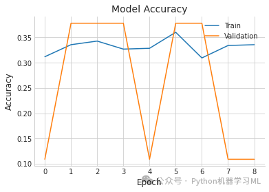
plt.plot(history.history['accuracy'], label='Train') # 绘制训练集准确率曲线
plt.plot(history.history['val_accuracy'], label='Validation') # 绘制验证集准确率曲线
plt.title('Model Accuracy') # 设置图表标题
plt.ylabel('Accuracy') # 设置y轴标签
plt.xlabel('Epoch') # 设置x轴标签
plt.legend() # 显示图例
plt.show() # 显示图表
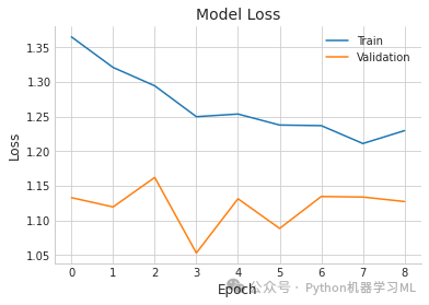
plt.plot(history.history['loss'], label='Train') # 绘制训练集损失曲线
plt.plot(history.history['val_loss'], label='Validation') # 绘制验证集损失曲线
plt.title('Model Loss') # 设置图表标题
plt.ylabel('Loss') # 设置y轴标签
plt.xlabel('Epoch') # 设置x轴标签
plt.legend() # 显示图例
plt.show() # 显示图表
9/9 [==============================] - 6s 253ms/step              precision    recall  f1-score   support
           0       0.00      0.00      0.00        30           1       0.00      0.00      0.00       141           2       0.38      1.00      0.55       104
    accuracy                           0.38       275   macro avg       0.13      0.33      0.18       275weighted avg       0.14      0.38      0.21       275
[[  0   0  30] [  0   0 141] [  0   0 104]]
数据增强
BATCH_SIZE = 8# Add Image augmentation to our generatortrain_datagen = ImageDataGenerator(rescale=1./255, rotation_range=360, horizontal_flip=True, vertical_flip=True, width_shift_range=0.1, height_shift_range=0.1, zoom_range=(0.75,1), brightness_range=(0.75,1.25) )val_datagen = ImageDataGenerator(rescale=1./255)train_generator = train_datagen.flow(X_train, y_train, batch_size=BATCH_SIZE)val_generator = train_datagen.flow(X_valid, y_valid, batch_size=BATCH_SIZE, shuffle= False)
微调模型
from tensorflow.keras.applications import EfficientNetB7from tensorflow.keras import layers, models, optimizers

# Instantiate the EfficientNetB7 modelbase_model = EfficientNetB7(weights='imagenet',                             include_top=False,                             input_shape=(256,256,3),                            classes= 3)
# Unfreeze some layers for fine-tuningbase_model.trainable = True
# Fine-tune from this layer onwardsfine_tune_at = 100
# Freeze all layers before the fine-tune starting layerfor layer in base_model.layers[:fine_tune_at]:    layer.trainable = False
# Create a new model on top of EfficientNetB0model3 = models.Sequential([    base_model,    layers.GlobalAveragePooling2D(),    layers.Dense(128, activation='relu'),    layers.Dropout(0.5),    layers.Dense(3, activation='softmax') ])
model3.summary()# Compile the modelmodel3.compile(    optimizer=optimizers.Adam(learning_rate=1e-4),    loss='sparse_categorical_crossentropy',    metrics=['accuracy'])# Train the modelhistory = model3.fit(    train_generator,     epochs= 25,      validation_data=val_generator,    callbacks=[        early_stopping,        checkpoint_callback,        reduce_lr    ])y_pred = model3.predict(X_valid, verbose=1)y_pred_bool = np.argmax(y_pred, axis=1)report = classification_report(y_valid, y_pred_bool)conf_mat = confusion_matrix(y_true=y_valid, y_pred=y_pred_bool)print("\nClassification Report:")print(conf_mat)print("\nClassification Report:")print(report)
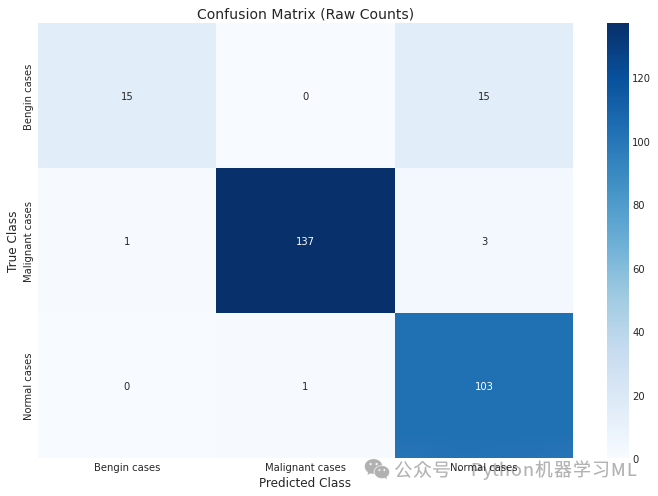
Classification Report:[[ 15 0 15] [ 1 137 3] [ 0 1 103]]Classification Report: precision recall f1-score support 0 0.94 0.50 0.65 30 1 0.99 0.97 0.98 141 2 0.85 0.99 0.92 104 accuracy 0.93 275 macro avg 0.93 0.82 0.85 275weighted avg 0.93 0.93 0.92 275
第二部分 模型评估与可视化代码详解
将详细解析一段用于多类分类模型评估的代码,代码主要包括ROC曲线绘制、混淆矩阵可视化、各项指标计算以及Grad-CAM模型解释等内容。将按照不同功能模块依次进行详细讲解。
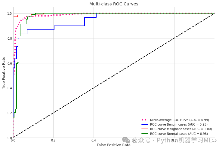
第一阶段:ROC曲线与AUC计算
# 1. ROC Curve and AUC calculationfrom sklearn.metrics import roc_curve, auc, roc_auc_scorefrom scipy import interpfrom itertools import cycle
# Calculate ROC curves for multi-class problemy_pred_proba = model3.predict(X_valid)n_classes = 3
# Calculate ROC curve and ROC area for each classfpr = dict()tpr = dict()roc_auc = dict()
for i in range(n_classes):    # Convert validation labels to one-hot encoding    y_valid_bin = np.zeros((len(y_valid), n_classes))    for j in range(len(y_valid)):        y_valid_bin[j, y_valid[j]] = 1
    fpr[i], tpr[i], _ = roc_curve(y_valid_bin[:, i], y_pred_proba[:, i])    roc_auc[i] = auc(fpr[i], tpr[i])
# Calculate micro-average ROC curve and ROC areafpr["micro"], tpr["micro"], _ = roc_curve(y_valid_bin.ravel(), y_pred_proba.ravel())roc_auc["micro"] = auc(fpr["micro"], tpr["micro"])
# Plot all ROC curvesplt.figure(figsize=(12, 8))plt.plot(fpr["micro"], tpr["micro"],         label=f'Micro-average ROC curve (AUC = {roc_auc["micro"]:.2f})',         color='deeppink', linestyle=':', linewidth=4)
colors = cycle(['blue', 'red', 'green'])for i, color in zip(range(n_classes), colors):    plt.plot(fpr[i], tpr[i], color=color, lw=2,             label=f'ROC curve {categories[i]} (AUC = {roc_auc[i]:.2f})')
plt.plot([0, 1], [0, 1], 'k--', lw=2)plt.xlim([0.0, 1.0])plt.ylim([0.0, 1.05])plt.xlabel('False Positive Rate')plt.ylabel('True Positive Rate')plt.title('Multi-class ROC Curves')plt.legend(loc="lower right")plt.grid(True)plt.show()
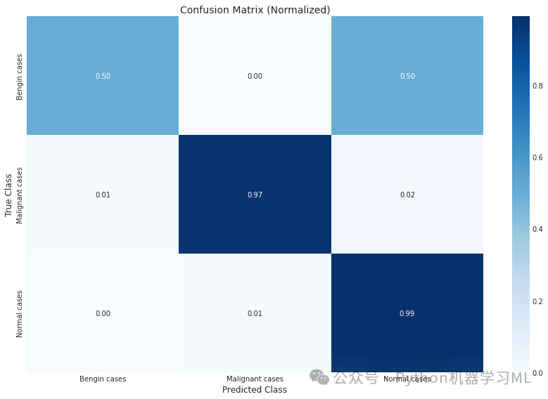
第二阶段:混淆矩阵可视化
python# 2. Enhanced confusion matrix visualization
plt.figure(figsize=(10, 8))
conf_mat_norm = conf_mat.astype('float') / conf_mat.sum(axis=1)[:, np.newaxis]  # 计算归一化的混淆矩阵

# Plot original confusion matrix
plt.figure(figsize=(12, 8))  # 创建新图形
sns.heatmap(conf_mat, annot=True, fmt='d', cmap='Blues',
            xticklabels=categories,
            yticklabels=categories)  # 使用热力图绘制原始混淆矩阵
plt.xlabel('Predicted Class')  # 设置x轴标签
plt.ylabel('True Class')  # 设置y轴标签
plt.title('Confusion Matrix (Raw Counts)')  # 设置标题
plt.savefig("Confusion Matrix (Raw Counts)")  # 保存图形
plt.show()  # 显示图形

# Plot normalized confusion matrix
plt.figure(figsize=(12, 8))  # 创建新图形
sns.heatmap(conf_mat_norm, annot=True, fmt='.2f', cmap='Blues',
            xticklabels=categories,
            yticklabels=categories)  # 使用热力图绘制归一化的混淆矩阵
plt.xlabel('Predicted Class')  # 设置x轴标签
plt.ylabel('True Class')  # 设置y轴标签
plt.title('Confusion Matrix (Normalized)')  # 设置标题

plt.tight_layout()  # 调整布局
plt.savefig("Confusion Matrix (Normalized)")  # 保存图形
plt.show()  # 显示图形
第三阶段:精确度**、召回率、F1分数的柱状图**
python# 3. Bar chart for precision, recall, F1-score
from sklearn.metrics import precision_recall_fscore_support

class_precision, class_recall, class_f1, _ = precision_recall_fscore_support(y_valid, y_pred_bool, average=None)  # 计算每个类别的指标

# Create bar chart of per-class metrics
metrics_df = pd.DataFrame({
    'Precision': class_precision,
    'Recall': class_recall,
    'F1-Score': class_f1
}, index=categories)  # 创建包含各项指标的DataFrame

plt.figure(figsize=(12, 6))  # 创建图形
metrics_df.plot(kind='bar', ylim=[0, 1.1], rot=0)  # 绘制柱状图
plt.title('Per-Class Performance Metrics')  # 设置标题
plt.ylabel('Score')  # 设置y轴标签
plt.xlabel('Class')  # 设置x轴标签
plt.legend(loc='lower right')  # 添加图例
plt.grid(True, linestyle='--', alpha=0.6)  # 添加网格
plt.tight_layout()  # 调整布局
plt.show()  # 显示图形
第四阶段**:类别不平衡可视化**
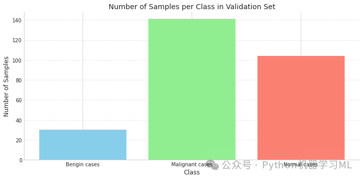
python# 4. Class imbalance visualization
plt.figure(figsize=(10, 5))  # 创建图形
class_counts = np.bincount(y_valid)  # 计算验证集中每个类别的样本数量
plt.bar(range(len(categories)), class_counts, color=['skyblue', 'lightgreen', 'salmon'])  # 绘制柱状图
plt.xticks(range(len(categories)), categories)  # 设置x轴刻度标签
plt.title('Number of Samples per Class in Validation Set')  # 设置标题
plt.xlabel('Class')  # 设置x轴标签
plt.ylabel('Number of Samples')  # 设置y轴标签
plt.grid(True, linestyle='--', alpha=0.6, axis='y')  # 添加y轴网格
plt.tight_layout()  # 调整布局
plt.show()  # 显示图形
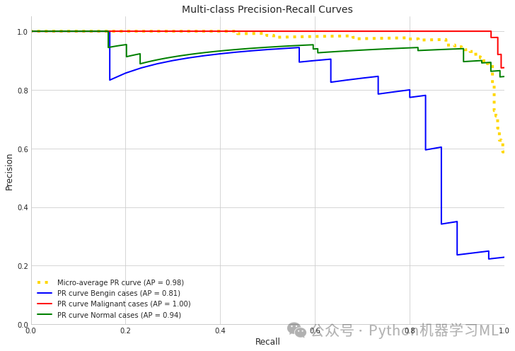
第五****阶段:精确度-召回率曲线
python# 5. Precision-Recall curves
from sklearn.metrics import precision_recall_curve, average_precision_score

# Use different variable names to avoid conflict
pr_precision = dict()  # 创建字典存储精确度
pr_recall = dict()  # 创建字典存储召回率
average_precision = dict()  # 创建字典存储平均精确度

for i inrange(n_classes):
    y_valid_bin = np.zeros((len(y_valid), n_classes))  # 创建全零矩阵用于一热编码
    for j inrange(len(y_valid)):
        y_valid_bin[j, y_valid[j]] = 1# 将真实标签转换为一热编码

    pr_precision[i], pr_recall[i], _ = precision_recall_curve(y_valid_bin[:, i], y_pred_proba[:, i])  # 计算每个类别的PR曲线参数
    average_precision[i] = average_precision_score(y_valid_bin[:, i], y_pred_proba[:, i])  # 计算每个类别的平均精确度

# Calculate micro-average precision-recall curve
pr_precision["micro"], pr_recall["micro"], _ = precision_recall_curve(y_valid_bin.ravel(), y_pred_proba.ravel())  # 计算micro-average的PR曲线
average_precision["micro"] = average_precision_score(y_valid_bin.ravel(), y_pred_proba.ravel())  # 计算micro-average的平均精确度

# Plot precision-recall curves
plt.figure(figsize=(12, 8))  # 创建图形
plt.plot(pr_recall["micro"], pr_precision["micro"],
         label=f'Micro-average PR curve (AP = {average_precision["micro"]:.2f})',
         color='gold', linestyle=':', linewidth=4)  # 绘制micro-average的PR曲线

colors = cycle(['blue', 'red', 'green'])  # 定义颜色循环
for i, color inzip(range(n_classes), colors):
    plt.plot(pr_recall[i], pr_precision[i], color=color, lw=2,
             label=f'PR curve {categories[i]} (AP = {average_precision[i]:.2f})')  # 绘制每个类别的PR曲线

plt.xlim([0.0, 1.0])  # 设置x轴范围
plt.ylim([0.0, 1.05])  # 设置y轴范围
plt.xlabel('Recall')  # 设置x轴标签
plt.ylabel('Precision')  # 设置y轴标签
plt.title('Multi-class Precision-Recall Curves')  # 设置标题
plt.legend(loc="lower left")  # 添加图例
plt.grid(True)  # 添加网格
plt.show()  # 显示图形
第六阶段:模型性能摘要报告
python# 6. Generate model performance summary report
print("\n=== Model Performance Summary ===")
print(f"Micro-average AUC: {roc_auc['micro']:.4f}")  # 打印微平均AUC
print(f"Class average AUC: {np.mean([roc_auc[i] for i in range(n_classes)]):.4f}")  # 打印类别平均AUC
print(f"Micro-average Precision-Recall Area: {average_precision['micro']:.4f}")  # 打印微平均PR曲线下面积

# Print detailed metrics for each class
for i in range(n_classes):
    print(f"\nClass: {categories[i]}")
    print(f"AUC: {roc_auc[i]:.4f}")  # 打印每个类别的AUC
    print(f"Precision: {class_precision[i]:.4f}")  # 打印每个类别的精确度
    print(f"Recall: {class_recall[i]:.4f}")  # 打印每个类别的召回率
    print(f"F1-Score: {class_f1[i]:.4f}")  # 打印每个类别的F1分数
=== Model Performance Summary ===Micro-average AUC: 0.9873Class average AUC: 0.9739Micro-average Precision-Recall Area: 0.9762
Class: Bengin casesAUC: 0.9471Precision: 0.9375Recall: 0.5000F1-Score: 0.6522
Class: Malignant casesAUC: 0.9980Precision: 0.9928Recall: 0.9716F1-Score: 0.9821
Class: Normal casesAUC: 0.9766Precision: 0.8512Recall: 0.9904F1-Score: 0.9156
第七阶段:Grad-CAM模型解释实现
python# 添加一个更通用的Grad-CAM实现
import tensorflow as tf
import matplotlib.cm as cm
import matplotlib.pyplot as plt

defget_img_array(img, size):
    # 扩展维度并确保使用正确的格式
    img_array = np.expand_dims(img, axis=0)
    return img_array

defmake_gradcam_heatmap(img_array, model, last_conv_layer_index=-4, pred_index=None):
    """
    创建一个更通用的Grad-CAM热力图实现

    参数:
        img_array: 预处理后的输入图像数组
        model: 训练好的模型
        last_conv_layer_index: 最后一个卷积层在base_model中的索引(负数表示从末尾开始)
        pred_index: 要生成热力图的类别索引(默认为预测的类别)

    返回:
        Grad-CAM热力图
    """
    # 首先预测类别
    preds = model.predict(img_array)  # 使用模型进行预测
    if pred_index isNone:
        pred_index = np.argmax(preds[0])  # 如果没有指定类别,使用预测的最可能类别

    # 获取模型中的base_model
    base_model = model.layers[0]  # 假设base_model是模型的第一层

    # 获取最后一个卷积层
    last_conv_layer = base_model.layers[last_conv_layer_index]  # 获取指定索引的卷积层
    print(f"Using layer '{last_conv_layer.name}' for Grad-CAM")  # 打印使用的层名称

    # 创建一个特征提取模型
    feature_model = tf.keras.models.Model(
        inputs=base_model.inputs,
        outputs=base_model.get_layer(last_conv_layer.name).output
    )  # 创建从输入到最后一个卷积层输出的模型

    # 创建一个分类模型
    classification_model = tf.keras.models.Model(
        inputs=model.inputs,
        outputs=model.outputs
    )  # 创建整个模型的副本

    # 使用特征提取模型获取卷积层的输出
    with tf.GradientTape() as tape:
        # 计算最后一个卷积层的输出
        conv_output = feature_model(img_array)  # 获取卷积层的输出
        tape.watch(conv_output)  # 监视卷积层输出以计算梯度

        # 使用这个输出创建一个带有可监视梯度的新模型
        # 这里我们使用一个简化模型来模拟从卷积层输出到分类结果的过程
        model_input = tf.keras.Input(shape=conv_output.shape[1:])  # 创建输入层
        x = model_input
        for layer in model.layers[1:]:  # 跳过base_model层
            x = layer(x)  # 应用后续的所有层
        simplified_model = tf.keras.Model(inputs=model_input, outputs=x)  # 创建简化模型

        # 计算预测结果
        pred_result = simplified_model(conv_output)  # 使用简化模型计算预测结果
        class_output = pred_result[:, pred_index]  # 获取指定类别的输出

    # 获取类别相对于卷积层输出的梯度
    grads = tape.gradient(class_output, conv_output)  # 计算梯度

    # 计算梯度的全局平均值
    pooled_grads = tf.reduce_mean(grads, axis=(0, 1, 2))  # 对梯度取平均值

    # 将卷积层输出与我们计算的权重相乘
    conv_output = conv_output[0]  # 取出第一个样本的卷积输出
    heatmap = tf.reduce_sum(tf.multiply(pooled_grads, conv_output), axis=-1)  # 计算加权和

    # 标准化热力图
    heatmap = tf.maximum(heatmap, 0) / tf.math.reduce_max(heatmap)  # 归一化热力图

    return heatmap.numpy()  # 返回NumPy数组格式的热力图

defsave_and_display_gradcam(img, heatmap, alpha=0.4, cam_path="cam.jpg"):
    """
    叠加热力图到原始图像上

    参数:
        img: 原始图像(RGB)
        heatmap: Grad-CAM热力图
        alpha: 热力图透明度系数
        cam_path: 保存结果图像的路径
    """
    # 调整热力图大小以匹配原始图像
    heatmap = np.uint8(255 * heatmap)  # 转换为0-255范围的整数

    # 将热力图应用到jet颜色图
    jet = cm.get_cmap("jet")  # 获取jet颜色映射
    jet_colors = jet(np.arange(256))[:, :3]  # 提取RGB部分
    jet_heatmap = jet_colors[heatmap]  # 应用颜色映射

    # 创建一个具有RGB彩色热力图的图像
    jet_heatmap = tf.keras.preprocessing.image.array_to_img(jet_heatmap)  # 将数组转换为图像
    jet_heatmap = jet_heatmap.resize((img.shape[1], img.shape[0]))  # 调整大小以匹配原始图像
    jet_heatmap = tf.keras.preprocessing.image.img_to_array(jet_heatmap)  # 转换回数组

    # 将热力图叠加到原始图像上
    superimposed_img = jet_heatmap * alpha + img  # 叠加图像
    superimposed_img = tf.keras.preprocessing.image.array_to_img(superimposed_img)  # 转换为图像

    return superimposed_img  # 返回叠加后的图像
第三部分
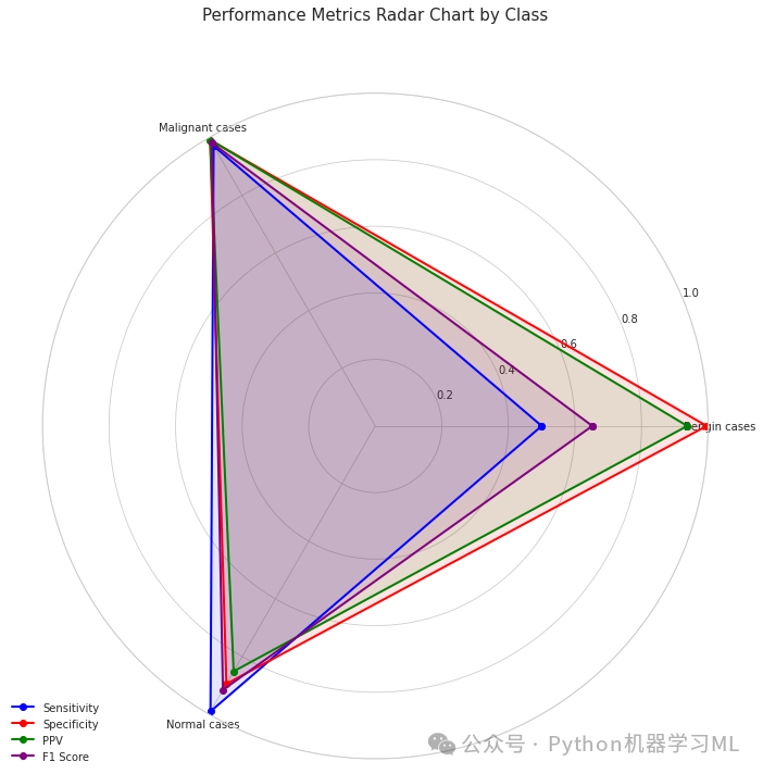
第一阶段:雷达图可视化
这个阶段的代码实现了一个雷达图,用于展示每个类别在不同性能指标上的表现。
python# 导入医学图像可视化所需的库
import matplotlib.pyplot as plt  # 导入matplotlib库,用于创建可视化图表
import seaborn as sns  # 导入seaborn库,用于增强可视化效果
import numpy as np  # 导入numpy库,用于数值计算

# 1. 绘制雷达图,显示模型在各种指标上的性能
defplot_radar_metrics(categories, metrics_dict):
    """
    绘制雷达图,显示每个类别的多个性能指标

    参数:
        categories: 类别名称列表
        metrics_dict: 包含指标数组/列表的字典
    """
    # 设置图形
    fig = plt.figure(figsize=(10, 10))  # 创建一个10x10大小的图形
    ax = fig.add_subplot(111, polar=True)  # 添加极坐标子图

    # 打印维度用于调试
    print(f"Categories: {categories}, length: {len(categories)}")  # 打印类别和类别数量
    for metric, values in metrics_dict.items():  # 遍历每个指标及其值
        print(f"Metric '{metric}' values: {values}, length: {len(values)}")  # 打印每个指标的值和长度

    # 确保所有指标与类别具有相同的维度
    for metric inlist(metrics_dict.keys()):  # 遍历所有指标
        iflen(metrics_dict[metric]) != len(categories):  # 如果指标的长度与类别数量不一致
            print(f"WARNING: Metric '{metric}' has {len(metrics_dict[metric])} values but there are {len(categories)} categories.")  # 打印警告
            print(f"Adjusting '{metric}' to match category length.")  # 打印调整信息

            # 选项1: 如果过长,则截断
            iflen(metrics_dict[metric]) > len(categories):  # 如果指标长度大于类别数量
                metrics_dict[metric] = metrics_dict[metric][:len(categories)]  # 截断指标使其与类别数量相同

            # 选项2: 如果过短,则用零填充
            eliflen(metrics_dict[metric]) < len(categories):  # 如果指标长度小于类别数量
                padding = np.zeros(len(categories) - len(metrics_dict[metric]))  # 创建由零组成的填充数组
                metrics_dict[metric] = np.concatenate([metrics_dict[metric], padding])  # 将填充数组连接到指标后

    # 获取角度
    angles = np.linspace(0, 2*np.pi, len(categories), endpoint=False).tolist()  # 创建均匀分布的角度列表
    angles += angles[:1]  # 闭合图形,添加第一个角度到末尾

    # 绘制每个指标
    metrics = list(metrics_dict.keys())  # 获取指标名称列表
    colors = ['b', 'r', 'g', 'purple']  # 设定颜色列表

    for i, metric inenumerate(metrics):  # 遍历每个指标
        values = metrics_dict[metric].copy()  # 创建指标值的副本,避免修改原始数据
        values = np.append(values, values[0])  # 闭合图形,添加第一个值到末尾

        # 再次检查维度
        iflen(angles) != len(values):  # 如果角度长度和值长度不一致
            print(f"ERROR: angles has {len(angles)} elements but values has {len(values)} elements")  # 打印错误信息
            continue# 跳过当前指标的绘制

        ax.plot(angles, values, 'o-', linewidth=2, color=colors[i % len(colors)], label=metric)  # 绘制线条和标记
        ax.fill(angles, values, alpha=0.1, color=colors[i % len(colors)])  # 填充区域

    # 设置角度标签
    ax.set_xticks(angles[:-1])  # 设置x轴刻度,不包括最后一个(闭合)角度
    ax.set_xticklabels(categories)  # 设置x轴刻度标签为类别名称

    # 设置y轴范围
    ax.set_ylim(0, 1)  # 设置y轴范围从0到1

    # 添加图例和标题
    plt.legend(loc='upper right', bbox_to_anchor=(0.1, 0.1))  # 添加图例
    plt.title('Performance Metrics Radar Chart by Class', size=15, y=1.1)  # 添加标题
    plt.tight_layout()  # 调整布局
    plt.show()  # 显示图形

# 准备雷达图数据 - 明确确保所有数组具有相同的长度
categories_array = np.array(categories)  # 将类别列表转换为numpy数组
n_categories = len(categories_array)  # 获取类别数量

# 检查所有指标的维度
print(f"Categories shape: {categories_array.shape}")  # 打印类别数组的形状
print(f"Sensitivities shape: {np.array(sensitivities).shape}")  # 打印敏感度数组的形状
print(f"Specificities shape: {np.array(specificities).shape}")  # 打印特异度数组的形状
print(f"PPVs shape: {np.array(ppvs).shape}")  # 打印PPV数组的形状
print(f"F1 scores shape: {np.array(class_f1).shape}")  # 打印F1分数数组的形状

# 确保所有指标具有正确的维度
sensitivities_array = np.array(sensitivities)  # 将敏感度列表转换为numpy数组
specificities_array = np.array(specificities)  # 将特异度列表转换为numpy数组
ppvs_array = np.array(ppvs)  # 将PPV列表转换为numpy数组
f1_array = np.array(class_f1)  # 将F1分数列表转换为numpy数组

# 如果需要,截断或填充
iflen(sensitivities_array) != n_categories:  # 如果敏感度数组长度与类别数量不一致
    sensitivities_array = np.resize(sensitivities_array, n_categories)  # 调整敏感度数组大小
iflen(specificities_array) != n_categories:  # 如果特异度数组长度与类别数量不一致
    specificities_array = np.resize(specificities_array, n_categories)  # 调整特异度数组大小
iflen(ppvs_array) != n_categories:  # 如果PPV数组长度与类别数量不一致
    ppvs_array = np.resize(ppvs_array, n_categories)  # 调整PPV数组大小
iflen(f1_array) != n_categories:  # 如果F1分数数组长度与类别数量不一致
    f1_array = np.resize(f1_array, n_categories)  # 调整F1分数数组大小

# 使用校正后的数组创建指标字典
radar_metrics = {
    'Sensitivity': sensitivities_array,  # 敏感度
    'Specificity': specificities_array,  # 特异度
    'PPV': ppvs_array,  # 阳性预测值
    'F1 Score': f1_array  # F1分数
}

# 使用校正后的数据调用函数
plot_radar_metrics(categories, radar_metrics)  # 调用雷达图绘制函数
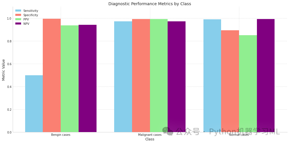
第二阶段:诊断性能比较柱状图
这个阶段的代码创建了一个柱状图,用于比较不同类别在各种诊断性能指标上的表现。
python# 2. 绘制诊断性能比较图 - 修正以确保数组具有兼容的形状
plt.figure(figsize=(14, 7))  # 创建一个14x7大小的图形
x = np.arange(len(categories))  # 创建类别索引数组
width = 0.2# 设置柱状图宽度

# 确保所有数组与x具有相同的长度
sens_array = sensitivities_array  # 使用上面校正后的敏感度数组
spec_array = specificities_array  # 使用上面校正后的特异度数组
ppv_array = ppvs_array  # 使用上面校正后的PPV数组
npv_array = np.array(npvs)  # 将NPV列表转换为numpy数组

# 如果需要,调整npv_array大小
iflen(npv_array) != len(x):  # 如果NPV数组长度与类别数量不一致
    npv_array = np.resize(npv_array, len(x))  # 调整NPV数组大小

# 绘制柱状图
plt.bar(x - width*1.5, sens_array, width, label='Sensitivity', color='skyblue')  # 绘制敏感度柱状图
plt.bar(x - width/2, spec_array, width, label='Specificity', color='salmon')  # 绘制特异度柱状图
plt.bar(x + width/2, ppv_array, width, label='PPV', color='lightgreen')  # 绘制PPV柱状图
plt.bar(x + width*1.5, npv_array, width, label='NPV', color='purple')  # 绘制NPV柱状图

# 设置图表属性
plt.xlabel('Class', fontsize=12)  # 设置x轴标签
plt.ylabel('Metric Value', fontsize=12)  # 设置y轴标签
plt.title('Diagnostic Performance Metrics by Class', fontsize=14)  # 设置图表标题
plt.xticks(x, categories)  # 设置x轴刻度标签为类别名称
plt.ylim(0, 1.1)  # 设置y轴范围从0到1.1
plt.legend()  # 添加图例
plt.grid(True, linestyle='--', alpha=0.7)  # 添加网格线
plt.tight_layout()  # 调整布局
plt.show()  # 显示图形
第三阶段:临床实用性分析
这个阶段的代码实现了临床实用性分析,包括计算加权Kappa系数、恶性病例识别率、基于严重性的错误分类度量等。
python# 临床实用性分析,使用固定的cohen_kappa_score实现
defclinical_utility_analysis(y_true, y_pred, y_pred_proba, categories):
    """计算与临床实用性相关的指标"""
    # 使用有效的weights参数计算cohen_kappa_score
    # 有效选项:None, 'linear', 'quadratic'
    # 使用标准的二次权重而不是自定义权重矩阵
    weighted_kappa = cohen_kappa_score(y_true, y_pred, weights='quadratic')  # 计算加权kappa系数

    # 对于每个恶性病例,计算模型的置信度
    malignant_indices = np.where(y_true == 1)[0]  # 获取所有恶性病例的索引
    malignant_confidences = y_pred_proba[malignant_indices, 1] iflen(malignant_indices) > 0else np.array([])  # 获取恶性病例的置信度
    avg_malignant_confidence = np.mean(malignant_confidences) iflen(malignant_confidences) > 0else0# 计算平均置信度

    # 恶性病例检测率
    malignant_detection_rate = np.sum((y_true == 1) & (y_pred == 1)) / np.sum(y_true == 1) if np.sum(y_true == 1) > 0else0# 计算恶性病例检测率

    print("\n=== Clinical Utility Analysis ===")  # 打印标题
    print(f"Weighted Cohen's Kappa (quadratic weights): {weighted_kappa:.4f}")  # 打印加权kappa系数
    print(f"Average confidence for malignant cases: {avg_malignant_confidence:.4f}")  # 打印恶性病例平均置信度
    print(f"Malignant case detection rate: {malignant_detection_rate:.4f}")  # 打印恶性病例检测率

    # 计算自定义的基于严重性加权的错误分类度量
    # 这解决了我们需要更严厉地惩罚漏诊恶性病例的需求
    # 而不使用自定义权重矩阵
    severity_matrix = np.ones((3, 3))  # 创建严重性矩阵
    severity_matrix[1, 0] = 2.0# 恶性误诊为良性的权重
    severity_matrix[1, 2] = 2.0# 恶性误诊为正常的权重

    conf_mat = confusion_matrix(y_true, y_pred)  # 计算混淆矩阵
    total_samples = np.sum(conf_mat)  # 计算样本总数
    weighted_errors = 0# 初始化加权错误

    for i inrange(3):  # 遍历每个真实类别
        for j inrange(3):  # 遍历每个预测类别
            if i != j:  # 只计算错误分类
                weighted_errors += conf_mat[i, j] * severity_matrix[i, j]  # 累加加权错误

    severity_weighted_error = weighted_errors / total_samples  # 计算基于严重性的加权错误率
    print(f"Severity-weighted error rate: {severity_weighted_error:.4f}")  # 打印基于严重性的加权错误率

    # 漏诊分析(恶性误诊为良性或正常)
    missed_diagnoses = np.where((y_true == 1) & (y_pred != 1))[0]  # 获取漏诊的恶性病例索引
    print(f"\nNumber of missed malignant diagnoses: {len(missed_diagnoses)} / {np.sum(y_true == 1)}")  # 打印漏诊恶性病例数量

    iflen(missed_diagnoses) > 0:  # 如果存在漏诊的恶性病例
        misdiagnosed_as = {}  # 初始化误诊类别字典
        for idx in missed_diagnoses:  # 遍历每个漏诊的恶性病例
            pred = y_pred[idx]  # 获取预测类别
            if categories[pred] in misdiagnosed_as:  # 如果该类别已在字典中
                misdiagnosed_as[categories[pred]] += 1# 计数加1
            else:  # 如果该类别不在字典中
                misdiagnosed_as[categories[pred]] = 1# 添加到字典并初始化计数为1

        print("Malignant cases misdiagnosed as:")  # 打印标题
        for category, count in misdiagnosed_as.items():  # 遍历每个误诊类别
            print(f"  - {category}: {count}")  # 打印每个类别的误诊数量

    # 计算并呈现基于风险的决策阈值
    print("\n=== Recommended Decision Thresholds ===")  # 打印标题
    # 设置不同的临床场景(例如,筛查,诊断确认)
    scenarios = {
        "Low-Risk Screening": 0.3,   # 漏诊成本较低,适合初步筛查
        "Routine Diagnosis": 0.5,    # 平衡考虑
        "High-Risk Confirmation": 0.7# 避免漏诊,接受一些误报
    }

    for scenario, threshold in scenarios.items():  # 遍历每个场景
        # 使用阈值进行预测
        pred_with_threshold = np.zeros_like(y_pred)  # 创建预测结果数组
        for i inrange(len(y_pred_proba)):  # 遍历每个样本
            max_prob = np.max(y_pred_proba[i])  # 获取最大概率
            if max_prob >= threshold:  # 如果最大概率大于等于阈值
                pred_with_threshold[i] = np.argmax(y_pred_proba[i])  # 使用概率最大的类别作为预测
            else:  # 如果最大概率小于阈值
                # 当概率低于阈值时,建议进一步检查
                pred_with_threshold[i] = -1# 标记为需要进一步检查

        # 计算有效预测率
        valid_predictions = np.sum(pred_with_threshold != -1)  # 计算有效预测数量
        valid_rate = valid_predictions / len(y_pred)  # 计算有效预测率

        # 计算有效预测中的准确率
        valid_indices = np.where(pred_with_threshold != -1)[0]  # 获取有效预测的索引
        iflen(valid_indices) > 0:  # 如果存在有效预测
            valid_accuracy = np.sum(y_true[valid_indices] == pred_with_threshold[valid_indices]) / len(valid_indices)  # 计算有效预测的准确率
        else:  # 如果不存在有效预测
            valid_accuracy = 0# 设置准确率为0

        print(f"{scenario} (threshold={threshold}):")  # 打印场景和阈值
        print(f"  Valid prediction rate: {valid_rate:.4f}")  # 打印有效预测率
        print(f"  Accuracy of valid predictions: {valid_accuracy:.4f}")  # 打印有效预测的准确率
        print(f"  Proportion of samples recommended for further examination: {1 - valid_rate:.4f}")  # 打印建议进一步检查的样本比例

# 调用修正后的clinical_utility_analysis函数
clinical_utility_analysis(y_valid, y_pred_bool, y_pred, categories)  # 调用临床实用性分析函数
=== Clinical Utility Analysis ===Weighted Cohen's Kappa (quadratic weights): 0.6970Average confidence for malignant cases: 0.9573Malignant case detection rate: 0.9716Severity-weighted error rate: 0.0873
Number of missed malignant diagnoses: 4 / 141Malignant cases misdiagnosed as:  - Normal cases: 3  - Bengin cases: 1
=== Recommended Decision Thresholds ===Low-Risk Screening (threshold=0.3):  Valid prediction rate: 1.0000  Accuracy of valid predictions: 0.9273  Proportion of samples recommended for further examination: 0.0000Routine Diagnosis (threshold=0.5):  Valid prediction rate: 0.9964  Accuracy of valid predictions: 0.9307  Proportion of samples recommended for further examination: 0.0036High-Risk Confirmation (threshold=0.7):  Valid prediction rate: 0.9273  Accuracy of valid predictions: 0.9529  Proportion of samples recommended for further examination: 0.0727
全面的医学图像分类模型评估工具,分为三个主要阶段:
-
雷达图可视化:通过多维雷达图直观展示每个类别在不同性能指标(敏感度、特异度、PPV、F1分数)上的表现,帮助医生全面理解模型的性能分布。
-
诊断性能比较柱状图:使用分组柱状图直观比较不同类别在各项诊断指标上的表现差异,便于识别模型在哪些类别上表现更好或更差。
-
临床实用性分析:
-
- 计算加权Kappa系数评估模型与临床专家的一致性
- 分析恶性病例检测率和置信度
- 使用自定义的严重性矩阵权衡不同类型的错误
- 分析漏诊情况,特别关注恶性病例的漏诊
- 提供不同风险场景下的决策阈值建议
非常适合应用于医学图像分类任务,可以轻松迁移到其他数据集。代码中实现了数据维度的自动检查和修正,增强了工具的健壮性。特别是临床实用性分析部分,考虑了医疗场景中不同类型错误的不同代价,对于医疗AI系统的临床应用具有重要意义。
第四部分
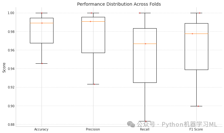
第一阶段:交叉验证性能评估
这部分代码实现了分层K折交叉验证,用于全面评估模型性能并展示结果分布。
python# 导入分层k折交叉验证和性能评估所需的库
from sklearn.model_selection import StratifiedKFold  # 导入分层K折交叉验证
from sklearn.metrics import accuracy_score, precision_score, recall_score, f1_score  # 导入评估指标函数

defcross_validate_model_performance(model, X, y, n_splits=5):
    """
    使用分层k折交叉验证评估模型性能

    参数:
        model: 待评估的机器学习模型
        X: 特征数据
        y: 标签数据
        n_splits: 交叉验证折数,默认为5

    返回:
        包含各项性能指标的字典
    """
    # 初始化分层k折交叉验证
    skf = StratifiedKFold(n_splits=n_splits, shuffle=True, random_state=42)  # 创建分层k折交叉验证对象,设置折数、打乱数据和随机种子

    # 指标存储列表
    accuracies = []  # 用于存储每折的准确率
    precisions = []  # 用于存储每折的精确率
    recalls = []     # 用于存储每折的召回率
    f1_scores = []   # 用于存储每折的F1分数

    print(f"\n=== {n_splits}-Fold Cross-Validation Performance ===")  # 打印交叉验证标题

    # 执行交叉验证
    for fold, (train_idx, test_idx) inenumerate(skf.split(X, y)):  # 遍历每一折的训练和测试索引
        print(f"\nFold {fold+1}/{n_splits}")  # 打印当前折数

        # 拆分数据
        X_train_fold, X_test_fold = X[train_idx], X[test_idx]  # 根据索引获取训练特征和测试特征
        y_train_fold, y_test_fold = y[train_idx], y[test_idx]  # 根据索引获取训练标签和测试标签

        # 在当前折上训练模型
        model.fit(X_train_fold, y_train_fold, epochs=3, batch_size=16, verbose=0)  # 训练模型,设置训练轮数、批量大小和不显示进度

        # 在测试折上评估模型
        y_pred_fold = model.predict(X_test_fold)  # 预测结果(概率)
        y_pred_classes = np.argmax(y_pred_fold, axis=1)  # 将概率转换为类别索引

        # 计算评估指标
        acc = accuracy_score(y_test_fold, y_pred_classes)  # 计算准确率
        prec = precision_score(y_test_fold, y_pred_classes, average='macro')  # 计算宏平均精确率
        rec = recall_score(y_test_fold, y_pred_classes, average='macro')  # 计算宏平均召回率
        f1 = f1_score(y_test_fold, y_pred_classes, average='macro')  # 计算宏平均F1分数

        # 存储评估指标
        accuracies.append(acc)  # 添加准确率到列表
        precisions.append(prec)  # 添加精确率到列表
        recalls.append(rec)      # 添加召回率到列表
        f1_scores.append(f1)     # 添加F1分数到列表

        # 打印当前折的结果
        print(f"  Accuracy: {acc:.4f}")    # 打印准确率
        print(f"  Precision: {prec:.4f}")  # 打印精确率
        print(f"  Recall: {rec:.4f}")      # 打印召回率
        print(f"  F1 Score: {f1:.4f}")     # 打印F1分数

    # 计算并打印所有折的平均性能
    print("\nAverage performance across all folds:")  # 打印平均性能标题
    print(f"  Accuracy: {np.mean(accuracies):.4f} ± {np.std(accuracies):.4f}")    # 打印平均准确率及标准差
    print(f"  Precision: {np.mean(precisions):.4f} ± {np.std(precisions):.4f}")  # 打印平均精确率及标准差
    print(f"  Recall: {np.mean(recalls):.4f} ± {np.std(recalls):.4f}")           # 打印平均召回率及标准差
    print(f"  F1 Score: {np.mean(f1_scores):.4f} ± {np.std(f1_scores):.4f}")     # 打印平均F1分数及标准差

    # 绘制性能分布图
    metrics = {  # 创建指标字典
        'Accuracy': accuracies,   # 准确率列表
        'Precision': precisions,  # 精确率列表
        'Recall': recalls,        # 召回率列表
        'F1 Score': f1_scores     # F1分数列表
    }

    plt.figure(figsize=(10, 6))  # 创建10x6大小的图形

    # 创建箱线图
    plt.boxplot([metrics[m] for m in metrics.keys()], labels=metrics.keys())  # 绘制所有指标的箱线图
    plt.title('Performance Distribution Across Folds')  # 设置图表标题
    plt.ylabel('Score')  # 设置y轴标签
    plt.grid(axis='y', linestyle='--', alpha=0.7)  # 添加网格线

    # 添加单个点
    for i, m inenumerate(metrics.keys()):  # 遍历每个指标
        x = np.random.normal(i+1, 0.04, size=len(metrics[m]))  # 为点生成稍微偏移的x坐标,增加可视性
        plt.plot(x, metrics[m], 'r.', alpha=0.4)  # 绘制点

    plt.tight_layout()  # 调整布局
    plt.show()  # 显示图形

    return metrics  # 返回指标字典

# 取消注释以运行交叉验证(注意:这可能很耗时)
cross_val_metrics = cross_validate_model_performance(model3, X_valid, y_valid, n_splits=3)  # 使用3折交叉验证评估模型
=== 3-Fold Cross-Validation Performance ===
Fold 1/3  Accuracy: 0.9457  Precision: 0.9232  Recall: 0.8834  F1 Score: 0.8995
Fold 2/3  Accuracy: 0.9891  Precision: 0.9907  Recall: 0.9667  F1 Score: 0.9778
Fold 3/3  Accuracy: 1.0000  Precision: 1.0000  Recall: 1.0000  F1 Score: 1.0000
Average performance across all folds:  Accuracy: 0.9783 ± 0.0235  Precision: 0.9713 ± 0.0342  Recall: 0.9500 ± 0.0490  F1 Score: 0.9591 ± 0.0431
第二阶段:特征可视化和聚类分析
这部分代码提取深度学习模型的特征表示,并通过降维和聚类分析探索数据结构与模型表现之间的关系。
python# 导入特征可视化和聚类分析所需的库
from sklearn.decomposition import PCA  # 导入主成分分析用于降维
from sklearn.manifold import TSNE      # 导入t-SNE用于高维数据可视化
from sklearn.cluster import KMeans     # 导入K均值聚类

defvisualize_features(model, X, y, categories, layer_name=-2):
    """
    提取和可视化指定层的特征

    参数:
        model: 深度学习模型
        X: 输入数据
        y: 标签数据
        categories: 类别名称列表
        layer_name: 要提取特征的层索引,默认为倒数第二层

    返回:
        原始特征、PCA降维特征、t-SNE降维特征和聚类标签
    """
    # 创建一个模型,输出指定层的特征
    feature_model = tf.keras.models.Model(
        inputs=model.input,
        outputs=model.layers[layer_name].output
    )  # 创建一个新模型,使用原模型输入,输出指定层的激活值

    # 提取特征
    features = feature_model.predict(X)  # 使用特征模型提取特征

    # 应用降维进行可视化
    # 先使用PCA减少计算时间
    if features.shape[1] > 50:  # 如果特征维度大于50
        pca = PCA(n_components=50)  # 创建PCA对象,设置降维至50维
        features_pca = pca.fit_transform(features)  # 应用PCA降维
        print(f"PCA explained variance ratio: {sum(pca.explained_variance_ratio_):.4f}")  # 打印PCA解释方差比例
    else:  # 如果特征维度不大于50
        features_pca = features  # 不使用PCA降维

    # 然后使用t-SNE进行可视化
    tsne = TSNE(n_components=2, random_state=42, perplexity=min(30, len(X)//10))  # 创建t-SNE对象,设置降至2维,固定随机种子,动态设置困惑度
    features_tsne = tsne.fit_transform(features_pca)  # 应用t-SNE降维

    # 绘制t-SNE可视化结果
    plt.figure(figsize=(12, 10))  # 创建12x10大小的图形

    # 根据真实类别绘制
    plt.subplot(2, 2, 1)  # 创建2x2网格的第1个子图
    for i, category inenumerate(categories):  # 遍历每个类别
        indices = np.where(y == i)[0]  # 获取属于当前类别的样本索引
        plt.scatter(features_tsne[indices, 0], features_tsne[indices, 1], label=category, alpha=0.6)  # 绘制散点图

    plt.title('Feature Space Visualization (t-SNE)')  # 设置标题
    plt.xlabel('t-SNE Dimension 1')  # 设置x轴标签
    plt.ylabel('t-SNE Dimension 2')  # 设置y轴标签
    plt.legend()  # 添加图例

    # 根据预测正确性绘制
    plt.subplot(2, 2, 2)  # 创建2x2网格的第2个子图
    y_pred = np.argmax(model.predict(X), axis=1)  # 获取预测类别
    correct = (y_pred == y)  # 判断预测是否正确
    plt.scatter(features_tsne[correct, 0], features_tsne[correct, 1],
                label='Correct Predictions', color='green', alpha=0.6)  # 绘制预测正确的点
    plt.scatter(features_tsne[~correct, 0], features_tsne[~correct, 1],
                label='Incorrect Predictions', color='red', alpha=0.6)  # 绘制预测错误的点

    plt.title('Prediction Correctness Visualization')  # 设置标题
    plt.xlabel('t-SNE Dimension 1')  # 设置x轴标签
    plt.ylabel('t-SNE Dimension 2')  # 设置y轴标签
    plt.legend()  # 添加图例

    # K均值聚类
    n_clusters = len(categories)  # 聚类数量设为类别数量
    kmeans = KMeans(n_clusters=n_clusters, random_state=42, n_init=10)  # 创建K均值聚类对象
    cluster_labels = kmeans.fit_predict(features_pca)  # 应用K均值聚类

    # 根据聚类结果绘制
    plt.subplot(2, 2, 3)  # 创建2x2网格的第3个子图
    for i inrange(n_clusters):  # 遍历每个聚类
        indices = np.where(cluster_labels == i)[0]  # 获取属于当前聚类的样本索引
        plt.scatter(features_tsne[indices, 0], features_tsne[indices, 1],
                   label=f'Cluster {i+1}', alpha=0.6)  # 绘制散点图

    plt.title('Feature Clustering (K-means)')  # 设置标题
    plt.xlabel('t-SNE Dimension 1')  # 设置x轴标签
    plt.ylabel('t-SNE Dimension 2')  # 设置y轴标签
    plt.legend()  # 添加图例

    # 计算聚类纯度
    purity_table = np.zeros((n_clusters, len(categories)))  # 创建纯度表格
    for i inrange(n_clusters):  # 遍历每个聚类
        cluster_indices = np.where(cluster_labels == i)[0]  # 获取属于当前聚类的样本索引
        for j inrange(len(categories)):  # 遍历每个类别
            purity_table[i, j] = np.sum(y[cluster_indices] == j) / len(cluster_indices) iflen(cluster_indices) > 0else0# 计算聚类中每个类别的比例

    # 将聚类纯度绘制为热图
    plt.subplot(2, 2, 4)  # 创建2x2网格的第4个子图
    sns.heatmap(purity_table, annot=True, fmt='.2f', cmap='Blues',
               xticklabels=categories, yticklabels=[f'Cluster {i+1}'for i inrange(n_clusters)])  # 绘制热图
    plt.title('Cluster Purity (Class Distribution)')  # 设置标题
    plt.ylabel('Cluster')  # 设置y轴标签
    plt.xlabel('True Class')  # 设置x轴标签

    plt.tight_layout()  # 调整布局
    plt.show()  # 显示图形

    # 返回特征和降维结果
    return features, features_pca, features_tsne, cluster_labels  # 返回原始特征、PCA降维特征、t-SNE降维特征和聚类标签

# 提取和可视化特征(取消注释以运行)
features_data = visualize_features(model3, X_valid, y_valid, categories)  # 调用特征可视化函数
第三阶段:模型样本难度分析
这部分代码分析模型对不同样本的分类难度,通过预测置信度与准确率的关系,识别难分样本和易误判样本。
python# 模型样本难度分析
defanalyze_sample_difficulty(y_true, y_pred_proba, categories):
    """
    分析模型对样本的分类难度

    参数:
        y_true: 真实标签
        y_pred_proba: 预测概率
        categories: 类别名称列表

    返回:
        按置信度排序的结果数据框
    """
    # 计算每个样本的预测置信度
    confidences = np.max(y_pred_proba, axis=1)  # 获取每个样本的最大预测概率作为置信度
    predicted_classes = np.argmax(y_pred_proba, axis=1)  # 获取预测类别
    correct_predictions = (predicted_classes == y_true)  # 判断预测是否正确

    # 创建结果数据框
    import pandas as pd  # 导入pandas用于数据处理
    df = pd.DataFrame({
        'True_Class': [categories[y] for y in y_true],  # 将真实类别索引转换为类别名称
        'Predicted_Class': [categories[y] for y in predicted_classes],  # 将预测类别索引转换为类别名称
        'Confidence': confidences,  # 预测置信度
        'Correct': correct_predictions  # 预测是否正确
    })

    # 按置信度排序
    df_sorted = df.sort_values('Confidence')  # 按置信度升序排序

    # 分析不同置信度区间的准确率
    confidence_bins = [0, 0.25, 0.5, 0.75, 0.9, 1.0]  # 定义置信度区间边界
    bin_labels = ['0-25%', '25-50%', '50-75%', '75-90%', '90-100%']  # 区间标签

    df['Confidence_Bin'] = pd.cut(df['Confidence'], confidence_bins, labels=bin_labels)  # 将置信度分箱
    bin_accuracy = df.groupby('Confidence_Bin')['Correct'].mean()  # 计算每个区间的准确率
    bin_counts = df.groupby('Confidence_Bin')['Correct'].count()  # 计算每个区间的样本数量

    # 绘制置信度与准确率的关系
    plt.figure(figsize=(14, 6))  # 创建14x6大小的图形

    # 准确率条形图
    plt.subplot(1, 2, 1)  # 创建1x2网格的第1个子图
    bin_accuracy.plot(kind='bar', color='skyblue')  # 绘制条形图
    plt.title('Accuracy at Different Confidence Intervals')  # 设置标题
    plt.xlabel('Confidence Interval')  # 设置x轴标签
    plt.ylabel('Accuracy')  # 设置y轴标签
    plt.ylim(0, 1.1)  # 设置y轴范围

    # 样本数量条形图
    plt.subplot(1, 2, 2)  # 创建1x2网格的第2个子图
    bin_counts.plot(kind='bar', color='salmon')  # 绘制条形图
    plt.title('Sample Count at Different Confidence Intervals')  # 设置标题
    plt.xlabel('Confidence Interval')  # 设置x轴标签
    plt.ylabel('Sample Count')  # 设置y轴标签

    plt.tight_layout()  # 调整布局
    plt.show()  # 显示图形

    # 返回难以分类的样本(低置信度但预测正确,或高置信度但预测错误)
    hard_correct = df[(df['Confidence'] < 0.6) & df['Correct']].sort_values('Confidence')  # 低置信度但预测正确的样本
    hard_incorrect = df[(df['Confidence'] > 0.8) & ~df['Correct']].sort_values('Confidence', ascending=False)  # 高置信度但预测错误的样本

    print("\n=== Difficult but Correct Samples (Low Confidence) ===")  # 打印标题
    iflen(hard_correct) > 0:  # 如果存在此类样本
        print(hard_correct.head(5))  # 打印前5个样本
    else:  # 如果不存在此类样本
        print("No such samples")  # 打印无样本信息

    print("\n=== Incorrectly Classified with High Confidence (Model Confidently Wrong) ===")  # 打印标题
    iflen(hard_incorrect) > 0:  # 如果存在此类样本
        print(hard_incorrect.head(5))  # 打印前5个样本
    else:  # 如果不存在此类样本
        print("No such samples")  # 打印无样本信息

    return df_sorted  # 返回按置信度排序的数据框

# 分析样本难度
difficulty_analysis = analyze_sample_difficulty(y_valid, y_pred, categories)  # 调用样本难度分析函数
=== Difficult but Correct Samples (Low Confidence) ===          True_Class  Predicted_Class  Confidence  Correct Confidence_Bin241     Bengin cases     Bengin cases    0.509895     True         50-75%210     Normal cases     Normal cases    0.512126     True         50-75%252     Normal cases     Normal cases    0.527766     True         50-75%48   Malignant cases  Malignant cases    0.554800     True         50-75%256     Bengin cases     Bengin cases    0.565877     True         50-75%
=== Incorrectly Classified with High Confidence (Model Confidently Wrong) ===          True_Class Predicted_Class  Confidence  Correct Confidence_Bin160     Bengin cases    Normal cases    0.994491    False        90-100%151     Bengin cases    Normal cases    0.990153    False        90-100%238     Bengin cases    Normal cases    0.989127    False        90-100%113  Malignant cases    Normal cases    0.957777    False        90-100%181     Bengin cases    Normal cases    0.953322    False        90-100%
这段代码提供了一套全面的深度学习模型评估工具,分为三个主要阶段:
-
交叉验证性能评估:
-
- 使用分层K折交叉验证方法评估模型在不同数据划分上的性能稳定性
- 计算准确率、精确率、召回率和F1分数等标准评估指标
- 通过箱线图直观展示模型性能分布,帮助评估性能波动情况
-
特征可视化和聚类分析:
-
- 提取模型内部特征表示,通过PCA和t-SNE进行降维可视化
- 从多个角度分析特征空间:真实类别分布、预测正确性和聚类结构
- 通过K均值聚类探索数据的内在结构,并分析聚类纯度
- 帮助理解模型决策边界和潜在的特征学习质量
-
样本难度分析:
-
- 基于预测置信度分析模型对不同样本的分类难度
- 研究置信度与准确率的关系,验证模型校准性
- 识别特别难以分类的样本(低置信但正确)和易误判样本(高置信但错误)
非常适合应用于各种深度学习分类任务,代码设计灵活,可以轻松迁移到其他数据集。特别是对医学图像分类等领域,可以提供全面的模型性能评估和深入洞察,帮助研究人员和开发者优化模型性能和可靠性。
如何学习大模型 AI ?
由于新岗位的生产效率,要优于被取代岗位的生产效率,所以实际上整个社会的生产效率是提升的。
但是具体到个人,只能说是:
“最先掌握AI的人,将会比较晚掌握AI的人有竞争优势”。
这句话,放在计算机、互联网、移动互联网的开局时期,都是一样的道理。
我在一线互联网企业工作十余年里,指导过不少同行后辈。帮助很多人得到了学习和成长。
我意识到有很多经验和知识值得分享给大家,也可以通过我们的能力和经验解答大家在人工智能学习中的很多困惑,所以在工作繁忙的情况下还是坚持各种整理和分享。但苦于知识传播途径有限,很多互联网行业朋友无法获得正确的资料得到学习提升,故此将并将重要的AI大模型资料包括AI大模型入门学习思维导图、精品AI大模型学习书籍手册、视频教程、实战学习等录播视频免费分享出来。

第一阶段(10天):初阶应用
该阶段让大家对大模型 AI有一个最前沿的认识,对大模型 AI 的理解超过 95% 的人,可以在相关讨论时发表高级、不跟风、又接地气的见解,别人只会和 AI 聊天,而你能调教 AI,并能用代码将大模型和业务衔接。
- 大模型 AI 能干什么?
- 大模型是怎样获得「智能」的?
- 用好 AI 的核心心法
- 大模型应用业务架构
- 大模型应用技术架构
- 代码示例:向 GPT-3.5 灌入新知识
- 提示工程的意义和核心思想
- Prompt 典型构成
- 指令调优方法论
- 思维链和思维树
- Prompt 攻击和防范
- …
第二阶段(30天):高阶应用
该阶段我们正式进入大模型 AI 进阶实战学习,学会构造私有知识库,扩展 AI 的能力。快速开发一个完整的基于 agent 对话机器人。掌握功能最强的大模型开发框架,抓住最新的技术进展,适合 Python 和 JavaScript 程序员。
- 为什么要做 RAG
- 搭建一个简单的 ChatPDF
- 检索的基础概念
- 什么是向量表示(Embeddings)
- 向量数据库与向量检索
- 基于向量检索的 RAG
- 搭建 RAG 系统的扩展知识
- 混合检索与 RAG-Fusion 简介
- 向量模型本地部署
- …
第三阶段(30天):模型训练
恭喜你,如果学到这里,你基本可以找到一份大模型 AI相关的工作,自己也能训练 GPT 了!通过微调,训练自己的垂直大模型,能独立训练开源多模态大模型,掌握更多技术方案。
到此为止,大概2个月的时间。你已经成为了一名“AI小子”。那么你还想往下探索吗?
- 为什么要做 RAG
- 什么是模型
- 什么是模型训练
- 求解器 & 损失函数简介
- 小实验2:手写一个简单的神经网络并训练它
- 什么是训练/预训练/微调/轻量化微调
- Transformer结构简介
- 轻量化微调
- 实验数据集的构建
- …
第四阶段(20天):商业闭环
对全球大模型从性能、吞吐量、成本等方面有一定的认知,可以在云端和本地等多种环境下部署大模型,找到适合自己的项目/创业方向,做一名被 AI 武装的产品经理。
- 硬件选型
- 带你了解全球大模型
- 使用国产大模型服务
- 搭建 OpenAI 代理
- 热身:基于阿里云 PAI 部署 Stable Diffusion
- 在本地计算机运行大模型
- 大模型的私有化部署
- 基于 vLLM 部署大模型
- 案例:如何优雅地在阿里云私有部署开源大模型
- 部署一套开源 LLM 项目
- 内容安全
- 互联网信息服务算法备案
- …
学习是一个过程,只要学习就会有挑战。天道酬勤,你越努力,就会成为越优秀的自己。
如果你能在15天内完成所有的任务,那你堪称天才。然而,如果你能完成 60-70% 的内容,你就已经开始具备成为一名大模型 AI 的正确特征了。
这份完整版的大模型 AI 学习资料已经上传CSDN,朋友们如果需要可以微信扫描下方CSDN官方认证二维码免费领取【保证100%免费】


 被折叠的 条评论
为什么被折叠?
被折叠的 条评论
为什么被折叠?
 到【灌水乐园】发言


