


引言
欢迎来到FTXUI文档!
这是一个简要的手册。你还应该通过阅读这些例子来自我学习。
一个简单的例子:
要建立一个单独的框架,你需要创建一个ftxui::Element,然后在ftxui::Screen上显示它。
main.cpp
#include <ftxui/dom/elements.hpp>
#include <ftxui/screen/screen.hpp>
#include <iostream>

int main(void) {
  using namespace ftxui;

  // Define the document
  Element document =
    hbox({
      text("left")   | border,
      text("middle") | border | flex,
      text("right")  | border,
    });

  auto screen = Screen::Create(
    Dimension::Full(),       // Width
    Dimension::Fit(document) // Height
  );
  Render(screen, document);
  screen.Print();

  return EXIT_SUCCESS;
}
输出
┌────┐┌────────────────────────────────────┐┌─────┐
│left││middle                              ││right│
└────┘└────────────────────────────────────┘└─────┘
构建
使用cmake
CMakeLists.txt
cmake_minimum_required (VERSION 3.11)

# --- Fetch FTXUI --------------------------------------------------------------
include(FetchContent)

set(FETCHCONTENT_UPDATES_DISCONNECTED TRUE)
FetchContent_Declare(ftxui
  GIT_REPOSITORY https://github.com/ArthurSonzogni/ftxui
  # Important: Specify a GIT_TAG XXXXX here.
)

FetchContent_GetProperties(ftxui)
if(NOT ftxui_POPULATED)
  FetchContent_Populate(ftxui)
  add_subdirectory(${ftxui_SOURCE_DIR} ${ftxui_BINARY_DIR} EXCLUDE_FROM_ALL)
endif()

# ------------------------------------------------------------------------------

project(ftxui-starter
  LANGUAGES CXX
  VERSION 1.0.0
)

add_executable(ftxui-starter src/main.cpp)
target_include_directories(ftxui-starter PRIVATE src)

target_link_libraries(ftxui-starter
  PRIVATE ftxui::screen
  PRIVATE ftxui::dom
  PRIVATE ftxui::component # Not needed for this example.
)
接下来,您可以按照标准方式构建项目,如下所示:
mkdir build && cd build
cmake ..
make
./main
模块列表
该项目由以下三个模块组成:
ftxui/screen定义了一个ftxui::Screen和一个ftxui::Pixel网格。
ftxui/dom是主模块。它定义了一个分层的ftxui::Element集合。一个元素在ftxui::Screen上绘制某些内容。它会响应其容器的大小。
ftxui/component如果您的程序需要响应用户输入,则需要该模块。它定义了一个ftxui::Component集合。这些组件可以用于使用箭头键和/或光标进行导航。有多个内置部件(如复选框/输入框等)可供交互。您可以组合它们,甚至定义自己的自定义组件。
screen
这是该程序的视觉元素。它定义了一个ftxui::Screen,这是ftxui::Pixel的网格。一个Pixel代表一个Unicode字符及其关联样式(粗体、颜色等)。可以使用ftxui::Screen::ToString()将屏幕打印为字符串。以下示例突出了这一过程:
#include <ftxui/screen/screen.hpp>
#include <iostream>

int main(void) {
  using namespace ftxui;
  auto screen = Screen::Create(Dimension::Fixed(32), Dimension::Fixed(10));

  auto& pixel = screen.PixelAt(9,9);
  pixel.character = U'A';
  pixel.bold = true;
  pixel.foreground_color = Color::Blue;

  std::cout << screen.ToString();
  return EXIT_SUCCESS;
}
dom
该模块定义了一个分层的ftxui::Element集合。一个元素管理布局,并且可以响应终端尺寸的改变。请注意以下示例,其中该模块被用于创建具有多个运算符的简单布局:
Example:
// Define the document
Element document = vbox({
  text("The window") | bold | color(Color::Blue),
  gauge(0.5)
  text("The footer")
});

// Add a border, by calling the `ftxui::border` decorator function.
document = border(document);

// Add another border, using the pipe operator.
document = document | border.

// Add another border, using the |= operator.
document |= border
List of elements
通过包含相应的头文件可以包含并访问所有元素的列表:
#include <ftxui/dom/elements.hpp>
#ifndef FTXUI_DOM_ELEMENTS_HPP
#define FTXUI_DOM_ELEMENTS_HPP

#include <functional>
#include <memory>

#include "ftxui/dom/canvas.hpp"
#include "ftxui/dom/direction.hpp"
#include "ftxui/dom/flexbox_config.hpp"
#include "ftxui/dom/linear_gradient.hpp"
#include "ftxui/dom/node.hpp"
#include "ftxui/screen/box.hpp"
#include "ftxui/screen/color.hpp"
#include "ftxui/screen/screen.hpp"
#include "ftxui/screen/terminal.hpp"
#include "ftxui/util/ref.hpp"

namespace ftxui {
class Node;
using Element = std::shared_ptr<Node>;
using Elements = std::vector<Element>;
using Decorator = std::function<Element(Element)>;
using GraphFunction = std::function<std::vector<int>(int, int)>;

enum BorderStyle {
  LIGHT,
  DASHED,
  HEAVY,
  DOUBLE,
  ROUNDED,
  EMPTY,
};

// Pipe elements into decorator togethers.
// For instance the next lines are equivalents:
// -> text("ftxui") | bold | underlined
// -> underlined(bold(text("FTXUI")))
Element operator|(Element, Decorator);
Element& operator|=(Element&, Decorator);
Elements operator|(Elements, Decorator);
Decorator operator|(Decorator, Decorator);

// --- Widget ---
Element text(std::string text);
Element vtext(std::string text);
Element separator();
Element separatorLight();
Element separatorDashed();
Element separatorHeavy();
Element separatorDouble();
Element separatorEmpty();
Element separatorStyled(BorderStyle);
Element separator(Pixel);
Element separatorCharacter(std::string);
Element separatorHSelector(float left,
                           float right,
                           Color unselected_color,
                           Color selected_color);
Element separatorVSelector(float up,
                           float down,
                           Color unselected_color,
                           Color selected_color);
Element gauge(float progress);
Element gaugeLeft(float progress);
Element gaugeRight(float progress);
Element gaugeUp(float progress);
Element gaugeDown(float progress);
Element gaugeDirection(float progress, Direction direction);
Element border(Element);
Element borderLight(Element);
Element borderDashed(Element);
Element borderHeavy(Element);
Element borderDouble(Element);
Element borderRounded(Element);
Element borderEmpty(Element);
Decorator borderStyled(BorderStyle);
Decorator borderStyled(BorderStyle, Color);
Decorator borderStyled(Color);
Decorator borderWith(const Pixel&);
Element window(Element title, Element content);
Element spinner(int charset_index, size_t image_index);
Element paragraph(const std::string& text);
Element paragraphAlignLeft(const std::string& text);
Element paragraphAlignRight(const std::string& text);
Element paragraphAlignCenter(const std::string& text);
Element paragraphAlignJustify(const std::string& text);
Element graph(GraphFunction);
Element emptyElement();
Element canvas(ConstRef<Canvas>);
Element canvas(int width, int height, std::function<void(Canvas&)>);
Element canvas(std::function<void(Canvas&)>);

// -- Decorator ---
Element bold(Element);
Element dim(Element);
Element inverted(Element);
Element underlined(Element);
Element underlinedDouble(Element);
Element blink(Element);
Element strikethrough(Element);
Decorator color(Color);
Decorator bgcolor(Color);
Decorator color(const LinearGradient&);
Decorator bgcolor(const LinearGradient&);
Element color(Color, Element);
Element bgcolor(Color, Element);
Element color(const LinearGradient&, Element);
Element bgcolor(const LinearGradient&, Element);
Decorator focusPosition(int x, int y);
Decorator focusPositionRelative(float x, float y);
Element automerge(Element child);
Decorator hyperlink(std::string link);
Element hyperlink(std::string link, Element child);

// --- Layout is
// Horizontal, Vertical or stacked set of elements.
Element hbox(Elements);
Element vbox(Elements);
Element dbox(Elements);
Element flexbox(Elements, FlexboxConfig config = FlexboxConfig());
Element gridbox(std::vector<Elements> lines);

Element hflow(Elements);  // Helper: default flexbox with row direction.
Element vflow(Elements);  // Helper: default flexbox with column direction.

// -- Flexibility ---
// Define how to share the remaining space when not all of it is used inside a
// container.
Element flex(Element);         // Expand/Minimize if possible/needed.
Element flex_grow(Element);    // Expand element if possible.
Element flex_shrink(Element);  // Minimize element if needed.

Element xflex(Element);         // Expand/Minimize if possible/needed on X axis.
Element xflex_grow(Element);    // Expand element if possible on X axis.
Element xflex_shrink(Element);  // Minimize element if needed on X axis.

Element yflex(Element);         // Expand/Minimize if possible/needed on Y axis.
Element yflex_grow(Element);    // Expand element if possible on Y axis.
Element yflex_shrink(Element);  // Minimize element if needed on Y axis.

Element notflex(Element);  // Reset the flex attribute.
Element filler();          // A blank expandable element.

// -- Size override;
enum WidthOrHeight { WIDTH, HEIGHT };
enum Constraint { LESS_THAN, EQUAL, GREATER_THAN };
Decorator size(WidthOrHeight, Constraint, int value);

// --- Frame ---
// A frame is a scrollable area. The internal area is potentially larger than
// the external one. The internal area is scrolled in order to make visible the
// focused element.
Element frame(Element);
Element xframe(Element);
Element yframe(Element);
Element focus(Element);
Element select(Element);

// --- Cursor ---
// Those are similar to `focus`, but also change the shape of the cursor.
Element focusCursorBlock(Element);
Element focusCursorBlockBlinking(Element);
Element focusCursorBar(Element);
Element focusCursorBarBlinking(Element);
Element focusCursorUnderline(Element);
Element focusCursorUnderlineBlinking(Element);

// --- Misc ---
Element vscroll_indicator(Element);
Decorator reflect(Box& box);
// Before drawing the |element| clear the pixel below. This is useful in
// combinaison with dbox.
Element clear_under(Element element);

// --- Util --------------------------------------------------------------------
Element hcenter(Element);
Element vcenter(Element);
Element center(Element);
Element align_right(Element);
Element nothing(Element element);

namespace Dimension {
Dimensions Fit(Element&);
}  // namespace Dimension

}  // namespace ftxui

// Make container able to take any number of children as input.
#include "ftxui/dom/take_any_args.hpp"

// Include old definitions using wstring.
#include "ftxui/dom/deprecated.hpp"
#endif  // FTXUI_DOM_ELEMENTS_HPP

// Copyright 2020 Arthur Sonzogni. All rights reserved.
// Use of this source code is governed by the MIT license that can be found in
// the LICENSE file.
text
最简单的部件。它显示文本。
text("I am a piece of text");
I am a piece of text.
vtext
与ftxui::text相同,但垂直显示。
vtext("HELLO");
H
E
L
L
O
paragraph
与ftxui::text类似,但根据其容器的宽度,将单个单词包装在多行中。
示例代码:
paragraph("A very long text")
[外链图片转存中…(img-UzoZUCk8-1689777870361)]
有关更详细的示例,请参阅详细示例。段落还包括许多其他变体,如下所示:
Element paragraph(std::string text);
Element paragraphAlignLeft(std::string text);
Element paragraphAlignRight(std::string text);
Element paragraphAlignCenter(std::string text);
Element paragraphAlignJustify(std::string text);
border
在元素周围添加边框。
代码:
border(text("The element"))
终端输出:
┌───────────┐
│The element│
└───────────┘
您可以使用管道运算符来实现相同的行为。
text("The element") | border
边框也有各种样式,如下所示:
Element border(Element);
Element borderLight(Element);
Element borderHeavy(Element);
Element borderDouble(Element);
Element borderRounded(Element);
Element borderEmpty(Element);
Decorator borderStyled(BorderStyle);
Decorator borderWith(Pixel);
window
ftxui::window是ftxui::border,但带有附加标题。要在元素周围添加一个窗口,将其包装起来,并指定一个字符串作为标题。代码:
window("The window", text("The element"))
终端输出
┌The window─┐
│The element│
└───────────┘
separator
显示垂直/水平线,以在视觉上将容器的分成两部分。
Code:
border(
  hbox({
    text("Left"),
    separator(),
    text("Right")
  })
)
Terminal output:
┌────┬─────┐
│left│right│
└────┴─────┘
分隔符有多种样式,如下所示:
Element separator(void);
Element separatorLight();
Element separatorHeavy();
Element separatorDouble();
Element separatorEmpty();
Element separatorStyled(BorderStyle);
Element separator(Pixel);
Element separatorCharacter(std::string);
Element separatorHSelector(float left,
                           float right,
                           Color background,
                           Color foreground);
Element separatorVSelector(float up,
                           float down,
                           Color background,
                           Color foreground);
gauge
它构成了仪表。可以将其用作进度条的表示。
Code:
border(gauge(0.5))
Teminal output:
┌────────────────────────────────────────────────────────────────────────────┐
│██████████████████████████████████████                                      │
└────────────────────────────────────────────────────────────────────────────┘
仪表可以按照多种方向进行显示,如下所示:
Element gauge(float ratio);
Element gaugeLeft(float ratio);
Element gaugeRight(float ratio);
Element gaugeUp(float ratio);
Element gaugeDown(float ratio);
Element gaugeDirection(float ratio, GaugeDirection);
graph
Element graph(GraphFunction);
Colors
大多数终端控制台可以显示彩色文本和彩色背景。FTXUI支持每一种调色板:
Decorator color(Color);
Decorator bgcolor(Color);
Color gallery:

Palette16
在大多数终端上,支持以下颜色:
- Default
- Black
- GrayDark
- GrayLight
- White
- Blue
- BlueLight
- Cyan
- CyanLight
- Green
- GreenLight
- Magenta
- MagentaLight
- Red
- RedLight
- Yellow
- YellowLight
使用管道运算符的上述颜色的示例用法:
text("Blue foreground") | color(Color::Blue);
text("Blue background") | bgcolor(Color::Blue);
text("Black on white") | color(Color::Black) | bgcolor(Color::White);
Palette256
在支持256色的终端上。
text("HotPink") | color(Color::HotPink);
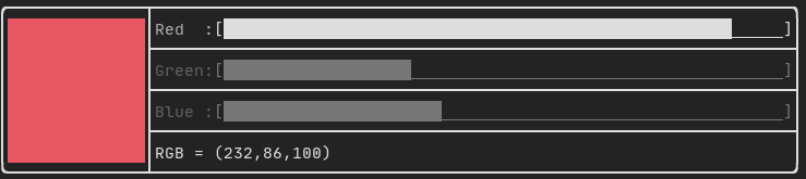
TrueColor
在支持真彩色的终端上,您可以直接使用24位的RGB颜色空间:
使用下面的构造函数来指定RGB或HSV值用于您的颜色:
有两个构造函数:
ftxui::Color::RGB(uint8_t red, uint8_t green, uint8_t blue);
ftxui::Color::HSV(uint8_t hue, uint8_t saturation, uint8_t value);
LinearGradient
FTXUI支持线性渐变。无论是在前景还是背景上。
Decorator color(const LinearGradient&);
Decorator bgcolor(const LinearGradient&);
ftxui::LinearGradient通过角度(以度为单位)和颜色停止列表进行定义。
auto gradient = LinearGradient()
  .Angle(45)
  .AddStop(0.0, Color::Red)
  .AddStop(0.5, Color::Green)
  .AddStop(1.0, Color::Blue);
您也可以使用简化构造函数:
LinearGradient(Color::Red, Color::Blue);
LinearGradient(45, Color::Red, Color::Blue);
See demo.
Style
除了彩色文本和彩色背景之外。许多终端支持文本效果,例如:粗体、昏暗、下划线、反转、闪烁。
Element bold(Element);
Element dim(Element);
Element inverted(Element);
Element underlined(Element);
Element underlinedDouble(Element);
Element strikethrough(Element);
Element blink(Element);
Decorator color(Color);
Decorator bgcolor(Color);
Decorator colorgrad(LinearGradient);
Decorator bgcolorgrad(LinearGradient);
[外链图片转存失败,源站可能有防盗链机制,建议将图片保存下来直接上传(img-GOOZVqC0-1689777870362)(https://user-images.githubusercontent.com/4759106/147244118-380bf834-9e33-40df-9ff0-07c10f2598ef.png)]
要使用这些效果,只需用所需的效果包装您的元素即可:
underlined(bold(text("This text is bold and underlined")))
或者,使用管道运算符将其链接到您的元素上:
text("This text is bold") | bold | underlined
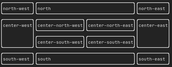
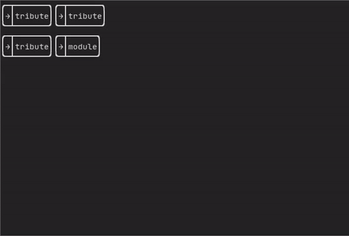
Layout
以以下方式对元素进行排列:
- 使用ftxui::hbox水平排列
- 使用ftxui::vbox垂直排列
- 使用ftxui::gridbox在网格内排列
- 使用ftxui::flexbox沿一个方向包裹。
使用ftxui::hbox、ftxui::vbox和ftxui::filler的示例。
[外链图片转存失败,源站可能有防盗链机制,建议将图片保存下来直接上传(img-h7hSGhxD-1689777870362)(https://user-images.githubusercontent.com/4759106/147242524-7103b5d9-1a92-4e2d-ac70-b3d6740061e3.png)]
使用ftxui::gridbox的示例:
使用flexbox的示例:
[外链图片转存失败,源站可能有防盗链机制,建议将图片保存下来直接上传(img-kXYATyaJ-1689777870363)(https://user-images.githubusercontent.com/4759106/147243064-780ac7cc-605b-475f-94b8-cf7c4aed03a5.png)]
查看此示例和相关演示。
使用ftxui::flex装饰器,Element也可以变得灵活。
Code:
hbox({
  text("left") | border ,
  text("middle") | border | flex,
  text("right") | border,
});
Terminal output:
┌────┐┌─────────────────────────────────────────────────────┐┌─────┐
│left││middle                                               ││right│
└────┘└─────────────────────────────────────────────────────┘└─────┘
Code:
hbox({
  text("left") | border ,
  text("middle") | border | flex,
  text("right") | border | flex,
});
Terminal output:
┌────┐┌───────────────────────────────┐┌───────────────────────────────┐
│left││middle                         ││right                          │
└────┘└───────────────────────────────┘└───────────────────────────────┘
Table
能够轻松将数据格式化为整洁的表格形式。
[外链图片转存失败,源站可能有防盗链机制,建议将图片保存下来直接上传(img-b1TYKuDl-1689777870364)(https://user-images.githubusercontent.com/4759106/147250766-77d8ec9e-cf2b-486d-9866-1fd9f1bd2e6b.png)]
Canvas
cauto c = Canvas(100, 100);
c.DrawPointLine(10, 10, 80, 10, Color::Red);
auto element = canvas(c);
可以使用盲文、方块或简单字符在ftxui::Canvas上执行绘图:
Simple example:
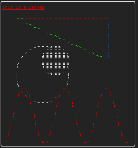
Complex example:
[外链图片转存中…(img-o8wKQ3Ze-1689777870364)]
component
ftxui::component模块定义了产生对用户事件(键盘、鼠标等)作出响应的交互式组件的逻辑。
ftxui::ScreenInteractive定义了一个主循环,用于呈现组件。
ftxui::Component是指向ftxui::ComponentBase的共享指针。后者定义了:
ftxui::ComponentBase::Render():如何呈现界面。
ftxui::ComponentBase::OnEvent():如何对事件作出反应。
ftxui::ComponentBase::Add():在两个组件之间建立父子关系。组件的树结构用于定义如何使用键盘进行导航。
ftxui::Element用于呈现单个帧。
ftxui::Component用于呈现动态用户界面,生成多个帧,并在事件发生时更新其状态。
多个组件的图库。(演示)
Gallery of multiple components. (demo)
All predefined components are available in “ftxui/dom/component.hpp”
#ifndef FTXUI_COMPONENT_HPP
#define FTXUI_COMPONENT_HPP

#include <functional>  // for function
#include <memory>      // for make_shared, shared_ptr
#include <string>      // for wstring
#include <utility>     // for forward
#include <vector>      // for vector

#include "ftxui/component/component_base.hpp"  // for Component, Components
#include "ftxui/component/component_options.hpp"  // for ButtonOption, CheckboxOption, MenuOption
#include "ftxui/dom/elements.hpp"  // for Element
#include "ftxui/util/ref.hpp"  // for ConstRef, Ref, ConstStringRef, ConstStringListRef, StringRef

namespace ftxui {
struct ButtonOption;
struct CheckboxOption;
struct Event;
struct InputOption;
struct MenuOption;
struct RadioboxOption;
struct MenuEntryOption;

template <class T, class... Args>
std::shared_ptr<T> Make(Args&&... args) {
  return std::make_shared<T>(std::forward<Args>(args)...);
}

// Pipe operator to decorate components.
using ComponentDecorator = std::function<Component(Component)>;
using ElementDecorator = std::function<Element(Element)>;
Component operator|(Component component, ComponentDecorator decorator);
Component operator|(Component component, ElementDecorator decorator);
Component& operator|=(Component& component, ComponentDecorator decorator);
Component& operator|=(Component& component, ElementDecorator decorator);

namespace Container {
Component Vertical(Components children);
Component Vertical(Components children, int* selector);
Component Horizontal(Components children);
Component Horizontal(Components children, int* selector);
Component Tab(Components children, int* selector);
Component Stacked(Components children);
}  // namespace Container

Component Button(ButtonOption options);
Component Button(ConstStringRef label,
                 std::function<void()> on_click,
                 ButtonOption options = ButtonOption::Simple());

Component Checkbox(CheckboxOption options);
Component Checkbox(ConstStringRef label,
                   bool* checked,
                   CheckboxOption options = CheckboxOption::Simple());

Component Input(InputOption options = {});
Component Input(StringRef content, InputOption options = {});
Component Input(StringRef content,
                StringRef placeholder,
                InputOption options = {});

Component Menu(MenuOption options);
Component Menu(ConstStringListRef entries,
               int* selected_,
               MenuOption options = MenuOption::Vertical());
Component MenuEntry(MenuEntryOption options);
Component MenuEntry(ConstStringRef label, MenuEntryOption options = {});

Component Radiobox(RadioboxOption options);
Component Radiobox(ConstStringListRef entries,
                   int* selected_,
                   RadioboxOption options = {});

Component Dropdown(ConstStringListRef entries, int* selected);
Component Toggle(ConstStringListRef entries, int* selected);

// General slider constructor:
template <typename T>
Component Slider(SliderOption<T> options);

// Shorthand without the `SliderOption` constructor:
Component Slider(ConstStringRef label,
                 Ref<int> value,
                 ConstRef<int> min = 0,
                 ConstRef<int> max = 100,
                 ConstRef<int> increment = 5);
Component Slider(ConstStringRef label,
                 Ref<float> value,
                 ConstRef<float> min = 0.f,
                 ConstRef<float> max = 100.f,
                 ConstRef<float> increment = 5.f);
Component Slider(ConstStringRef label,
                 Ref<long> value,
                 ConstRef<long> min = 0l,
                 ConstRef<long> max = 100l,
                 ConstRef<long> increment = 5l);

Component ResizableSplit(ResizableSplitOption options);
Component ResizableSplitLeft(Component main, Component back, int* main_size);
Component ResizableSplitRight(Component main, Component back, int* main_size);
Component ResizableSplitTop(Component main, Component back, int* main_size);
Component ResizableSplitBottom(Component main, Component back, int* main_size);

Component Renderer(Component child, std::function<Element()>);
Component Renderer(std::function<Element()>);
Component Renderer(std::function<Element(bool /* focused */)>);
ComponentDecorator Renderer(ElementDecorator);

Component CatchEvent(Component child, std::function<bool(Event)>);
ComponentDecorator CatchEvent(std::function<bool(Event)> on_event);

Component Maybe(Component, const bool* show);
Component Maybe(Component, std::function<bool()>);
ComponentDecorator Maybe(const bool* show);
ComponentDecorator Maybe(std::function<bool()>);

Component Modal(Component main, Component modal, const bool* show_modal);
ComponentDecorator Modal(Component modal, const bool* show_modal);

Component Collapsible(ConstStringRef label,
                      Component child,
                      Ref<bool> show = false);

Component Hoverable(Component component, bool* hover);
Component Hoverable(Component component,
                    std::function<void()> on_enter,
                    std::function<void()> on_leave);
Component Hoverable(Component component,  //
                    std::function<void(bool)> on_change);
ComponentDecorator Hoverable(bool* hover);
ComponentDecorator Hoverable(std::function<void()> on_enter,
                             std::function<void()> on_leave);
ComponentDecorator Hoverable(std::function<void(bool)> on_change);

Component Window(WindowOptions option);

}  // namespace ftxui

#endif /* end of include guard: FTXUI_COMPONENT_HPP */

// Copyright 2021 Arthur Sonzogni. All rights reserved.
// Use of this source code is governed by the MIT license that can be found in
// the LICENSE file.
Input
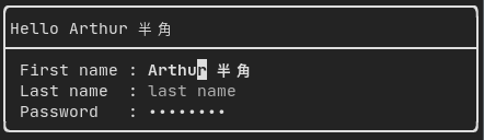
Produced by: ftxui::Input() from “ftxui/component/component.hpp”
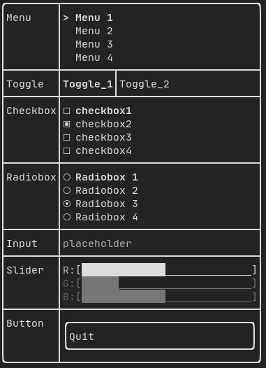
Menu
定义了一个菜单对象。它包含一个条目列表,其中之一被选中。
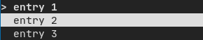
Produced by: ftxui::Menu() from “ftxui/component/component.hpp”
Toggle
一种特殊的菜单。条目水平显示。
[外链图片转存中…(img-suMmwixP-1689777870366)]
Produced by: ftxui::Toggle() from “ftxui/component/component.hpp”
CheckBox
该组件定义了一个复选框。它是一个可以打开或关闭的单个条目。
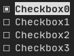
Produced by: ftxui::Checkbox() from “ftxui/component/component.hpp”
RadioBox
一个单选按钮组件。这是一组条目,其中只能有一个被打开。
[外链图片转存中…(img-2kFgABKR-1689777870366)]
Produced by: ftxui::Radiobox() from “ftxui/component/component.hpp”
Dropdown
下拉菜单是一个组件,当用户选中时,会显示一个元素列表供用户选择。
Produced by: ftxui::Dropdown() from “ftxui/component/component.hpp”
Slider
表示一个由一系列区间组成的滑块对象,区间为等间隔的中间值。可以通过ftxui::Slider()创建该对象。
Produced by: ftxui::Slider() from “ftxui/component/component.hpp”
Renderer
制作:ftxui::Renderer()来自ftxui/component/component.hpp。该组件使用不同的函数渲染界面来装饰另一个组件。
Example:
auto inner = [...]

auto renderer = Renderer(inner, [&] {
  return inner->Render() | border
});
ftxui::Renderer还支持组件装饰器模式:
auto component = [...]
component = component
  | Renderer([](Element e) { return e | border))
  | Renderer(bold)
作为简写方式,您也可以使用元素装饰器来组合一个组件:
auto component = [...]
component = component | border | bold;
CatchEvent
制作:ftxui::CatchEvent()来自ftxui/component/component.hpp。此组件装饰其他组件,在底层组件之前捕获事件。
Examples:
auto screen = ScreenInteractive::TerminalOutput();
auto renderer = Renderer([] {
  return text("My interface");
});
auto component = CatchEvent(renderer, [&](Event event) {
  if (event == Event::Character('q')) {
    screen.ExitLoopClosure()();
    return true;
  }
  return false;
});
screen.Loop(component);
ftxui::CatchEvent也可以用作装饰器:
component = component
  | CatchEvent(handler_1)
  | CatchEvent(handler_2)
  | CatchEvent(handler_3)
  ;
Collapsible
适用于可见性可以由用户切换的可见性元素。本质上,这是ftxui::Checkbox()和ftxui::Maybe()组件的组合。
auto collabsible = Collapsible("Show more", inner_element);
Maybe
制作:ftxui::Maybe()来自ftxui/component/component.hpp。该组件可用于通过布尔值或谓词来显示/隐藏任何其他组件。
使用布尔值的示例:
bool show = true;
auto component = Renderer([]{ return "Hello World!"; });
auto maybe_component = Maybe(component, &show)
使用谓词的示例:
auto component = Renderer([]{ return "Hello World!"; });
auto maybe_component = Maybe(component, [&] { return time > 10; })
像往常一样,ftxui::Maybe也可以用作装饰器:
component = component
  | Maybe(&a_boolean)
  | Maybe([&] { return time > 10; })
  ;
Container
Horizontal
制作:ftxui::Container::Horizontal()来自“ftxui/component/component.hpp”。它水平显示组件列表并处理键盘/鼠标导航。
Vertical
制作:ftxui::Container::Vertical()来自“ftxui/component/component.hpp”。它垂直显示组件列表并处理键盘/鼠标导航。
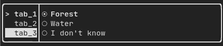
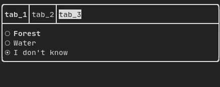
Tab
制作:ftxui::Container::Tab()来自“ftxui/component/component.hpp”。它接受一个组件列表,只显示其中的一个。这对于实现选项卡栏很有用。
ResizableSplit
它定义了两个子组件之间的水平或垂直分隔。分隔的位置是可变的,并可以使用鼠标进行控制。有四个可能的分隔:
ftxui::ResizableSplitLeft()ftxui::ResizableSplitRight()ftxui::ResizableSplitTop()ftxui::ResizableSplitBottom()from “ftxui/component/component.hpp”
[外链图片转存中…(img-S1xCbjSc-1689777870368)]
Force a frame redraw.
通常,ftxui::ScreenInteractive::Loop()负责在处理新的一组事件(例如键盘、鼠标、窗口大小调整等)时绘制新帧。但是,您可能希望对FTXUI不知道的任意事件做出反应。要实现这一点,您必须使用ftxui::ScreenInteractive::PostEvent(这是线程安全的)通过线程发布事件。您必须发布ftxui::Event::Custom事件。
Example:
screen->PostEvent(Event::Custom);


 扫一扫
扫一扫


 564
564

 被折叠的 条评论
为什么被折叠?
被折叠的 条评论
为什么被折叠?
 到【灌水乐园】发言


