


1. 椭圆
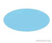
椭圆.png
.oval {
width: 200px;
height: 100px;
background-color: skyblue;
border-radius: 100px / 50px;
}
复制代码
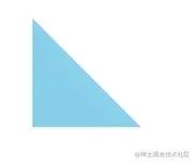
2. 上三角
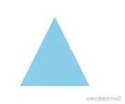
上三角.png
.triangle-up {
width: 0;
height: 0;
border-right: 50px solid transparent;
border-bottom: 100px solid skyblue;
border-left: 50px solid transparent;
}
复制代码
3. 下三角

下三角.png
.triangle-down {
width: 0;
height: 0;
border-top: 100px solid skyblue;
border-right: 50px solid transparent;
border-left: 50px solid transparent;
}
复制代码
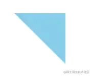
4. 左三角
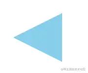
左三角.png
.triangle-left {
width: 0;
height: 0;
border-top: 50px solid transparent;
border-right: 100px solid skyblue;
border-bottom: 50px solid transparent;
}
复制代码
5. 右三角

右三角.png
.triangle-right {
width: 0;
height: 0;
border-top: 50px solid transparent;
border-bottom: 50px solid transparent;
border-left: 100px solid skyblue;
}
复制代码
6. 左上角
左上角.png
.triangle-topleft {
width: 0;
height: 0;
border-top: 100px solid skyblue;
border-right: 100px solid transparent;
}
复制代码
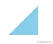
7. 右上角
右上角.png
.triangle-topright {
width: 0;
height: 0;
border-top: 100px solid skyblue;
border-left: 100px solid transparent;
}
复制代码
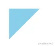
8. 左下角
左下角.png
.triangle-bottomleft {
width: 0;
height: 0;
border-right: 100px solid transparent;
border-bottom: 100px solid skyblue;
}
复制代码
9. 右下角
右下角.png
.triangle-bottomright {
width: 0;
height: 0;
border-bottom: 100px solid skyblue;
border-left: 100px solid transparent;
}
复制代码
10. 箭头

箭头.png
.curvedarrow {
position: relative;
width: 0;
height: 0;
border-top: 9px solid transparent;
border-right: 9px solid skyblue;
transform: rotate(10deg);
}
.curvedarrow:after {
position: absolute;
top: -12px;
left: -9px;
width: 12px;
height: 12px;
content: ‘’;
border: 0 solid transparent;
border-top: 3px solid skyblue;
border-radius: 20px 0 0 0;
transform: rotate(45deg);
}
复制代码
11. 平行四边形
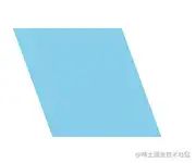
平行四边形.png
.parallelogram {
width: 100px;
height: 100px;
background-color: skyblue;
transform: skew(20deg);
}
复制代码
12. 梯形
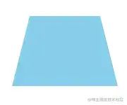
梯形.png
.trapezoid {
width: 100px;
height: 0;
border-right: 25px solid transparent;
border-bottom: 100px solid skyblue;
border-left: 25px solid transparent;
}
复制代码
13. 五边形
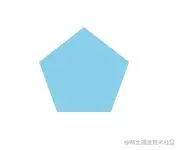
五边形.png
.pentagon {
position: relative;
width: 54px;
border-width: 50px 18px 0;
border-style: solid;
border-color: skyblue transparent;
box-sizing: content-box;
}
.pentagon:before {
position: absolute;
top: -85px;
left: -18px;
height: 0;
width: 0;
content: ‘’;
border-width: 0 45px 35px;
border-style: solid;
border-color: transparent transparent skyblue;
}
复制代码
14. 六边形
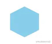
六边形.png
.hexagon {
position: relative;
width: 100px;
height: 55px;
background-color: skyblue;
}
.hexagon:before {
position: absolute;
top: -25px;
left: 0;
width: 0;
height: 0;
content: ‘’;
border-right: 50px solid transparent;
border-bottom: 25px solid skyblue;
border-left: 50px solid transparent;
}
.hexagon:after {
position: absolute;
bottom: -25px;
left: 0;
width: 0;
height: 0;
content: ‘’;
border-top: 25px solid skyblue;
border-right: 50px solid transparent;
border-left: 50px solid transparent;
}
复制代码
15. 爱心 ❤️

爱心.png
.heart {
position: relative;
width: 100px;
height: 90px;
}
.heart:before,
.heart:after {
position: absolute;
left: 50px;
top: 0;
width: 50px;
height: 80px;
content: ‘’;
background-color: skyblue;
border-radius: 50px 50px 0 0;
transform: rotate(-45deg);
transform-origin: 0 100%;
}
.heart:after {
left: 0;
transform: rotate(45deg);
transform-origin: 100% 100%;
}
复制代码
16. 无穷大

无穷大.png
.infinity {
position: relative;
width: 150px;
height: 100px;
box-sizing: content-box;
}
.infinity:before,
.infinity:after {
position: absolute;
top: 0;
left: 0;
width: 30px;
height: 30px;
content: ‘’;
border: 20px solid skyblue;
border-radius: 50px 50px 0 50px;
box-sizing: content-box;
transform: rotate(-45deg);
}
.infinity:after {
left: auto;
right: 0;
border-radius: 50px 50px 50px 0;
transform: rotate(45deg);
}
复制代码
17. 钻石 💎
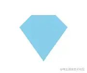
钻石.png
.diamond {
position: relative;
width: 50px;
height: 0;
border-width: 0 25px 25px 25px;
border-style: solid;
border-color: transparent transparent skyblue transparent;
box-sizing: content-box;
}
.diamond:after {
position: absolute;
top: 25px;
left: -25px;
width: 0;
height: 0;
content: ‘’;
border-width: 70px 50px 0 50px;
border-style: solid;
border-color: skyblue transparent transparent transparent;
}
复制代码
18. 锁 🔒

锁.png
.lock {
position: relative;
width: 90px;
height: 65px;
border: 18px solid skyblue;
border-right-width: 37px;
border-left-width: 37px;
border-radius: 10px;
box-sizing: border-box;
}
.lock:before {
position: absolute;
top: -60px;
left: 50%;
width: 70px;
height: 60px;
content: ‘’;
border: 12px solid skyblue;
小编13年上海交大毕业,曾经在小公司待过,也去过华为、OPPO等大厂,18年进入阿里一直到现在。
深知大多数初中级前端工程师,想要提升技能,往往是自己摸索成长或者是报班学习,但自己不成体系的自学效果低效又漫长,而且极易碰到天花板技术停滞不前!
因此收集整理了一份《2024年Web前端开发全套学习资料》送给大家,初衷也很简单,就是希望能够帮助到想自学提升又不知道该从何学起的朋友,同时减轻大家的负担。


由于文件比较大,这里只是将部分目录截图出来,每个节点里面都包含大厂面经、学习笔记、源码讲义、实战项目、讲解视频
如果你觉得这些内容对你有帮助,可以添加下面V无偿领取!(备注:前端)

计算机网络
-
HTTP 缓存
-
你知道 302 状态码是什么嘛?你平时浏览网页的过程中遇到过哪些 302 的场景?
-
HTTP 常用的请求方式,区别和用途?
-
HTTPS 是什么?具体流程
-
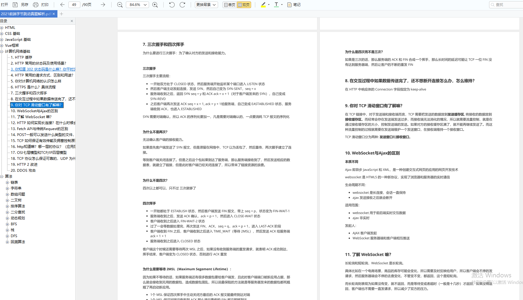
三次握手和四次挥手
-
你对 TCP 滑动窗口有了解嘛?
-
WebSocket与Ajax的区别
-
了解 WebSocket 嘛?
-
HTTP 如何实现长连接?在什么时候会超时?
-
TCP 如何保证有效传输及拥塞控制原理。
-
TCP 协议怎么保证可靠的,UDP 为什么不可靠?
开源分享:【大厂前端面试题解析+核心总结学习笔记+真实项目实战+最新讲解视频】
算法
-
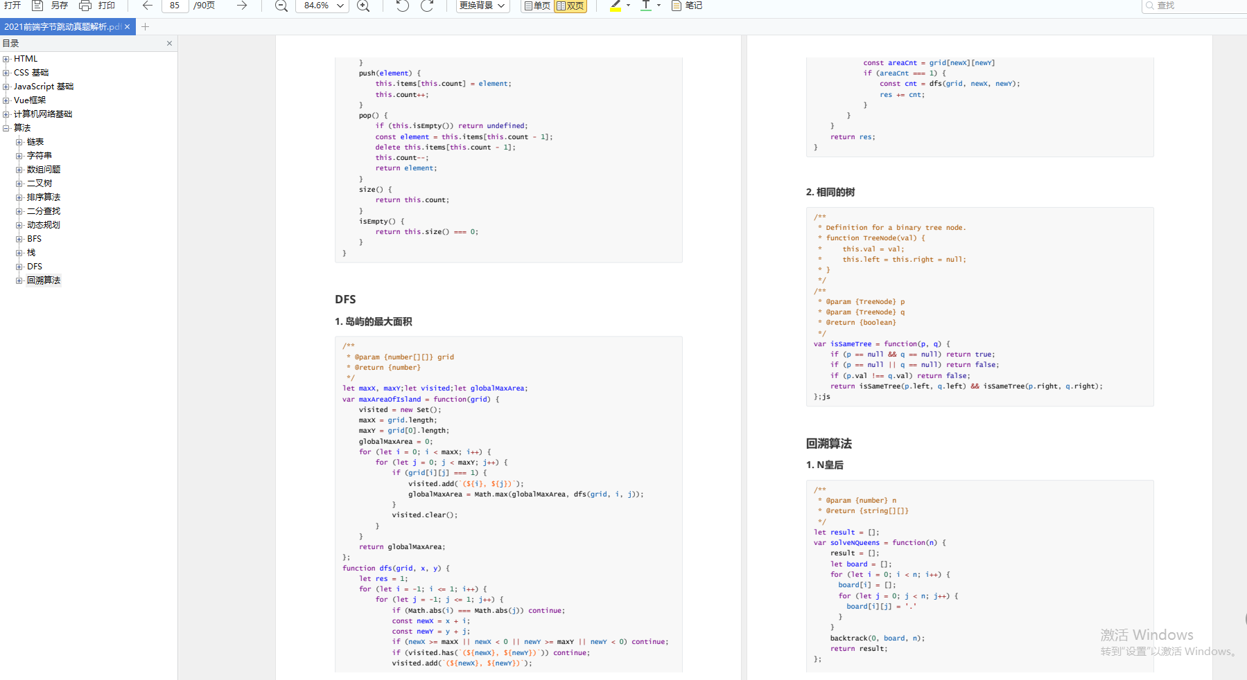
链表
-
字符串
-
数组问题
-
二叉树
-
排序算法
-
二分查找
-
动态规划
-
BFS
-
栈
-
DFS
-
回溯算法
转存中…(img-hDyf9X0P-1710751479797)]
[外链图片转存中…(img-2arcZCdC-1710751479797)]
[外链图片转存中…(img-AeNTS1mT-1710751479798)]
[外链图片转存中…(img-7zNiSZw4-1710751479798)]
由于文件比较大,这里只是将部分目录截图出来,每个节点里面都包含大厂面经、学习笔记、源码讲义、实战项目、讲解视频
如果你觉得这些内容对你有帮助,可以添加下面V无偿领取!(备注:前端)
[外链图片转存中…(img-9hrnIABK-1710751479798)]
计算机网络
-
HTTP 缓存
-
你知道 302 状态码是什么嘛?你平时浏览网页的过程中遇到过哪些 302 的场景?
-
HTTP 常用的请求方式,区别和用途?
-
HTTPS 是什么?具体流程
-
三次握手和四次挥手
-
你对 TCP 滑动窗口有了解嘛?
-
WebSocket与Ajax的区别
-
了解 WebSocket 嘛?
-
HTTP 如何实现长连接?在什么时候会超时?
-
TCP 如何保证有效传输及拥塞控制原理。
-
TCP 协议怎么保证可靠的,UDP 为什么不可靠?
开源分享:【大厂前端面试题解析+核心总结学习笔记+真实项目实战+最新讲解视频】
算法
-
链表
-
字符串
-
数组问题
-
二叉树
-
排序算法
-
二分查找
-
动态规划
-
BFS
-
栈
-
DFS
-
回溯算法


 1150
1150


 被折叠的 条评论
为什么被折叠?
被折叠的 条评论
为什么被折叠?
 到【灌水乐园】发言


