


目录
css定位
在css中想要设置元素的位置,需要进行层叠
子类元素绝对定位,父类元素相对定位
potition属性表示定位,relative表示相对定位,absolute表示绝对定位
在设置定位的时候,使用top属性和left属性,表示上边距和左边距
border-radius属性表示设置圆角,border-radius:50%表示一个正圆
background-color属性表示设置背景颜色
transform属性表示可以旋转,缩放,倾斜或平移等,
rotate属性表示围绕着某个点进行旋转,deg表示角度;
scale属性表示缩放,transform: scale(0.5) 或者 transform: scale(0.5, 2)
参数表示缩放倍数;
一个参数时:表示水平和垂直同时缩放该倍率
两个参数时:第一个参数指定水平方向的缩放倍率,第二个参数指定垂直方向的缩放倍率。
skew属性表示倾斜,transform: skew(30deg) 或者 transform: skew(30deg, 30deg);
参数表示倾斜角度,单位deg
一个参数时:表示水平方向的倾斜角度;
两个参数时:第一个参数表示水平方向的倾斜角度,第二个参数表示垂直方向的倾斜角度。
translate属性表示移动,transform: translate(45px) 或者 transform: skew(45px, 150px);
参数表示移动距离,单位px,
一个参数时:表示水平方向的移动距离;
两个参数时:第一个参数表示水平方向的移动距离,第二个参数表示垂直方向的移动距离。
<style>
/*子元素绝对定位  父元素相对定位 */
	.fu{
		width: 300px;
		height: 300px;
		position: relative;
		}
		.z1,.z2,.z3{
			position: absolute;
		}
		.z1{
			width: 300px;
			height: 300px;
			left: 200px;
			top: 200px;
			background-color: red;
			border-radius: 50%; // 变成圆形
		}
		.z2{
			width: 300px;
			height: 300px;
			left: 300px;
			top: 300px;
			background-color: red;
			transform: rotate(45deg); // 旋转45度角
		}
		.z3{
			width: 300px;
			height: 300px;
			left: 400px;
			top: 200px;
			background-color: red;
			border-radius: 50%;
		}
</style>

<body>
	<div class="fu" >
		<div class="z1"></div>
		<div class="z2"></div>
		<div class="z3"></div>
	</div>
</body>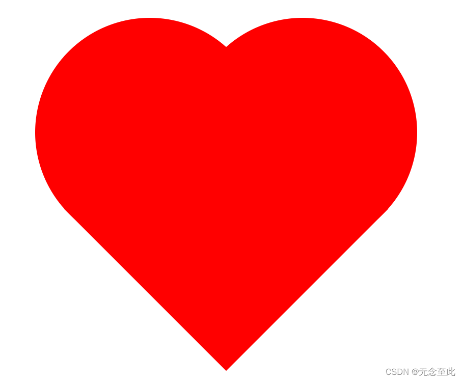
css层叠样式练习
z-index属性表示图形的层级,z-index:值,值越大,图形的层级越高。高层级的可以覆盖低层级的图形
<style>
	/* 子类元素绝对定位,父类元素相对定位 */
	.f{
		width: 300px;
		height: 300px;
		position: relative;
	}
	.z1,.z2,.z3{
		width: 300px;
		height: 300px;
		position: absolute;
	}
	z1{
		top: 200px;
		left: 300px;
		border-radius: 50%; /* 设置为圆形 */
		background-color: black;
		z-index: 2;
	}
	.z2{
		top: 100px;
		left: 400px;
		background-color: black;
		/* 设置旋转45度 */
		transform: rotate(45deg);
		z-index: 2;
	}
	.z3{
		top: 200px;
		left: 500px;
		border-radius: 50%;
		background-color: black;
		z-index: 2;
	}
	.z4{
		position: absolute;
		width: 300px;
		height: 300px;
		top: 300px;
		left: 230px;
		border-radius: 50%;
		background-color: white;
		z-index: 1;
	}
	.z5{
		position: absolute;
		width: 300px;
		height: 300px;
		top: 300px;
		left: 580px;
		border-radius: 50%;
		background-color: white;
		z-index: 1;
	}
	.z6{
		position: absolute;
		width: 300px;
		height: 300px;
		top: 280px;
		left: 400px;
		background-color: black;
		z-index: 0;
	}
</style>

<body>
    <div class="f">
		<div class="z1"></div>
		<div class="z2"></div>
		<div class="z3"></div>
		<div class="z4"></div>
		<div class="z5"></div>
		<div class="z6"></div>
	</div>
</body>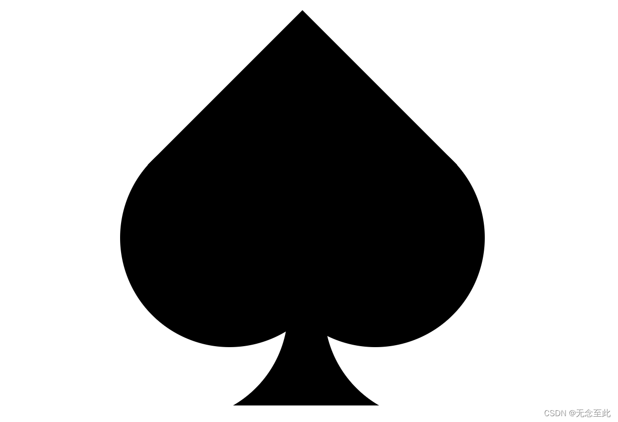
再次练习巩固一下
<style>
	.fu{
		width: 300px;
		height: 300px;
		position: relative;
	}
	.z1,.z2,.z3{
		width: 200px;
		height: 200px;
		border-radius: 50%;
		position: absolute;
	}
	.z1{
		top: 200px;
		left: 300px;
		background-color: black;
		z-index: 2;
	}
	.z2{
		top: 50px;
		left: 400px;
		background-color: black;
		z-index: 2;
	}
	.z3{
		top: 200px;
		left: 500px;
		background-color: black;
		z-index: 2;
	}
	.z4{
		position: absolute;
		width: 300px;
		height: 300px;
		top: 200px;
		left: 180px;
		border-radius: 50%;
		background-color: white;
		z-index: 1;
	}
	.z5{
		position: absolute;
		width: 300px;
		height: 300px;
		top: 200px;
		left: 520px;
		border-radius: 50%;
		background-color: white;
	    z-index: 1;
	}
	.z6{
		position: absolute;
		width: 250px;
		height: 250px;
		top: 210px;
		left: 350px;
		background-color: black;
		z-index: 0;
	}
</style>

<body>
	<div class="fu">
		<div class="z1"></div>
		<div class="z2"></div>
		<div class="z3"></div>
		<div class="z4"></div>
		<div class="z5"></div>
		<div class="z6"></div>
	</div>
</body>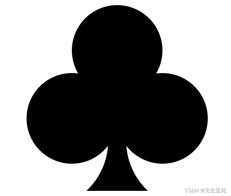
太极图
<style>
	/* 子类元素绝对定位 父类元素相对定位 */
	.fu{
		width: 600px;
		height: 600px;
		border: 1px solid black;
		background-color: wheat;
		position: relative;
	}
	.fu>div{
		position: absolute;
	}
	.z1{
		width: 300px;
		height: 600px;
		background-color: white;
	    border-radius: 300px 0px 0px 300px;
	}
	.z2{
		width: 300px;
		height: 600px;
		background-color: black;
		left: 300px;
		border-radius: 0px 300px 300px 0px;
	}
	.z3{
		width: 300px;
		height: 300px;
		top: 0px;
		left: 150px;
		border-radius: 50%;
		background-color: white;
	}
	.z4{
		width: 300px;
		height: 300px;
		top: 300px;
		left: 150px;
		border-radius: 50%;
		background-color: black;
	}
	.z5{
		width: 80px;
		height: 80px;
		top: 110px;
		left: 260px;
		border-radius: 50%;
		background-color: black;
	}
	.z6{
		width: 80px;
		height: 80px;
		top: 410px;
		left: 260px;
		border-radius: 50%;
		background-color: white;
	}
</style>

<body>
	<div class="fu">
		<div class="z1"></div>
		<div class="z2"></div>
		<div class="z3"></div>
		<div class="z4"></div>
		<div class="z5"></div>
		<div class="z6"></div>
	</div>
</body>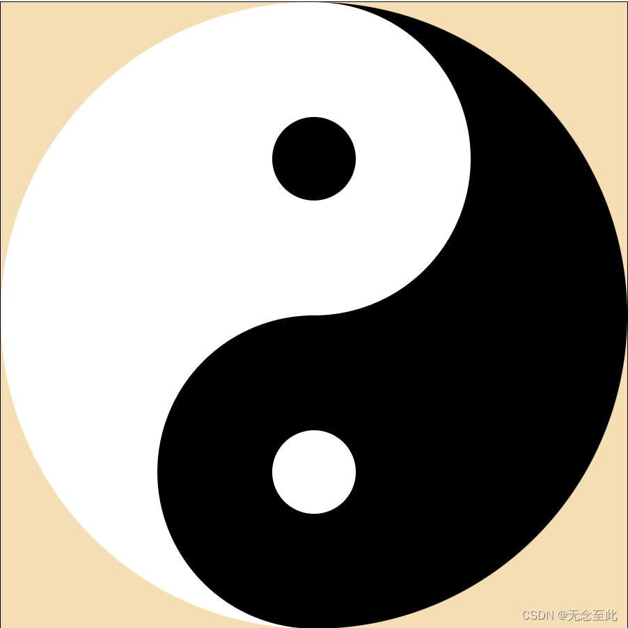
css动画效果
想让图形动起来,需要设置函数
@keyframes关键字表示设置一个函数
@keyframes move1{
form{ }to{ }}
注意:这里move1表示函数名,内部书写form{}-to{}的形式,form表示起点,to表示终点
内部书写成form-to的形式,表示从起点直接到终点。如果我们想在中间添加其他的效果,就必须换另外一种书写方式。
0%{}-100%{},这样也表示从起点到终点。而且我们还可以在中间添加其他效果。
例如:0%{}-30%{}-60%{}-80%{}-100%{}等
设置完毕函数之后,我们需要将函数和图像进行绑定
animation属性是一个简写属性,用于设置六个动画属性
- 为该属性绑定动画效果:animation-name: move1;
- 设置运动时间:animation-duration: 2s;
- 设置延迟时间:animation-delay: 0.1s;
- 设置动画执行次数:animation-iteration-count: 3; // n为执行n次,infinite表示无限执行
- 设置动画移动效果:animation-timing-function: linear; // linear表示匀速移动
- 设置轮流反向播放动画:animation-direction: alternate; //normal正常播放,alternate反向轮流播放
- 动画在播放之前或之后,其动画效果是否可见:animation-fill-mode: forwards; // none不改变,forwards播放完毕后保持最后一个值,backwards一段时间内动画开始播放的值
当然我们没有必要一个属性一个属性去设置
animation: name duration timing-function delay iteration-count direction fill-mode;
这句话,可以直接设置其中的值,只需要将其中的每个属性用值替换即可
<style>
	.f{
		width: 600px;
		height: 600px;
		border: 1px solid black;
		position: relative;
	}
	.z{
		width: 100px;
		height: 100px;
		background-color: aqua;
		position: absolute;

		/* 为该属性绑定动画效果 */
		animation-name: move1;
		/* 设置运动时间 */
		animation-duration: 2s;
		/* 设置延迟时间 */
		animation-delay: 0.1s;
		/* 设置动画执行次数 */
		animation-iteration-count: 3;
		/* 设置动画移动效果:平稳移动 */
		animation-timing-function: linear;
		/* 设置动画往返移动 */
		animation-direction: alternate;
		/* 设置动画移动后,不在返回 */
		animation-fill-mode: forwards;
	}
	/* 添加动画效果 */
	@keyframes move1{
		0%{
			top: 0px;
			left: 0px;
		}100%{
			top: 500px;
	    	left: 500px;
		}
	}
</style>

<body>
	<div class="f">
		<div class="z"></div>
	</div>
</body>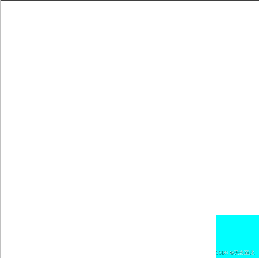
太极旋转效果
<style>
	/* 子类元素绝对定位 父类元素相对定位 */
	body{
		background-color: aliceblue;
	}
	.fu{
		width: 600px;
		height: 600px;
		/* border: 1px solid black; */
		/* background-color: wheat; */
		position: relative;
		animation: xuanz 2s linear infinite;
	}
	.fu>div{
		position: absolute;
	}
	.z1{
		width: 300px;
		height: 600px;
		background-color: white;
		border-radius: 300px 0px 0px 300px;
	}
	.z2{
		width: 300px;
		height: 600px;
		background-color: black;
		left: 300px;
		border-radius: 0px 300px 300px 0px;
	}
	.z3{
		width: 300px;
		height: 300px;
		top: 0px;
		left: 150px;
		border-radius: 50%;
		background-color: white;
	}
	.z4{
		width: 300px;
		height: 300px;
		top: 300px;
		left: 150px;
		border-radius: 50%;
		background-color: black;
	}
	.z5{
		width: 80px;
		height: 80px;
		top: 110px;
		left: 260px;
		border-radius: 50%;
		background-color: black;
	}
	.z6{
		width: 80px;
		height: 80px;
		top: 410px;
		left: 260px;
		border-radius: 50%;
		background-color: white;
	}

	@keyframes xuanz {
		from{
			transform: rotate(0deg); /* 旋转角度 */
		}to{
			transform: rotate(360deg);/* from从0度开始旋转to到360度结束 */
		}
	}
</style>

<body>
	<div class="fu">
		<div class="z1"></div>
		<div class="z2"></div>
		<div class="z3"></div>
		<div class="z4"></div>
		<div class="z5"></div>
		<div class="z6"></div>
	</div>
</body>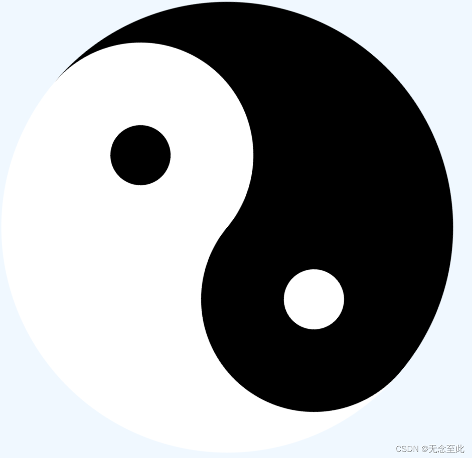


 1721
1721


 被折叠的 条评论
为什么被折叠?
被折叠的 条评论
为什么被折叠?
 到【灌水乐园】发言


