


1、步骤
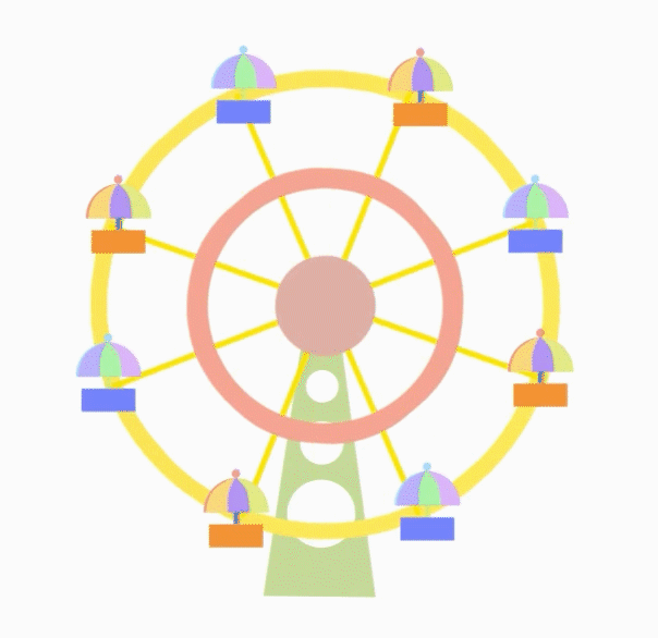
- 需要的素材分为三个部分,一个是底部位置固定的支架;一个是中间旋转的骨架;一个是单个座位;
- 分为三个盒子分别装这三种素材,第一个盒子放骨架,第二个盒子利用绝对定位放在第一个盒子之上,里面放单个的座位,第三个盒子就放底部支架,通过 z-index: -1属性使它放在最底层,让其他盒子遮住它;
- 单个座位需要使用绝对定位来对齐骨架的每个连接处;
- 动画部分就两个,一个逆时针自转(单个座位),一个顺时针整体旋转(包含单个座位的父盒子)
2、代码
素材和效果图在下面
    <style>
        section {
            position: relative;
            width: 600px;
            height: 600px;
            margin: 100px auto;
        }

        section div:nth-child(1) img {
            /* 原图片太大,所有等比例强制缩放固定大小了 */
            width: 358px;
            height: 358px;
        }

        section div:nth-child(1) {
            /* 固定大盒子的位置,并且添加顺时针动画 */
            position: absolute;
            top: 0;
            left: 0;
            animation: rotate 5s linear infinite;
        }

        section div:nth-child(3) {
            position: relative;
            top: -400px;
            left: -5px;
            /* 把底部支架移到最底层 */
            z-index: -1;
        }

        section div:nth-of-type(3) img {
            /* 原图片太大,所有等比例强制缩放固定大小了 */
            width: 366px;
            height: 436px;
        }

        section .box div img {
            /* 原图片太大,所有等比例强制缩放固定大小了 */
            width: 80px;
            height: 80px;
        }

        section .box {
            width: 358px;
            height: 358px;
            position: relative;
            top: 0;
            left: 0;
            /* 控制旋转架子添加顺时针动画 */
            animation: rotate 5s linear infinite;
        }

        section .box div:nth-child(1) {
            /* 固定定位座位 */
            position: absolute;
            top: -20px;
            left: 66px;
            animation: rotate2 5s linear infinite;
        }

        section .box div:nth-child(2) {
            /* 固定定位座位 */
            position: absolute;
            top: -23px;
            left: 192px;
            animation: rotate2 5s linear infinite;
        }

        section .box div:nth-child(3) {
            /* 固定定位座位 */
            position: absolute;
            top: 48px;
            left: 280px;
            animation: rotate2 5s linear infinite;
        }

        section .box div:nth-child(4) {
            /* 固定定位座位 */
            position: absolute;
            top: 175px;
            left: 300px;
            animation: rotate2 5s linear infinite;
        }

        section .box div:nth-child(5) {
            /* 固定定位座位 */
            position: absolute;
            top: 285px;
            left: 212px;
            animation: rotate2 5s linear infinite;
        }

        section .box div:nth-child(6) {
            /* 固定定位座位 */
            position: absolute;
            top: 290px;
            left: 75px;
            animation: rotate2 5s linear infinite;
        }

        section .box div:nth-child(7) {
            /* 固定定位座位 */
            position: absolute;
            top: 209px;
            left: -8px;
            animation: rotate2 5s linear infinite;
        }

        section .box div:nth-child(8) {
            /* 固定定位座位 */
            position: absolute;
            top: 77px;
            left: -20px;
            animation: rotate2 5s linear infinite;
        }
        /* 控制摩天轮整体的顺时针旋转 */

        @keyframes rotate {
            0% {}
            100% {
                transform: rotate(360deg);
            }
        }
        /* 控制摩天轮上单个座位的逆时针自转 */

        @keyframes rotate2 {
            0% {}
            100% {
                transform: rotate(-360deg);
            }
        }
    </style>
</head>

<body>
    <section>
        <div><img src="images/骨架.png" alt=""></div>
        <div class="box">
            <div><img src="images/座位1.png" alt=""></div>
            <div><img src="images/座位2.png" alt=""></div>
            <div><img src="images/座位1.png" alt=""></div>
            <div><img src="images/座位2.png" alt=""></div>
            <div><img src="images/座位1.png" alt=""></div>
            <div><img src="images/座位2.png" alt=""></div>
            <div><img src="images/座位1.png" alt=""></div>
            <div><img src="images/座位2.png" alt=""></div>
        </div>
        <div><img src="images/支架.png" alt=""></div>
    </section>
</body>
3、效果
4、总结
很简单的一个小案例,注意盒子层级关系,找好素材,相信你也可以做出来的! 素材在下面,需要自取:


 8338
8338


 被折叠的 条评论
为什么被折叠?
被折叠的 条评论
为什么被折叠?
 到【灌水乐园】发言


