


因为有些分数问我怎么直接爬取一年的天气,并做数据分析,今天我就来了
1.爬取2021年一年的数据
首先,我们需要找到一个能够提供天气数据的网站。这里我们选择了中国天气网(【惠州历史天气】惠州历史天气预报_惠州历史天气预报记录查询-历史天气查询网 (tianqi.com)
导出相应的包
import numpy as np
import pandas as pd
import requests
from bs4 import BeautifulSoup
from matplotlib import pyplot as plt
from pandas import Series, DataFrame
2.进行伪装
headers = {
    'Host': 'lishi.tianqi.com',
    'user-agent': 'Mozilla/5.0 (Linux; Android 6.0; Nexus 5 Build/MRA58N) AppleWebKit/537.36 (KHTML, like Gecko) Chrome/112.0.0.0 Mobile Safari/537.36 Edg/112.0.1722.58'
}
3.抓取一年天气数据
url_base = 'https://lishi.tianqi.com/huizhou/2021{}.html' # 惠州 2021年天气
data_all = []
for month in range(1, 13):
    url = url_base.format(str(month).zfill(2))
    res = requests.get(url, headers=headers)
    res.encoding = 'utf-8'
    html = BeautifulSoup(res.text, 'html.parser')
    tian_three = html.find("div", {"class": "tian_three"})
    lishi = tian_three.find_all("li")
    for i in lishi:
        lishi_div = i.find_all("div")
        data = []
        for j in lishi_div:
            data.append(j.text)
        data_all.append(data)
4.数据存储
在数据存储前,对数据进行处理,便于后期的数据分析。将上面的“当天信息”字段拆分为“日期”和“星期”两个字段,“风向信息”也是如此。最后,将数据保存为csv文件中。
weather = pd.DataFrame(data_all)
weather.columns = ["当日信息", "最高气温", "最低气温", "天气", "风向信息"]
weather_shape = weather.shape

weather['当日信息'].apply(str)
result = DataFrame(weather['当日信息'].apply(lambda x: Series(str(x).split(' '))))
result = result.loc[:, 0:1]
result.columns = ['日期', '星期']
weather['风向信息'].apply(str)
result1 = DataFrame(weather['风向信息'].apply(lambda x: Series(str(x).split(' '))))
result1 = result1.loc[:, 0:1]
result1.columns = ['风向', '级数']
weather = weather.drop(columns='当日信息')
weather = weather.drop(columns='风向信息')
weather.insert(loc=0, column='日期', value=result['日期'])
weather.insert(loc=1, column='星期', value=result['星期'])
weather.insert(loc=5, column='风向', value=result1['风向'])
weather.insert(loc=6, column='级数', value=result1['级数'])
weather.to_csv("惠州2021年天气.csv", encoding="utf_8")
5.数据分析
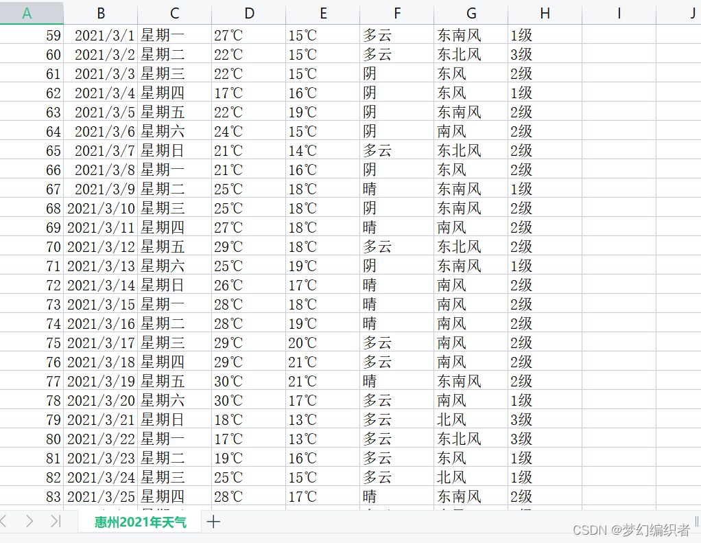
注:数据分析用的是惠州2021年的天气数据,如下图

读取惠州2021年天气情况并转化为图形
# 数据处理
plt.rcParams['font.sans-serif'] = ['SimHei']
plt.rcParams['axes.unicode_minus'] = False


weather['最高气温'] = weather['最高气温'].map(lambda x: int(x.replace('℃', '')))
weather['最低气温'] = weather['最低气温'].map(lambda x: int(x.replace('℃', '')))

dates = weather['日期']
highs = weather['最高气温']
lows = weather['最低气温']

# 画图

fig = plt.figure(dpi=128, figsize=(10, 6))

plt.plot(dates, highs, c='red', alpha=0.5)
plt.plot(dates, lows, c='blue', alpha=0.5)

plt.fill_between(dates, highs, lows, facecolor='blue', alpha=0.2)
# 图表格式
# 设置图标的图形格式
plt.title('2023惠州2021年天气情况', fontsize=24)
plt.xlabel('', fontsize=6)
fig.autofmt_xdate()
plt.ylabel('气温', fontsize=12)
plt.tick_params(axis='both', which='major', labelsize=10)
# 修改刻度
plt.xticks(dates[::5])
# 显示
plt.show()
因为数据量下面代表日期比较多,所以比较乱一点


 4382
4382


 被折叠的 条评论
为什么被折叠?
被折叠的 条评论
为什么被折叠?
 到【灌水乐园】发言


