


因在使用vant时文字不支持上下显示,后自行封装,目前存在一定的问题,请指教
| 属性 | 类型 | 必传 |
| active | Number | String | 是 |
| index | Number | String | 是 |
| top | String | 否 |
| left | Number | String | 否 |
子组件
<template>
	<div :class="{ stepItem: true }" :style="flexNum">
		<div
			class="content"
			:class="{ headLeftClass: headLeft && left === 0 }"
			:style="{ left: formatLeft(left) }"
		>
			<div
				@click="emitText"
				class="text"
				:class="{
					textTop: isTop === 'top',
					textBottom: isTop === 'bottom',
					textColor: activeList.includes(index),
				}"
			>
				<slot></slot>
			</div>
			<slot name="icon">
				<div
					class="icon-default"
					:class="{ 'icon-active': activeList.includes(index) }"
				></div>
			</slot>
		</div>
		<div class="line" :class="{ 'line-active': activeList.includes(index) }"></div>
	</div>
</template>

<script>
export default {
	name: 'step0', // 步骤条子级
	props: {
		// 当前组件为唯一标识
		index: {
			type: Number | String,
			default: 0,
			required: true,
		},
		// top 文字显示在上面 bottom 文字显示在下面
		isTop: {
			type: String,
			default: 'top',
		},
		// 控制图标及文字距离右边的距离支持 px %
		left: {
			type: Number | String,
			default: 0,
		},
	},
	data() {
		return {
			flexNum: null, // 首尾flex占比
			headLeft: false, // 第一个子组件默认距离左边的距离
			activeList: [],
		};
	},
	mounted() {
		const arr = [];
		this.$parent.$children.find(item => {
			arr.push(item.index);
			if (item.index === this.$parent.active) return true;
		});
		this.activeList = arr;
		const indexTail = this.$parent.$children[this.$parent.$children.length - 1]._uid;
		const indexHead = this.$parent.$children[0]._uid;
		if (indexHead === this._uid) {
			this.flexNum = {
				flex: 1.3,
			};
			this.headLeft = true;
		} else if (indexTail === this._uid) {
			this.flexNum = {
				flex: 0.3,
			};
		} else {
			this.flexNum = null;
		}
	},
	methods: {
		formatLeft(val) {
			if (typeof val === 'string') {
				return val;
			} else if (typeof val === 'number') {
				return val + 'px';
			} else {
				return 0;
			}
		},
		emitText() {
			this.$parent.$emit('stepItem', this.index);
		},
	},
};
</script>

<style scoped lang="less">
.stepItem {
	position: relative;
	flex: 1;
	width: 100%;
	height: 100%;
	font-size: 14px;
	.headLeftClass {
		left: 18px !important;
	}

	.content {
		position: absolute;
		top: 50%;
		transform: translate(0, -50%);
		width: 1px;
		height: 1px;
		z-index: 2;
		.text {
			position: absolute;
			transform: translate(-50%);
			white-space: nowrap;
			color: #bcbcbc;
		}

		// 完成的文字状态
		.textColor {
			color: #000;
		}
		.textTop:extend(.text) {
			bottom: 12px;
		}
		.textBottom {
			top: 12px;
		}
		.icon-default {
			position: absolute;
			top: -50%;
			transform: translate(-50%, -30%);
			width: 5px;
			height: 5px;
			border-radius: 50%;
			background: #fff;
			border: 1px solid #bcbcbc;
		}
		// 完成的图标样式
		.icon-active {
			width: 10px;
			height: 10px;
			border: 1px solid #d53736;
		}
	}
	.line {
		position: absolute;
		top: 50%;
		left: 0;
		width: 100%;
		height: 1px;
		z-index: 0;
		background: #bcbcbc;
	}
	.line-active {
		background: #d53736;
	}
}
.stepFlex {
	flex: 0.4 !important;
}
</style>
父组件
<template>
	<div class="steps-content">
		<div class="steps">
			<slot></slot>
		</div>
	</div>
</template>

<script>
export default {
	name: 'steps0', // 步骤条父组件
	props: {
		active: {
			type: Number | String,
			default: 0,
			required: true,
		},
	},
};
</script>

<style scoped lang="less">
.steps-content {
	// overflow: hidden; // 建议打开,需要自行调试文字距离
	padding: 8px 8px;
	.steps {
		display: flex;
		height: 60px;
		padding: 0 10px;
	}
}
</style>
使用
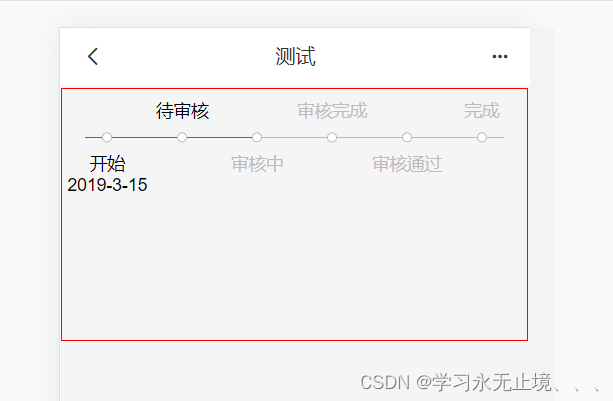
<template>
	<div>
		<div class="testContent">
			<steps :active="1" @stepItem="stepItem">
				<step isTop="bottom" :index="0">
					<div style="text-align: center">
						开始
						<br />
						2019-3-15
					</div>
				</step>
				<step :index="1">待审核</step>
				<step isTop="bottom" :index="2">审核中</step>
				<step :index="3">审核完成</step>
				<step isTop="bottom" :index="4">审核通过</step>
				<step :index="5">完成</step>
			</steps>
		</div>
	</div>
</template>

<script>
import steps from './steps.vue';
import step from './step.vue';
export default {
	name: 'test',
	components: {
		steps,
		step,
	},
	data() {
		return {
			active: 1,
		};
	},
	methods: {
		stepItem(index) {
			console.log('index', index);
		},
	},
};
</script>

<style scoped lang="less">
.testContent {
	width: 99%;
	height: 200px;
	border: 1px solid red;
}
</style>
展示


 310
310


 被折叠的 条评论
为什么被折叠?
被折叠的 条评论
为什么被折叠?
 到【灌水乐园】发言


