


目录
1.响应式布局viewport
(1)viewport: 初始化页面元素,防止页面被缩放,规范用户操作
(2)width=device-width:设置宽度为屏幕宽度
(3)maximum-scale=1.0:最大缩放比例为1.0
(4)minimum-scale=1.0:最小缩放比例为1.0
(5)user-scalable=no:禁止用户捏合操作
(6)initial-scale=1.0:初始化的缩放比例
代码:
<!DOCTYPE html>
<html lang="en">
<head>
<meta charset="UTF-8">
<meta http-equiv="X-UA-Compatible" content="IE=edge">
<meta name="viewport" content="width=device-width, initial-scale=1.0">
<title>帅哥鉴赏大赛</title>
</head>
<link rel="stylesheet" href="reset.css">
<style>
/* 公共样式 */
html{
/* 62.5%也就是10px */
font-size: 62.5%;
}
a,span{
color: black;
/* 2rem相当于20px */
font-size: 2rem;
}
nav{
width: 80%;
height: 60px;
background-color: #fff;
position: fixed;
top:0;
}
nav ul{
width: 100%;
height: 60px;
}
main img{
width: 100px;
height: 240px;
}
</style>
<link rel="stylesheet" href="pc.css" media="screen and (min-width:750px)">
<link rel="stylesheet" href="phone.css" media="screen and (max-width:750px)">
<body>
<div class="wrap">
<!-- 导航条部分 -->
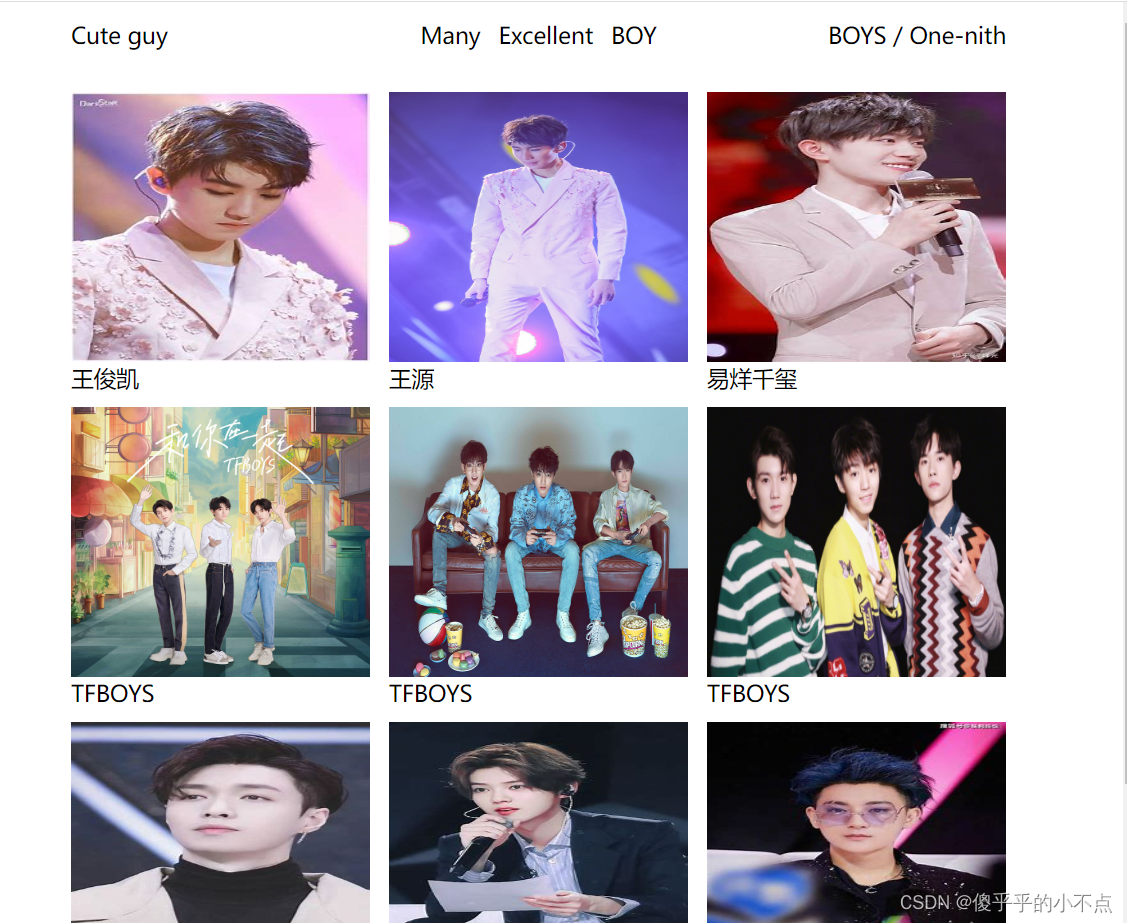
<nav>
<ul class="pc">
<li>
<a href="#">Cute guy</a>
</li>
<li>
<a href="#">Many</a>
<a href="#">Excellent</a>
<a href="#">BOY</a>
</li>
<li>
<a href="#">BOYS</a> / <a href="#">One-nith</a>
</li>
</ul>
<ul class="phone">
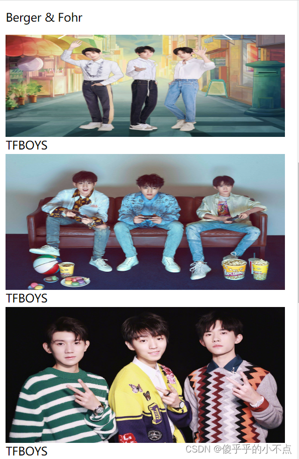
<li><a href="#">Berger & Fohr</a></li>
<li><a href="#"></a></li>
</ul>
</nav>
<!-- 图文组合 -->
<main>
<div class="item">
<img src="img/01.jfif" alt="">
<p><a href="">王俊凯</a></p>
</div>
<div class="item">
<img src="img/02.jfif" alt="">
<p><a href="">王源</a></p>
</div>
<div class="item">
<img src="img/03.jfif" alt="">
<p><a href="">易烊千玺</a></p>
</div>
<div class="item">
<img src="img/04.jpg" alt="">
<p><a href="">TFBOYS</a></p>
</div>
<div class="item">
<img src="img/05.jfif" alt="">
<p><a href="">TFBOYS</a></p>
</div>
<div class="item">
<img src="img/07.jpg" alt="">
<p><a href="">TFBOYS</a></p>
</div>
<div class="item">
<img src="img/06.jfif" alt="">
<p><a href="">张艺兴</a></p>
</div>
<div class="item">
<img src="img/08.jfif" alt="">
<p><a href="">鹿晗</a></p>
</div>
<div class="item">
<img src="img/09.jfif" alt="">
<p><a href="">黄子韬</a></p>
</div>
</main>
</div>
<!-- 联系方式 -->
<footer>
<p><a href="#">TFBOYS</a></p>
<p><a href="#">2013-08-06</a></p>
<p><span>(10year) 2023-08-06</span></p>
</footer>
</body>
</html>新建css文件夹,在里面创建一个reset.css文件
body, h1, h2, h3, h4, h5, h6, hr, p, blockquote, dl, dt, dd, ul, ol, li, pre, form, fieldset, legend, button, input, textarea, th, td { margin:0; padding:0; }
body, button, input, select, textarea { font:12px/1.5tahoma, arial, \5b8b\4f53; }
h1, h2, h3, h4, h5, h6{ font-size:100%; }
address, cite, dfn, em, var { font-style:normal; }
code, kbd, pre, samp { font-family:couriernew, courier, monospace; }
small{ font-size:12px; }
ul, ol { list-style:none; }
a { text-decoration:none; }
a:hover { text-decoration:underline; }
sup { vertical-align:text-top; }
sub{ vertical-align:text-bottom; }
legend { color:#000; }
fieldset, img { border:0; }
button, input, select, textarea { font-size:100%; }
table { border-collapse:collapse; border-spacing:0; }
新建css文件夹,在里面创建一个pc.css文件 (电脑端)
.wrap{
    width: 80%;
    margin: 0 auto;
    padding-top: 80px;
    /* height: 200px; */
    /* background-color: aqua; */
}

.phone{
    display: none;
}

.pc li{
    line-height: 60px;
    font-size: 2rem;
    overflow: hidden;
    /* background-color: blue; */
}

.pc li:nth-of-type(1){
    width: 30%;
    height: 100%;
    float: left;
    text-align: left;
}
.pc li:nth-of-type(2){
    width: 40%;
    height: 100%;
    float: left;
    text-align: center;
}
.pc li:nth-of-type(2) a{
    margin: 0 5px;
}
.pc li:nth-of-type(3){
    width: 30%;
    height: 100%;
    float: left;
    text-align: right;
}

main{
    overflow: hidden;
    /* width: 100%;
    padding-bottom: 80px; */

}
main .item{
    width: 32%;
    float: left;
    margin-right: 2%;
    /* background-color: aquamarine; */
    height: 280px;
}

main .item:nth-of-type(3n){
    margin-right: 0;

}

main .item img{
    display: block;
    width: 100%;
    /* height: 20px; */
}

main .item p{
    height: 3rem;
    line-height: 3rem;
}

footer{
    /* margin-left: 80px; */
    height: 3rem;
    text-align: center;
    /* background-color: blueviolet; */
}
footer p{
    height: 100%;
    /* text-align: center; */
    line-height: 3rem;
    float: left;
    width: 30%;
}
footer p:nth-of-type(2){
    width: 40%;
    text-align: center;
}
footer p:nth-of-type(3){
    text-align: right;
}
新建css文件夹,在里面创建一个phone.css文件 (手机端)
.wrap{
    width: 92%;
    margin: 0 auto;
    padding-top: 80px;
    /* background-color: aqua; */
}
nav{
    width: 92%;
}

.pc{
    display: none;
}

.phone{
    width: 100%;
    height: 60px;
    /* background-color: blueviolet; */
}

.phone li{
    width: 50%;
    height: 60px;
    line-height: 60px;
    font-size: 2rem;
    float: left;
}
.phone li:nth-of-type(2) a {
    float: right;
    width: 20px;
    height: 20px;
    background-image: url(./img/caidan.png);
    background-size: 100% 100%;
    margin-top: 20px;
}

main{
    overflow: hidden;
}

main .item{
    width: 100%;
}
main .item img{
    display: block;
    width: 100%;
}

main .item p{
    height: 3rem;
    line-height: 3rem;
}
footer p{
    height: 3rem;
    line-height: 3rem;
}
运行结果:
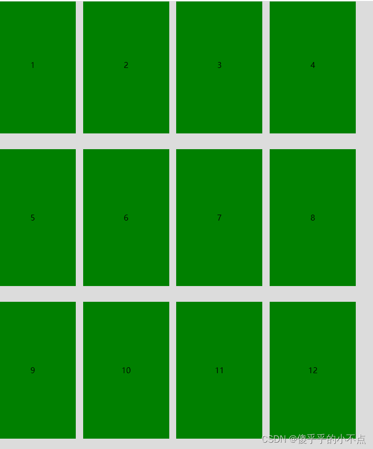
pc端
phone端
2.百分比布局
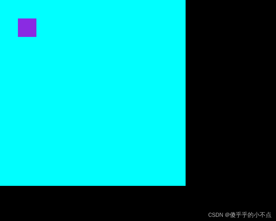
没有定位的情况:
(1)宽高百分比相对于父元素的宽高
(2)margin和padding的百分比相对于父元素的宽度
(3)定位的百分比相对于它的参照物
定位情况:
(1)宽高设置百分比相对于定位父元素的宽高
(2)定位的left和right相对于定位父元素的宽度,top和bottom相对于定位父元素的高度
代码:
<!DOCTYPE html>
<html lang="en">
<head>
    <meta charset="UTF-8">
    <meta http-equiv="X-UA-Compatible" content="IE=edge">
    <meta name="viewport" content="width=device-width, initial-scale=1.0">
    <title>百分比布局</title>
    <style>
        /* 没有定位的情况
             1.宽高设置百分比相对于父元素的宽高
             2.margin和padding相对于父元素的宽度

            定位情况
             1.宽高设置百分比相对于定位父元素地宽高
             2.定位的left和right相对于定位父元素的宽度  top和bottom相对于定位父元素的高度

             vw(宽度撑满)和vh(高度撑满)相对于浏览器可视窗口  和父元素没有关系
        */
        *{
            margin: 0;
            padding: 0;
        }
        .grandfather{
            width: 800px;
            height: 900px;
            background-color: black;
            position: relative;
        }
        .father{
            width: 500px;
            height: 500px;
            background-color: aqua;
            position: relative;
        }
        .father div{
            width: 10%;
            height: 10%;
            background-color: blueviolet;
            position: absolute;
            left: 10%;
            top: 10%;
        }
        /* html,body{
            height: 100%;
        } */
        .container{
            width: 100vw;
            height: 50px;
            background-color: blue;
        }
        .container p{
            width: 10%;
            height: 30px;
            background-color: brown;
        }


    </style>
</head>
<body>
    <div class="grandfather">
        <div class="father">
            <div></div>
        </div>
    </div>
    <div class="container">
        <p></p>
    </div>
</body>
</html>
运行结果:
3.媒体查询
(1)在不同的屏幕大小下定制样式
(2)@media screen and(min-width:宽度){样式}:大于某个值时的样式
(3)@media screen and(max-width:宽度){样式}:小于某个值的样式
(4)@media screen and(min-width:宽度) and (max-width:宽度){样式}:
在最大值和最小值内的样式
(5)@media not screen and(min-width:宽度) and (max-width:宽度){样式}:
除某个范围内样式
(6)可以使用link引入外部文件,link的media属性中写媒体查询:
<link rel="stylesheet" media="screen and (max-width:800px)"href="er.css">
(7)补充:
<1>浏览器大小使用min-width和max-width判断
<2>屏幕大小使用min-device-width和max-device-width判断
代码:
<!DOCTYPE html>
<html lang="en">
<head>
<meta charset="UTF-8">
<meta http-equiv="X-UA-Compatible" content="IE=edge">
<meta name="viewport" content="width=device-width, initial-scale=1.0">
<title>媒体查询练习1</title>
<style>
div{
background-color: #dcdcdc;
padding-top: 5px;
}
@media screen and (min-width:1200px) {
div{
width: 700px;
height: 680px;
}
p{
width: 100px;
height: 300px;
display: inline-block;
background-color: gold;
margin-left: 10px;
text-align: center;
line-height: 300px;
}
p:nth-of-type(7){
margin-top: 10px;
}
}
@media screen and (min-width:780px) and (max-width:1200px) {
div{
width: 800px;
height: 940px;
}
p{
width: 175px;
height: 278px;
display: inline-block;
background-color: green;
margin-left: 10px;
text-align: center;
line-height: 278px;
}
p:nth-of-type(5),p:nth-of-type(9){
margin-top: 10px;
}
}
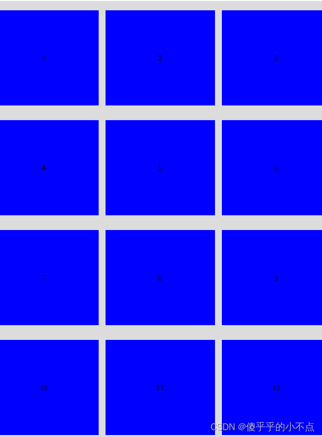
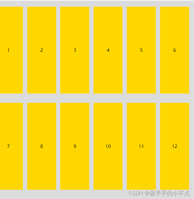
@media screen and (max-width:780px) {
div{
width: 800px;
height: 1300px;
}
p{
width: 238px;
height: 207px;
display: inline-block;
background-color: blue;
margin-left: 10px;
text-align: center;
line-height: 207px;
}
p:nth-of-type(4),p:nth-of-type(7),p:nth-of-type(10){
margin-top: 10px;
}
}
</style>
</head>
<body>
<div>
<p>1</p>
<p>2</p>
<p>3</p>
<p>4</p>
<p>5</p>
<p>6</p>
<p>7</p>
<p>8</p>
<p>9</p>
<p>10</p>
<p>11</p>
<p>12</p>
</div>
</body>
</html>运行结果:
4.em和rem的区别:
(1)em:相对于最近的父元素的font-size的大小
(2)rem:相对于html的字体大小
5.vw和vh:相对于可视窗口的大小
(1)vw单位可以根据窗口的宽度自动改变大小,“1vw”是窗口宽度的“1%”
(2)vh单位可以根据窗口的高度自动改变大小,“1vh”是窗口高度的“1%”
注意:vw(宽度撑满)和vh(高度撑满)相对于浏览器可视窗口 和父元素没有关系


 585
585


 被折叠的 条评论
为什么被折叠?
被折叠的 条评论
为什么被折叠?
 到【灌水乐园】发言


