


一,默认模版中是容器Row或者Column中添加一个Text文本,我们可以尝试一下修改它的内容和样式,对UI语法有一个初体验:
// 文本内容Text("沉默的闪客")// 字体大小.fontSize(50)//背景色.backgroundColor(Color.Green)// 字体粗细.fontWeight(FontWeight.Bold)//字体颜色.fontColor(Color.Red)//对齐方式.textAlign(TextAlign.Start)//宽度.width(100)//高度.height(100)//外边距.margin({left:10})//内边距.padding({top:10})// 内容边框.border({ width: 1 })// 设置文本超长时的显示方式.textOverflow({ overflow: TextOverflow.Clip })// 设置文本的最大行数.maxLines(1)// 设置文本字符间距.letterSpacing(3)// 文本基线偏移.baselineOffset(0)// 文本大小写展示.textCase(TextCase.LowerCase)// 设置文本装饰线样式及其颜色.decoration({type: TextDecorationType.LineThrough,color: Color.Red})
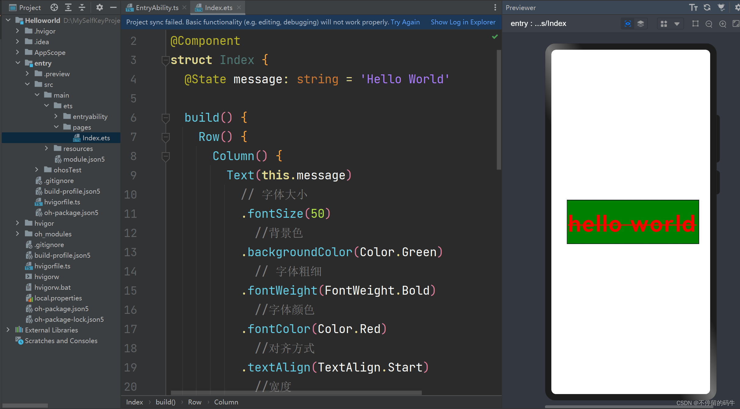
以上就是一个文本组件Text常用的一些设置,如果不知道是什么或者不知道都有什么,可以通过DevEco编译器里面的代码提示,组件后面添加英文点儿一下就能看到,大家可以按需选择,也可以多多尝试,其他组件通用。

二,如果上面的Text 看起来不尽兴,再来一个Image组件的内容和样式:
// 加载图片Image($r('app.media.ic_camera_master_ai_leaf'))// 宽.width(110)// 高.height(110)// 外边距.margin(15)// 使用alt,在网络图片加载成功前使用占位图.alt($r('app.media.icon'))// 设置图片的填充效果.objectFit(ImageFit.Cover).onClick(() => {}).onFinish(() => {})// 图片加载完成后,获取图片尺寸。.onComplete((msg: { width: number,height: number }) => {this.widthValue = msg.widththis.heightValue = msg.height})// 图像像素大小.sourceSize({width: 900,height: 900})// Overlay 侧边栏浮在内容区上面.overlay('png', { align: Alignment.Bottom, offset: { x: 0, y: 20 } })

三,Button 按钮组件,可快速创建不同样式的按钮,同时可以在内部添加文本和进度效果。
// type: ButtonType.Normal 属性是按钮类型 包括,胶囊,原型和普通三种
Button('OK', { type: ButtonType.Normal, stateEffect: true })
   // 圆角
  .borderRadius(8)
  // 背景颜色
  .backgroundColor(0x317aff)
  // 宽
  .width(90)
  .onClick(() => {
    console.log('ButtonType.Normal')
  })
Button({ type: ButtonType.Normal, stateEffect: true }) {
  // 按钮上添加进度条和文本
  Row() {
    LoadingProgress()
    .width(20)
    .height(20)
    .margin({ left: 12 })
    .color(0xFFFFFF)
    Text('loading')
    .fontSize(12)
    .fontColor(0xffffff)
    .margin({ left: 5, right: 12 })
  }
  .alignItems(VerticalAlign.Center)
}
.borderRadius(8)
.backgroundColor(0x317aff)
.width(90)
.height(40)

Button('Disable', { type: ButtonType.Normal, stateEffect: false })
// 透明度
.opacity(0.4)
.borderRadius(8)
.backgroundColor(0x317aff)
.width(90)
上面说的都是基础组件,用来显示界面中的每一个效果的显示。
下面来说说容器组件,容器组件是包含基础组件实现界面的显示:
List是列表组件,用于展示列表数据,是容器布局中的重要组件,列表由多个ListItem构成。
// space:行间距
List({ space: 20, initialIndex: 0 }) {
  ForEach(this.arr, (item) => {
   // item
    ListItem() {
      Text('' + item)
        .width('100%').height(100).fontSize(16)
        .textAlign(TextAlign.Center).borderRadius(10).backgroundColor(0xFFFFFF)
    }
  }, item => item)
}
.listDirection(Axis.Vertical) // 排列方向
.divider({ strokeWidth: 2, color: 0xFFFFFF, startMargin: 20, endMargin: 20 }) // 每行之间的分界线
.edgeEffect(EdgeEffect.Spring) // 滑动到边缘无效果
.onScrollIndex((firstIndex: number, lastIndex: number) => {
  console.info('first' + firstIndex)
  console.info('last' + lastIndex)
})
.width('90%')

类似的容器组件 还有 Grid,Scroll 组件,组件的用法都大同小异,不再一一叙述,后面实战使用更高效,接下来要说一说基本的布局。
布局无非就是水平排列、竖向排列,层叠排列和弹性布局,由他们又繁衍出了各种各样的排列组合方式。下面进行一一讲述:
Row:横向排列,Row容器内子元素按照水平方向排列,可以包含所有基础组件。
Row() {
  Text('闪客1').width(110).height(50).textAlign(TextAlign.Center).backgroundColor('#e1e1e1')
  Image($r('app.media.icon')).width(50)
  Text('闪客3').width(110).height(50).textAlign(TextAlign.Center).backgroundColor('#ff96eeac')
  Text('闪客4').width(110).height(50).textAlign(TextAlign.Center).backgroundColor('#ffde6e6e')
}
.height('100%')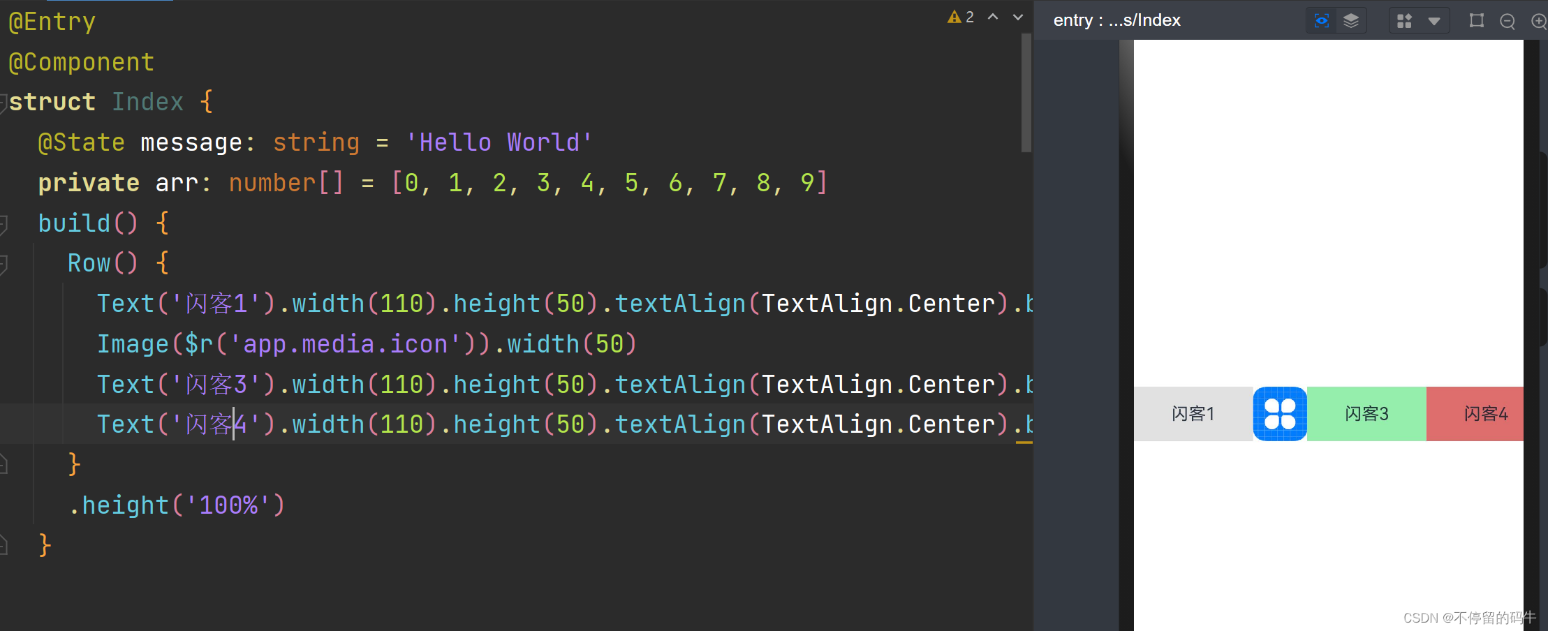
Column:竖向排列。Column容器内子元素按照垂直方向排列, 可以包含所有基础组件。
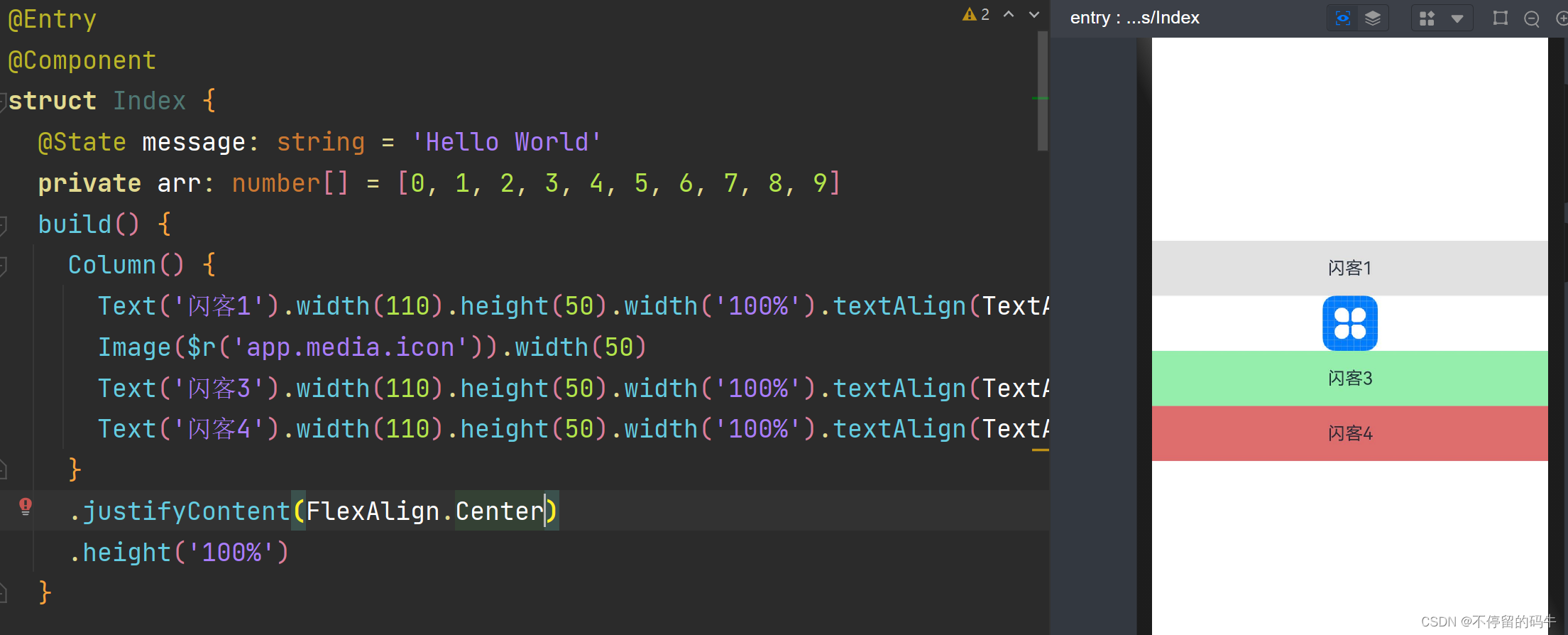
 Column() {
    Text('闪客1').width(110).height(50).width('100%').textAlign(TextAlign.Center).backgroundColor('#e1e1e1')
    Image($r('app.media.icon')).width(50)
    Text('闪客3').width(110).height(50).width('100%').textAlign(TextAlign.Center).backgroundColor('#ff96eeac')
    Text('闪客4').width(110).height(50).width('100%').textAlign(TextAlign.Center).backgroundColor('#ffde6e6e')
  }
  .justifyContent(FlexAlign.Center) // 竖直居中
.height('100%')Stack:层叠布局。容器内子元素的位置可以重叠,可以按照层次添加,可以把组件覆盖到另一个组件之上。
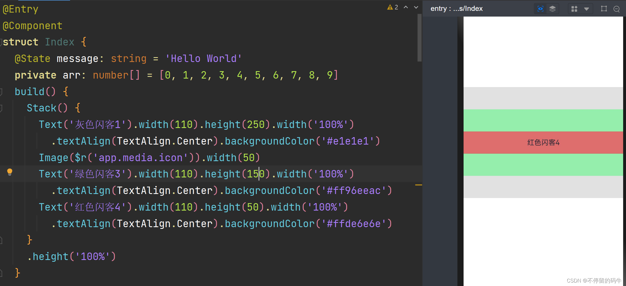
Stack() {
  Text('灰色闪客1').width(110).height(250).width('100%')
    .textAlign(TextAlign.Center).backgroundColor('#e1e1e1')
  Image($r('app.media.icon')).width(50)
  Text('绿色闪客3').width(110).height(150).width('100%')
    .textAlign(TextAlign.Center).backgroundColor('#ff96eeac')
  Text('红色闪客4').width(110).height(50).width('100%')
    .textAlign(TextAlign.Center).backgroundColor('#ffde6e6e')
}
.height('100%')Flex:弹性布局,以弹性方式布局子组件的容器组件,有效的对容器中的子元素进行排列、对齐和分配剩余空间, 使用Flex可以同时支持横向布局和纵向布局:
Flex({ direction: FlexDirection.Row }) { // 子组件在容器主轴上布局
  Text('灰色闪客1').width(110).height(250).width('100%')
    .textAlign(TextAlign.Center).backgroundColor('#e1e1e1')
  Image($r('app.media.icon')).width(50)
  Text('绿色闪客3').width(110).height(150).width('100%')
    .textAlign(TextAlign.Center).backgroundColor('#ff96eeac')
  Text('红色闪客4').width(110).height(50).width('100%')
    .textAlign(TextAlign.Center).backgroundColor('#ffde6e6e')
}
.height('100%')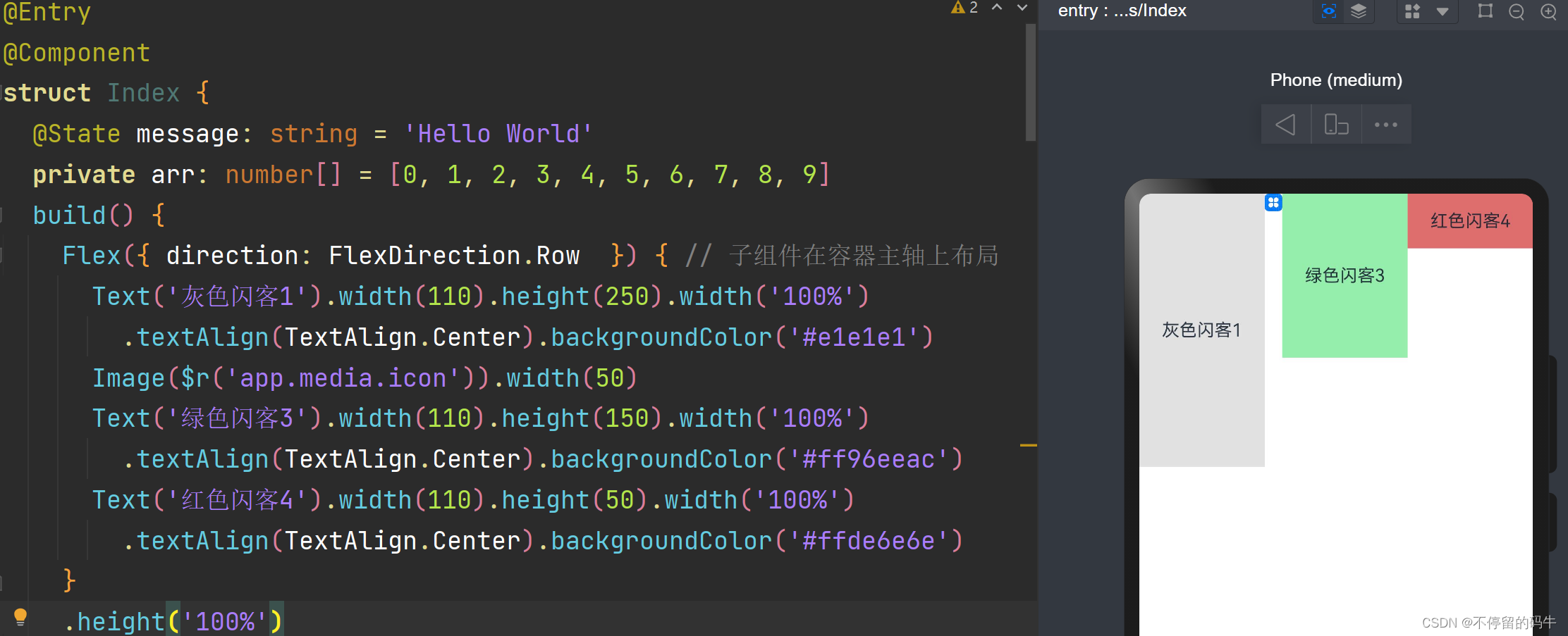
垂直布局:
Flex({ direction: FlexDirection.Column }) { // 子组件在容器主轴上布局
  Text('灰色闪客1').width(110).height(250).width('100%')
    .textAlign(TextAlign.Center).backgroundColor('#e1e1e1')
  Image($r('app.media.icon')).width(50)
  Text('绿色闪客3').width(110).height(150).width('100%')
    .textAlign(TextAlign.Center).backgroundColor('#ff96eeac')
  Text('红色闪客4').width(110).height(50).width('100%')
    .textAlign(TextAlign.Center).backgroundColor('#ffde6e6e')
}
.height('100%')
上面说了很多,都是基础的开发,组件,容器,做界面妥妥的,为了能够尽快熟悉,下面来一个登记界面的开发吧,再次熟悉熟悉开发的乐趣。
先来看登记界:
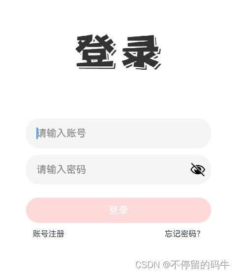
从整理布局来看是竖直布局,最外层使用Colomn容器或者Flex容器。
1,先来实现头部的图片显示
Image($r('app.media.ic_login'))
.width(130).height(60)  // 设置宽高
.margin({ top: 50, bottom: 70 }) //设置内边距 顶部和底部
2,再来实现下面的输入框,鸿蒙有TextInput组件可以实现输入操作
// 默认信息和输入信息
TextInput({ placeholder: '请输入账号', text: this.account })
  .type(InputType.Normal) // 输入类型
  .placeholderColor(Color.Gray) // 默认信息颜色
  .placeholderFont({ size: 15, weight: 2 }) // 默认信息的大小和权重
  .height(45)
  .onChange((value: string) => {

  })
3,再来实现下面的按钮,按钮使用上面说的Button来实现,按钮可以直接添加文本,也可以在内部添加文本组件。
Button() {
  Text('登录')
    .textAlign(TextAlign.Center)
    .width('100%')
    .fontSize(15)
    .fontColor(Color.White)
}.height(38)
.margin({ top: 20 })
.enabled(this.isEnableLogin)
.backgroundColor(this.isEnableLogin ? '#d81e06' : '#F9A3A1')
.onClick(()=>{
  this.login()
})
4,最先的注册和忘记密码,两个看成一个整体 通过 水平容器Row来实现,每一个是一个文本 使用Text来实现。
Row() {
  Text('账号注册')
    .fontSize(12)
    .padding(10)
  Blank() // 填充内部剩余空间,让两端的组件靠近边框
  Text('忘记密码?')
    .fontSize(12)
    .padding(10)
}.width('100%')
因为注册和忘记密码文本在两端,可以使用布局属性也可以使用Blank来实现,占用空余布局。
上面几部分完成 就成功的组成一个登录界面,当然还需要有一些点击操作和输入框文本变化监听,才是一个完整的登录功能页面。
最后
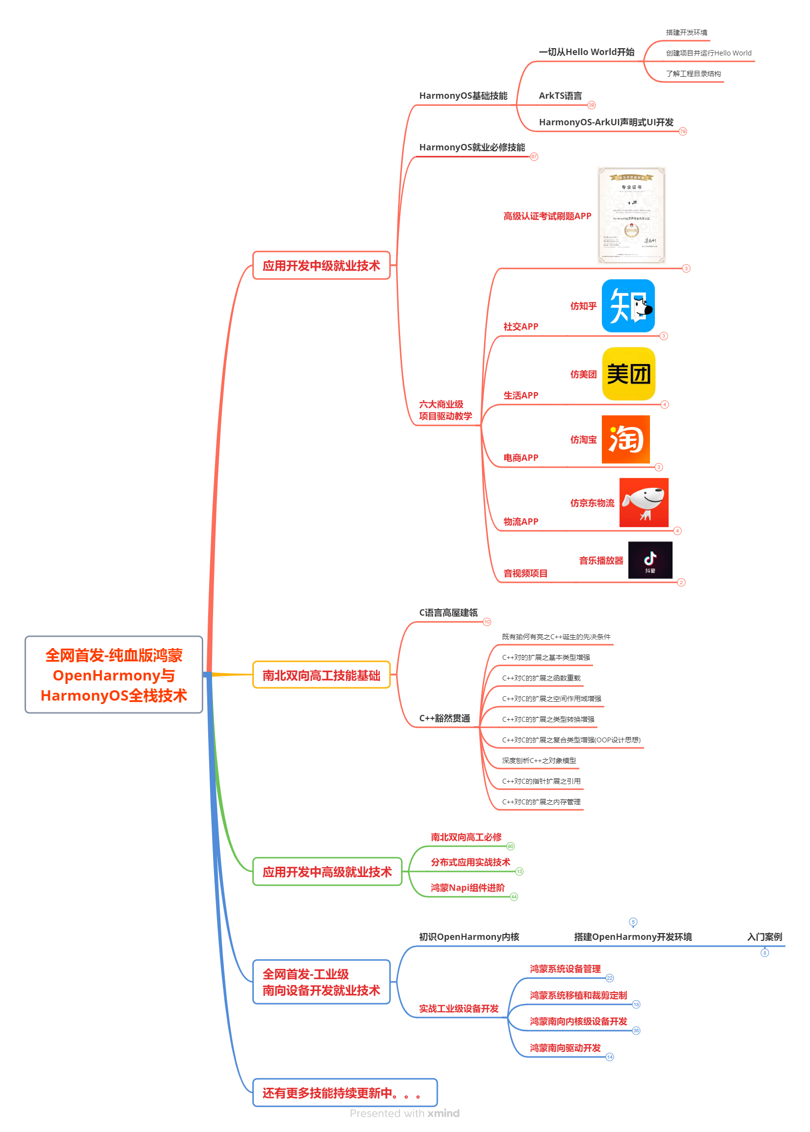
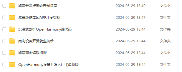
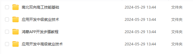
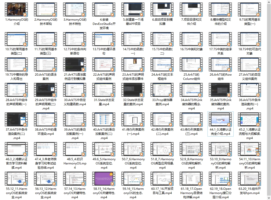
如果你想成为一名鸿蒙开发者,以下这些资料将是十分优质且有价值,让你的鸿蒙开发之路事半功倍!相对于网上那些碎片化的知识内容,这份学习资料的知识点更加系统化,更容易理解和记忆。
内容包含了:【OpenHarmony多媒体技术、Stage模型、ArkUI多端部署、分布式应用开发、音频、视频、WebGL、Napi组件、OpenHarmony内核、Harmony南向开发、鸿蒙项目实战】等技术知识点。
鸿蒙Next全套VIP学习资料←点击领取!(安全链接,放心点击)
1.鸿蒙核心技术学习路线
2.大厂面试必问面试题
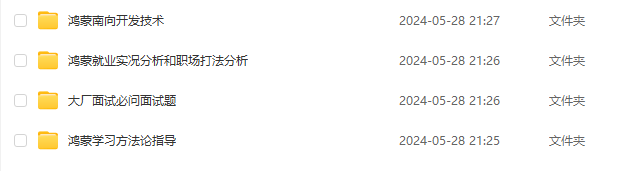
3.鸿蒙南向开发技术
4.鸿蒙APP开发必备
5.HarmonyOS Next 最新全套视频教程
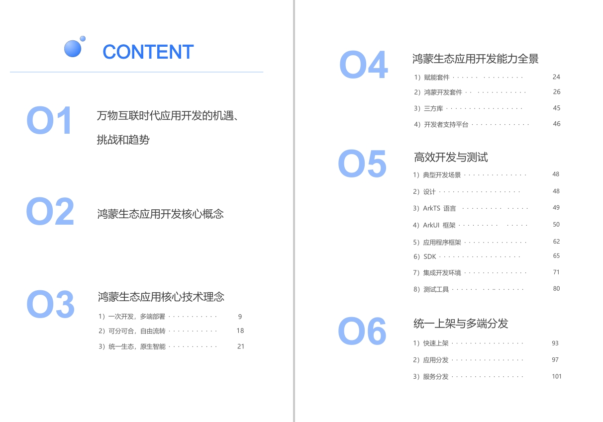
6.鸿蒙生态应用开发白皮书V2.0PDF


 1190
1190


 被折叠的 条评论
为什么被折叠?
被折叠的 条评论
为什么被折叠?
 到【灌水乐园】发言


