


一、具体思路
主要靠css3里面的贝塞尔曲线完成
1.创建div元素
2.给div定位
3.计算div具体左侧和顶部的距离
4.设置小球样式
5.贝塞尔曲线动画
6.用appendChild向父元素最后添加
7.添加动画属性Getcollect(),以定时器进行处理
8.添加ontransitionend事件 在 transition过度完之后执行的
二、贝塞尔曲线的介绍
cubic-bezier 又称三次贝塞尔,主要是为 animation 生成速度曲线的函数,是 animation-timing-function 和 transition-timing-function 中的一个重要值。
语法:
cubic-bezier(x1,y1,x2,y2)流程图和取值范围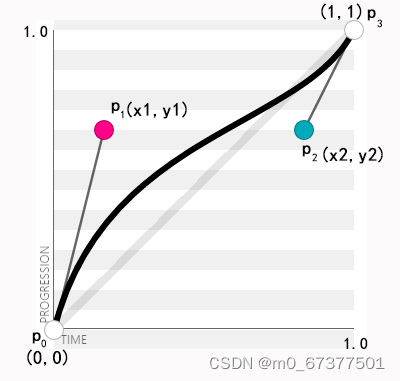
cubic-bezier 的取值范围:
- p0:默认值(0,0)
- p1:取值(x1,y1)
- p2:取值(x2,y2)
- p3:默认值(1,1)
在 cubic-bezier 中,p0和p3是默认的点,所以我们只需要定义p1和p2两个点,同时x1、y1、x2、y2的取值范围为[0,1]
注意:当取值超出范围时, cubic-bezier 就会失效。
在CSS3的动画中,有几个常用的固定值。
ease: cubic-bezier(.25, .1, .25, 1)
linear: cubic-bezier(0, 0, 1, 1)
ease-in:cubic-bezier(.42,0,1,1)
ease-out:cubic-bezier(0,0,.58,1)
ease-in-out:cubic-bezier(.42,0,.58,1)
ease: cubic-bezier(.25, .1, .25, 1)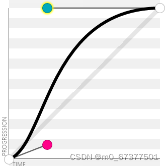
linear: cubic-bezier(0, 0, 1, 1)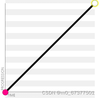
ease-in:cubic-bezier(.42,0,1,1)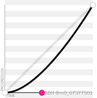
ease-out:cubic-bezier(0,0,.58,1)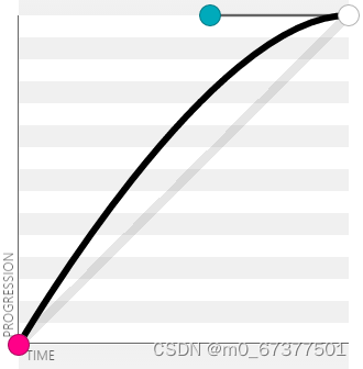
ease-in-out:cubic-bezier(.42,0,.58,1)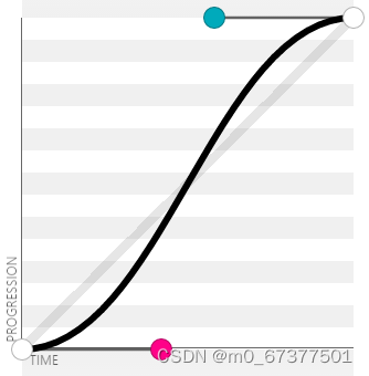
三、页面结构代码
<div className='list'>
      <Header />
      <Tabs style={{
        "--active-title-color": "orange"
      }}>
        <Tabs.Tab title='商品' key='fruits'>
          <div className="box">
            <div className="menu-wrapper">
              <ul>
                {
                  menuList.length > 0 && menuList.map((item, index) => (
                    <li className={act === index ? 'active' : ''} onClick={() => FnTable(index)} key={index}>
                      <span className="text border-1px">
                        <span style={item.type > 0 ? {} : { display: 'none' }}></span>{item.name}                                    </span>
                    </li>
                  ))
                }
              </ul>
            </div>
            <div className="floor-list" ref={leftItem} >
              {menuList.map((floor, index) => (
                <div key={index} className="floor-item" id={`floor-${index}`}>
                  <div className="img">
                    <span>{floor.name}</span>
                  </div>
                  <div className="tp">
                    {
                      floor.foods.map((food, idx) => (
                        <div className='fot_id' key={idx}>
                          <div className="icon">
                            <img width="57" height="57" src={food.icon} />
                          </div>
                          <div className="content">
                            <h2 className="name">{food.name}</h2>
                            <p className="desc">{food.description}</p>
                            <div className="extra">
                              <span className="count">月售{food.sellCount}份</span><span>好评率{food.rating}%</span>
                            </div>
                            <div className="price">
                              <span className="now">¥{food.price}</span><span className='old' style={food.oldPrice ? {} : { display: 'none' }}>¥{food.oldPrice}</span>
                            </div>
                            <button onClick={(e) => {
                              Fnstart(e)
                            }}>+</button>
                          </div>
                        </div>
                      ))
                    }
                  </div>

                </div>
              ))}
            </div>
          </div>
        </Tabs.Tab>
        <Tabs.Tab title='评价' key='vegetables'>
          <Rates />
        </Tabs.Tab>
        <Tabs.Tab title='商家' key='animals'>
          商家
        </Tabs.Tab>
      </Tabs>
      <div className="footer" ref={collect}>
        <div className="left">
          <Badge content={total[1]}>
            <div className={styles.box}>
              <TruckOutline fontSize={"40px"} />
            </div>
          </Badge>
          <span style={{ marginRight: "10px" }}>¥{total[0]}</span>
          <span>另需配送费4元</span>
        </div>
        <div className="right">
          <button style={{ background: total[1] > 0 ? "green" : "#e3e3e3" }}>去结算</button>
        </div>
      </div>
    </div >
四、实现代码
//加入购物车的小球动画
  // 创建小球添加动画
  const createBall = (left, top) => {
    // 创建div元素
    let Ball = document.createElement('div')
    // 给div定位
    Ball.style.position = "absolute";
    // div的left和span的left是一样的
    Ball.style.left = (left - 10) + 'px'
    // div的top和span的top是一样的
    Ball.style.top = (top - 10) + 'px'
    Ball.style.width = '20px'
    Ball.style.height = '20px'
    Ball.style.borderRadius = '50%'
    Ball.style.backgroundColor = 'green'
    // 贝塞尔曲线
    Ball.style.transition = "left .6s linear, top .6s cubic-bezier(0.5, -0.5, 1, 1)";
    // 向父元素最后添加
    document.body.appendChild(Ball);
    // 添加动画属性
    setTimeout(() => {
      Ball.style.left = Getcollect().offsetLeft + Getcollect().offsetWidth / 2 + "px";
      Ball.style.top = Getcollect().offsetTop + "px";
    }, 0);    //动画结束后,删除自己
    // ontransitionend事件 是在 transition过度完之后执行的
    Ball.ontransitionend = function () {
      Ball.remove();
    };
  }

  // 获取收藏盒子
  const collect = useRef()
  const Getcollect = () => collect.current
  // 给每个span绑定点击事件
  const Fnstart = (e) => {
    // 获取当前span的x和y的值
    let x = e.clientX
    let y = e.clientY
    // 点击一次让state中的num+1
    setNum(num += 1)
    // 调用函数把x和y当参数传过去
    createBall(x, y)
    // 判断收藏的数量不为0的时候让收藏盒子显示
    if (num != 0) {
      Getcollect().style.opacity = '1'
    }
  }

  let total = useMemo(() => {
    let totalprice = 0
    let totalnum = 0
    menuList.forEach((good, index) => {
      good.foods.forEach((item, idx) => {
        totalprice += item.price * num
        totalnum += num
      })
    })
    return [totalprice, totalnum]
  })
五、css样式
.tab {
  --active-line-color: #ffffff;
  --active-title-color: orange;
}

.box {
  background: #eee;
  width: 40px;
  height: 40px;
  display: block;
  border-radius: 8px;

  &.dark {
    background: #666666;
  }
}

.overlayContent {
  position: absolute;
  top: 50%;
  left: 50%;
  display: flex;
  align-items: center;
  justify-content: center;
  width: 150px;
  height: 150px;
  margin-top: -75px;
  margin-left: -75px;
  background-color: black;
  border-radius: 16px;

}
.fade{
  color: white;
}
.fade-enter {
  opacity: 0;
  animation-duration: .5s;
  animation-fill-mode: both;
  animation-timing-function: cubic-bezier(0.55, 0, 0.55, 0.2);
  animation-play-state: paused;
}

.fade-appear {
  opacity: 0;
  animation-duration: .5s;
  animation-fill-mode: both;
  animation-timing-function: cubic-bezier(0.55, 0, 0.55, 0.2);
  animation-play-state: paused;
}

.fade-leave {
  animation-duration: .5s;
  animation-fill-mode: both;
  animation-timing-function: cubic-bezier(0.55, 0, 0.55, 0.2);
  animation-play-state: paused;
}

.fade-enter.fade-enter-active {
  animation-name: fadeIn;
  animation-play-state: running;
}

.fade-appear.fade-appear-active {
  animation-name: fadeIn;
  animation-play-state: running;
}

.fade-leave.fade-leave-active {
  animation-name: fadeOut;
  animation-play-state: running;
}

@keyframes fadeIn {
  0% {
    opacity: 0;
  }

  100% {
    opacity: 1;
  }
}

@keyframes fadeOut {
  0% {
    opacity: 1;
  }

  100% {
    opacity: 0;
  }
}


 6639
6639


 被折叠的 条评论
为什么被折叠?
被折叠的 条评论
为什么被折叠?
 到【灌水乐园】发言


