


根据指定的选择范围创建文本选择器,展示在弹窗上。
说明:
该组件从API Version 8开始支持。后续版本如有新增内容,则采用上角标单独标记该内容的起始版本。
本模块功能依赖UI的执行上下文,不可在UI上下文不明确的地方使用,参见UIContext说明。
从API version 10开始,可以通过使用UIContext中的showTextPickerDialog来明确UI的执行上下文。
TextPickerDialog.show
static show(options?: TextPickerDialogOptions)
定义文本滑动选择器弹窗并弹出。
元服务API: 从API version 11开始,该接口支持在元服务中使用。
系统能力: SystemCapability.ArkUI.ArkUI.Full
参数:
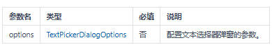
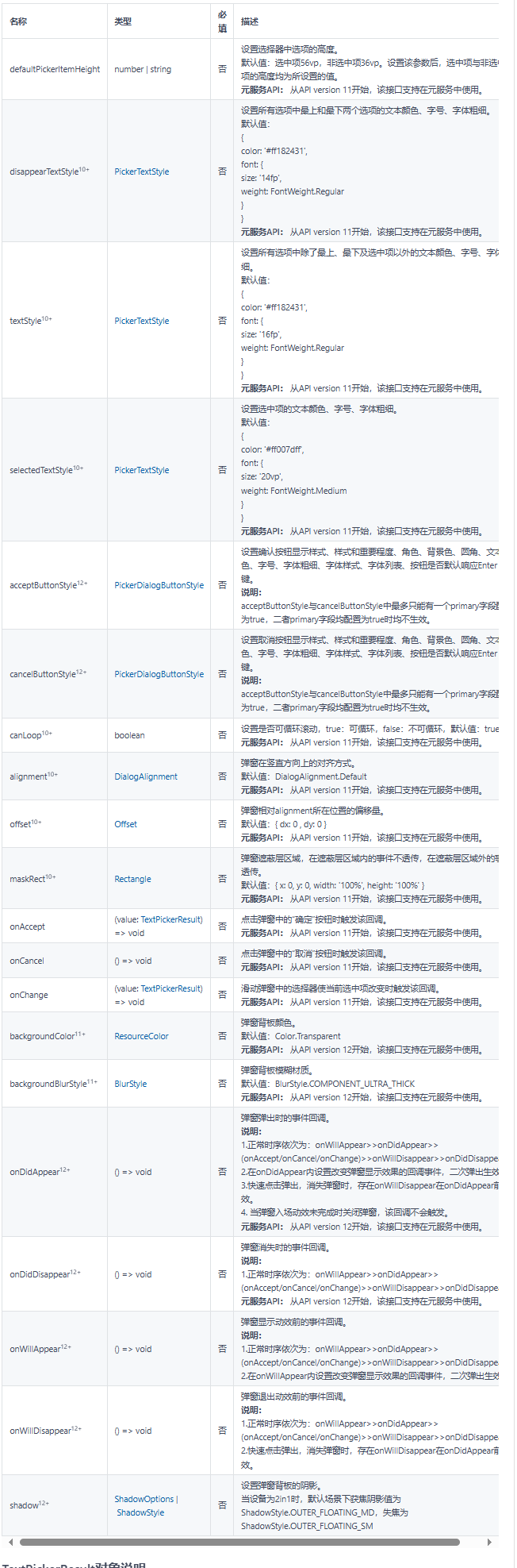
TextPickerDialogOptions对象说明
文本选择器弹窗的参数继承自TextPickerOptions。
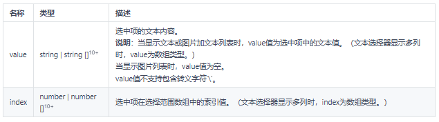
TextPickerResult对象说明
元服务API: 从API version 11开始,该接口支持在元服务中使用。
示例
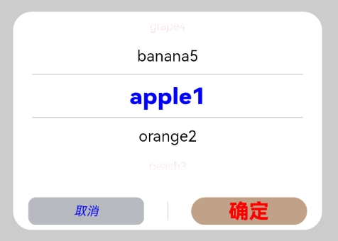
示例1
TextPickerDialog基本使用
// xxx.ets
@Entry
@Component
struct TextPickerDialogExample {
  private select: number | number[] = 0
  private fruits: string[] = ['apple1', 'orange2', 'peach3', 'grape4', 'banana5']
  @State v:string = '';

  build() {
    Row() {
      Column() {
        Button("TextPickerDialog:" + this.v)
          .margin(20)
          .onClick(() => {
            TextPickerDialog.show({
              range: this.fruits,
              selected: this.select,
              disappearTextStyle: {color: Color.Red, font: {size: 15, weight: FontWeight.Lighter}},
              textStyle: {color: Color.Black, font: {size: 20, weight: FontWeight.Normal}},
              selectedTextStyle: {color: Color.Blue, font: {size: 30, weight: FontWeight.Bolder}},
              onAccept: (value: TextPickerResult) => {
                // 设置select为按下确定按钮时候的选中项index,这样当弹窗再次弹出时显示选中的是上一次确定的选项
                this.select = value.index
                console.log(this.select + '')
                // 点击确定后,被选到的文本数据展示到页面
                this.v = value.value as string
                console.info("TextPickerDialog:onAccept()" + JSON.stringify(value))
              },
              onCancel: () => {
                console.info("TextPickerDialog:onCancel()")
              },
              onChange: (value: TextPickerResult) => {
                console.info("TextPickerDialog:onChange()" + JSON.stringify(value))
              },
              onDidAppear: () => {
                console.info("TextPickerDialog:onDidAppear()")
              },
              onDidDisappear: () => {
                console.info("TextPickerDialog:onDidDisappear()")
              },
              onWillAppear: () => {
                console.info("TextPickerDialog:onWillAppear()")
              },
              onWillDisappear: () => {
                console.info("TextPickerDialog:onWillDisappear()")
              }
            })
          })
      }.width('100%')
    }.height('100%')
  }
}

示例2
按钮支持自定义样式
// xxx.ets
@Entry
@Component
struct TextPickerDialogExample {
  private select: number | number[] = 0
  private fruits: string[] = ['apple1', 'orange2', 'peach3', 'grape4', 'banana5']
  @State v:string = '';

  build() {
    Row() {
      Column() {
        Button("TextPickerDialog:" + this.v)
          .margin(20)
          .onClick(() => {
            TextPickerDialog.show({
              range: this.fruits,
              selected: this.select,
              disappearTextStyle: {color: Color.Red, font: {size: 15, weight: FontWeight.Lighter}},
              textStyle: {color: Color.Black, font: {size: 20, weight: FontWeight.Normal}},
              selectedTextStyle: {color: Color.Blue, font: {size: 30, weight: FontWeight.Bolder}},
              acceptButtonStyle: { type: ButtonType.Normal, style: ButtonStyleMode.NORMAL, role: ButtonRole.NORMAL, fontColor: Color.Red,
                fontSize: '26fp', fontWeight: FontWeight.Bolder, fontStyle: FontStyle.Normal, fontFamily: 'sans-serif', backgroundColor:'#80834511',
                borderRadius: 20 },
              cancelButtonStyle: { type: ButtonType.Normal, style: ButtonStyleMode.NORMAL, role: ButtonRole.NORMAL, fontColor: Color.Blue,
                fontSize: '16fp', fontWeight: FontWeight.Normal, fontStyle: FontStyle.Italic, fontFamily: 'sans-serif', backgroundColor:'#50182431',
                borderRadius: 10 },
              onAccept: (value: TextPickerResult) => {
                // 设置select为按下确定按钮时候的选中项index,这样当弹窗再次弹出时显示选中的是上一次确定的选项
                this.select = value.index
                console.log(this.select + '')
                // 点击确定后,被选到的文本数据展示到页面
                this.v = value.value as string
                console.info("TextPickerDialog:onAccept()" + JSON.stringify(value))
              },
              onCancel: () => {
                console.info("TextPickerDialog:onCancel()")
              },
              onChange: (value: TextPickerResult) => {
                console.info("TextPickerDialog:onChange()" + JSON.stringify(value))
              },
              onDidAppear: () => {
                console.info("TextPickerDialog:onDidAppear()")
              },
              onDidDisappear: () => {
                console.info("TextPickerDialog:onDidDisappear()")
              },
              onWillAppear: () => {
                console.info("TextPickerDialog:onWillAppear()")
              },
              onWillDisappear: () => {
                console.info("TextPickerDialog:onWillDisappear()")
              }
            })
          })
      }.width('100%')
    }.height('100%')
  }
}
我这边特意整理了《鸿蒙语法ArkTS、TypeScript、ArkUI、实战开发视频教程》以及《鸿蒙生态应用开发白皮书V2.0PDF》《鸿蒙开发学习手册》(共计890页)鸿蒙开发资料等…希望对大家有所帮助:https://docs.qq.com/doc/DZVVBYlhuRkZQZlB3
鸿蒙语法ArkTS、TypeScript、ArkUI等…视频教程:https://docs.qq.com/doc/DZVVBYlhuRkZQZlB3

OpenHarmony APP开发教程步骤:https://docs.qq.com/doc/DZVVBYlhuRkZQZlB3
鸿蒙生态应用开发白皮书V2.0PDF:https://docs.qq.com/doc/DZVVkRGRUd3pHSnFG

应用开发中级就业技术:https://docs.qq.com/doc/DZVVBYlhuRkZQZlB3

应用开发中高级就业技术:https://docs.qq.com/doc/DZVVBYlhuRkZQZlB3

南北双向高工技能基础:https://docs.qq.com/doc/DZVVBYlhuRkZQZlB3

全网首发-工业级 南向设备开发就业技术:https://docs.qq.com/doc/DZVVBYlhuRkZQZlB3

《鸿蒙开发学习手册》:
如何快速入门:https://docs.qq.com/doc/DZVVBYlhuRkZQZlB3
1.基本概念
2.构建第一个ArkTS应用
3.……

开发基础知识:https://docs.qq.com/doc/DZVVBYlhuRkZQZlB3
1.应用基础知识
2.配置文件
3.应用数据管理
4.应用安全管理
5.应用隐私保护
6.三方应用调用管控机制
7.资源分类与访问
8.学习ArkTS语言
9.……

基于ArkTS 开发:https://docs.qq.com/doc/DZVVBYlhuRkZQZlB3
1.Ability开发
2.UI开发
3.公共事件与通知
4.窗口管理
5.媒体
6.安全
7.网络与链接
8.电话服务
9.数据管理
10.后台任务(Background Task)管理
11.设备管理
12.设备使用信息统计
13.DFX
14.国际化开发
15.折叠屏系列
16.……


 1135
1135

 被折叠的 条评论
为什么被折叠?
被折叠的 条评论
为什么被折叠?
 到【灌水乐园】发言


