


vue3 setup语法使用echarts图表
第一步 安装
npm i echarts --save
第二步 导入echarts
import * as echarts from "echarts";
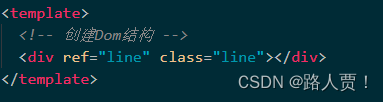
第三步 创建Dom结构
如下图所示
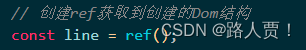
第四步 创建ref获取到创建的Dom结构
如下图所示
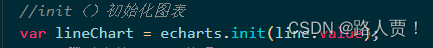
第五步 初始化图表
如下图所示
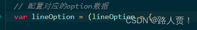
第六步 配置对应的option数据
如下图所示
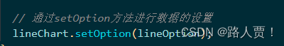
第七步 setOption方法进行数据的设置
如下图所示
整体代码
<template>
  <div ref="line" class="line"></div>
</template>

<script setup>
// 按需引入 echarts
import * as echarts from "echarts";
import { ref, onMounted } from "vue";
const line = ref();
function chart() {
  // 折线图
  var lineChart = echarts.init(line.value);
  var lineOption = (lineOption = {
    tooltip: {
      trigger: "axis",
    },

    legend: {
      textStyle: {
        color: "#4c9bfd", // 图例文字颜色
      },
      right: "10%", // 距离右边10%
      // 如果series 里面设置了name,那么此时图里组件的data可以省略!!!
      // data: ['Email', 'Union Ads']
    },
    grid: {
      top: "20%",
      left: "3%",
      right: "4%",
      bottom: "3%",
      show: true, //显示边框
      borderColor: "#012f4a", // 边框颜色
      containLabel: true,
    },

    xAxis: {
      type: "category",
      boundaryGap: false, // 去除轴内间距
      axisTick: {
        show: false, // 去除刻度线
      },
      axisLabel: {
        color: "#4c9bfd", // 文本颜色
      },
      axisLine: {
        show: false, // 去除轴线
      },
      data: [
        "1月",
        "2月",
        "3月",
        "4月",
        "5月",
        "6月",
        "7月",
        "8月",
        "9月",
        "10月",
        "11月",
        "12月",
      ],
    },
    yAxis: {
      type: "value",
      axisTick: {
        show: false, // 去除刻度
      },
      axisLabel: {
        color: "#4c9bfd", // 文字颜色
      },
      splitLine: {
        lineStyle: {
          color: "#012f4a", // 分割线颜色
        },
      },
    },
    color: ["#00f2f1", "#ed3f35"], //两条曲线改变颜色
    series: [
      {
        name: "预期销售额",
        type: "line",
        smooth: true,
        stack: "总量",
        data: [24, 40, 101, 134, 90, 230, 210, 230, 120, 230, 210, 120],
      },
      {
        name: "实际销售额",
        type: "line",
        smooth: true,
        stack: "总量",
        data: [40, 64, 191, 324, 290, 330, 310, 213, 180, 200, 180, 79],
      },
    ],
  });
  lineChart.setOption(lineOption);
}
onMounted(() => {
  chart();
});
</script>

<style  scoped>
.line {
  width: 500px;
  height: 500px;
}
</style>


 4930
4930


 被折叠的 条评论
为什么被折叠?
被折叠的 条评论
为什么被折叠?
 到【灌水乐园】发言


