


- 不管什么统计图都要用到的 初始化Echarts代码
//下载echarts
npm i echarts --s

//在组件中全局引用
import * as echarts from 'echarts'

//写echarts方法
initEcharts(){
    //绑定div
    let chart = echarts.init(绑定我们想让图表显示的demo上)
    //这里写我们要的统计图表的配置项
    let option = {}
    //把绑定的div和配置项联系起来
    chart.setOption(option);
    //这一步是我们的图表大小随着窗口变化而变化
    window.addEventListener("resize", chart.resize);
}- 两种饼图(这里只写option部分)
- 类似于这种(拿别人的图):
let option = {
      //提示框组件
      tooltip: {
          trigger: 'item',   // trigger 触发方式,放到图形上触发提示
          // 格式化提示内容:a 代表series系列图表名称;b 代表series数据名称 data 里面的name;c 代表series数据值 data 里面的value;d代表 当前数据/总数据的比例
          formatter: "{b} : {c}",
          backgroundColor:'rgba(50,50,50,0.7)',
          borderColor:'rgba(51,51,51)',
          confine: true, // 防止提示框被遮挡
          // 改变标示文字的颜色
          textStyle: {
              color: '#fff'
          }
        },
      //用来控制解释部分
      legend: {
          orient: 'vertical',
          x:'left',
          y:'top'
        },
      // 图表中间
      graphic: {
          type: "group",
          top: "middle",
          left: "center",
          height: 80,
          children: [
              {
                  type: "text",
                  left: "center",
                  top: "20%",
                  style: {
                      text: "种类数量",
                      textAlign: "center",
                      textVerticaAlign: "middle",
                      fill: "#000",  //字体颜色
                      font: "20px Helvetica",
                  }
                },

            ]
        },
       // 控制图表
       series: [
          {
              type: 'pie',  // 图表类型
              radius: ['40%', '80%'],  //第一项是内半径,第二项是外半径(通过它可以实现饼形图大小
              // 图表中心位置 left 50%  top 50%  距离图表DOM容器  在容器中间显示
              center: ["50%", "50%"],
              // 修饰饼形图文字相关的样式 label对象
              label: {
                  show: true,
                  position: 'inner',
                  textStyle : {
                      fontWeight : 300 ,
                      fontSize : 16    //文字的字体大小
                  },
                  formatter: "{b}:{c}",
              },
              // 修饰引导线样式
              labelLine: {
                  show: false
              },
              //data写的是用来展示的数据
              data:[{value:222,name:'xxx'},{value:333,name:'ccc'}]
          }
      ]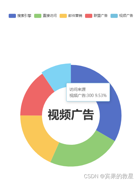
}- 类似于这种(拿别人的图)

let option = {
            //提示框组件
            tooltip: {
              trigger: 'item',   // trigger 触发方式,放到图形上触发提示
              // 格式化提示内容:a 代表series系列图表名称;b 代表series数据名称 data 里面的name;c 代表series数据值 data 里面的value;d代表 当前数据/总数据的比例
              formatter: "{b} : {c}",
              backgroundColor:'rgba(50,50,50,0.7)',
              borderColor:'rgba(51,51,51)',
              confine: true, // 防止提示框被遮挡
              // 改变标示文字的颜色
              textStyle: {
                  color: '#fff'
              }
            },
            //设置标题
            title: {
              text: '问题原因',
              left: 'center',
              top:'3%'
            },
          // 注意颜色写的位置
          color: [
            "#006cff",
            "#60cda0",
            "#ed8884",
            "#ff9f7f"
          ],
          //用来控制解释部分
            legend: {
              bottom: "0",
              left: "center",

            },
          // 控制图表
          series: [
              {
                  type: 'pie',  // 图表类型
                  // 图表中心位置 left 50%  top 50%  距离图表DOM容器  在容器中间显示
                  center: ["50%", "50%"],
                  // 修饰饼形图文字相关的样式 label对象
                  label: {
                      show: true,
                      position: 'inner',
                      title:'问题原因',
                      textStyle : {
                          fontWeight : 300 ,
                          fontSize : 16    //文字的字体大小
                      },
                      formatter: "{c}",
                  },
                  // 修饰引导线样式
                  labelLine: {
                      show: false
                  },
                  data: taskStatusList
              }
          ]
}- 折线图(这里只写option部分)
实例图:

this.option = {
        //表格位置信息
        grid: {
          top:30,
          left:50,
          bottom:30,
          right:50,
        },
        //x轴
        xAxis: {
          type: "category",
          data: ['数据1','数据2','数据3','数据4','数据5'],
          axisLabel: { color: "#fff" },
          axisLine: {
            show: true, // 是否显示坐标轴轴线
            symbol: ["none", "arrow"], // 轴线两端箭头
            symbolSize: [10, 5],
            symbolOffset: 10, //使箭头偏移
            lineStyle: {
              color: "aqua", // 坐标轴线线的颜色
              // width: "5", // 坐标轴线线宽
              width: 2,
              shadowOffsetX: 10,
              shadowColor: "aqua",
            },

          },
          axisTick: {
            show: false
          }
        },
        //y轴
        yAxis: {
          type: "value",
          axisLabel: { color: "#fff",fontSize:'.2rem' }, // 字体颜色
          //给y轴加箭头
          axisLine: {
            show: true,
            symbol: ["none", "arrow"], //加箭头处
            symbolSize: [10, 5],
            symbolOffset: 30, //使箭头偏移
            lineStyle: {
              color: "aqua", //设置y轴的颜色
              width: 2,
              shadowOffsetY: -30, //利用阴影进行反向延长
              shadowColor: "aqua", //设置阴影的颜色
            },
          },
          splitLine: {//网格线
            show: true,//是否显示
            lineStyle: { //网格线样式
              color: 'rgb(233, 234, 235,0.5)',
              type: 'dashed'//网格线类型
            }
          }
        },
        //显示的数据
        series: [
          {
            data: [1,200,345,67,45],
            type: "line",
            symbol:"none",
            itemStyle:{
              normal:{
                lineStyle: {
                  color: "aqua", //改变折线颜色
                },
              }
            }
          },
        ],
};- 柱状图(这里只写option部分)
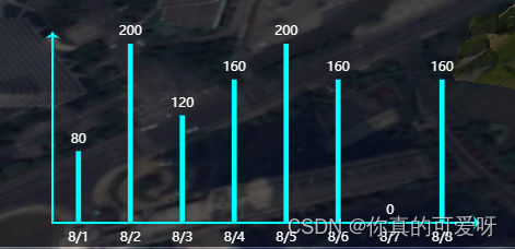
示例图:
this.option={
        //表格位置信息
        grid: {
          top:30,
          left:50,
          bottom:30,
          right:50,
        },
        //x轴
        xAxis: {
          type: "category",
          data:['数据1','数据2','数据3','数据4','数据5'],
          axisLabel: { color: "#fff" },
          axisLine: {
            show: true, // 是否显示坐标轴轴线
            symbol: ["none", "arrow"], // 轴线两端箭头
            symbolSize: [10, 5],
            symbolOffset: 10, //使箭头偏移
            lineStyle: {
              color: "aqua", // 坐标轴线线的颜色
              // width: "5", // 坐标轴线线宽
              width: 2,
              shadowOffsetX: 10,
              shadowColor: "aqua",
            },

          },
          axisTick: {
            show: false
          }
        },
        //y轴
        yAxis: {
          type: "value",
          axisLabel: {
             show:false //是否显示坐标轴的字体
             },
          //给y轴加箭头
          axisLine: {
            show: true,
            symbol: ["none", "arrow"], //加箭头处
            symbolSize: [10, 5],
            symbolOffset: 10, //使箭头偏移
            lineStyle: {
              color: "aqua", //设置y轴的颜色
              width: 2,
              shadowOffsetY: -10, //利用阴影进行反向延长
              shadowColor: "aqua", //设置阴影的颜色
            },
          },
          splitLine: {//网格线
            show: false,//是否显示
            // lineStyle: { //网格线样式
            //   color: 'rgb(233, 234, 235,0.5)',
            //   type: 'dashed'//网格线类型
            // }
          }
        },
        //显示的数据
        series: [
          {
            data: [1,2,3,4,5],
            type: "bar",
            symbol:"none",
            barWidth:"10%",
            color: "aqua",
            label: {
              // 柱状图上方文本标签,默认展示数值信息
              show: true,
              position: "top",
              color:'#fff',
            }
          },
        ],
      }


 3124
3124


 被折叠的 条评论
为什么被折叠?
被折叠的 条评论
为什么被折叠?
 到【灌水乐园】发言


