


今天没上什么新内容,还是分享一下自己写过的东西吧
用HTML实现城市场景动画:
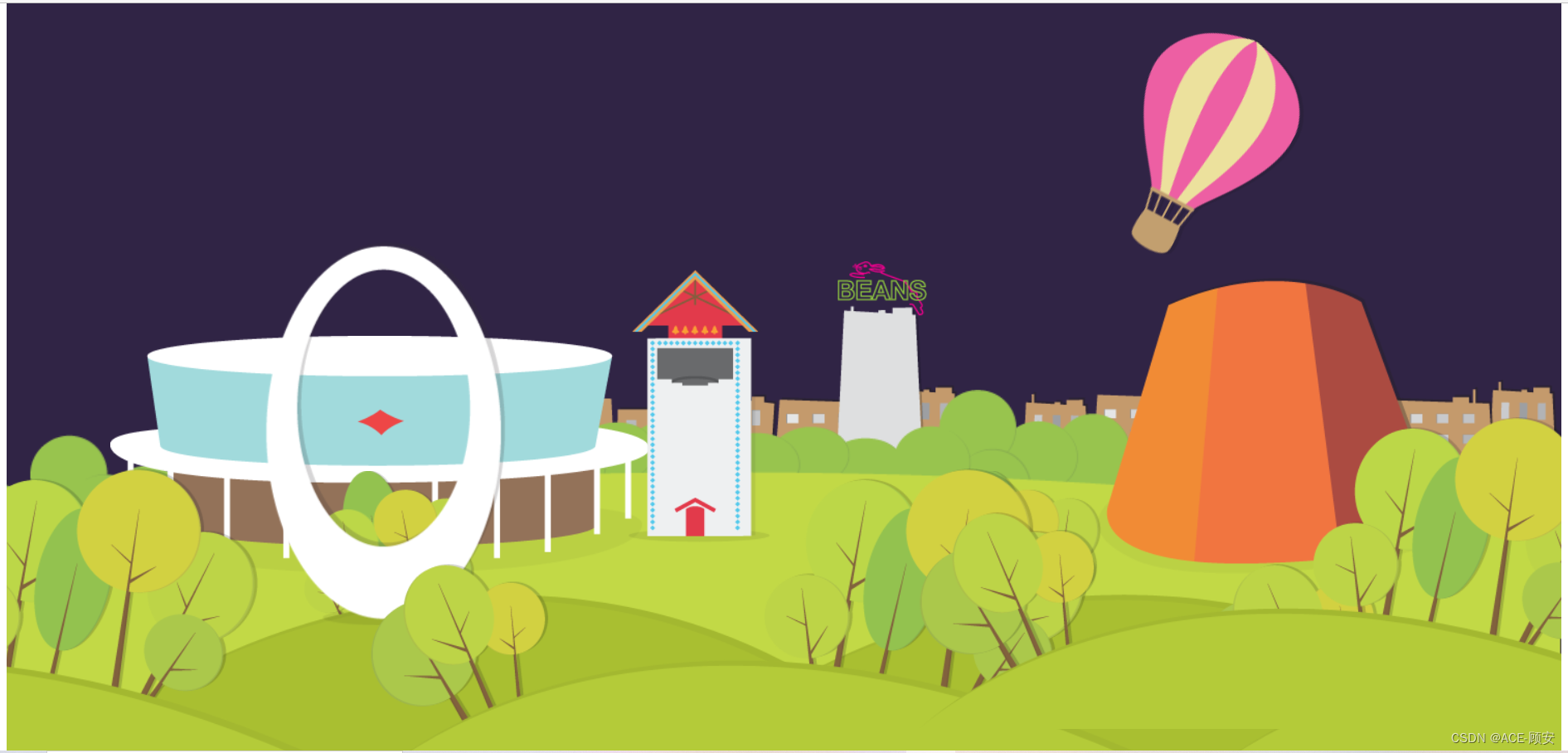
效果图
代码
<!DOCTYPE html>
<html lang="en">
<head>
	<meta charset="UTF-8">
	<meta name="viewport" content="width=device-width, initial-scale=1.0">
	<title>城市场景动画</title>
	<style>
		*{
			margin: 0;
			padding: 0;
		}
		/* 整体 */
		div{
			width: 1500px;
			height: 750px;
			background: white;
			position: relative;
			overflow: hidden;
			margin: 0 auto;
			animation: setting 50s infinite;
		}
		/* 第一张图片 */
		.photo_1{
			position: absolute;
			width: 1500px;
			bottom: 20px;
			z-index: 1;
		}
		/* 第二张极其附属 */
		.photo_2{
			position: absolute;
			left:1150px;
			bottom: 0px;
			z-index: 3;
		}

		.photo_2_2{
			position: absolute;
			right:350px;
			bottom: 0px;
			z-index: 3;
		}
		.photo_2_3{
			position: absolute;
			right:1150px;
			bottom: 0px;
			z-index: 3;

		}

		.photo_2_4{
			position: absolute;
			bottom: 50px;
			right: -180px;
			z-index: 5;
		}
		/* 第三张极其附属 */
		.photo_3{
			position: absolute;
			right:0px;
			bottom: 0px;
			z-index: 2;

		}
		.photo_3_2{
			position: absolute;
			right:600px;
			bottom: 0px;
			z-index: 2;

		}
		/* 第四张 */
		.photo_4{
			position: absolute;
			bottom: 200px;
			right: 100px;
			z-index: 1;
		}
		/* 第五张极其附属 */
		.photo_5{
			position: absolute;
			bottom: 240px;
			right: 0px;
			z-index: 0;
		}
		.photo_5_2{
			position: absolute;
			bottom: 240px;
			left: 400px;
			z-index: 0;
		}
		/* 第六张 */
		.photo_6{
			position: absolute;
			left: 250px;
			bottom: 150px;
			z-index: 2;
		}
		/* 第七张 */
		.photo_7{
			position: absolute;
			left: 100px;
			bottom: 200px;
			z-index: 1;
		}
		/* 第八张 */
		.photo_8{
			position: absolute;
			left: 600px;
			bottom: 230px;
			z-index: 1;
		}
		/* 第九张 */
		.photo_9{
			position: absolute;
			left: 800px;
			bottom: 300px;
			z-index: 0;
		}
		/* 第十张 */
		.photo_10{
			position: absolute;
			bottom: 500px;
			animation: move 50s infinite;
			z-index: 1;
		}
	     /* 热气球动画效果 */
		@keyframes move{
			0%{
				transform: translateX(1420px);
			}
			13%{
				transform: translateX(1050px) rotate(30deg);
			}
			26%{
				transform: translateX(680px) rotate(60deg);
			}
			39%{
				transform: translateX(310px) rotate(30deg);
			}
			50%{
				transform: translateX(-80px);
			}
			61%{
				transform: translateX(310px) rotate(30deg);
			}
			74%{
				transform: translateX(680px) rotate(60deg);
			}
			87%{
				transform: translateX(1050px) rotate(30deg);
			}
			100%{
				transform: translateX(1420px) ;
			}
		}
		/* 背景动画效果 */
			@keyframes setting{
			0%{
				background-color: #5A436C;
			}
			13%{
				background-color: #2D2242;
			}
			26%{
				background-color: #6F6366;
			}
			39%{
				background-color: #DDCCC2;
			}
			50%{
				background-color: #B9C6D1
			}
			61%{
				background-color: #DDCCC2;
			}
			74%{
				background-color: #6F6366;
			}
			87%{
				background-color: #2D2242;
			}
			100%{
				background-color: #5A436C;
			}
		}
	</style>
</head>
<body>
	<div>
	<img class="photo_1" src="./作业3:城市场景动画/images/groundBack.png" alt="">
	<img class="photo_2" src="./作业3:城市场景动画/images/groundFront.png" alt="">
	<img class="photo_2_2" src="./作业3:城市场景动画/images/groundFront.png" alt="">
	<img class="photo_2_3" src="./作业3:城市场景动画/images/groundFront.png" alt="">
	<img class="photo_2_4" src="./作业3:城市场景动画/images/groundFront.png" alt="">
	<img class="photo_3" src="./作业3:城市场景动画/images/groundMid.png" alt="">
	<img class="photo_3_2" src="./作业3:城市场景动画/images/groundMid.png" alt="">
	<img class="photo_4" src="./作业3:城市场景动画/images/Planetarium.png" alt="">
	<img class="photo_5" src="./作业3:城市场景动画/images/skyline.png" alt="" >
	<img class="photo_5_2" src="./作业3:城市场景动画/images/skyline.png" alt="">
	<img  class="photo_6" src="./作业3:城市场景动画/images/friendshipShell.png" alt="">
	<img class="photo_7" src="./作业3:城市场景动画/images/dowEventCenter.png" alt="">
	<img class="photo_8" src="./作业3:城市场景动画/images/Glockenspiel.png" alt="">
	<img class="photo_9" src="./作业3:城市场景动画/images/beans.png" alt="" >
	<img  class="photo_10" src="./作业3:城市场景动画/images/balloon.png" alt="">

</div>
</body>
</html>
希望能得到一些指正,谢谢


 154
154


 被折叠的 条评论
为什么被折叠?
被折叠的 条评论
为什么被折叠?
 到【灌水乐园】发言


