


目录
(1)如果9个值中没有auto,则自动调整right值以使等式满足
1.语法
水平方向9个值相加必须要等于父元素的内容的宽高,否则浏览器就会自动调整,这个过程
还是叫过渡约束
2.水平方向的九个值
当开启决定定位后,水平方向的布局等式就会加上left,right两个值此时规则和之前一样,只是多添加了两个值:
left+margin-left+border-left+padding-left+width+
padding-right+border-right+margin-right+right
3.元素布局
当发生过度约束时
(1)如果9个值中没有auto,则自动调整right值以使等式满足
意思是9个值如果都有固定值,会自动调整right值直到right+其余八个值等于父元素内容区的宽高
(2)如果有auto,则自动调整auto的值以使等式满足
可以设置为auto值的为
margin width left right
a 一个auto的情况
四个值中,三个值固定,某一个值设为auto,则会调整这个auto值,若width left right top bottm都为固定值,margin会均分四个方向值,让元素水平垂直居中
 设置内容区:
 .box1 {
        width: 400px;
        height: 400px;
        background-color: palegreen;
        position: relative;
      }
.box2 {
        width: 100px;
        height: 100px;
        background-color: orange;
        /* 在定位的情况下,元素水平垂直居中的方式 */
        position: absolute;
        margin: auto;
        left: 0;
        right: 0;
        top: 0;
        bottom: 0;
      }
内容区:
   <div class="box1">
      <div class="box2">box2</div>
    </div>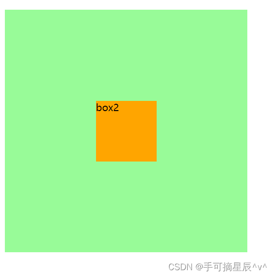
如图所示:黄色盒子水平垂直居中在了绿色盒子的中间, 因为width left right top bottm都为固定值,所以margin均分了四个方向的值
b 两个auto的情况
margin 和width为auto, 调整width
设置内容区:
.box1 {
width: 400px;
height: 400px;
background-color: palegreen;
position: relative;
}
.box2 {
width: auto;
height: 100px;
background-color: orange;
/* 在定位的情况下,元素水平垂直居中的方式 */
position: absolute;
margin: auto;
left: 0;
right: 0;
top: 0;
bottom: 0;
}
内容区:
<div class="box1">
<div class="box2">box2</div>
</div>
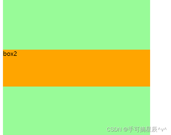
如图所示: margin 和width为auto, 调整width直到和父元素一样,所以黄色盒子和绿色黑子一样宽
margin 和left,right其中一个值为auto,调整left或right
例如margin 和left值为auto
设置内容区:
.box1 {
width: 400px;
height: 400px;
background-color: palegreen;
position: relative;
}
.box2 {
width: 100px;
height: 100px;
background-color: orange;
/* 在定位的情况下,元素水平垂直居中的方式 */
position: absolute;
margin: auto;
left: auto;
right: 0;
top: 0;
bottom: 0;
}
内容区:
<div class="box1">
<div class="box2">box2</div>
</div>
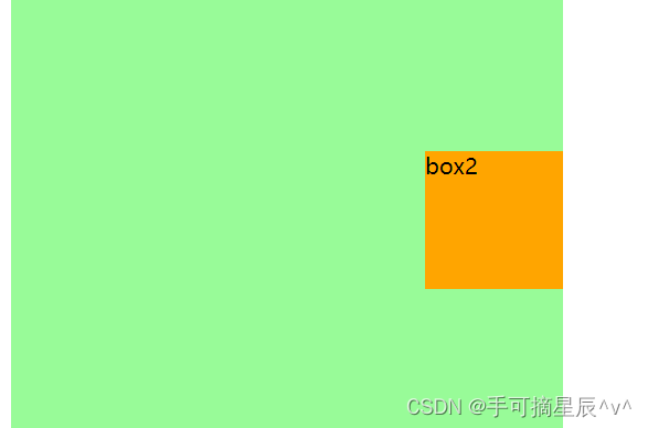
如图所示: margin 和left值为auto,调整left值,所以就把黄色盒子挤到最右边了
width 和left,right其中一个值,调整left或right
例如width 和left值为auto
设置内容区:
.box1 {
width: 400px;
height: 400px;
background-color: palegreen;
position: relative;
}
.box2 {
width: auto;
height: 100px;
background-color: orange;
/* 在定位的情况下,元素水平垂直居中的方式 */
position: absolute;
margin: 0;
left: auto;
right: 0;
top: 0;
bottom: 0;
}
内容区:
<div class="box1">
<div class="box2">box2</div>
</div>

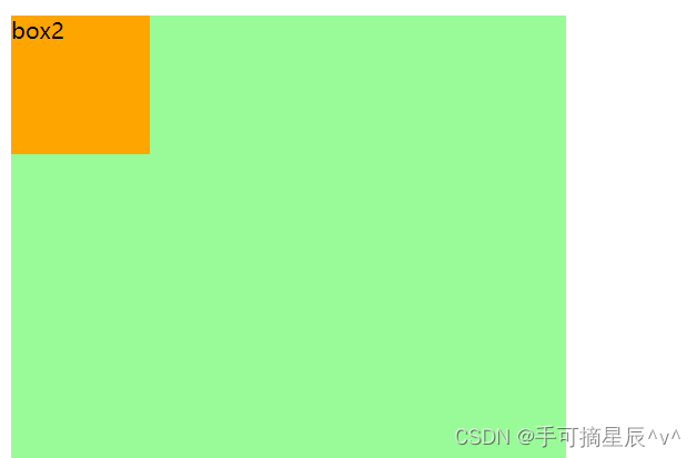
如图所示:width 和left值为auto,调整left,所以就把黄色盒子挤到最右边了,因为不调整width值,所以黄色盒子的大小是被内容所撑开的
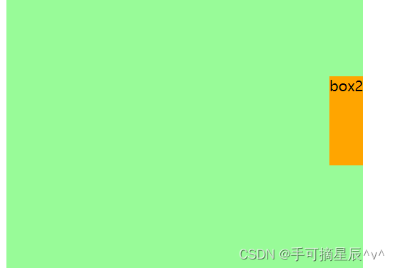
left,right都为auto 调整right
设置内容区:
.box1 {
width: 400px;
height: 400px;
background-color: palegreen;
position: relative;
}
.box2 {
width: 100px;
height: 100px;
background-color: orange;
/* 在定位的情况下,元素水平垂直居中的方式 */
position: absolute;
margin: 0;
left: auto;
right: auto;
top: 0;
bottom: 0;
}
内容区:
<div class="box1">
<div class="box2">box2</div>
</div>
如图所示: left,right都为auto , 调整right值,所以把黄色盒子挤到了最左边
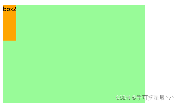
c 三个auto的情况
margin width left ===> 调整left
设置内容区:
.box1 {
width: 400px;
height: 400px;
background-color: palegreen;
position: relative;
}
.box2 {
width: auto;
height: 100px;
background-color: orange;
/* 在定位的情况下,元素水平垂直居中的方式 */
position: absolute;
margin:auto;
left: auto;
right: 0;
top: 0;
bottom: 0;
}
内容区:
<div class="box1">
<div class="box2">box2</div>
</div>
如图所示: margin width left的值都为auto,调整left,所以黄色盒子被挤到了最左边且不调整width值,所以黄色盒子的大小被内容所撑开
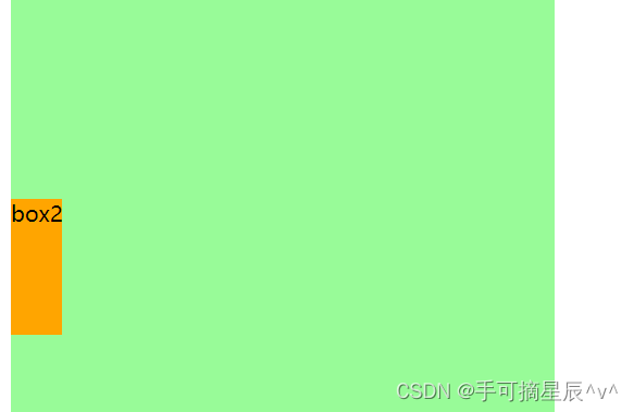
margin width right ===> 调整right
意思是:right优先级比width和right高,所以调整right,黄色盒子会被挤到最左边且大小被内容所撑开
width left right ===> 调整right
设置内容区:
.box1 {
width: 400px;
height: 400px;
background-color: palegreen;
position: relative;
}
.box2 {
width: auto;
height: 100px;
background-color: orange;
/* 在定位的情况下,元素水平垂直居中的方式 */
position: absolute;
margin:0;
left: auto;
right: auto;
top: 0;
bottom: 0;
}
内容区:
<div class="box1">
<div class="box2">box2</div>
</div>
如图所示: width left right 都为auto, 调整right值,所以黄色盒子被挤到最左边且大小被内容撑开
d 四个值auto的情况
margin,width,right,left,调整right
设置内容区:
.box1 {
width: 400px;
height: 400px;
background-color: palegreen;
position: relative;
}
.box2 {
width: auto;
height: 100px;
background-color: orange;
/* 在定位的情况下,元素水平垂直居中的方式 */
position: absolute;
margin:auto;
left: auto;
right: auto;
top: 0;
bottom: 0;
}
内容区:
<div class="box1">
<div class="box2">box2</div>
</div>
如图所示:margin,width,right,left值都为auto,调整right值,所以黄色盒子被挤到最左边且大小被内容撑开
4.水平方向总结
只要right为auto,那就调整right
right>left>width>margin


 394
394


 被折叠的 条评论
为什么被折叠?
被折叠的 条评论
为什么被折叠?
 到【灌水乐园】发言


