


往期鸿蒙5.0全套实战文章必看:(文中附带鸿蒙5.0全栈学习资料)
Flex布局
说明
flexBasis
flexBasis(value: number | string)
设置组件的基准尺寸。
卡片能力: 从API version 9开始,该接口支持在ArkTS卡片中使用。
元服务API: 从API version 11开始,该接口支持在元服务中使用。
系统能力: SystemCapability.ArkUI.ArkUI.Full
参数:
| 参数名 | 类型 | 必填 | 说明 |
|---|---|---|---|
| value | number | string | 是 | 设置组件在父容器主轴方向上的基准尺寸。 默认值:'auto'(表示组件在主轴方向上的基准尺寸为组件原本的大小)。 string类型可选值:可以转化为数字的字符串(如'10')或带长度单位的字符串(如'10px')或'auto',不允许设置百分比字符串。 number:取值范围(0,+∞),单位为vp。 异常值:默认为'auto'。 |
flexGrow
flexGrow(value: number)
设置组件在父容器的剩余空间所占比例。
卡片能力: 从API version 9开始,该接口支持在ArkTS卡片中使用。
元服务API: 从API version 11开始,该接口支持在元服务中使用。
系统能力: SystemCapability.ArkUI.ArkUI.Full
参数:
| 参数名 | 类型 | 必填 | 说明 |
|---|---|---|---|
| value | number | 是 | 设置父容器在主轴方向上的剩余空间分配给此属性所在组件的比例。 默认值:0 |
flexShrink
flexShrink(value: number)
设置父容器压缩尺寸分配给此属性所在组件的比例。当父容器为Column、Row时,需设置主轴方向的尺寸。
卡片能力: 从API version 9开始,该接口支持在ArkTS卡片中使用。
元服务API: 从API version 11开始,该接口支持在元服务中使用。
系统能力: SystemCapability.ArkUI.ArkUI.Full
参数:
| 参数名 | 类型 | 必填 | 说明 |
|---|---|---|---|
| value | number | 是 | 设置父容器压缩尺寸分配给此属性所在组件的比例。 父容器为Flex时,默认值:1 constraintSize限制组件的尺寸范围,Column和Row即使设置了constraintSize,在未设置主轴尺寸(width/height/size)时仍遵守默认布局行为,在主轴上自适应子组件尺寸,此时flexShrink不生效。 |
alignSelf
alignSelf(value: ItemAlign)
子组件在父容器交叉轴的对齐格式。
卡片能力: 从API version 9开始,该接口支持在ArkTS卡片中使用。
元服务API: 从API version 11开始,该接口支持在元服务中使用。
系统能力: SystemCapability.ArkUI.ArkUI.Full
参数:
| 参数名 | 类型 | 必填 | 说明 |
|---|---|---|---|
| value | ItemAlign | 是 | 子组件在父容器交叉轴的对齐格式,会覆盖Flex、Column、Row、GridRow布局容器中的alignItems设置。 GridCol可以绑定alignsSelf属性来改变它自身在交叉轴方向上的布局。 默认值:ItemAlign.Auto |
示例
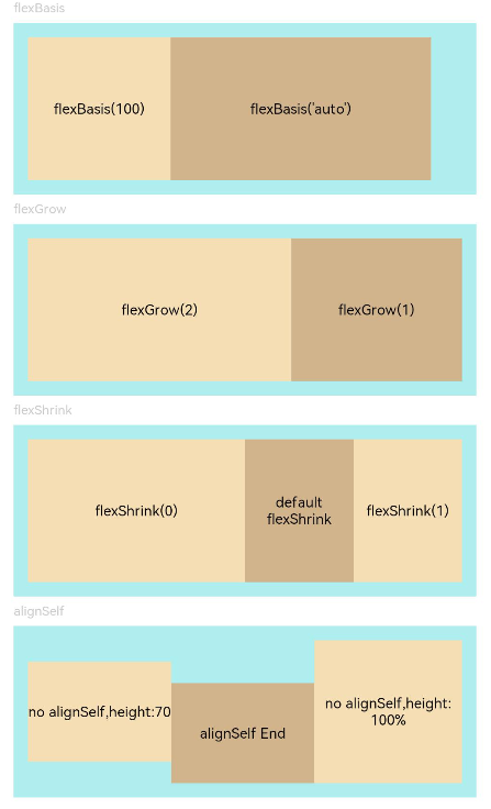
通过配置flexBasis/flexGrow/flexShrink/alignSelf属性设置Flex布局。
// xxx.ets
@Entry
@Component
struct FlexExample {
  build() {
    Column({ space: 5 }) {
      Text('flexBasis').fontSize(9).fontColor(0xCCCCCC).width('90%')
      // 基于主轴的基准尺寸
      // flexBasis()值可以是字符串'auto',表示基准尺寸是元素本来的大小,也可以是长度设置,相当于.width()/.height()
      Flex() {
        Text('flexBasis(100)')
          .flexBasis(100) // 这里表示宽度为100vp
          .height(100)
          .backgroundColor(0xF5DEB3)
          .textAlign(TextAlign.Center)
        Text(`flexBasis('auto')`)
          .flexBasis('auto') // 这里表示宽度保持原本设置的60%的宽度
          .width('60%')
          .height(100)
          .backgroundColor(0xD2B48C)
          .textAlign(TextAlign.Center)
      }.width('90%').height(120).padding(10).backgroundColor(0xAFEEEE)

      Text('flexGrow').fontSize(9).fontColor(0xCCCCCC).width('90%')
      // flexGrow()表示剩余空间分配给该元素的比例
      Flex() {
        Text('flexGrow(2)')
          .flexGrow(2) // 父容器分配给该Text的宽度为剩余宽度的2/3
          .height(100)
          .backgroundColor(0xF5DEB3)
          .textAlign(TextAlign.Center)
        Text('flexGrow(1)')
          .flexGrow(1) // 父容器分配给该Text的宽度为剩余宽度的1/3
          .height(100)
          .backgroundColor(0xD2B48C)
          .textAlign(TextAlign.Center)
      }.width('90%').height(120).padding(10).backgroundColor(0xAFEEEE)

      Text('flexShrink').fontSize(9).fontColor(0xCCCCCC).width('90%')
      // flexShrink()表示该元素的压缩比例,基于超出的总尺寸进行计算
      // 第一个text压缩比例是0,另外两个都是1,因此放不下时等比例压缩后两个,第一个不压缩
      Flex({ direction: FlexDirection.Row }) {
        Text('flexShrink(0)')
          .flexShrink(0)
          .width('50%')
          .height(100)
          .backgroundColor(0xF5DEB3)
          .textAlign(TextAlign.Center)
        Text('default flexShrink') // 默认值为1
          .width('40%')
          .height(100)
          .backgroundColor(0xD2B48C)
          .textAlign(TextAlign.Center)
        Text('flexShrink(1)')
          .flexShrink(1)
          .width('40%')
          .height(100)
          .backgroundColor(0xF5DEB3)
          .textAlign(TextAlign.Center)
      }.width('90%').height(120).padding(10).backgroundColor(0xAFEEEE)

      Text('alignSelf').fontSize(9).fontColor(0xCCCCCC).width('90%')
      // alignSelf会覆盖Flex布局容器中的alignItems设置
      Flex({ direction: FlexDirection.Row, alignItems: ItemAlign.Center }) {
        Text('no alignSelf,height:70')
          .width('33%')
          .height(70)
          .backgroundColor(0xF5DEB3)
          .textAlign(TextAlign.Center)
        Text('alignSelf End')
          .alignSelf(ItemAlign.End)
          .width('33%')
          .height(70)
          .backgroundColor(0xD2B48C)
          .textAlign(TextAlign.Center)
        Text('no alignSelf,height:100%')
          .width('34%')
          .height('100%')
          .backgroundColor(0xF5DEB3)
          .textAlign(TextAlign.Center)
      }.width('90%').height(120).padding(10).backgroundColor(0xAFEEEE)
    }.width('100%').margin({ top: 5 })
  }
}


 扫一扫
扫一扫


 被折叠的 条评论
为什么被折叠?
被折叠的 条评论
为什么被折叠?
 到【灌水乐园】发言


