


往期鸿蒙5.0全套实战文章必看:(文中附带鸿蒙5.0全栈学习资料)
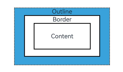
外描边设置
设置组件外描边(outline)样式。外描边绘制在组件的外侧,不影响布局,不会占用组件本身大小。
说明
从API Version 11开始支持。后续版本如有新增内容,则采用上角标单独标记该内容的起始版本。
outline
outline(value: OutlineOptions)
统一外描边样式设置接口。
卡片能力: 从API version 11开始,该接口支持在ArkTS卡片中使用。
元服务API: 从API version 12开始,该接口支持在元服务中使用。
系统能力: SystemCapability.ArkUI.ArkUI.Full
参数:
| 参数名 | 类型 | 必填 | 说明 |
|---|---|---|---|
| value | OutlineOptions | 是 | 外描边样式。 |
OutlineStyle11+枚举说明
外描边样式。
卡片能力: 从API version 11开始,该接口支持在ArkTS卡片中使用。
元服务API: 从API version 12开始,该接口支持在元服务中使用。
系统能力: SystemCapability.ArkUI.ArkUI.Full
| 名称 | 说明 |
|---|---|
| SOLID | 显示为一条实线。 |
| DASHED | 显示为一系列短的方形虚线。 |
| DOTTED | 显示为一系列圆点,圆点半径为outlineWidth的一半。 |
outlineStyle
outlineStyle(value: OutlineStyle | EdgeOutlineStyles)
设置元素的外描边样式。
卡片能力: 从API version 11开始,该接口支持在ArkTS卡片中使用。
元服务API: 从API version 12开始,该接口支持在元服务中使用。
系统能力: SystemCapability.ArkUI.ArkUI.Full
参数:
| 参数名 | 类型 | 必填 | 说明 |
|---|---|---|---|
| value | OutlineStyle | EdgeOutlineStyles | 是 | 设置元素的外描边样式。 默认值:OutlineStyle.SOLID |
outlineWidth
outlineWidth(value: Dimension | EdgeOutlineWidths)
设置元素的外描边宽度。
卡片能力: 从API version 11开始,该接口支持在ArkTS卡片中使用。
元服务API: 从API version 12开始,该接口支持在元服务中使用。
系统能力: SystemCapability.ArkUI.ArkUI.Full
参数:
| 参数名 | 类型 | 必填 | 说明 |
|---|---|---|---|
| value | Dimension | EdgeOutlineWidths | 是 | 设置元素的外描边宽度,不支持百分比。 默认值:0,外描边效果width为必设项。 |
outlineColor
outlineColor(value: ResourceColor | EdgeColors)
设置元素的外描边颜色。
卡片能力: 从API version 11开始,该接口支持在ArkTS卡片中使用。
元服务API: 从API version 12开始,该接口支持在元服务中使用。
系统能力: SystemCapability.ArkUI.ArkUI.Full
参数:
| 参数名 | 类型 | 必填 | 说明 |
|---|---|---|---|
| value | ResourceColor | EdgeColors | 是 | 设置元素的外描边颜色。 默认值:Color.Black。 |
outlineRadius
outlineRadius(value: Dimension | OutlineRadiuses)
设置元素的外描边圆角半径。
卡片能力: 从API version 11开始,该接口支持在ArkTS卡片中使用。
元服务API: 从API version 12开始,该接口支持在元服务中使用。
系统能力: SystemCapability.ArkUI.ArkUI.Full
参数:
| 参数名 | 类型 | 必填 | 说明 |
|---|---|---|---|
| value | Dimension | OutlineRadiuses | 是 | 设置元素的外描边圆角半径,不支持百分比。 默认值:0。 最大生效值:组件width/2 + outlineWidth或组件height/2 + outlineWidth。 |
OutlineOptions对象说明
元服务API: 从API version 12开始,该接口支持在元服务中使用。
卡片能力: 从API version 12开始,该接口支持在ArkTS卡片中使用。
| 名称 | 类型 | 必填 | 说明 |
|---|---|---|---|
| width | Dimension | EdgeOutlineWidths | 否 | 设置外描边宽度,不支持百分比。 默认值:0,外描边效果width为必设项,否则不显示外描边。 |
| color | ResourceColor | EdgeColors | LocalizedEdgeColors12+ | 否 | 设置外描边颜色。 默认值:Color.Black。 |
| radius | Dimension | OutlineRadiuses | 否 | 设置外描边圆角半径,不支持百分比。 默认值:0。 最大生效值:组件width/2 + outlineWidth或组件height/2 + outlineWidth。 |
| style | OutlineStyle | EdgeOutlineStyles | 否 | 设置外描边样式。 默认值:OutlineStyle.SOLID。 |
EdgeOutlineWidths对象说明
引入该对象时,至少传入一个参数。
元服务API: 从API version 12开始,该接口支持在元服务中使用。
卡片能力: 从API version 12开始,该接口支持在ArkTS卡片中使用。
| 名称 | 参数类型 | 必填 | 描述 |
|---|---|---|---|
| left | Dimension | 否 | 左侧外描边宽度。 |
| right | Dimension | 否 | 右侧外描边宽度。 |
| top | Dimension | 否 | 上侧外描边宽度。 |
| bottom | Dimension | 否 | 下侧外描边宽度。 |
EdgeColors对象说明
引入该对象时,至少传入一个参数。
元服务API: 从API version 11开始,该接口支持在元服务中使用。
系统能力: SystemCapability.ArkUI.ArkUI.Full
卡片能力: 从API version 12开始,该接口支持在ArkTS卡片中使用。
| 名称 | 参数类型 | 必填 | 描述 |
|---|---|---|---|
| left | ResourceColor | 否 | 左侧外描边颜色。 |
| right | ResourceColor | 否 | 右侧外描边颜色。 |
| top | ResourceColor | 否 | 上侧外描边颜色。 |
| bottom | ResourceColor | 否 | 下侧外描边颜色。 |
LocalizedEdgeColors对象说明12+
引入该对象时,至少传入一个参数。
元服务API: 从API version 12开始,该接口支持在元服务中使用。
卡片能力: 从API version 12开始,该接口支持在ArkTS卡片中使用。
| 名称 | 参数类型 | 必填 | 描述 |
|---|---|---|---|
| start | ResourceColor | 否 | 左侧外描边颜色。 从左至右显示语言模式下为右侧外描边颜色。 |
| end | ResourceColor | 否 | 右侧外描边颜色。 从左至右显示语言模式下为左侧外描边颜色。 |
| top | ResourceColor | 否 | 上侧外描边颜色。 |
| bottom | ResourceColor | 否 | 下侧外描边颜色。 |
OutlineRadiuses对象说明
引用该对象时,至少传入一个参数。
元服务API: 从API version 12开始,该接口支持在元服务中使用。
卡片能力: 从API version 12开始,该接口支持在ArkTS卡片中使用。
| 名称 | 参数类型 | 必填 | 描述 |
|---|---|---|---|
| topLeft | Dimension | 否 | 左上角圆角半径。 |
| topRight | Dimension | 否 | 右上角圆角半径。 |
| bottomLeft | Dimension | 否 | 左下角圆角半径。 |
| bottomRight | Dimension | 否 | 右下角圆角半径。 |
EdgeOutlineStyles对象说明
引入该对象时,至少传入一个参数。
元服务API: 从API version 12开始,该接口支持在元服务中使用。
卡片能力: 从API version 12开始,该接口支持在ArkTS卡片中使用。
| 名称 | 参数类型 | 必填 | 描述 |
|---|---|---|---|
| left | OutlineStyle | 否 | 左侧外描边样式。 |
| right | OutlineStyle | 否 | 右侧外描边样式。 |
| top | OutlineStyle | 否 | 上侧外描边样式。 |
| bottom | OutlineStyle | 否 | 下侧外描边样式。 |
示例
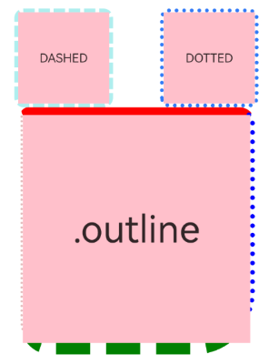
示例1(使用外描边属性)
该示例主要演示如何通过outline来实现组件外描边。
// xxx.ets
@Entry
@Component
struct OutlineExample {
  build() {
    Column() {
      Flex({ justifyContent: FlexAlign.SpaceAround, alignItems: ItemAlign.Center }) {
        // 线段
        Text('DASHED')
          .backgroundColor(Color.Pink)
          .outlineStyle(OutlineStyle.DASHED).outlineWidth(5).outlineColor(0xAFEEEE).outlineRadius(10)
          .width(120).height(120).textAlign(TextAlign.Center).fontSize(16)
        // 点线
        Text('DOTTED')
          .backgroundColor(Color.Pink)
          .outline({ width: 5, color: 0x317AF7, radius: 10, style: OutlineStyle.DOTTED })
          .width(120).height(120).textAlign(TextAlign.Center).fontSize(16)
      }.width('100%').height(150)

      Text('.outline')
        .backgroundColor(Color.Pink)
        .fontSize(50)
        .width(300)
        .height(300)
        .outline({
          width: { left: 3, right: 6, top: 10, bottom: 15 },
          color: { left: '#e3bbbb', right: Color.Blue, top: Color.Red, bottom: Color.Green },
          radius: { topLeft: 10, topRight: 20, bottomLeft: 40, bottomRight: 80 },
          style: {
            left: OutlineStyle.DOTTED,
            right: OutlineStyle.DOTTED,
            top: OutlineStyle.SOLID,
            bottom: OutlineStyle.DASHED
          }
        }).textAlign(TextAlign.Center)
    }
  }
}
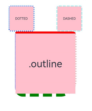
示例2(使用LocalizedEdgeColors类型)
该示例将outline属性中的color属性值设置为LocalizedEdgeColors类型。
// xxx.ets
@Entry
@Component
struct OutlineExample {
build() {
Column() {
Flex({ justifyContent: FlexAlign.SpaceAround, alignItems: ItemAlign.Center }) {
// 线段
Text('DASHED')
.backgroundColor(Color.Pink)
.outlineStyle(OutlineStyle.DASHED).outlineWidth(5).outlineColor(0xAFEEEE).outlineRadius(10)
.width(120).height(120).textAlign(TextAlign.Center).fontSize(16)
// 点线
Text('DOTTED')
.backgroundColor(Color.Pink)
.outline({ width: 5, color: 0x317AF7, radius: 10, style: OutlineStyle.DOTTED })
.width(120).height(120).textAlign(TextAlign.Center).fontSize(16)
}.width('100%').height(150)
Text('.outline')
.backgroundColor(Color.Pink)
.fontSize(50)
.width(300)
.height(300)
.outline({
width: { left: 3, right: 6, top: 10, bottom: 15 },
color: { start: '#e3bbbb', end: Color.Blue, top: Color.Red, bottom: Color.Green },
radius: { topLeft: 10, topRight: 20, bottomLeft: 40, bottomRight: 80 },
style: {
left: OutlineStyle.DOTTED,
right: OutlineStyle.DOTTED,
top: OutlineStyle.SOLID,
bottom: OutlineStyle.DASHED
}
}).textAlign(TextAlign.Center)
}
}
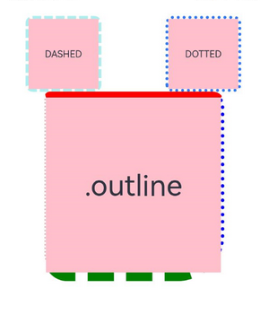
}从左至右显示语言示例图
从右至左显示语言示例图


 扫一扫
扫一扫


 761
761

 被折叠的 条评论
为什么被折叠?
被折叠的 条评论
为什么被折叠?
 到【灌水乐园】发言


