


往期鸿蒙5.0全套实战文章必看:(文中附带鸿蒙5.0全栈学习资料)
Rating
提供在给定范围内选择评分的组件。
说明
该组件从API Version 7开始支持。后续版本如有新增内容,则采用上角标单独标记该内容的起始版本。
子组件
无
接口
Rating(options?: { rating: number, indicator?: boolean })
卡片能力: 从API version 9开始,该接口支持在ArkTS卡片中使用。
元服务API: 从API version 11开始,该接口支持在元服务中使用。
系统能力: SystemCapability.ArkUI.ArkUI.Full
参数:
| 参数名 | 类型 | 必填 | 说明 |
|---|---|---|---|
| rating | number | 是 | 设置并接收评分值。 默认值:0 取值范围: [0, stars] 小于0取0,大于stars取最大值stars。 从API version 10开始,该参数支持$$双向绑定变量。 |
| indicator | boolean | 否 | 设置评分组件作为指示器使用,不可改变评分。 默认值:false, 可进行评分 说明: indicator=true时,默认组件高度height=12.0vp,组件width=height * stars。 indicator=false时,默认组件高度height=28.0vp,组件width=height * stars。 |
属性
stars
stars(value: number)
设置评分总数。设置为小于等于0的值时,按默认值显示。
卡片能力: 从API version 9开始,该接口支持在ArkTS卡片中使用。
元服务API: 从API version 11开始,该接口支持在元服务中使用。
系统能力: SystemCapability.ArkUI.ArkUI.Full
参数:
| 参数名 | 类型 | 必填 | 说明 |
|---|---|---|---|
| value | number | 是 | 设置评分总数。 默认值:5 |
stepSize
stepSize(value: number)
设置操作评级的步长。设置为小于0.1的值时,按默认值显示。
卡片能力: 从API version 9开始,该接口支持在ArkTS卡片中使用。
元服务API: 从API version 11开始,该接口支持在元服务中使用。
系统能力: SystemCapability.ArkUI.ArkUI.Full
参数:
| 参数名 | 类型 | 必填 | 说明 |
|---|---|---|---|
| value | number | 是 | 操作评级的步长。 默认值:0.5 取值范围:[0.1, stars] |
starStyle
starStyle(value: { backgroundUri: string, foregroundUri: string, secondaryUri?: string })
设置评分的样式。该属性所支持的图片类型能力参考Image组件。
支持加载本地图片和网络图片,暂不支持PixelMap类型和Resource资源。
默认图片加载方式为异步,暂不支持同步加载。
卡片能力: 从API version 9开始,该接口支持在ArkTS卡片中使用。
元服务API: 从API version 11开始,该接口支持在元服务中使用。
系统能力: SystemCapability.ArkUI.ArkUI.Full
参数:
| 参数名 | 类型 | 必填 | 说明 |
|---|---|---|---|
| value | { backgroundUri: string, foregroundUri: string, secondaryUri?: string } | 是 | backgroundUri:未选中的星级的图片链接,可由用户自定义或使用系统默认图片。 foregroundUri:选中的星级的图片路径,可由用户自定义或使用系统默认图片。 secondaryUri:部分选中的星级的图片路径,可由用户自定义或使用系统默认图片。 说明: backgroundUri或者foregroundUri或者secondaryUri设置的图片路径错误时,图片不显示。 backgroundUri或者foregroundUri设置为undefined或者空字符串时,rating会选择加载系统默认星型图源。 secondaryUri不设置或者设置的值为undefined或者空字符串时,优先设置为backgroundUri,效果上等同于只设置了foregroundUri、backgroundUri。 |
说明
rating宽高为[width, height]时,单个图片的绘制区域为[width / stars, height]。
为了指定绘制区域为方形,建议自定义宽高时采取[height * stars, height], width = height * stars的方式。
contentModifier12+
contentModifier(modifier: ContentModifier<RatingConfiguration>)
定制Rating内容区的方法。
元服务API: 从API version 12开始,该接口支持在元服务中使用。
系统能力: SystemCapability.ArkUI.ArkUI.Full
参数:
| 参数名 | 类型 | 必填 | 说明 |
|---|---|---|---|
| modifier | ContentModifier<RatingConfiguration> | 是 | 在Rating组件上,定制内容区的方法。 modifier: 内容修改器,开发者需要自定义class实现ContentModifier接口。 |
事件
onChange
onChange(callback:(value: number) => void)
操作评分条的评星发生改变时触发该回调。
卡片能力: 从API version 9开始,该接口支持在ArkTS卡片中使用。
元服务API: 从API version 11开始,该接口支持在元服务中使用。
系统能力: SystemCapability.ArkUI.ArkUI.Full
参数:
| 参数名 | 类型 | 必填 | 说明 |
|---|---|---|---|
| value | number | 是 | 评分条的评分。 |
键盘走焦规格
| 按键 | 功能描述 |
|---|---|
| Tab | 组件间切换焦点。 |
| 左右方向键 | 评分预览增加/减少(步长为step),不改变实际分值。 |
| Home | 移动到第一个星星, 不改变实际分值。 |
| End | 移动到最后一个星星, 不改变实际分值。 |
| Space/Enter | 根据当前评分提交评分结果。 |
RatingConfiguration12+对象说明
开发者需要自定义class实现ContentModifier接口。
元服务API: 从API version 12开始,该接口支持在元服务中使用。
系统能力: SystemCapability.ArkUI.ArkUI.Full
| 名称 | 类型 | 只读 | 可选 | 说明 |
|---|---|---|---|---|
| rating | number | 否 | 否 | 评分条当前评分数。 默认值:0 |
| indicator | boolean | 否 | 否 | 评分条是否作为一个指示器。 默认值:false |
| stars | number | 否 | 否 | 评分条的星级总数。 默认值:5 |
| stepSize | number | 否 | 否 | 评分条的评分步长。 默认值:0.5 |
| triggerChange | Callback<number> | 否 | 否 | 触发评分数量变化。 |
示例
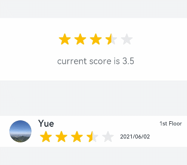
示例1(设置默认评分样式)
该示例为创建默认星型评分样式。
// xxx.ets
@Entry
@Component
struct RatingExample {
  @State rating: number = 3.5


  build() {
    Column() {
      Column() {
        Rating({ rating: this.rating, indicator: false })
          .stars(5)
          .stepSize(0.5)
          .margin({ top: 24 })
          .onChange((value: number) => {
            this.rating = value
          })
        Text('current score is ' + this.rating)
          .fontSize(16)
          .fontColor('rgba(24,36,49,0.60)')
          .margin({ top: 16 })
      }.width(360).height(113).backgroundColor('#FFFFFF').margin({ top: 68 })


      Row() {
        Image('common/testImage.jpg')
          .width(40)
          .height(40)
          .borderRadius(20)
          .margin({ left: 24 })
        Column() {
          Text('Yue')
            .fontSize(16)
            .fontColor('#182431')
            .fontWeight(500)
          Row() {
            Rating({ rating: 3.5, indicator: false }).margin({ top: 1, right: 8 })
            Text('2021/06/02')
              .fontSize(10)
              .fontColor('#182431')
          }
        }.margin({ left: 12 }).alignItems(HorizontalAlign.Start)


        Text('1st Floor')
          .fontSize(10)
          .fontColor('#182431')
          .position({ x: 295, y: 8 })
      }.width(360).height(56).backgroundColor('#FFFFFF').margin({ top: 64 })
    }.width('100%').height('100%').backgroundColor('#F1F3F5')
  }
}
示例2(设置评分的样式)
该示例通过配置starStyle实现自定义星级的图片链接。
// xxx.ets
@Entry
@Component
struct RatingExample {
  @State rating: number = 3.5


  build() {
    Column() {
      Rating({ rating: this.rating, indicator: false })
        .stars(5)
        .stepSize(0.5)
        .starStyle({
          backgroundUri: '/common/imag1.png', // common目录与pages同级
          foregroundUri: '/common/imag2.png',
          secondaryUri: '/common/imag3.png'
        })
        .margin({ top: 24 })
        .onChange((value: number) => {
          this.rating = value
        })
      Text('current score is ' + this.rating)
        .fontSize(16)
        .fontColor('rgba(24,36,49,0.60)')
        .margin({ top: 16 })
    }.width('100%').height('100%').backgroundColor('#F1F3F5')
  }
}
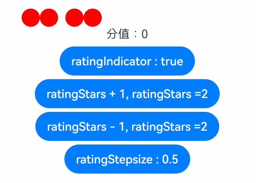
示例3(自定义评分条)
该示例实现了自定义评分条的功能,每个圆圈表示0.5分。ratingIndicator为true时表示评分条作为一个指示器不可改变评分;
为false时可以进行评分。ratingStars可改变评分总数。ratingStepsize可改变评分步长。
// xxx.ets
class MyRatingStyle implements ContentModifier<RatingConfiguration> {
  name: string = ""
  style: number = 0
  constructor(value1: string, value2: number) {
    this.name = value1
    this.style = value2
  }
  applyContent() : WrappedBuilder<[RatingConfiguration]> {
    return wrapBuilder(buildRating)
  }
}


@Builder function buildRating(config: RatingConfiguration) {
  Column() {
    Row() {
      Circle({ width: 25, height: 25 })
        .fill(config.rating >= 0.4 ? Color.Black : Color.Red)
        .onClick((event: ClickEvent) => {
          if (!config.indicator) {
            if (config.stepSize = 0.5) {
              config.triggerChange(0.5);
              return
            }
            if (config.stepSize = 1) {
              config.triggerChange(1);
              return
            }
          }
        }).visibility(config.stars >= 1 ? Visibility.Visible : Visibility.Hidden)
      Circle({ width: 25, height: 25 })
        .fill(config.rating >= 0.9 ? Color.Black : Color.Red)
        .onClick((event: ClickEvent) => {
          if (!config.indicator) {
            config.triggerChange(1);
          }
        }).visibility(config.stars >= 1 ? Visibility.Visible : Visibility.Hidden)
      Circle({ width: 25, height: 25 })
        .fill(config.rating >= 1.4 ? Color.Black : Color.Red)
        .onClick((event: ClickEvent) => {
          if (!config.indicator) {
            if (config.stepSize = 0.5) {
              config.triggerChange(1.5);
              return
            }
            if (config.stepSize = 1) {
              config.triggerChange(2);
              return
            }
          }
        }).visibility(config.stars >= 2 ? Visibility.Visible : Visibility.Hidden).margin({left:10})
      Circle({ width: 25, height: 25 })
        .fill(config.rating >= 1.9 ? Color.Black : Color.Red)
        .onClick((event: ClickEvent) => {
          if (!config.indicator) {
            config.triggerChange(2);
          }
        }).visibility(config.stars >= 2 ? Visibility.Visible : Visibility.Hidden)
      Circle({ width: 25, height: 25 })
        .fill(config.rating >= 2.4 ? Color.Black : Color.Red)
        .onClick((event: ClickEvent) => {
          if (!config.indicator) {
            if (config.stepSize = 0.5) {
              config.triggerChange(2.5);
              return
            }
            if (config.stepSize = 1) {
              config.triggerChange(3);
              return
            }
          }
        }).visibility(config.stars >= 3 ? Visibility.Visible : Visibility.Hidden).margin({left:10})
      Circle({ width: 25, height: 25 })
        .fill(config.rating >= 2.9 ? Color.Black : Color.Red)
        .onClick((event: ClickEvent) => {
          if (!config.indicator) {
            config.triggerChange(3);
          }
        }).visibility(config.stars >= 3 ? Visibility.Visible : Visibility.Hidden)
      Circle({ width: 25, height: 25 })
        .fill(config.rating >= 3.4 ? Color.Black : Color.Red)
        .onClick((event: ClickEvent) => {
          if (!config.indicator) {
            if (config.stepSize = 0.5) {
              config.triggerChange(3.5);
              return
            }
            if (config.stepSize = 1) {
              config.triggerChange(4);
              return
            }
          }
        }).visibility(config.stars >= 4 ? Visibility.Visible : Visibility.Hidden).margin({left:10})
      Circle({ width: 25, height: 25 })
        .fill(config.rating >= 3.9 ? Color.Black : Color.Red)
        .onClick((event: ClickEvent) => {
          if (!config.indicator) {
            config.triggerChange(4);
          }
        }).visibility(config.stars >= 4 ? Visibility.Visible : Visibility.Hidden)
      Circle({ width: 25, height: 25 })
        .fill(config.rating >= 4.4 ? Color.Black : Color.Red)
        .onClick((event: ClickEvent) => {
          if (!config.indicator) {
            if (config.stepSize = 0.5) {
              config.triggerChange(4.5);
              return
            }
            if (config.stepSize = 1) {
              config.triggerChange(5);
              return
            }
          }
        }).visibility(config.stars >= 5 ? Visibility.Visible : Visibility.Hidden).margin({left:10})
      Circle({ width: 25, height: 25 })
        .fill(config.rating >= 4.9 ? Color.Black : Color.Red)
        .onClick((event: ClickEvent) => {
          if (!config.indicator) {
            config.triggerChange(5);
          }
        }).visibility(config.stars >= 5 ? Visibility.Visible : Visibility.Hidden)
    }
    Text("分值:" + config.rating)
  }
}


@Entry
@Component
struct ratingExample {
  @State rating: number = 0;
  @State ratingIndicator: boolean = true;
  @State ratingStars: number = 0;
  @State ratingStepsize: number = 0.5;
  @State ratingEnabled: boolean = true;
  build() {
    Row() {
      Column() {
        Rating({
          rating: 0,
          indicator: this.ratingIndicator
        })
          .stepSize(this.ratingStepsize)
          .stars(this.ratingStars)
          .backgroundColor(Color.Transparent)
          .width('100%')
          .height(50)
          .onChange((value: number) => {
            console.info('Rating change is'+ value);
            this.rating = value
          })
          .contentModifier(new MyRatingStyle("hello", 3))
        Button(this.ratingIndicator ? "ratingIndicator : true" : "ratingIndicator : false")
          .onClick((event) => {
            if (this.ratingIndicator) {
              this.ratingIndicator = false
            } else {
              this.ratingIndicator = true
            }
          }).margin({top : 5})


        Button(this.ratingStars < 5 ? "ratingStars + 1, ratingStars =" + this.ratingStars : "ratingStars最大值为5")
          .onClick((event) => {
            if (this.ratingStars < 5) {
              this.ratingStars += 1
            }
          }).margin({top : 5})


        Button(this.ratingStars > 0 ? "ratingStars - 1, ratingStars =" + this.ratingStars : "ratingStars小于等于0时默认等于5")
          .onClick((event) => {
            if (this.ratingStars > 0) {
              this.ratingStars -= 1
            }
          }).margin({top : 5})


        Button(this.ratingStepsize == 0.5 ? "ratingStepsize : 0.5" : "ratingStepsize : 1")
          .onClick((event) => {
            if (this.ratingStepsize == 0.5) {
              this.ratingStepsize = 1
            } else {
              this.ratingStepsize = 0.5
            }
          }).margin({top : 5})
      }
      .width('100%')
      .height('100%')
      .justifyContent(FlexAlign.Center)
    }
    .height('100%')
  }
}


 扫一扫
扫一扫


 912
912

 被折叠的 条评论
为什么被折叠?
被折叠的 条评论
为什么被折叠?
 到【灌水乐园】发言


