


往期鸿蒙5.0全套实战文章必看:(文中附带鸿蒙5.0全栈学习资料)
advanced.Counter
Counter是用于精确调节数值的组件。
说明
该组件从API Version 11开始支持。后续版本如有新增内容,则采用上角标单独标记该内容的起始版本。
导入模块
import { CounterType, CounterComponent, CounterOptions, DateData } from '@kit.ArkUI';子组件
无
CounterComponent
CounterComponent({ options: CounterOptions })
定义计数器组件。
装饰器类型:@Component
元服务API: 从API version 12开始,该接口支持在元服务中使用。
系统能力: SystemCapability.ArkUI.ArkUI.Full
参数:
| 名称 | 类型 | 必填 | 装饰器类型 | 说明 |
|---|---|---|---|---|
| options | CounterOptions | 是 | @Prop | 定义counter组件的类型。 |
CounterOptions
CounterOptions定义Counter的类型及具体式样参数。
元服务API: 从API version 12开始,该接口支持在元服务中使用。
系统能力: SystemCapability.ArkUI.ArkUI.Full
| 名称 | 类型 | 必填 | 说明 |
|---|---|---|---|
| type | CounterType | 是 | 指定当前Counter的类型。 |
| direction12+ | Direction | 否 | 布局方向。 默认值:Direction.Auto |
| numberOptions | NumberStyleOptions | 否 | 列表型和紧凑型counter的式样。 |
| inlineOptions | InlineStyleOptions | 否 | 普通数字内联调节型Counter的式样。 |
| dateOptions | DateStyleOptions | 否 | 日期型内联型counter的式样。 |
选择不同的counter类型,需要选择对应的counter式样,其对应关系如下:
| counter类型 | counter式样 |
|---|---|
| CounterType.LIST | NumberStyleOptions |
| CounterType.COMPACT | NumberStyleOptions |
| CounterType.INLINE | InlineStyleOptions |
| CounterType.INLINE_DATE | DateStyleOptions |
CounterType
CounterType指定Counter的类型,如列表型Counter。
元服务API: 从API version 12开始,该接口支持在元服务中使用。
系统能力: SystemCapability.ArkUI.ArkUI.Full
| 名称 | 说明 |
|---|---|
| LIST | 列表型Counter。 |
| COMPACT | 紧凑型Counter。 |
| INLINE | 普通数字内联调节型Counter。 |
| INLINE_DATE | 日期型内联型Counter。 |
CommonOptions
CommonOptions定义Counter的共通属性和事件。
元服务API: 从API version 12开始,该接口支持在元服务中使用。
系统能力: SystemCapability.ArkUI.ArkUI.Full
| 名称 | 类型 | 必填 | 默认值 | 说明 |
|---|---|---|---|---|
| focusable | boolean | 否 | true | 设置Counter是否可以获焦。 说明: 该属性对列表型、紧凑型Counter生效。 |
| step | number | 否 | 1 | 设置Counter的步长。 取值范围:大于等于1的整数。 |
| onHoverIncrease | (isHover: boolean) =>void | 否 | - | 鼠标进入或退出Counter组件的增加按钮触发该回调。 isHover:表示鼠标是否悬浮在组件上,鼠标进入时为true, 退出时为false。 |
| onHoverDecrease | (isHover: boolean) =>void | 否 | - | 鼠标进入或退出Counter组件的减小按钮触发该回调。 isHover:表示鼠标是否悬浮在组件上,鼠标进入时为true, 退出时为false。 |
InlineStyleOptions
InlineStyleOptions定义Inline Style(数值内联型Counter)的属性和事件。
继承于CommonOptions 。
元服务API: 从API version 12开始,该接口支持在元服务中使用。
系统能力: SystemCapability.ArkUI.ArkUI.Full
| 名称 | 类型 | 必填 | 默认值 | 说明 |
|---|---|---|---|---|
| value | number | 否 | 0 | 设置Counter的初始值。 |
| min | number | 否 | 0 | 设置Counter的最小值。 |
| max | number | 否 | 999 | 设置Counter的最大值。 |
| textWidth | number | 否 | 0 | 设置数值文本的宽度。 |
| onChange | (value: number) =>void | 否 | - | 当数值改变时,返回当前值。 value:当前显示的数值。 |
NumberStyleOptions
NumberStyleOptions定义Number style(列表型Counter和紧凑型Counter)的属性和事件。
元服务API: 从API version 12开始,该接口支持在元服务中使用。
系统能力: SystemCapability.ArkUI.ArkUI.Full
| 名称 | 类型 | 必填 | 默认值 | 说明 |
|---|---|---|---|---|
| label | ResourceStr | 否 | - | 设置Counter的说明文本。 |
| onFocusIncrease | () =>void | 否 | - | 当前Counter组件增加按钮获取焦点时触发的回调。 |
| onFocusDecrease | () =>void | 否 | - | 当前Counter组件减小按钮获取焦点时触发的回调。 |
| onBlurIncrease | () =>void | 否 | - | 当前Counter组件增加按钮失去焦点时触发的回调。 |
| onBlurDecrease | () =>void | 否 | - | 当前Counter组件减小按钮失去焦点时触发的回调。 |
DateStyleOptions
DateStyleOptions定义Date style(日期内联型Counter)的属性和事件。
继承于CommonOptions 。
元服务API: 从API version 12开始,该接口支持在元服务中使用。
系统能力: SystemCapability.ArkUI.ArkUI.Full
| 名称 | 类型 | 必填 | 默认值 | 说明 |
|---|---|---|---|---|
| year | number | 否 | 1 | 设置日期内联型初始年份。 |
| month | number | 否 | 1 | 设置日期内联型初始月份。 |
| day | number | 否 | 1 | 设置日期内联型初始日。 |
| onDateChange | (date: DateData)=>void | 否 | - | 当日期改变时,返回当前日期。 date:当前显示的日期值。 |
DateData
DateData定义Date通用属性和方法,如年、月、日。
元服务API: 从API version 12开始,该接口支持在元服务中使用。
系统能力: SystemCapability.ArkUI.ArkUI.Full
| 名称 | 类型 | 说明 |
|---|---|---|
| year | number | 设置日期内联型初始年份。 |
| month | number | 设置日期内联型初始月份。 |
| day | number | 设置日期内联型初始日。 |
constructor
constructor(year: number, month: number, day: number)
DateData的构造函数。
元服务API:从API version 12 开始,该接口支持在元服务中使用。
系统能力: SystemCapability.ArkUI.ArkUI.Full
| 参数名 | 类型 | 说明 |
|---|---|---|
| year | number | 设置日期内联型初始年份。 |
| month | number | 设置日期内联型初始月份。 |
| day | number | 设置日期内联型初始日。 |
toString
toString(): string
以字符串格式返回当前日期值。
元服务API:从API version 12 开始,该接口支持在元服务中使用。
系统能力: SystemCapability.ArkUI.ArkUI.Full
返回值:
| 类型 | 说明 |
|---|---|
| string | 当前日期值。 |
示例
示例1(列表型Counter)
该示例通过设置type为CounterType.LIST以及numberOptions,实现列表型Counter。
import { CounterType, CounterComponent } from '@kit.ArkUI';


@Entry
@Component
struct ListCounterExample {
  build() {
    Column() {
      //列表型Counter
      CounterComponent({
        options: {
          type: CounterType.LIST,
          numberOptions: {
            label: "价格",
            min: 0,
            value: 5,
            max: 10
          }
        }
      })
    }
  }
}
示例2(紧凑型Counter)
该示例通过设置type为CounterType.COMPACT以及numberOptions,实现紧凑型Counter。
import { CounterType, CounterComponent } from '@kit.ArkUI';


@Entry
@Component
struct CompactCounterExample {
  build() {
    Column() {
      //紧凑型Counter
      CounterComponent({
        options: {
          type: CounterType.COMPACT,
          numberOptions: {
            label: "数量",
            value: 10,
            min: 0,
            max: 100,
            step: 10
          }
        }
      })
    }
  }
}
示例3(数值内联型Counter)
该示例通过设置type为CounterType.INLINE以及inlineOptions,实现数值内联型Counter。
import { CounterType, CounterComponent } from '@kit.ArkUI';


@Entry
@Component
struct NumberStyleExample {
  build() {
    Column() {
      //数值内联型Counter
      CounterComponent({
        options: {
          type: CounterType.INLINE,
          inlineOptions: {
            value: 100,
            min: 10,
            step: 2,
            max: 1000,
            textWidth: 100,
            onChange: (value: number) => {
              console.log("onDateChange Date: " + value.toString());
            }
          }
        }
      })
    }
  }
}
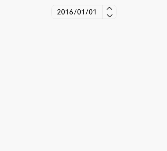
示例4(日期内联型Counter)
该示例通过设置type为CounterType.INLINE_DATE以及dateOptions,实现日期内联型Counter,用户可以手动输入日期。
import { CounterType, CounterComponent, DateData } from '@kit.ArkUI';


@Entry
@Component
struct DataStyleExample {
  build() {
    Column() {
      //日期内联型counter
      CounterComponent({
        options: {
          type: CounterType.INLINE_DATE,
          dateOptions: {
            year: 2016,
            onDateChange: (date: DateData) => {
              console.log("onDateChange Date: " + date.toString());
            }
          }
        }
      })
    }
  }
}
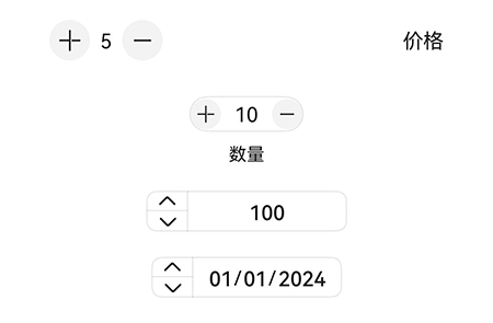
示例5(镜像布局展示)
该示例通过设置direction属性,实现列表型、紧凑型、数字内联型、日期内联型Counter进行镜像布局。
// xxx.ets
import { CounterType, CounterComponent, DateData } from '@kit.ArkUI';


@Entry
@Component
struct CounterPage {
  @State currentDirection: Direction = Direction.Rtl


  build() {
    Column({}) {


      //列表型Counter
      CounterComponent({
        options: {
          direction: this.currentDirection,
          type: CounterType.LIST,
          numberOptions: {
            label: "价格",
            min: 0,
            value: 5,
            max: 10,
          }
        }
      })
        .width('80%')


      //数值型Counter
      CounterComponent({
        options: {
          direction: this.currentDirection,
          type: CounterType.COMPACT,
          numberOptions: {
            label: "数量",
            value: 10,
            min: 0,
            max: 100,
            step: 10
          }
        }
      }).margin({ top: 20 })


      //数值内联型Counter
      CounterComponent({
        options: {
          type: CounterType.INLINE,
          direction: this.currentDirection,
          inlineOptions: {
            value: 100,
            min: 10,
            step: 2,
            max: 1000,
            textWidth: 100,
            onChange: (value: number) => {
              console.log("onDateChange Date: " + value.toString());
            }
          }
        }
      }).margin({ top: 20 })
      //日期内联型counter
      CounterComponent({
        options: {
          direction: this.currentDirection,
          type: CounterType.INLINE_DATE,
          dateOptions: {
            year: 2024,
            onDateChange: (date: DateData) => {
              console.log("onDateChange Date: " + date.toString());
            }
          }
        }
      }).margin({ top: 20 })
    }
    .width('100%')
    .height('100%')
    .justifyContent(FlexAlign.Center)
    .alignItems(HorizontalAlign.Center)
  }
}


 扫一扫
扫一扫


 392
392

 被折叠的 条评论
为什么被折叠?
被折叠的 条评论
为什么被折叠?
 到【灌水乐园】发言


