


伪类选择器
伪类选择器:用来描述一个元素的特殊状态。比如第一个元素、某个元素的子元素、鼠标点击的元素
a:link {
            color: pink;---------------------字体颜色
        }
        a:visited {
            color: red;---------------------访问后字体颜色
        }
        -----------------------------------------/* :hover   鼠标悬停 */
        a:hover {
        ---------------------------------------------/* cursor  鼠标样式 */
            cursor: pointer;----------------------------鼠标在链接上面悬停是的样式
            font-size: 40px;
        }


        a:active {
            font-size: 70px;------------------------------鼠标按住不动时字体的大小
        }

      display: none;--------------------------删除原有的样式
结构伪类选择器
1.原理:能够使用 结构伪类选择器 在HTML中定位元素
2.作用:根据元素在HTML中的结构关系查找元素( 根据html结构选择标签 )
3.优势:减少对于HTML中类的依赖,有利于保持代码整洁( 选择方便,省去了很多类名 )
4.场景:常用于查找某父级选择器中的子元素
父元素 子元素:nth-child(n) :父元素第n个子元素
even:偶数
odd:奇数
ul li:nth-child(3) {------------------------匹配父元素中的第几个
        }
ul li:nth-of-type(4) {----------------------指定类型E的第几个
        }
ul li:nth-child(2) {--------------------先看nth-child,再看li
        }

ul li:nth-of-type(2) {--------------------先找li,把指定元素的盒子排列序号
        }
伪元素选择器
同伪类一样,伪元素也是不存在的元素,表示元素的特殊状态
常见的几个伪元素:
::first-letter 表示第一个字母
::first-line 表示第一行
::selection 表示选中的元素
::before 元素开始的位置前
::after 元素结束的位置后
befor和after必须配合contend一起使用(before,after所写的内容无法选中且永远在最前和最后)
::before       content:"~"
::after  content:"~"
::selection
文本相关样式
text-indent: 2em;
文本水平对齐方式
text-align: center;
overflow: auto;
行高 单行文本垂直居中 行高=元素高度
line-height: 200px;
list
css具有层叠行,后面的会覆盖前面的
list-style:
元素显示模式转换
行内元素无法设置宽、高 转换为行内块元素
display: none;隐藏元素,脱离文档流
display: inline-block; 将元素转换为行内块元素
display: inline; 行内元素
display: block; 块元素
背景
background-color: aqua;
background-image: url(../.jpg);------------插入背景图片
background-repeat: no-repeat;
background-attachment: fixed;------------------背景图片固定
background-position: top left; */--------------定位
background: fixed url(../.jpg) no-repeat;-------------背景不重复
样例:五彩导航
<!DOCTYPE html>
<html lang="en">

<head>
    <meta charset="UTF-8">
    <meta name="viewport" content="width=device-width, initial-scale=1.0">
    <title>Document</title>
    <style>
        a {
            display: inline-block;
            text-decoration: none;
            width: 120px;
            height: 58px;
            text-align: center;
            line-height: 54px;
            color: #3f3f3f;
        }

        .one {
            background-image: url(../01-案例/images/bg1.png);
        }

        .two {
            background-image: url(../01-案例/images/bg2.png);
        }

        .three {
            position: relative;
            background-image: url(../01-案例/images/bg3.png);
        }

        .three img {
            display: none;
            position: absolute;
            bottom: -130px;
            left: 0;

        }

        .four {
            background-image: url(../01-案例/images/bg4.png);
        }

        .one:hover {
            background-image: url(../01-案例/images/bg5.png);
            color:rgb(0, 255, 255);
        }

        .two:hover {
            background-image: url(../01-案例/images/bg6.png);
            color:rgb(0, 225, 255);
        }

        .three:hover {
            background-image: url(../01-案例/images/bg7.png);
            color: rgb(0, 255, 255);
        }

        .three:hover img {
            display: block;
        }

        .four:hover {
            background-image: url(../01-案例/images/bg8.png);
            color: rgb(0, 225, 255);
        }
    </style>

</head>

<body>
    <a href="#" class="one">五彩导航</a>
    <a href="#" class="two">五彩导航</a>
    <a href="#" class="three">
        五彩导航
        <img src="../code.jpg" alt="">
    </a>
    <a href="#" class="four">五彩导航</a>

</body>

</html>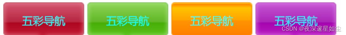
边框
border-radius 边框弧度
border-width 边框宽度
border-style 边框样式
border-color 边框颜色
样例
<!DOCTYPE html>
<html lang="en">

<head>
    <meta charset="UTF-8">
    <meta name="viewport" content="width=device-width, initial-scale=1.0">
    <title>Document</title>
    <style>
        div {
            width: 300px;
            height: 300px;
            background-color: pink;
            /* border-radius: 10px; */
            /* border-width 边框宽度 */
            /* border-width: 20px;
            border-style: solid;
            border-color: rgb(35, 223, 18); */
            border: 4px solid black;
            /* border-radius: 50%;    边框弧度*/
            border-top-left-radius: 40%;
        }
    </style>
</head>

<body>
    <div>
        我是一个盒子
    </div>
</body>

</html>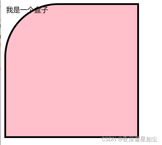
合并相邻边框
合并相邻边框 border-collapse: collapse;
<table cellspacing="0">---------------边框空隙为0
阴影
样例
<!DOCTYPE html>
<html lang="en">

<head>
    <meta charset="UTF-8">
    <meta name="viewport" content="width=device-width, initial-scale=1.0">
    <title>Document</title>
    <style>
        div {
            width: 300px;
            height: 300px;
            background-color: pink;
            /* box-shadow: 20px 20px 10px 10px black; */
        }

        p {
            text-shadow: red 5px 5px;

        }
    </style>
</head>

<body>
    <div>
        bvdjvdjc
    </div>
    <p>woshi wenzi</p>
</body>

</html>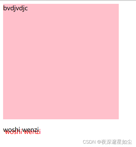
轮廓线
outline: none; 取消乱廓线
outline-style: groove; 罗廓线样式
防拖拽
resize: none; 防止文本拖拽
vertical-align 改变与文字的对齐方式
隐藏元素
display: none; 脱离文档流,原来的位置不再保留
visibility: hidden; 元素隐藏,位置保留
opacity: 0; 透明度为0
绝对定位
position: relative; 相对定位
osition: absolute; 绝对定位:不保留原来位置 子绝父相 父亲没有相对定位,继续向上找,谁有相对定位,以谁作为参考移动。如果都没找到,则相对于浏览器进行定位
top: 100px; 距离顶端100px
当元素的position设置为absolute时,则开启了元素的绝对定位
用法: position: absolute;
绝对定位的特点:
与相对定位一样.开启了绝对定位以后,如果不设置偏移量,元素的位置不会发生任何改变
开启绝对定位之后,元素会从原有的文档流中脱离.只是相对于它的包含块定位,包含块可能是文档流中的另一个元素或者是初始包含块
绝对定位会改变元素的性质.行内元素变为块元素,块元素的宽度被内容撑开(即块元素中原有内容有多宽,开启绝对定位之后的块元素就有多宽)
绝对定位会使元素提升一个层级
固定定位
固定定位:相对于可视区域进行定位
-
以浏览器的可视窗口为参照点移动元素
-
定位参照点跟父元素没有任何关系
-
固定定位的元素页面发生滚动时不随滚动条滚动
-
固定定位不在占有原先的位置,脱离文档流
固定定位也是脱标的,其实固定定位也可以看做是一种特殊的绝对定位。
position: fixed;
right: 40px;
top: 50%;
height: 100px;
background-color: pink;
粘性定位
粘性定位可以被认为是相对定位和固定定位的混合(即元素子再跨越特定阈值前为相对定位,之后为固定定位)
视口元素:显示内容的区域。会设置宽,高。一般会设置 overflow:hidden
容器元素:离 sticky 元素最近的能滚动的祖先元素。
粘性约束元素:粘性定位的父元素。有时,也会出现粘性约束元素就是容器元素的情况。
sticky 元素:设置了 position: sticky; 的元素。


 447
447


 被折叠的 条评论
为什么被折叠?
被折叠的 条评论
为什么被折叠?
 到【灌水乐园】发言


