


toolbar为页面工具栏组件,用于展示针对当前界面的操作选项,可作为页面的一级导航。
创建toolbar组件
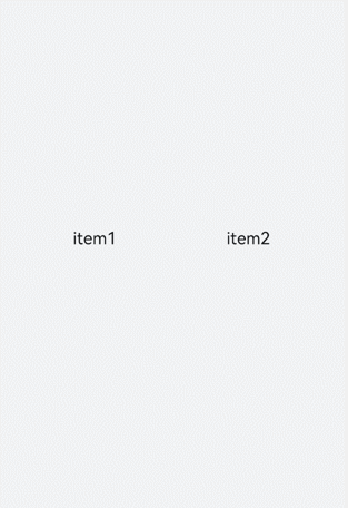
在pages/index目录下的hml文件中创建一个toolbar组件。
<!-- xxx.hml -->
<div class="container">
  <toolbar style="background-color: #F1F3F5;">
    <toolbar-item value="item1"></toolbar-item>
    <toolbar-item value="item2"></toolbar-item>
  </toolbar>
</div>
/* xxx.css */
.container {
  width: 100%;
  height: 100%;
  flex-direction: column;
  justify-content: center;
  align-items: center;
  background-color: #F1F3F5;
}
toolbar-item{
  font-size: 35px;
}
添加子组件
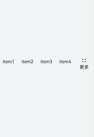
toolbar组件仅支持toolbar-item为子组件,页面最多可以展示5个toolbar-item子组件,如果存在6个及以上toolbar-item,则保留前面4个,后续的将收纳到工具栏上的更多项中,通过点击更多项弹窗进行展示。并且更多项展示的组件样式采用系统默认样式,toolbar-item上设置的自定义样式不生效。
<!-- xxx.hml -->
<div class="container">
  <toolbar>
    <toolbar-item value="item1"></toolbar-item>
    <toolbar-item value="item2"></toolbar-item>
    <toolbar-item value="item3"></toolbar-item>
    <toolbar-item value="item4"></toolbar-item>
    <toolbar-item value="item5"></toolbar-item>
    <toolbar-item value="item6"></toolbar-item>
  </toolbar>
</div>
/* xxx.css */
.container {
  width: 100%;
  height: 100%;
  flex-direction: column;
  justify-content: center;
  align-items: center;
  background-color: #F1F3F5;
}
toolbar-item{
  font-size: 35px;
}
设置样式
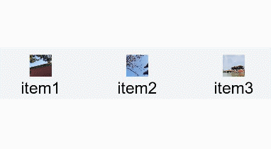
设置position样式控制toolbar组件的位置,并设置子组件toolbar-item的字体颜色、大小及背景色。
<!-- xxx.hml -->
<div class="container">
  <toolbar style="position: fixed;bottom: 5%;width: 100%;background-color: #F1F3F5;">
    <toolbar-item value="item1" icon="common/images/1.png" class="toolbarActive"></toolbar-item>
    <toolbar-item value="item2" icon="common/images/2.png"></toolbar-item>
    <toolbar-item value="item3" icon="common/images/1.png"></toolbar-item>
    <toolbar-item value="item4" icon="common/images/2.png"></toolbar-item>
  </toolbar>
</div>
/* xxx.css */
.container {
  background-color: #F1F3F5;
  flex-direction: column;
  width: 100%;
  height: 100%;
  justify-content: center;
  align-items: center;
}
toolbar-item{
  font-size: 35px;
}

绑定事件
分别给toolbar-item绑定单击事件和长按事件,单击后文本变红,长按时文本变蓝。
<!-- xxx.hml -->
<div class="container">
  <toolbar style="position: fixed;top: 50%;width: 100%;background-color: #F1F3F5;">
    <toolbar-item value="item1" icon="common/images/1.png" style="color: {{itemColor}};" onclick="itemClick"></toolbar-item>
    <toolbar-item value="item2" icon="common/images/2.png"  style="color: {{itemColor}}"></toolbar-item>
    <toolbar-item value="item3" icon="common/images/3.png"  style="color: {{itemColor}}" onlongpress="itemLongPress"></toolbar-item>
  </toolbar>
</div>
/* xxx.css */
.container {
  background-color: #F1F3F5;
  flex-direction: column;
  width: 100%;
  height: 100%;
  justify-content: center;
  align-items: center;
}
toolbar-item{
  font-size: 35px;
}
// xxx.js
import promptAction from '@ohos.promptAction';
export default {
  data:{
    itemColor:'black'
  },
  itemClick(){
    this.itemColor= "red";
    promptAction.showToast({duration:2000,message:'item click'});
  },
  itemLongPress(){
    promptAction.showToast({duration:2000,message:'item long press'});
    this.itemColor= "blue";
  },
}
说明
toolbar组件不支持添加事件和方法,但其子组件toolbar-item支持。
场景示例
本场景中开发者可点击toolbar-item组件,改变当前组件文本颜色并更换相对应的图片内容。
使用for循环创建toolbar-item组件并添加点击事件,点击后获得索引值进行存储。设置文本颜色时,判断当前索引值是否为储存的值,若相同则设置为红色,不同则使用默认颜色。
<!-- xxx.hml -->
<div class="container">
  <image src="{{imgList[active]}}"></image>
  <toolbar style="position: fixed;bottom: 5%;width: 100%;background-color: #F1F3F5;">
    <toolbar-item value="{{ item.option}}" icon="{{item.icon}}" style="color: {{active == $idx?'red':'black'}};background-color: {{active== $idx?'#dbe7f1':'#F1F3F5'}};" for="{{item in itemList}}" onclick="itemClick({{$idx}})"></toolbar-item>
    </toolbar>
</div>
/* xxx.css */
.container {
  background-color: #F1F3F5;
  flex-direction: column;
  width: 100%;
  justify-content: center;
  align-items: center;
}
toolbar-item{
  font-size: 35px;
}
// xxx.js
export default {
  data:{
    active: 0,
    imgList:["common/images/1.png","common/images/2.png","common/images/3.png","common/images/4.png"],
    itemList:[
      {option:'item1',icon:'common/images/1.png'},
      {option:'item2',icon:'common/images/2.png'},
      {option:'item3',icon:'common/images/3.png'},
      {option:'item4',icon:'common/images/4.png'},
    ]
  },
  itemClick(id){
    this.active= id;
  },
}

鸿蒙全栈开发全新学习指南
有很多小伙伴不知道学习哪些鸿蒙开发技术?不知道需要重点掌握哪些鸿蒙应用开发知识点?而且学习时频繁踩坑,最终浪费大量时间。所以要有一份实用的鸿蒙(HarmonyOS NEXT)学习路线与学习文档用来跟着学习是非常有必要的。
针对一些列因素,整理了一套纯血版鸿蒙(HarmonyOS Next)全栈开发技术的学习路线,包含了鸿蒙开发必掌握的核心知识要点,内容有(ArkTS、ArkUI开发组件、Stage模型、多端部署、分布式应用开发、WebGL、元服务、OpenHarmony多媒体技术、Napi组件、OpenHarmony内核、OpenHarmony驱动开发、系统定制移植等等)鸿蒙(HarmonyOS NEXT)技术知识点。
本路线共分为四个阶段:
第一阶段:鸿蒙初中级开发必备技能

第二阶段:鸿蒙南北双向高工技能基础:gitee.com/MNxiaona/733GH
第三阶段:应用开发中高级就业技术
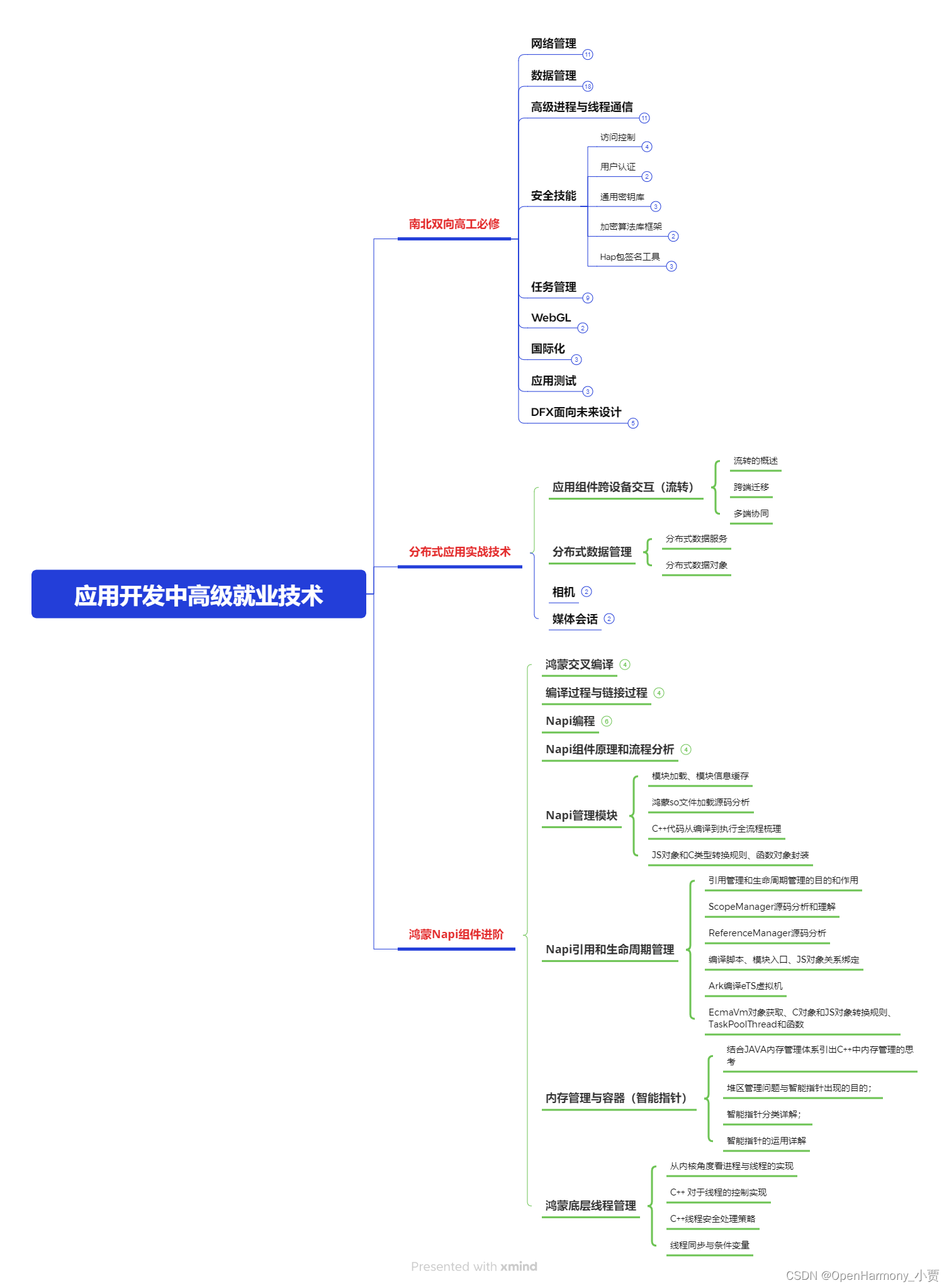
第四阶段:全网首发-工业级南向设备开发就业技术:gitee.com/MNxiaona/733GH

《鸿蒙 (Harmony OS)开发学习手册》(共计892页)
如何快速入门?
1.基本概念
2.构建第一个ArkTS应用
3.……

开发基础知识:gitee.com/MNxiaona/733GH
1.应用基础知识
2.配置文件
3.应用数据管理
4.应用安全管理
5.应用隐私保护
6.三方应用调用管控机制
7.资源分类与访问
8.学习ArkTS语言
9.……

基于ArkTS 开发
1.Ability开发
2.UI开发
3.公共事件与通知
4.窗口管理
5.媒体
6.安全
7.网络与链接
8.电话服务
9.数据管理
10.后台任务(Background Task)管理
11.设备管理
12.设备使用信息统计
13.DFX
14.国际化开发
15.折叠屏系列
16.……

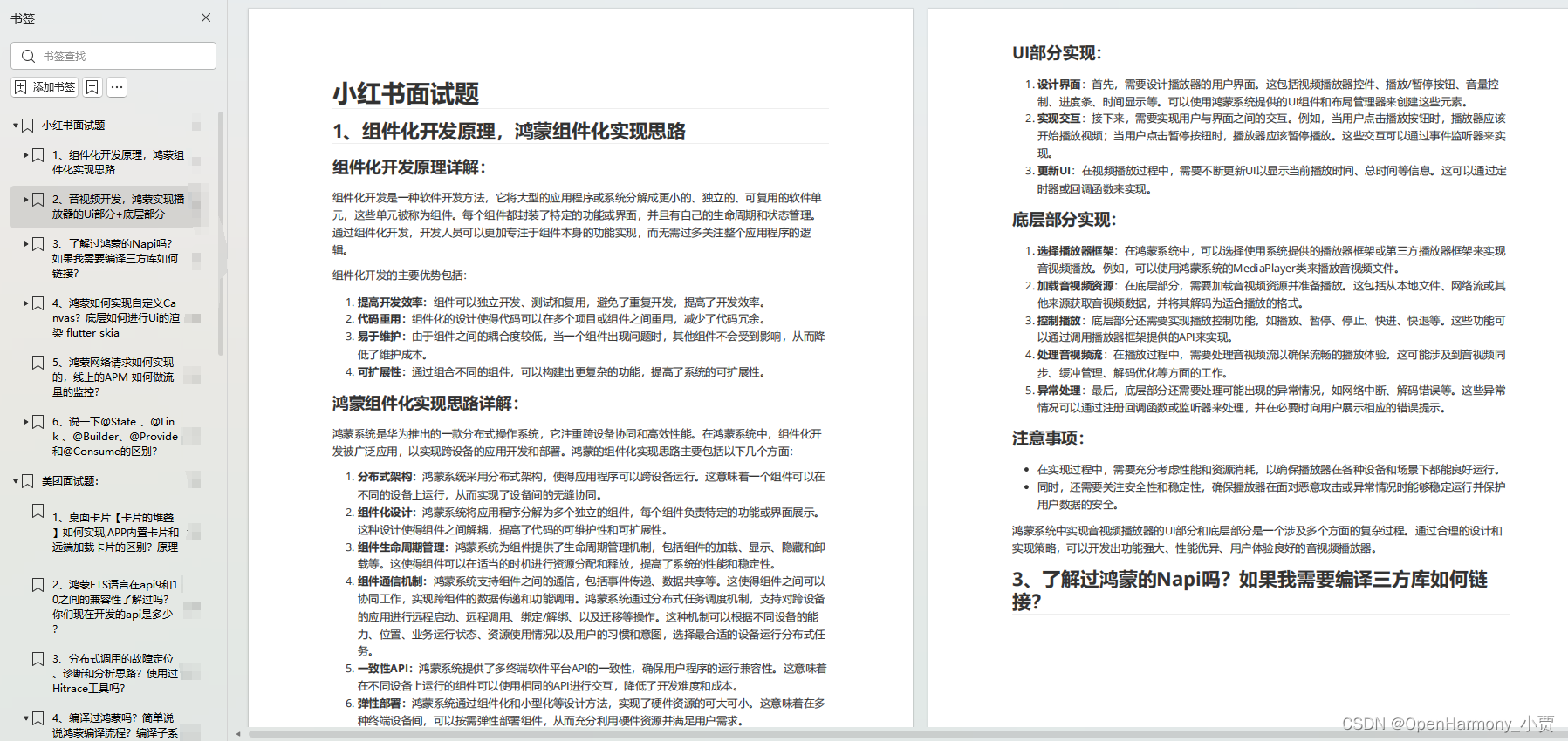
鸿蒙开发面试真题(含参考答案):gitee.com/MNxiaona/733GH
鸿蒙入门教学视频:
美团APP实战开发教学:gitee.com/MNxiaona/733GH

写在最后
- 如果你觉得这篇内容对你还蛮有帮助,我想邀请你帮我三个小忙:
- 点赞,转发,有你们的 『点赞和评论』,才是我创造的动力。
- 关注小编,同时可以期待后续文章ing🚀,不定期分享原创知识。
- 想要获取更多完整鸿蒙最新学习资源,请移步前往小编:
gitee.com/MNxiaona/733GH


 802
802


 被折叠的 条评论
为什么被折叠?
被折叠的 条评论
为什么被折叠?
 到【灌水乐园】发言


