


Android系统运行在许许多多设备上,这些设备有好几种屏幕尺寸,小到手机,大到电视机。所以,必须让你的应用适配所有的屏幕尺寸,这样可以让它被更可能多的人使用,这点是非常重要的。
但是仅仅与不同的设备适配是不够的,每一个屏幕尺寸都提供了不同的可能和机会给用户交互,所以为了真的让你用户满意以及让他们留下好的影像,你的应用必须比仅仅支持不同的设备要做的更多,他必须优化不同屏幕尺寸下的用户体验。
这一篇将告诉你怎么实现用户界面,并且对于不同的屏幕来说都是最优化的。
每一篇用到的代码都来自一个示例应用程序,它是用来示范实现多屏幕最佳适配的最好练习。可以用这个例子作为一个可复用的代码为你的应用服务。
注意:为了支持在3.0以下的系统上使用Fragment,这一篇中用到的例子也用到了支持库。所以当你使用这个例子中讲的方法时,你也必须为你的应用添加支持库。
A:支持不同屏幕尺寸的设备
下面将会告诉你可以通过这几种方式支持不同尺寸的设备:
~ 确保你的布局可以被适当的调整大小来适应不同的屏幕
~ 根据屏幕配置提供适当的UI布局
~ 确保正确的布局被应用到正确的屏幕尺寸中
~ 提供正确比例的位图
A.a 使用“wrap_content”和“match_parent”
为了确保你的布局是灵活的并且是适应不同屏幕尺寸的,控件的width和height属性你应该使用“wrap_content”和“match_parent”。如果你对一个控件使用“wrap_content”,那么这个控件的宽或者高将显示成他本身中包含内容的大小。当使用“match_parent”时,将使这个控件扩展来匹配他的父容器。
通过使用使用“wrap_content”和“match_parent”,而不是固定死的尺寸。你的控件便可以分别自己要求的空间大小或者扩展到所有可利用的空间。例如下面:
<LinearLayout xmlns:android="http://schemas.android.com/apk/res/android"
    android:orientation="vertical"
    android:layout_width="match_parent"
    android:layout_height="match_parent">
    <LinearLayout android:layout_width="match_parent"
                  android:id="@+id/linearLayout1"
                  android:gravity="center"
                  android:layout_height="50dp">
        <ImageView android:id="@+id/imageView1"
                   android:layout_height="wrap_content"
                   android:layout_width="wrap_content"
                   android:src="@drawable/logo"
                   android:paddingRight="30dp"
                   android:layout_gravity="left"
                   android:layout_weight="0" />
        <View android:layout_height="wrap_content"
              android:id="@+id/view1"
              android:layout_width="wrap_content"
              android:layout_weight="1" />
        <Button android:id="@+id/categorybutton"
                android:background="@drawable/button_bg"
                android:layout_height="match_parent"
                android:layout_weight="0"
                android:layout_width="120dp"
                style="@style/CategoryButtonStyle"/>
    </LinearLayout>

    <fragment android:id="@+id/headlines"
              android:layout_height="fill_parent"
              android:name="com.example.android.newsreader.HeadlinesFragment"
              android:layout_width="match_parent" />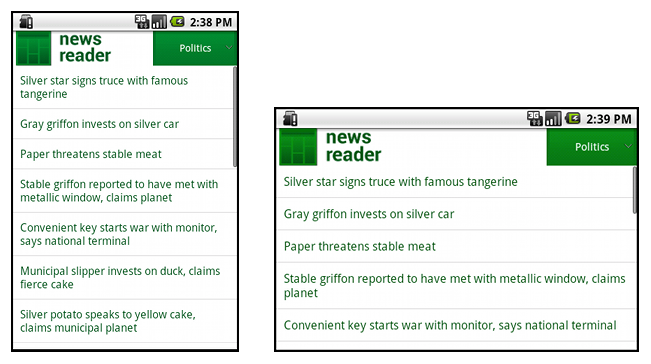
</LinearLayout>例如,下面就是这个布局文件在横屏和竖屏下的状况。注意到当中控件的尺寸都自动的适应了宽和高:
A.b 使用相对布局(RelativeLayout)
通过使用Linearlayout的嵌套以及使用“wrap_content”和“match_parent”的组合你可以创建出相当复杂的布局。然而,linearlayout不允许你去精确的控制子views之间的位置关系。linearlayout中的views只是简单的排成一排。如果你需要使子views的变化更多种而不只是直线,更好的解决方法便是使用relativelayout,他运行你指定你布局中的控件之间存在特殊的位置关系。例如,你可以让一个view对齐左边并且另一个view放在屏幕的右边。例如下面:
<?xml version="1.0" encoding="utf-8"?>
<RelativeLayout xmlns:android="http://schemas.android.com/apk/res/android"
    android:layout_width="match_parent"
    android:layout_height="match_parent">
    <TextView
        android:id="@+id/label"
        android:layout_width="match_parent"
        android:layout_height="wrap_content"
        android:text="Type here:"/>
    <EditText
        android:id="@+id/entry"
        android:layout_width="match_parent"
        android:layout_height="wrap_content"
        android:layout_below="@id/label"/>
    <Button
        android:id="@+id/ok"
        android:layout_width="wrap_content"
        android:layout_height="wrap_content"
        android:layout_below="@id/entry"
        android:layout_alignParentRight="true"
        android:layout_marginLeft="10dp"
        android:text="OK" />
    <Button
        android:layout_width="wrap_content"
        android:layout_height="wrap_content"
        android:layout_toLeftOf="@id/ok"
        android:layout_alignTop="@id/ok"
        android:text="Cancel" />
</RelativeLayout>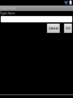
上面布局在大屏幕下的情况则如下图:
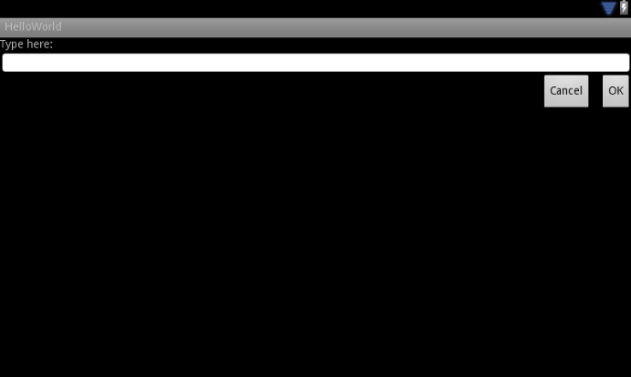
可以注意到虽然控件的大小变了,但是他们之间的位置关系却一直被RelativeLayout.LayoutParams控制着。
A.c 使用大小限定词
你可以从一个复杂的布局或者像上面那样的relativelayout布局中获得的就这么多。虽然这些布局通过拉伸内部空间以及调整空间周围的方法来支持不同尺寸的屏幕,但是他们可能还没有做到为不同的屏幕带来最好的用户界面。因此,你的应用不应该只实现复杂的布局,而是应该针对不同的屏幕尺寸提供几个可供选择的布局。你可以通过使用配置限定词实现它,它可以是程序运行时自动选择合适的布局资源,并且是根据现在的设备配置选出的(例如不同的布局设计为不同的屏幕大小)。
例如,许多应用都在大尺寸屏幕时使用“两个面板”的样式(在一个面板中显示列表,另外一个中显示内容)。平板电脑以及电视设备足够大,可以保证两个面板同时合适的出现在屏幕中,但是手机屏幕就不得不独立的显示他们了。所以,为了实现这种可能,你应该有下面这几个文件:
res/layout/main.xml, 单面板(默认)布局:
<LinearLayout xmlns:android="http://schemas.android.com/apk/res/android"
    android:orientation="vertical"
    android:layout_width="match_parent"
    android:layout_height="match_parent">

    <fragment android:id="@+id/headlines"
              android:layout_height="fill_parent"
              android:name="com.example.android.newsreader.HeadlinesFragment"
              android:layout_width="match_parent" />
</LinearLayout>res/layout-large/main.xml, 两个面板的布局:
<LinearLayout xmlns:android="http://schemas.android.com/apk/res/android"
    android:layout_width="fill_parent"
    android:layout_height="fill_parent"
    android:orientation="horizontal">
    <fragment android:id="@+id/headlines"
              android:layout_height="fill_parent"
              android:name="com.example.android.newsreader.HeadlinesFragment"
              android:layout_width="400dp"
              android:layout_marginRight="10dp"/>
    <fragment android:id="@+id/article"
              android:layout_height="fill_parent"
              android:name="com.example.android.newsreader.ArticleFragment"
              android:layout_width="fill_parent" />
</LinearLayout>A.d 使用最小宽度限定符
对于开发者来说一个困难的问题就是系统版本在3.2之前的设备的大屛缺陷,其中包括Dell Streak,最初的Galaxy Tab,以及一些7寸的设备。然而,许多应用想要在5寸和7寸的设备上显示不同的布局,虽然他们都被划分到大尺寸屏幕中。这就是android在3.2版本中推出最小宽度限定符的原因。
最小宽度限定词可以帮助你针对那些有一定相对像素宽度的屏幕。例如,一般的7寸设备都至少拥有600相对像素,所以如果你想在这些屏幕下使用两个面板的布局(但是在小的屏幕上则只有一个列表),你依然可以使用上面的两个布局文件,但是不再是使用large这个限定符,而是用sw600这个限定符来指定这个两个面板的布局是给那些最小宽度为600dp的设备使用的:
res/layout/main.xml, 单面板(默认)布局:
<LinearLayout xmlns:android="http://schemas.android.com/apk/res/android"
    android:orientation="vertical"
    android:layout_width="match_parent"
    android:layout_height="match_parent">

    <fragment android:id="@+id/headlines"
              android:layout_height="fill_parent"
              android:name="com.example.android.newsreader.HeadlinesFragment"
              android:layout_width="match_parent" />
</LinearLayout>res/layout-sw600dp/main.xml, 两个面板的布局:
<LinearLayout xmlns:android="http://schemas.android.com/apk/res/android"
    android:layout_width="fill_parent"
    android:layout_height="fill_parent"
    android:orientation="horizontal">
    <fragment android:id="@+id/headlines"
              android:layout_height="fill_parent"
              android:name="com.example.android.newsreader.HeadlinesFragment"
              android:layout_width="400dp"
              android:layout_marginRight="10dp"/>
    <fragment android:id="@+id/article"
              android:layout_height="fill_parent"
              android:name="com.example.android.newsreader.ArticleFragment"
              android:layout_width="fill_parent" />
</LinearLayout>但是,这在系统版本为3.2之前的设备上将不管用,因为他们不认为sw600是一个限定符,所以你还必须使用large这个限定符。所以,你必须有res/layout-large/main.xml这个文件,并且和sw600里面的文件时一样的。下一段中,将介绍如何避免这种情况下使用重复布局文件的技术。
A.e 使用布局别名
最小宽度限定符只可以在系统版本3.2或者更高的设备上使用。因此,你必须依然使用small、middle、large、xlarge这些抽象的限定词去支持3.2以前的版本。例如,你想你的应用在手机上使用单面板布局,而在7寸平板电脑或者电视或者其他的大屏幕尺寸设备上使用两个面板的布局,你就必须有下面这些文件:
res/layout/main.xml: single-pane layout
res/layout-large: multi-pane layout
res/layout-sw600dp: multi-pane layout
后面的两个文件时完全一样的,因为其中一个是用来匹配3.2系统版本的设备,而另一个则是为了匹配那些系统版本在3.2之前的平板或者电视设备。
为了避免针对平板设备或者电视等设备所必须的重复文件(以及维护带来的麻烦),你可以使用别名文件,例如,你可以定义下面的文件:
res/layout/main.xml, single-pane layout
res/layout/main_twopanes.xml, two-pane layout
并且添加下面两个文件:
res/values-large/layout.xml:
<resources>
    <item name="main" type="layout">@layout/main_twopanes</item>
</resources>res/values-sw600dp/layout.xml:
<resources>
    <item name="main" type="layout">@layout/main_twopanes</item>
</resources>A.f 使用方向限定符
一些布局在横屏或者竖屏时都可以工作的很好,但是他们中的大多数都可以收益于调整。下面是demo在各个屏幕尺寸以及方向下的显示情况:
small screen, portrait: single pane, with logo
small screen, landscape: single pane, with logo
7" tablet, portrait: single pane, with action bar
7" tablet, landscape: dual pane, wide, with action bar
10" tablet, portrait: dual pane, narrow, with action bar
10" tablet, landscape: dual pane, wide, with action bar
TV, landscape: dual pane, wide, with action bar
这些布局文件都在res/layout文件夹中。为了分配不同的布局给不同的屏幕配置,这个应用使用布局别名来匹配每一种配置。
res/layout/onepane.xml:
<LinearLayout xmlns:android="http://schemas.android.com/apk/res/android"
    android:orientation="vertical"
    android:layout_width="match_parent"
    android:layout_height="match_parent">

    <fragment android:id="@+id/headlines"
              android:layout_height="fill_parent"
              android:name="com.example.android.newsreader.HeadlinesFragment"
              android:layout_width="match_parent" />
</LinearLayout>
res/layout/onepane_with_bar.xml:
<LinearLayout xmlns:android="http://schemas.android.com/apk/res/android"
    android:orientation="vertical"
    android:layout_width="match_parent"
    android:layout_height="match_parent">
    <LinearLayout android:layout_width="match_parent"
                  android:id="@+id/linearLayout1"
                  android:gravity="center"
                  android:layout_height="50dp">
        <ImageView android:id="@+id/imageView1"
                   android:layout_height="wrap_content"
                   android:layout_width="wrap_content"
                   android:src="@drawable/logo"
                   android:paddingRight="30dp"
                   android:layout_gravity="left"
                   android:layout_weight="0" />
        <View android:layout_height="wrap_content"
              android:id="@+id/view1"
              android:layout_width="wrap_content"
              android:layout_weight="1" />
        <Button android:id="@+id/categorybutton"
                android:background="@drawable/button_bg"
                android:layout_height="match_parent"
                android:layout_weight="0"
                android:layout_width="120dp"
                style="@style/CategoryButtonStyle"/>
    </LinearLayout>

    <fragment android:id="@+id/headlines"
              android:layout_height="fill_parent"
              android:name="com.example.android.newsreader.HeadlinesFragment"
              android:layout_width="match_parent" />
</LinearLayout>res/layout/twopanes.xml:
<LinearLayout xmlns:android="http://schemas.android.com/apk/res/android"
    android:layout_width="fill_parent"
    android:layout_height="fill_parent"
    android:orientation="horizontal">
    <fragment android:id="@+id/headlines"
              android:layout_height="fill_parent"
              android:name="com.example.android.newsreader.HeadlinesFragment"
              android:layout_width="400dp"
              android:layout_marginRight="10dp"/>
    <fragment android:id="@+id/article"
              android:layout_height="fill_parent"
              android:name="com.example.android.newsreader.ArticleFragment"
              android:layout_width="fill_parent" />
</LinearLayout>res/layout/twopanes_narrow.xml:
<LinearLayout xmlns:android="http://schemas.android.com/apk/res/android"
    android:layout_width="fill_parent"
    android:layout_height="fill_parent"
    android:orientation="horizontal">
    <fragment android:id="@+id/headlines"
              android:layout_height="fill_parent"
              android:name="com.example.android.newsreader.HeadlinesFragment"
              android:layout_width="200dp"
              android:layout_marginRight="10dp"/>
    <fragment android:id="@+id/article"
              android:layout_height="fill_parent"
              android:name="com.example.android.newsreader.ArticleFragment"
              android:layout_width="fill_parent" />
</LinearLayout>
现在所有可能被用到的布局都被定义好了,接下来的问题便是使用配置限定符来映射正确的布局到每种配置,现在你就可以使用布局别名技术了:
res/values/layouts.xml:
<resources>
    <item name="main_layout" type="layout">@layout/onepane_with_bar</item>
    <bool name="has_two_panes">false</bool>
</resources>res/values-sw600dp-land/layouts.xml:
<resources>
    <item name="main_layout" type="layout">@layout/twopanes</item>
    <bool name="has_two_panes">true</bool>
</resources>res/values-sw600dp-port/layouts.xml:
<resources>
    <item name="main_layout" type="layout">@layout/onepane</item>
    <bool name="has_two_panes">false</bool>
</resources>res/values-large-land/layouts.xml:
<resources>
    <item name="main_layout" type="layout">@layout/twopanes</item>
    <bool name="has_two_panes">true</bool>
</resources>res/values-large-port/layouts.xml:
<resources>
    <item name="main_layout" type="layout">@layout/twopanes_narrow</item>
    <bool name="has_two_panes">true</bool>
</resources>
A.g 使用可拉伸的位图
支持不同尺寸的屏幕经常意味着你的图片资源也必须能够适应不同的尺寸。例如,一个按钮的背景必须合适无论他被应用到任何形状的按钮上去。
如果你使用一般的图片到那个可以改变大小的控件上去,你会很快发现一些情况下效果是不好的,因为程序运行时会一致的拉伸或者压缩你的图片。解决办法就是使用可拉伸图片,一种特殊的png格式的图片,指定了哪些地方可以拉伸哪些地方不可以拉伸。
因此,当为那个大小会改变的控件设计图片时,可拉伸的位图经常要被用到。为了把一张图片变成可拉伸的图片,你可以从下面这张普通的图片开始(为了清晰放大了4倍来看)。
然后使用SDK提供的draw9pacth工具打开它(位于SDK/tools/文件夹中),然后你可以标记可拉伸区域通过在左和上边界标记像素点。你同样可以标记填充内容的区域通过在右和下边界标记像素点。像下图这样:

注意沿着边界的黑色像素点,左和上边界的黑色像素点定义了可以拉伸的图片区域,右和下边界的黑色像素点定义了内容应该填充的区域。
同时要注意 .9.png的扩展名。你必须使用这个扩展名,因为这是框架发现他是可拉伸位图的方法,以区分和一般的位图的不同。
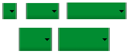
当你把这个背景用到控件上时(通过设置android:backgroud=“@drawable/button”),框架将会拉伸图片到正确的大小来适应按钮的大小,表现出不同的尺寸。如下如:


 507
507

 被折叠的 条评论
为什么被折叠?
被折叠的 条评论
为什么被折叠?
 到【灌水乐园】发言


