


目录
介绍
Avalonia是一个很棒的新的多平台.NET框架,用于构建UI桌面应用程序。它与WPF非常相似,更强大且错误更少,并且不仅可以在Windows上运行,还可以在Linux和Mac上运行。
通过WASM在浏览器中的Avalonia即将推出,原型已经在运行(请参阅浏览器预览中的Avalonia)。
用于移动开发的Avalonia也在筹备中。
我爱上了Avalonia,并且在过去的6个月里一直在与它进行广泛的合作。在此期间,我创建了(或从我以前的WPF库中移植)了许多Avalonia控件、实用程序和各种类型的行为,这些被证明对于构建Avalonia应用程序非常有用。它们都是开源的,在最宽松的MIT许可下共享,位于NP.Avalonia.Visuals中。NP.Avalonia.Visuals nuget包可从nuget.org获得。
本文描述了NP.Avalonia.Visuals库中最有用的控件,并为每个控件提供了工作使用示例。所有样本都经过测试,发现可以在Windows 10、Mac Catalina和Ubunty 20.04上运行。
此处描述的控件是:
- CustomWindow——带有可自定义标题的窗口
- AutoGrid——根据为其子项指定的行和列自动创建行和列定义的网格面板
- LabeledControl——将文本标签分配给其他控件或控件集
为了阅读本文,您应该了解WPF或Avalonia概念和开发的基础知识。
如果您是初学者,可以从以下文章开始:
- 在Easy Samples中使用AvaloniaUI进行多平台UI编码——第1部分——AvaloniaUI构建块
- 多平台Avalonia .NET Framework简单示例中的XAML基础知识
- 简单示例中的多平台Avalonia .NET Framework编程基本概念
- 简单示例中的多平台Avalonia .NET Framework编程高级概念
NP.Avalonia.Visuals库还包含主题和L10N功能,这里将不进行描述,因为它已经在另一篇文章——多平台Avalonia UI框架的主题化和本地化功能中进行了介绍。
本文中演示的所有源代码都位于NP.Demos.VisualSamples下。
如果您想创建自己的使用NP.Avalonia.Visuals库的项目,您应该从nuget.org将其安装为nuget包。在这种情况下,您不必安装Avalonia软件包,因为它们会被NP.Avalonia.Visuals拉取。此外,如果您使用UniDock框架,则不必安装NP.Avalonia.Visuals,因为它将由UniDock安装拉取。
CustomWindow 控件
毫无疑问,我创建的控件中最有用的是允许自定义窗口及其标题外观的CustomWindow控件,将一些有用的自定义信息或控件放入窗口标题并删除默认窗口镶边。
下面的示例描述了CustomWindow各种使用方式。
普通CustomWindow示例
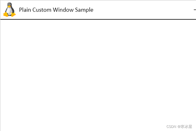
NP.Demos.CustomWindowSample解决方案演示了一个没有任何额外定制的平面CustomWindow。它提供了一个带有Linux图标和标题的自定义标题,而不是窗口镶边:
在解决方案中修改了两个XAML文件以实现此窗口布局——App.axaml和MainWindow.axaml。
App.axaml在对默认Avalonia主题的引用之上包含对CustomWindowStyles.axaml的引用:
<Application.Styles>
    <StyleInclude Source="avares://Avalonia.Themes.Default/Accents/BaseLight.xaml"/>
    <StyleInclude Source="avares://Avalonia.Themes.Default/DefaultTheme.xaml"/>

    <!-- refers to CustomWindowStyles.axaml from NP.Avalonia.Visual package-->
    <StyleInclude Source="avares://NP.Avalonia.Visuals/Themes/CustomWindowStyles.axaml"/>
</Application.Styles> 对MainWindow.asaml的更改也非常简单:
<np:CustomWindow
         ...
         Classes="PlainCustomWindow"
         CustomHeaderIcon="/Assets/LinuxIcon.png"
         HeaderHeight="50"
         Title="Plain Custom Window Sample"
         Width="600"
Height="400"/> Classes设置为“PlainCustomWindow”是指NP.Avalonia.Visuals包内的预定义Style。请注意,我们设置的不是窗口的Icon属性,而是CustomHeaderIcon指向包含窗口图标图像的文件。它还在任务栏中设置图标。
HeaderHeight属性允许我们设置窗口标题的高度。
其余的属性几乎是不言自明的。
带有图标和标题自定义的CustomWindow
我们的下一个示例——NP.Demos.CustomWindowIconAndTitleCustomizationSample展示了如何修改与窗口标题和图标相关的更多参数:
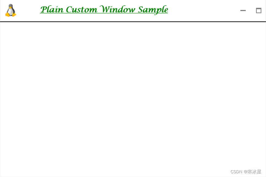
请注意,窗口标题是大的、粗体的、绿色的、华丽的和带下划线的。另请注意,图标和标题之间的水平距离更大。
这是MainWindow.axaml文件中的自定义代码:
<Window
        ...
        Classes="PlainCustomWindow"
        CustomHeaderIcon="/Assets/LinuxIcon.png"
        HeaderHeight="50"
        CustomHeaderIconHeight="30"
        CustomHeaderIconWidth="30"
        CustomHeaderIconMargin="10"
        Title="Plain Custom Window Sample"
        TitleMargin="40,0,0,0"
        TitleClasses="DefaultWindowTitle TitleText"
        CanClose="False"
        ... >
	<Window.Styles>
		<!-- creates the TitleText style for the test of the title-->
		<Style Selector="TextBlock.TitleText">
			<!-- bold -->
			<Setter Property="FontWeight"
				Value="Bold"/>
			<!-- Green -->
			<Setter Property="Foreground"
				Value="Green"/>

			<!-- large -->
			<Setter Property="FontSize"
				Value="18"/>

			<!-- fancy -->
			<Setter Property="FontFamily"
				Value="Lucida Calligraphy"/>

			<!-- underlined -->
			<Setter Property="TextDecorations"
				Value="Underline"/>
		</Style>
	</Window.Styles>
</Window> CustomHeaderIconHeight,CustomHeaderIconWidth和CustomHeaderIconMargin允许相应地指定图标的宽度、高度和边距。
TitleMargin指定标题周围的边距——它可以用来(在我们的例子中)设置图标和标题之间的距离。
TitleClasses指定Title文本的Style类。其中一个类——"DefaultWindowTitle"我们从NP.Avalonia.Visuals包中获取,另一个类——"TitleText" 我们在Window.Styles标签中定义:
<Window.Styles>
    <!-- creates the TitleText style for the test of the title-->
    <Style Selector="TextBlock.TitleText">
        <!-- bold -->
        <Setter Property="FontWeight"
            Value="Bold"/>
        <!-- Green -->
        <Setter Property="Foreground"
            Value="Green"/>

        <!-- large -->
        <Setter Property="FontSize"
            Value="18"/>

        <!-- fancy -->
        <Setter Property="FontFamily"
            Value="Lucida Calligraphy"/>

        <!-- underlined -->
        <Setter Property="TextDecorations"
            Value="Underline"/>
    </Style>
</Window.Styles>
正是这种风格使标题文本变得粗体的、绿色的、大的、华丽的和下划线。
更改右上角的按钮
每个窗口通常都有最小化、最大化/恢复和关闭按钮。在Windows和Linux上,它们通常位于右侧,在Mac上——位于左侧。
我们的下一个示例——NP.Demos.CustomWindowChangingButtonsSample展示了如何添加另一个按钮——编辑三个常用按钮:
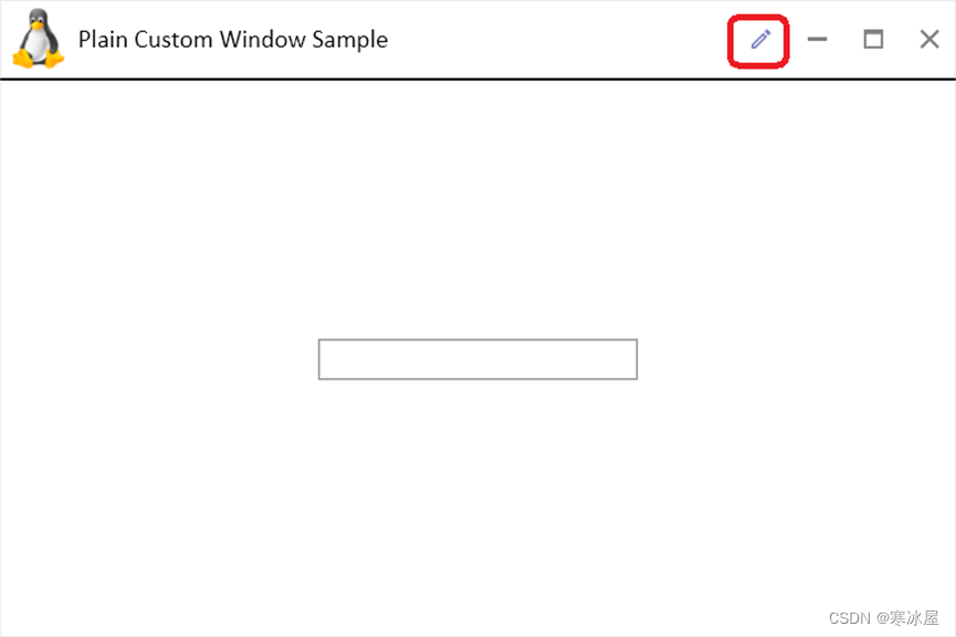
选中切换按钮时,其图标为蓝色,可以修改窗口中间的TextBox文本。取消选中切换按钮时,其图标为灰色,中间的TextBox被禁用。
为了控制窗口是否处于可编辑状态,我们在MainWindow.axaml.cs文件中添加CanEdit布尔Style属性:
#region CanEditContent Styled Avalonia Property
public bool CanEditContent
{
    get { return GetValue(CanEditContentProperty); }
    set { SetValue(CanEditContentProperty, value); }
}

public static readonly StyledProperty<bool> CanEditContentProperty =
    AvaloniaProperty.Register<MainWindow, bool>
    (
        nameof(CanEditContent),
        true
    );
#endregion CanEditContent Styled Avalonia Property 提醒——Avalonia中的样式属性与WPF中的Dependency属性基本相同。
在MainWindow.asaml文件中,我们通过设置ButtonAreaTemplate来更改按钮区域:
<np:CustomWindow ...>
    <np:CustomWindow.ButtonsAreaTemplate>
        <ControlTemplate>
            <StackPanel x:Name="FloatingWindowButtonsPanel"
                        Orientation="Horizontal">
                <!-- Edit toggle button -->
                <ToggleButton Classes="WindowIconButton IconButton IconToggleButton"
                              Opacity="0.5"
                              np:AttachedProperties.IconData="{StaticResource Pencil}"
                              ToolTip.Tip="Edit"
                              IsChecked="{Binding Path=$parent[Window].CanEditContent,
                                          Mode=TwoWay}"/>

                <!-- usual Minimize - Maximize/Restore and Close buttons -->
                <TemplatedControl Template="{StaticResource CustomWindowButtonsTemplate}"/>
            </StackPanel>
        </ControlTemplate>
   </np:CustomWindow.ButtonsAreaTemplate>
   ...
</np:CustomWindow>新的“编辑” ToggleButton与IconData设置为Pencil几何添加到旧按钮行表示CustomWindowButtonsTemplate。请注意,它的IsChecked属性是双向绑定到窗口上的CanEditContent属性的。
窗口的内容只包含TextBox,其IsEnabled属性绑定到窗口的CanEditContent Style属性:
<TextBox HorizontalAlignment="Center"
         VerticalAlignment="Center"
         Width="200"
         IsEnabled="{Binding Path=$parent[Window].CanEditContent}"/>
窗口标题中的自定义内容
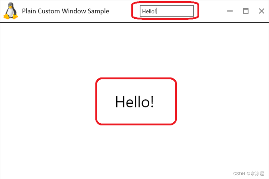
我们的下一个示例展示了如何将一个TextBox(或任何其他控件)插入到标题中。此外,它还展示了如何通过视图模型将此类控件连接到窗口内容中的另一个控件。
示例代码位于NP.Demos.CustomWindowHeaderContentSample解决方案中。它包含一个只有一个可通知Text属性的MyTestViewModel类:
public class MyTestViewModel : VMBase
{
    #region Text Property
    private string? _text;
    public string? Text
    {
        get
        {
            return this._text;
        }
        set
        {
            if (this._text == value)
            {
                return;
            }

            this._text = value;
            this.OnPropertyChanged(nameof(Text));
        }
    }
    #endregion Text Property
} 其余有趣的代码都位于MainWindow.asaml文件中:
<np:CustomWindow ...
                 HeaderContent="{DynamicResource TheViewModel}">
    <np:CustomWindow.HeaderContentTemplate>
        <DataTemplate>
            <TextBox Text="{Binding Text, Mode=TwoWay}"
                     Width="120"
                     Height="25"/>
        </DataTemplate>
    </np:CustomWindow.HeaderContentTemplate>
    <np:CustomWindow.Resources>
        <local:MyTestViewModel x:Key="TheViewModel"/>
    </np:CustomWindow.Resources>
    <TextBlock HorizontalAlignment="Center"
               VerticalAlignment="Center"
               Text="{Binding Text, Source={StaticResource TheViewModel}}"
               FontSize="34"/>
</np:CustomWindow> 我们将MyTestViewModel定义为窗口的资源:
<np:CustomWindow.Resources>
    <local:MyTestViewModel x:Key="TheViewModel"/>
</np:CustomWindow.Resources> CustomWindow将其HeaderContent属性设置为视图模型实例:HeaderContent="{DynamicResource TheViewModel}"。请注意,我们正在使用DynamicResource扩展,因为视图模型是定义在MainWindow.asaml文件中的HeaderContent赋值的下方。
TextBox通过HeaderContentTemplate属性将插入到标题中:
<np:CustomWindow.HeaderContentTemplate>
    <DataTemplate>
        <TextBox Text="{Binding Text, Mode=TwoWay}"
                 Width="120"
                 Height="25"/>
    </DataTemplate>
</np:CustomWindow.HeaderContentTemplate> HeaderContentTemplate提供的视觉效果的DataContext是由HeaderContent给出的,因此它将被设置为我们的视图模型实例,这样我们就可以轻松地将TextBox.Text绑定到视图模型的Text属性:Text="{Binding Text, Mode=TwoWay}"。
以类似的方式,我们将窗口内容中的TextBlock的Text绑定到视图模型的相同Text属性:
<TextBlock HorizontalAlignment="Center"
           VerticalAlignment="Center"
           Text="{Binding Text, Source={StaticResource TheViewModel}}"
           FontSize="34"/>
完全改变窗口的标题
我们的最后一个CustomWindow示例展示了如何完全重新设置窗口标题的样式,而不会与原始标题留下任何相似之处:
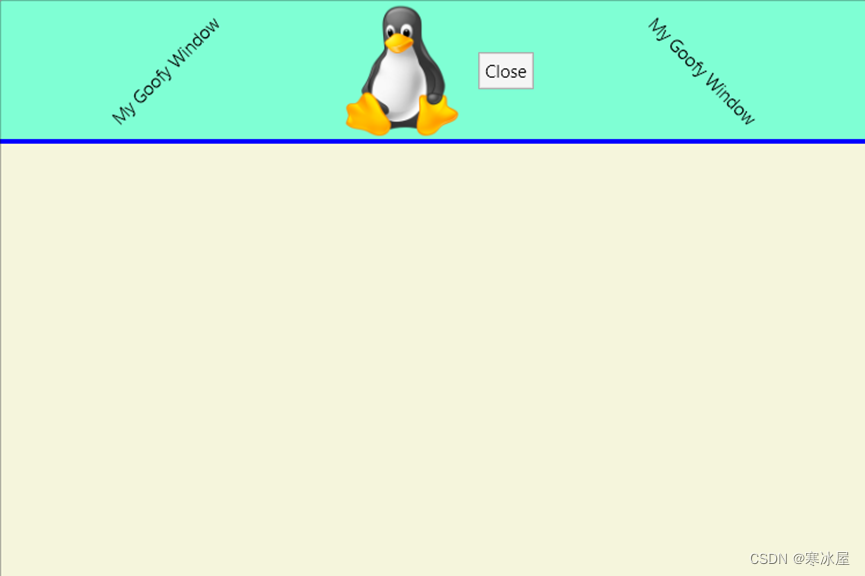
该示例的代码可以在NP.Demos.CustomWindowCompleteHeaderChangeSample下找到。
<np:CustomWindow ...
                 Classes="PlainCustomWindow"
                 BorderThickness="1"
                 BorderBrush="Black"
                 HeaderSeparatorHeight="3"
                 HeaderSeparatorBrush="Blue"
                 Background="Beige"
                 Width="600"
                 Height="400">
    <np:CustomWindow.HeaderTemplate>
        <ControlTemplate>
            <Grid Height="100"
                  Margin="0,0,0,-3"
                  DataContext="{Binding RelativeSource=
                               {RelativeSource AncestorType=np:CustomWindow}}">
                <Grid.ColumnDefinitions>
                    <ColumnDefinition Width="*"/>
                    <ColumnDefinition Width="Auto"/>
                </Grid.ColumnDefinitions>
                <Border Background="Aquamarine"
                        CornerRadius="5,5,0,0"
                        Grid.ColumnSpan="3"/>
                <TextBlock Text="My Goofy Window"
                           HorizontalAlignment="Center"
                           VerticalAlignment="Center">
                    <TextBlock.RenderTransform>
                        <RotateTransform Angle="-45"/>
                    </TextBlock.RenderTransform>
                </TextBlock>
                <StackPanel Orientation="Horizontal"
                            VerticalAlignment="Center"
                            Grid.Column="1">
                    <Image Source="/Assets/LinuxIcon.png"
                           VerticalAlignment="Center"
                           Stretch="Uniform"
                           np:CallAction.TheEvent="{x:Static InputElement.DoubleTappedEvent}"
                           np:CallAction.MethodName="Close"
                           Margin="2"/>
                    <Button Content="Close"
                            VerticalAlignment="Center"
                            Margin="2"
                            np:CallAction.TheEvent="{x:Static Button.ClickEvent}"
                            np:CallAction.MethodName="Close"/>
                </StackPanel>

                <TextBlock Text="My Goofy Window"
                           Grid.Column="2"
                           HorizontalAlignment="Center"
                           VerticalAlignment="Center">
                    <TextBlock.RenderTransform>
                        <RotateTransform Angle="45"/>
                    </TextBlock.RenderTransform>
                </TextBlock>
            </Grid>
        </ControlTemplate>
    </np:CustomWindow.HeaderTemplate>
</np:CustomWindow> 为了完全重新设计CustomWindow的标题,我们使用可以放入任何我们想要的东西的HeaderTemplate属性。
AutoGrid
另一个来自NP.Avalonia.Visuals的非常有用的控件是AutoGrid。它类似于Grid面板,但
- 不需要指定行和列定义。相反,将创建与其子项上定义的AutoGrid.Row和AutoGrid.Column附加属性相对应的唯一行和列。
- 允许有负值AutoGrid.Row和AutoGrid.Column值:行和列从最低数字到最高排列,无论数字是正数还是负数——例如,带有AutoGrid.Row = -10的行将始终位于带有AutoGrid.Row = -9的行的顶部。
来自上述两点的灵活性允许AutoGrid子控件轻松地改变他们的相互位置,如示例中所示。
默认情况下,使用相应GridLength设置为Auto创建的行和列——意味着默认行或列的大小与其内容相同。
但是,有一种方法可以为列的高度或行或宽度指定数字或星号(“*”),如示例中所述。
该示例的代码位于NP.Demos.AutoGridSamples下。
以下是运行示例后您将看到的内容:
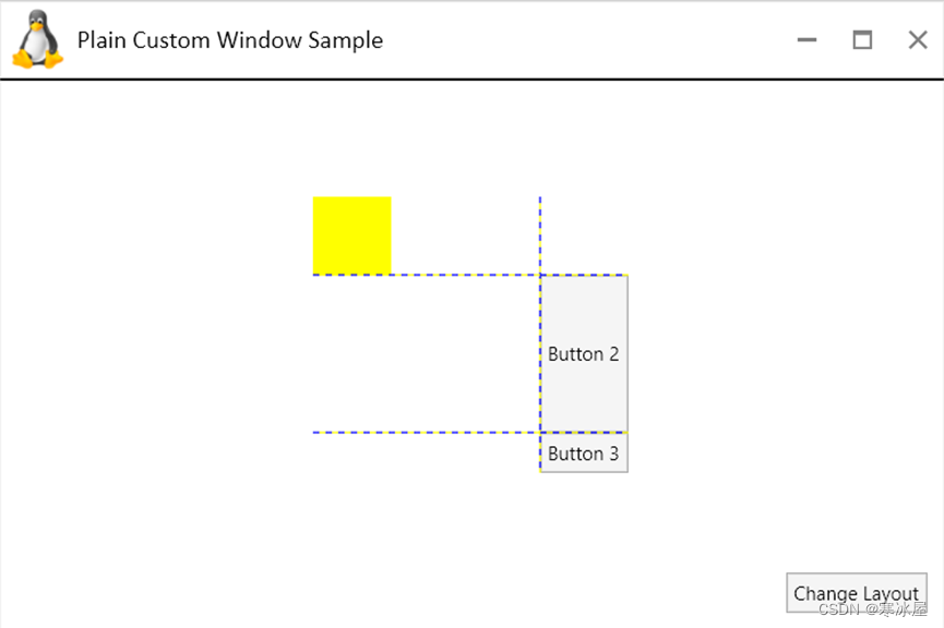
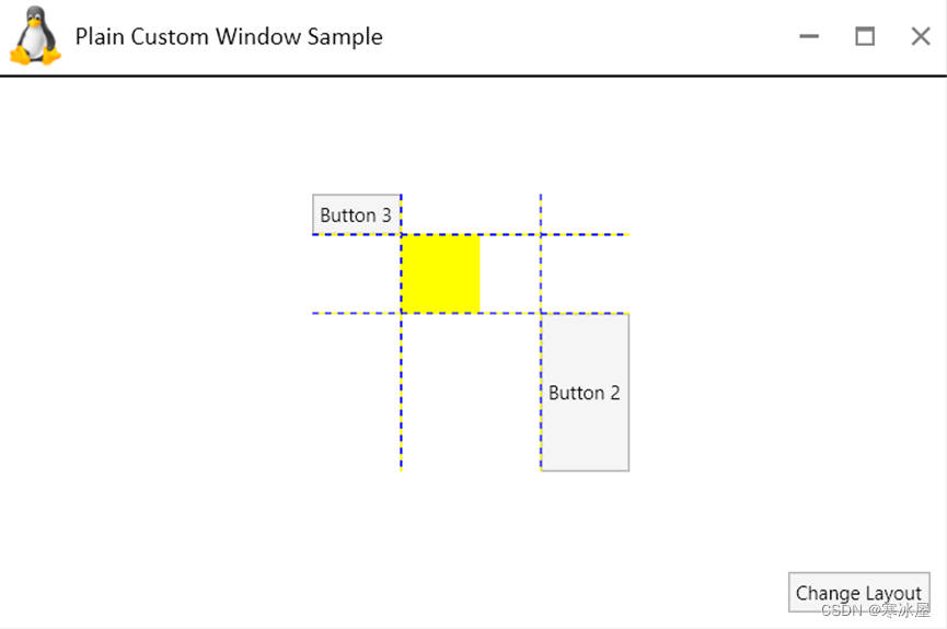
按“更改布局”按钮,“按钮3”将移动到最上/最左位置(从最右/最下):
这是MainWindow.axaml文件中有趣的部分:
<Grid RowDefinitions="*,Auto"
      Margin="10">
    <np:AutoGrid x:Name="MyAutoGrid"
                 Width="200"
                 HorizontalAlignment="Center"
                 VerticalAlignment="Center"
                 ShowGridLines="True">
        <np:AutoGrid.RowsHeights>
            <GridLength x:Key="1">100</GridLength>
        </np:AutoGrid.RowsHeights>
        <np:AutoGrid.ColumnsWidths>
            <GridLength x:Key="0">*</GridLength>
        </np:AutoGrid.ColumnsWidths>
        <Border Width="50"
                Height="50"
                HorizontalAlignment="Left"
                VerticalAlignment="Top"
                Background="Yellow"/>
        <Button Content="Button 2"
                np:AutoGrid.Row="1"
                np:AutoGrid.Column="1"/>
        <Button x:Name="Button3"
                Content="Button 3"
                np:AutoGrid.Row="2"
                np:AutoGrid.Column="1"/>
    </np:AutoGrid>
    <Button x:Name="ChangeLayoutButton"
            Content="Change Layout"
            Grid.Row="1"
            HorizontalAlignment="Right"/>
</Grid> 底部的按钮用于在AutoGrid中执行布局更改。 AutoGrid包含一个50x50的黄色边框(在Row=0和Column=0的默认单元格内)。它还包含两个按钮:
- "Button 2" 在row=1和column=1中
- "Button 3" 在row=2和column=1中
我们将AutoGrid的宽度设置为200。
代码行:
<np:AutoGrid.RowsHeights>
    <GridLength x:Key="1">100</GridLength>
</np:AutoGrid.RowsHeights>意味着我们的AutoGrid第1行有高度为 100。
代码行:
<np:AutoGrid.ColumnsWidths>
    <GridLength x:Key="0">*</GridLength>
</np:AutoGrid.ColumnsWidths> 表示第0列或我们的AutoGrid的宽度为“*”(这意味着它需要其他列留下的任何宽度来确保网格的总宽度为200)。
您可以看到,在第一个屏幕中,第0列的宽度比黄色边框所需的宽度大得多。此外,第1列的高度为100,这远高于“Button 2”所需的高度。
按下“更改布局”按钮(借助后面的代码)将“Button 3”上定义的AutoGrid.Row和AutoGrid.Column参数从2和1相应地更改为-1和-1。按钮移动到左上角。请注意,新的行和列分别用-1和-1进行索引,因此第0行和第0列现在位于中间,而第1行和第1列现在相应地位于底部和右侧。第1行(现在是底行)仍然具有高度100,第0列(现在是中间列)仍然具有星形宽度(占用剩余空间以构成网格的整个宽度)。
LabeledControl
各种应用程序通常具有控制字段,并在字段旁边带有一些描述它们的文本。有些应用程序在字段上方有这样的文本,有些在它们旁边,有些甚至可以——在它们的右侧,但在单个应用程序中,文本相对于它们描述的字段的位置通常是相同的(如果它不一样——您可能应该修复它)。
在从事各种项目时,我一次又一次地遇到这种范例,并构建了自定义控件来简化处理这些领域的过程。
在这里,我介绍了为Avalonia构建的此类控件(称为LabeledControl),作为NP.Avalonia.Visuals包的一部分。我使用了上一节中描述的灵活AutoGrid方式,以便可以轻松地更改控件相对于文本的位置。
NP.Demos.LabeledControlSamples包含LabeledControl的使用示例。请注意,为了显示各种可能的标签字段排列,我为水平和垂直布局创建了几种不同的样式,但通常在单个应用程序甚至单个应用程序套件中,您应该只使用一个标签字段布局。
以下是您在运行应用程序时将看到的内容:
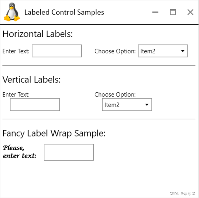
分为三个部分:
- 上一页展示了如何创建带有TextBox和ComboBox作为字段的水平标签控件
- 中间一个显示如何创建具有相同字段的垂直LabeledControls
- 底部显示了如何创建一个带有精美标签样式的包装的LabeledControl
所有有趣的代码都位于MainWindow.axaml文件下。
这是水平标签字段排列的样式:
<Style Selector="np|LabeledControl">
    <Setter Property="ControlRow"
            Value="0"/>
    <Setter Property="ControlColumn"
            Value="1"/>
    <Setter Property="VerticalTextAlignment"
            Value="Center"/>
    <Setter Property="Padding"
            Value="5,0,0,0"/>
    <Setter Property="Margin"
            Value="5,5,20,5"/>
</Style> ControlRow和ControlColumn在AutoGrid中相对于文本设置字段的行和列。ControlRow=0表示它与文本在同一行,而ControlColumn=1表示它在文本的左侧。
Padding指定控件相对于文本的偏移——在我们的例子中, Padding="5,0,0,0意味着我们的控件向右偏移距离文本5个通用像素。
下面是我们如何创建LabeledControl:
<np:LabeledControl Text="Enter Text:"
                   np:AutoGrid.Row="1">
    <np:LabeledControl.ContainedControlTemplate>
        <ControlTemplate>
            <TextBox Width="100"/>
        </ControlTemplate>
    </np:LabeledControl.ContainedControlTemplate>
</np:LabeledControl> 请注意,我们使用ContainedControlTemplate属性将控件(或一组控件)放置在文本旁边。
这是垂直文本/控件排列的样式:
<Style Selector="np|LabeledControl">
    <Setter Property="ControlRow"
            Value="1"/>
    <Setter Property="VerticalTextAlignment"
            Value="Center"/>
    <Setter Property="Padding"
            Value="15,0,0,0"/>
    <Setter Property="Margin"
            Value="5,5,20,5"/>
</Style> ControlColumn现在是0(默认),ControlRow=1表示控件位于文本下方。Padding=15,0,0,0从文本中创建一个向右的偏移。
对于底行的花哨文本,我们创建一个花哨的文本样式,提供类名——“FancyStyle”:
<Style Selector="TextBlock.FancyStyle">
    <Setter Property="FontWeight"
            Value="Bold"/>
    <Setter Property="FontFamily"
            Value="Lucida Calligraphy"/>
</Style>然后我们将这个类传递给LabeledControl.TextClasses属性以使用它来设置LabeledControl标签的样式:
<np:LabeledControl Text="Please, enter text:"
                   MaxTextWidth="70"
                   TheTextWrapping="WrapWithOverflow"
                   TextClasses="FancyStyle"
                   VerticalTextAlignment="Center"
                   ControlColumn="1"
                   ControlRow="0"
                   np:AutoGrid.Row="1">
    <np:LabeledControl.ContainedControlTemplate>
        <ControlTemplate>
            <TextBox Width="100"/>
        </ControlTemplate>
    </np:LabeledControl.ContainedControlTemplate>
</np:LabeledControl> 我们还可以使用MaxTextWidth来指定文本的MaxWidth属性,并且TheTextWrapping指定标签是否应该在超出MaxWidth或不换行时换行。
结论
在本文中,我描述了NP.Avalonia.Visuals开源库中最有用的控件的功能,这些控件也可作为nuget包使用。特别是,我详细描述:
- CustomWindow
- AutoGrid
- LabeledControl
我计划发布更多关于NP.Avalonia.Visuals功能的文章,重点介绍位于该库中的一些非常有用的行为、实用程序和转换器。
https://www.codeproject.com/Articles/5320502/Useful-Generic-Avalonia-Controls-located-within-NP


 876
876


 被折叠的 条评论
为什么被折叠?
被折叠的 条评论
为什么被折叠?
 到【灌水乐园】发言


