


.container {
  display: flex;
  height: 100%;
  flex-direction: column;
  overflow: hidden;
  background-color: #fff;
}
display 标签
display 属性可以设置元素的内部和外部显示类型 display types。元素的外部显示类型 outer display types 将决定该元素在流式布局中的表现(块级或内联元素);元素的内部显示类型 inner display types 可以控制其子元素的布局(例如:flow layout,grid 或 flex)。
在 CSS 规范(特指 CSS Level 1/2/3 规范)中查阅 display 属性的所有取值时需要注意:个别取值的详细信息记录在独立的规范中。 例如,display: flex 的详细信息在 CSS Flexible Box Model 规范中记录。可以在本文档末尾的表格中查看所有有关的规范。
| 类型 | 解释 |
|---|---|
<display-outside> | 这些关键字指定了元素的外部显示类型,实际上就是其在流式布局中的角色(即在流式布局中的表现)。 |
<display-inside> | 这些关键字指定了元素的内部显示类型,它们定义了该元素内部内容的布局方式(假定该元素为非替换元素 non-replaced element)。 |
<display-listitem> | 将这个元素的外部显示类型变为 block 盒,并将内部显示类型变为多个 list-item inline 盒。 |
| … | … |
flex
The element behaves like a block element and lays out its content according to the flexbox model.
元素的行为如同块模型,它的内容按照flexBox模型排列。
flexBox
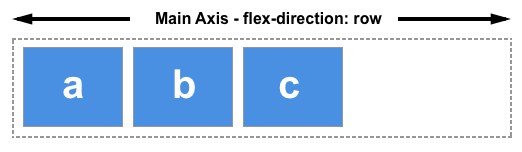
The main axis
The main axis is defined by flex-direction, which has four possible values:
- row
- row-reverse
- column
- column-reverse
Should you choose row or row-reverse, your main axis will run along the row in the inline direction.
Choose column or column-reverse and your main axis will run from the top of the page to the bottom — in the block direction.


 553
553


 被折叠的 条评论
为什么被折叠?
被折叠的 条评论
为什么被折叠?
 到【灌水乐园】发言


