


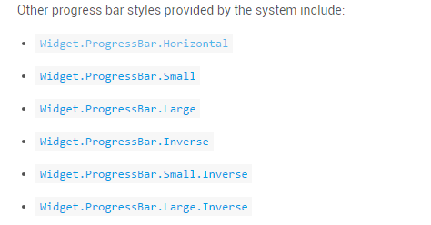
1. 系统提供了水平progressbar 组件。可以方便的实现进度条和加载框。二者的区别在于定义的style。以系统提供的源码来分析:
源码提供的 style样式
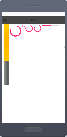
下面是使用不同style的效果图(除了第一个垂直progressbar)
说了这么多,究竟系统是这么控制让一个progressBar 既能实现水平进度也可以实现加载进度呢?
答案就在 style中,下面以水平progressbar为例子进行分析:
  <ProgressBar        style="@style/Base.Widget.AppCompat.ProgressBar.Horizontal"
        android:layout_width="100dp"
        android:layout_height="wrap_content"
        android:max="100"
        android:progress="50" />
首先看一下
style="@style/Base.Widget.AppCompat.ProgressBar.Horizontal" \sdk\platforms\android-20\data\res\values\styles.xml

  <style name="Widget.ProgressBar.Horizontal">
        <item name="indeterminateOnly">false</item>
        <item name="progressDrawable">
        @drawable/progress_horizontal</item>
        <item name="indeterminateDrawable">
                       @drawable/progress_indeterminate_horizontal</item>
        <item name="minHeight">20dip</item>
        <item name="maxHeight">20dip</item>
        <item name="mirrorForRtl">true</item>
    </style>
@drawable/progress_horizontal中定义了 progressbar的 背景drawable,secondaryProgress,progress 的样式
<layer-list xmlns:android="http://schemas.android.com/apk/res/android">

    <item android:id="@android:id/background">
        <shape>
            <corners android:radius="5dip" />
            <gradient
                    android:startColor="#ff9d9e9d"
                    android:centerColor="#ff5a5d5a"
                    android:centerY="0.75"
                    android:endColor="#ff747674"
                    android:angle="270"
            />
        </shape>
    </item>

    <item android:id="@android:id/secondaryProgress">
        <clip>
            <shape>
                <corners android:radius="5dip" />
                <gradient
                        android:startColor="#80ffd300"
                        android:centerColor="#80ffb600"
                        android:centerY="0.75"
                        android:endColor="#a0ffcb00"
                        android:angle="270"
                />
            </shape>
        </clip>
    </item>

    <item android:id="@android:id/progress">
        <clip>
            <shape>
                <corners android:radius="5dip" />
                <gradient
                        android:startColor="#ffffd300"
                        android:centerColor="#ffffb600"
                        android:centerY="0.75"
                        android:endColor="#ffffcb00"
                        android:angle="270"
                />
            </shape>
        </clip>
    </item>

</layer-list>
@drawable/progress_indeterminate_horizontal中定义了 进度条的动画样式
<animation-list
       xmlns:android="http://schemas.android.com/apk/res/android"
        android:oneshot="false">
<item android:
drawable="@drawable/progressbar_indeterminate1" android:duration="200" />
<item android:
drawable="@drawable/progressbar_indeterminate2" android:duration="200" />
<item android:
drawable="@drawable/progressbar_indeterminate3" android:duration="200" />

</animation-list>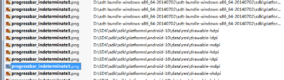
标红地方是三张图片样式(不同平台略有不同)
类似progressbar 加载框只是改了drable 图片,加了旋转动画。可以自行查看 \sdk\platforms\android-20\data\res\drawable 中源码(关于progessbar 加载框的)
以上部分只是简单分析了progressbar的一些属性和如何查看系统style样式,同样对系统style稍加修改就可以成为自定义样式的组件。
要想让progressbar 垂直了。需要了解android drawable的类别及clip标签使用
Android内置了如下几种Drawable类型:ColorDrawable、GradientDrawable、BitmapDrawable、 NinePatchDrawable、InsetDrawable、ClipDrawable、ScaleDrawable、RotateDrawable、AnimationDrawable、LayerDrawable、LevelListDrawable、StateListDrawable、TransitionDrawable。
资源分类:
我们只需要修改 style 中 progress 的
android:clipOrientation=”vertical”
android:gravity=”top” ,系统就会帮我们对progressBar进行旋转
  <item android:id="@android:id/progress">
        <clip
            android:clipOrientation="vertical"
            android:gravity="top">
            <shape>
                <corners android:radius="5dip"/>
                <gradient
                    android:angle="90"
                    android:centerColor="#ffffb600"
                    android:centerX="0.75"
                    android:endColor="#ffffcb00"
                    android:startColor="#ffffd300"
                    />
            </shape>
        </clip>
    </item>
当然简单介绍一下 标签的子标签,子标签包含对图片裁剪的三个属性。
android:drawable:指定要剪切的原图像。
android:clipOrientation:截取的方向。可取的值:horizontal和vertical。分别表 示水平和垂直方向截取图像。
android:gravity:表示如何截取图像。例如,left表示从左侧截取图像,right表示从右侧截取图像。
这样无需进行复杂的修改就可以完成垂直进度条的实现。


 扫一扫
扫一扫
 812
812

 被折叠的 条评论
为什么被折叠?
被折叠的 条评论
为什么被折叠?
 到【灌水乐园】发言


