<!DOCTYPE html>
<html lang="zh-CN">
<head>
<meta charset="utf-8">
<meta http-equiv="X-UA-Compatible" content="IE=edge">
<meta name="viewport" content="width=device-width, initial-scale=1">
<style type="text/css">
pre {
padding: 10px;
border: 1px solid #cccccc;
background-color: #f1f1f1;
}
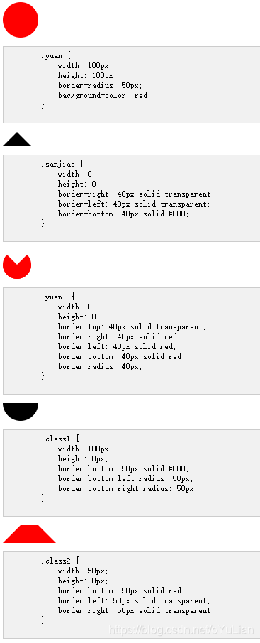
.yuan {
width: 100px;
height: 100px;
border-radius: 50px;
background-color: red;
}
.yuan1 {
width: 0;
height: 0;
border-top: 40px solid transparent;
border-right: 40px solid red;
border-left: 40px solid red;
border-bottom: 40px solid red;
border-radius: 40px;
}
.sanjiao {
width: 0;
height: 0;
border-right: 40px solid transparent;
border-left: 40px solid transparent;
border-bottom: 40px solid #000;
}
.class1 {
width: 100px;
height: 0px;
border-bottom: 50px solid #000;
border-bottom-left-radius: 50px;
border-bottom-right-radius: 50px;
}
.class2 {
width: 50px;
height: 0px;
border-bottom: 50px solid red;
border-left: 50px solid transparent;
border-right: 50px solid transparent;
}
</style>
</head>
<body>
<div class="yuan"></div>
<pre>
.yuan {
width: 100px;
height: 100px;
border-radius: 50px;
background-color: red;
}
</pre>
<br>
<div class="sanjiao"></div>
<pre>
.sanjiao {
width: 0;
height: 0;
border-right: 40px solid transparent;
border-left: 40px solid transparent;
border-bottom: 40px solid #000;
}
</pre>
<br>
<div class="yuan1"></div>
<pre>
.yuan1 {
width: 0;
height: 0;
border-top: 40px solid transparent;
border-right: 40px solid red;
border-left: 40px solid red;
border-bottom: 40px solid red;
border-radius: 40px;
}
</pre>
<br>
<div class="class1"></div>
<pre>
.class1 {
width: 100px;
height: 0px;
border-bottom: 50px solid #000;
border-bottom-left-radius: 50px;
border-bottom-right-radius: 50px;
}
</pre>
<br>
<div class="class2"></div>
<pre>
.class2 {
width: 50px;
height: 0px;
border-bottom: 50px solid red;
border-left: 50px solid transparent;
border-right: 50px solid transparent;
}
</pre>
</body>
</html>


 5206
5206


 被折叠的 条评论
为什么被折叠?
被折叠的 条评论
为什么被折叠?
 到【灌水乐园】发言


