


最近在实现tab页切换时突然想到写一个圆角梯形,但是又需要与底部的连接向外扩展一个弧度,我就寻思使用伪类和阴影来实现。
这是实现效果:
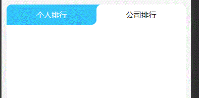
想法是先用伪类创建一个与底色一样圆形,再用阴影扩展出一个与tab页颜色一样的圆形,再用伪类的圆形去盖住tab页颜色的圆形,最后使用定位来置于底部。
这是具体思路:
HTML:
			<view class="tabs">
				<view @click="tabChange(1)" :class="activeIndex===1?'actleft':'left'">个人排行</view>
				<view @click="tabChange(2)" :class="activeIndex===2?'actright':'right'">公司排行</view>
			</view>
SCSS:
.tabs{
		display: flex;
		justify-content: space-between;
		border-radius: 20px;
		background-color: #33c4f8;
		view{
			transition: color 0.5s;
			font-size: 30rpx;
		}

		.actleft,.right{
			text-align: center;
			width: 50%;
			background-color: white;
			border-radius: 10px 10px 0 0;
			padding: 10px;
		}
		.actleft{
			z-index: +1;
			position: relative;
		}
		.actleft::after{
			content: '';
			animation: opacityAct 0.5s forwards;
			position: absolute;
			right: -20px;
			bottom: 0px;
			width: 20px;
			height: 20px;
			background-color: #33c4f8;
			border-radius: 50%;
			box-shadow: white -10px 10px 0px 0px;
		}
		.right{
			border-radius: 10px 10px 0 10px;
			background-color: #33c4f8;
			color: white;
			overflow: hidden;
		}


		.left,.actright{
			text-align: center;
			width: 50%;
			background-color: white;
			border-radius: 10px 10px 0 0;
			padding: 10px;
		}
		.actright{
			z-index: +1;
			position: relative;
		}
		.actright::after{
			content: '';
			position: absolute;
			left: -20px;
			bottom: 0px;
			width: 20px;
			height: 20px;
			background-color: #33c4f8;
			border-radius: 50%;
			box-shadow: white 10px 10px 0px 0px;
		}
		.left{
			border-radius: 10px 10px 10px 0px;
			color: white;
			background-color: #33c4f8;
			overflow: hidden;
		}

	}


 694
694


 被折叠的 条评论
为什么被折叠?
被折叠的 条评论
为什么被折叠?
 到【灌水乐园】发言


