


对于实现如图样式?

并列关系(粉色背景条与正文内容为并列关系) 注意需要设置z-index:1实现分层,使其层级下去不会遮住正文内容,还需要对背景条设置绝对定位
代码如下:
html代码
<div class="big">
    <div class="bg"></div>
    <div class="content">正文内容</div>
</div>

css代码
.big{
    width: 1190px;
    height: 200px;
    margin: 0 auto;        /*让里面文本内容居中*/
}
.bg{
    position: absolute;
    left: 0;           /*让背景条绝对定位出去左对齐*/
    width: 100%;          /*设置宽度为浏览器默认宽度*/
    height: 200px;
    background-color: pink;
    z-index: -1;
}
.content{
    width: auto;
    height: 200px;
    border: 1px solid red;
}
- 父子关系(将粉色背景当作正文内容的背景)
代码如下:
html代码
<div class="bg">
    <div class="content">正文内容</div>
</div>
css代码
*{
    padding: 0;
    margin: 0px;
}
.bg{
    width: 100%;          /*设置宽度为浏览器默认宽度*/
    height: 200px;
    background-color: pink;
}
.content{
    width: 1190px;
    height: 200px;
    border: 1px solid red;
    margin: 0 auto;                 /*让里面文本内容居中*/
}
固定定位
语法为:poisition:fixed;
需要注意的是固定布局不占位置跟绝对定位一样,无论网页多大,固定布局的元素相对于浏览器位置固定。所以有时候下面的元素会跑上去。即为这种
解决的办法有两种。
在固定布局元素的下面设置一个宽高跟它一模一样的空div占着他的位置。
代码如下:
html代码
<div class="guding"></div>
<div class="main">
    <div class="kong"></div>
    <div class="tu">
        防止此div跑上去到固定元素的下面
    </div>
</div>
css代码
.guding{
    width: 100%;
    position: fixed;       /*固定定位*/
    height:200px;
    background-color: #000000;
}
.main{
    width: 1190px;
    margin: 0 auto;
}
.kong{
     height: 200px;     /*因为固定定位的元素不占空间,下面的元素会自动上去所以加空div*/
     width: 100%;
     border: 1px solid black;
}
.tu{
    width: 100%;
    height:300px;
    border: 1px solid red
}
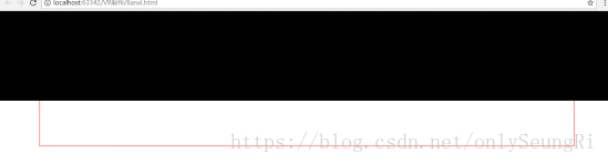
对固定布局下面的元素设置padding-top值等于固定布局元素的高,把下面的元素撑开。
html代码
<div class="guding"></div>
<div class="main">
    利用padding撑开元素
</div>
css代码
.guding{
    width: 100%;
    position: fixed;       /*固定定位*/
    height:200px;
    background-color: #000000;
}
.main{
    height: 300px;
    padding-top: 200px;    /*利用padding撑开元素*/
    width: 1190px;
    margin: 0 auto;
    border: 1px solid red;
}
修改后效果如图
3.怎样用浮动实现选项卡?
对要悬停出来的子元素绝对定位,对父元素设置overflow:hidden,对父元素的父元素设置相对定位。
4.颜色透明度的应用
eg:怎样实现如图所示效果?
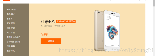
步骤
1.让左边框绝对定位不占位置;
2.对右边框设置宽度等于左右框宽度之和;
3.在对左边框设置透明色。使其透明度刚好看可以看见右边框伸过来的图片即可;
代码如下
html
<div class="text_bottom">
<div class="text_bottom_left">
<ul>
<li>手机 电话卡</li>
</ul>
</div>
<div class="text_bottom_right">
<img src="./img/vi3.jpg">
</div>
</div>
css
.text_bottom{
height: auto;
overflow: hidden;
}
.text_bottom_left{
width: 180px;
height: 460px;
float: left;
position: absolute;/*让其不占位置设置透色*/
background-color: rgba(112, 128, 144, 0.33);
}
.text_bottom_right{
width: 1020px; /*让其不占位置设置透明色,使右边的宽度等于总宽*/
height: auto;
float: left;
}
5.小技巧总结
- 顺序问题:对img元素设置样式必须写在图片插入之后,对图片上方设置悬停出现阴影,在html中必须将阴影块写在图片上方
- out-line:none; 去掉input的边框
- border-style:none 去掉input默认获取焦点后的蓝色边框
background: url("./img/vi2.jpg") 0 0 no-repeat;
background: url("./img/vi2.jpg")center no-repeat;


 2163
2163


 被折叠的 条评论
为什么被折叠?
被折叠的 条评论
为什么被折叠?
 到【灌水乐园】发言


