


背景
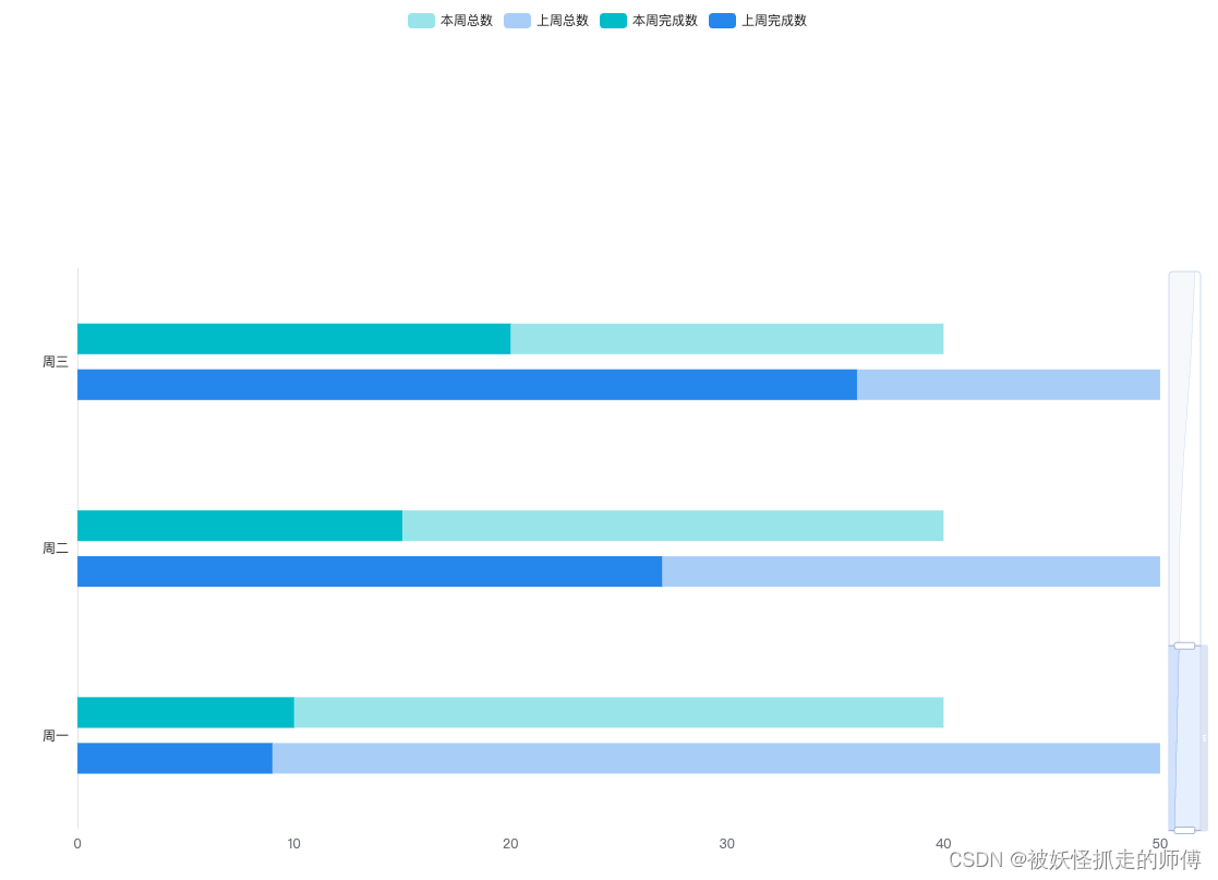
近期有个需求,要实现一个多组柱状图堆叠对比的图表,先看实现后的效果图:
实现过程
需要在有限高度的容器里实现如上图的柱状图,先开始我试了下通过barGap这个属性来实现所需要的效果,但是发现如果只是两个柱状图的话使用这个属性就没什么问题,但是多个的话barGap这个属性就不能达到效果了,通过多次尝试得到了下边这个方法来实现,直接上代码:
option = {
    tooltip: {
        trigger: 'axis',
        axisPointer: {
            type: 'shadow',
            shadowStyle: {
                color: '#323232',
                opacity: 0
            }
        },
    },
    legend: { },
    dataZoom: [{
        show: true,
        type: 'slider',
        orient: 'vertical',
        realtime: true,
        showDetail: false,
        // 将两个 Y 轴的索引都加入到 dataZoom 的设置中
        // 这步设置非常重要可以保证 dataZoom 的正常使用,进行配置才能同时控制所有柱
        yAxisIndex: [0, 1],
        startValue: 0,
        endValue: 2,
    }],
    grid: {
        left: '3%',
        right: '4%',
        bottom: '3%',
        top: '30%',
        containLabel: true
    },
    yAxis: [
        {
            type: 'category',
            data: ['周一', '周二', '周三', '周四', '周五', '周六', '周日'],
            axisTick: {
                show: false
            },
            axisLine: {
                lineStyle: {
                    color: '#e4e4e4',
                    width: 1
                }
            },
            axisLabel: {
                show: true,
                textStyle: {
                    color: '#323232',
                    fontSize: 12
                }
            },
        },
        {
            type: 'category',
            axisLine: {
                show: false
            },
            axisTick: {
                show: false
            },
            axisLabel: {
                show: false
            },
            splitArea: {
                show: false
            },
            splitLine: {
                show: false
            },
            data: ['周一', '周二', '周三', '周四', '周五', '周六', '周日'],
        },
    ],
    xAxis: [
        {
            type: 'value',
            axisTick: {
                show: false
            },
            axisLine: {
                show: false
            },
            splitLine: {
                show: false,
            }
        }
    ],
    series: [
        {
            name: '本周总数',
            type: 'bar',
            yAxisIndex: 1,
            itemStyle: {
                normal: {
                show: true,
                color: 'rgba(41, 188, 203, 0.4)'
                }
            },
            barWidth: 28,
            data: [40, 40, 40, 40, 40, 40, 40]
        }, {
            name: '上周总数',
            type: 'bar',
            yAxisIndex: 1,
            barWidth: 28,
            barGap: '50%', // 设置多柱之间空隙
            itemStyle: {
                normal: {
                show: true,
                color: 'rgba(63, 133, 240, 0.4)'
                }
            },
            data: [50, 50, 50, 50, 50, 50, 50]
        }, {
            name: '本周完成数',
            type: 'bar',
            barWidth: 28,
            itemStyle: {
                normal: {
                show: true,
                color: 'rgba(41, 188, 203, 1)'
                }
            },
            data: [10, 15, 20, 20, 30, 45, 55]
        }, {
            name: '上周完成数',
            type: 'bar',
            barWidth: 28,
            barGap: '50%',
            itemStyle: {
                normal: {
                show: true,
                color: 'rgba(63, 133, 240, 1)'
                }
            },
            data: [9, 27, 36, 30, 22, 35, 40]
        }
    ]
};
总结
这个功能的主要思路就是设计两个Y轴,一个X轴,一组数据使用一个Y轴从而控制重合,实现多柱情况下的堆叠或重叠。实现过程中遇到了dataZoom组件无法控制两组柱状图的情况,因为有两个Y轴所以要对dataZoom进行相应的配置让其可以同时控制两个轴的数据
如有纰漏欢迎大佬指正。


 1万+
1万+


 被折叠的 条评论
为什么被折叠?
被折叠的 条评论
为什么被折叠?
 到【灌水乐园】发言


