


前言
最近开始搞flutter,然后想去使用TabBar,遇到了一些坑,记录一下。
分析过程
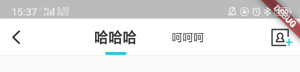
需求是这样:
需要处理这样几个细节:
- 下划线固定宽度
- 下划线圆角
- 下划线和文字的间距
- 两个文字之间的间距
然后在使用TabBar过程中:
- 下划线想固定25,indicatorSize只有两个属性,一是与tab父布局同宽,二是与字同宽
- 圆角看看能不能用自定义indicator来实现
- 默认的text和下划线挺大的,看看有什么办法改改
- 文字间的默认间距也挺大,看看怎么改
看看源码研究一下:那么找到TabBar有一个indicator的属性。
看注释大体是说如果使用自定义的indicator,那么indicatorColor、indicatorWeight、indicatorPadding都将被忽略
默认的indicator是UnderlineTabIndicator,然后indicator的size有两种情况


OK,那我们找一找这个indicator是怎么初始化的,在_TabBarState中找到:

然后在UnderlineTabIndicator中找到了答案,我们把UnderlineTabIndicator拷贝出来改个名
修改如下两处就可以固定宽度和修改圆角:

对于下划线和文字的间距问题,找到Tab,看到text是居中显示的,而且tab高度是固定的
如果你的Container的高度比46小,那么indicator就会被截掉一部分,甚至是截没了
我们把tab拷贝出来换个命名,然后把高度改低一些

对于两个tab间距很宽的问题,看了一下发现有默认的padding,然后添加labelPadding属性就OK了
那么最后这样使用:
child: TabBar(
   indicator: RoundUnderlineTabIndicator(
      borderSide: BorderSide(
         width: 3.5,
         color: Color(0xff00cdd7),
      )
   ),
   labelColor: Color(0xff333333),
   labelStyle: TextStyle(fontSize: 17, fontWeight: FontWeight.bold),
   labelPadding: EdgeInsets.only(left: 0, right: 0),
   unselectedLabelColor: Color(0xff333333),
   unselectedLabelStyle: TextStyle(fontSize: 13, fontWeight: FontWeight.normal),
   controller: controller,
   tabs: [VgTab(text:"哈哈哈"), VgTab(text:"呵呵 · 99")],
),
修改后的源码,将以下代码保存到一个新的dart文件里,就可以使用RoundUnderlineTabIndicator和VgTab了:
/**************************** 以下为修改的源码部分 ******************************/
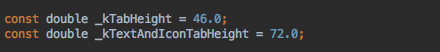
// 默认高度从46改为40
const double _kTabHeight = 40.0;
const double _kTextAndIconTabHeight = 72.0;
class RoundUnderlineTabIndicator extends Decoration {
/// Create an underline style selected tab indicator.
///
/// The [borderSide] and [insets] arguments must not be null.
const RoundUnderlineTabIndicator({
this.borderSide = const BorderSide(width: 2.0, color: Colors.white),
this.insets = EdgeInsets.zero,
}) : assert(borderSide != null),
assert(insets != null);
/// The color and weight of the horizontal line drawn below the selected tab.
final BorderSide borderSide;
/// Locates the selected tab's underline relative to the tab's boundary.
///
/// The [TabBar.indicatorSize] property can be used to define the
/// tab indicator's bounds in terms of its (centered) tab widget with
/// [TabIndicatorSize.label], or the entire tab with [TabIndicatorSize.tab].
final EdgeInsetsGeometry insets;
@override
Decoration lerpFrom(Decoration a, double t) {
if (a is UnderlineTabIndicator) {
return UnderlineTabIndicator(
borderSide: BorderSide.lerp(a.borderSide, borderSide, t),
insets: EdgeInsetsGeometry.lerp(a.insets, insets, t),
);
}
return super.lerpFrom(a, t);
}
@override
Decoration lerpTo(Decoration b, double t) {
if (b is UnderlineTabIndicator) {
return UnderlineTabIndicator(
borderSide: BorderSide.lerp(borderSide, b.borderSide, t),
insets: EdgeInsetsGeometry.lerp(insets, b.insets, t),
);
}
return super.lerpTo(b, t);
}
@override
_UnderlinePainter createBoxPainter([ VoidCallback onChanged ]) {
return _UnderlinePainter(this, onChanged);
}
}
class _UnderlinePainter extends BoxPainter {
_UnderlinePainter(this.decoration, VoidCallback onChanged)
: assert(decoration != null),
super(onChanged);
final RoundUnderlineTabIndicator decoration;
BorderSide get borderSide => decoration.borderSide;
EdgeInsetsGeometry get insets => decoration.insets;
Rect _indicatorRectFor(Rect rect, TextDirection textDirection) {
assert(rect != null);
assert(textDirection != null);
final Rect indicator = insets.resolve(textDirection).deflateRect(rect);
// return Rect.fromLTWH(
// indicator.left,
// indicator.bottom - borderSide.width,
// indicator.width,
// borderSide.width,
// );
//希望的宽度
double wantWidth = 25;
//取中间坐标
double cw = (indicator.left + indicator.right) / 2;
return Rect.fromLTWH(cw - wantWidth / 2,
indicator.bottom - borderSide.width, wantWidth, borderSide.width);
}
@override
void paint(Canvas canvas, Offset offset, ImageConfiguration configuration) {
assert(configuration != null);
assert(configuration.size != null);
final Rect rect = offset & configuration.size;
final TextDirection textDirection = configuration.textDirection;
final Rect indicator = _indicatorRectFor(rect, textDirection).deflate(borderSide.width / 2.0);
// final Paint paint = borderSide.toPaint()..strokeCap = StrokeCap.square;
// 改为圆角
final Paint paint = borderSide.toPaint()..strokeCap = StrokeCap.round;
canvas.drawLine(indicator.bottomLeft, indicator.bottomRight, paint);
}
}
class VgTab extends StatelessWidget {
/// Creates a material design [TabBar] tab.
///
/// At least one of [text], [icon], and [child] must be non-null. The [text]
/// and [child] arguments must not be used at the same time.
const VgTab({
Key key,
this.text,
this.icon,
this.child,
}) : assert(text != null || child != null || icon != null),
assert(!(text != null && null != child)), // TODO(goderbauer): https://github.com/dart-lang/sdk/issues/34180
super(key: key);
/// The text to display as the tab's label.
///
/// Must not be used in combination with [child].
final String text;
/// The widget to be used as the tab's label.
///
/// Usually a [Text] widget, possibly wrapped in a [Semantics] widget.
///
/// Must not be used in combination with [text].
final Widget child;
/// An icon to display as the tab's label.
final Widget icon;
Widget _buildLabelText() {
return child ?? Text(text, softWrap: false, overflow: TextOverflow.fade);
}
@override
Widget build(BuildContext context) {
assert(debugCheckHasMaterial(context));
double height;
Widget label;
if (icon == null) {
height = _kTabHeight;
label = _buildLabelText();
} else if (text == null && child == null) {
height = _kTabHeight;
label = icon;
} else {
height = _kTextAndIconTabHeight;
label = Column(
mainAxisAlignment: MainAxisAlignment.center,
crossAxisAlignment: CrossAxisAlignment.center,
children: <Widget>[
Container(
child: icon,
margin: const EdgeInsets.only(bottom: 10.0),
),
_buildLabelText(),
],
);
}
return SizedBox(
height: height,
child: Center(
child: label,
widthFactor: 1.0,
),
);
}
@override
void debugFillProperties(DiagnosticPropertiesBuilder properties) {
super.debugFillProperties(properties);
properties.add(StringProperty('text', text, defaultValue: null));
properties.add(DiagnosticsProperty<Widget>('icon', icon, defaultValue: null));
}
}总结
当然这几个宽度和高度属性也可以抽离出去,从外面传进来,更加灵活。
从源码分析了一遍,终于实现了需求。记录下来,希望能帮到大家。


 1537
1537


 被折叠的 条评论
为什么被折叠?
被折叠的 条评论
为什么被折叠?
 到【灌水乐园】发言


