


0.
pylab 包含matplotlib,numpy等,引入了pylab就不需要分别引入matplotlib, numpy了。
1.Simple Plot
from pylab import *
t = arange(0.0,2.0,0.01)
s = sin(2*pi*t)

plot(t,s) # x, y axis

xlabel('time (s)')
ylabel('voltage (mV)')
title('About as simple as it gets, folks')
grid(True) #有小方格
savefig("test.png")
show()
2.Subplot demo
在一张图里画几张子图
import numpy as np
import matplotlib.pyplot as plt

x1 = np.linespace(0.0,5.0)
x2 = np.linespace(0.0,2.0)

y1 = np.cos(2 * np.pi * x1) * np.exp(-x1)
y2 = np.cos(2 * np.pi * x2)

ply.subplot(2,1,1) #2行1列,这个语句画的是第一个图
plt.plot(x1,y1,'yo-')
# 第3个参数是LineSpec,y:黄色, o:空心圆, -:实线
plt.title('A tale of 2 wubplots')
plt.ylabel('Damped oscillation')

plt.subplot(2,1,2)
plt.plot(x2,y2,'r.-')
# r:red . 实心圆 - 实线
plt.xlavel('time (s)')
plt.ylabel('Undamped')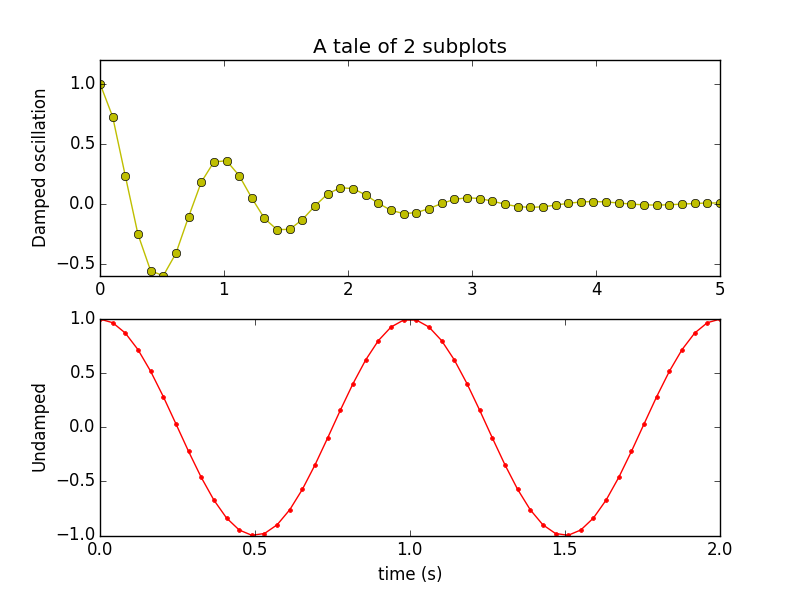
python中的应该和matlab一样:

3.Histograms
matplotlib.pyplot.hist(x, bins=10, range=None, normed=False, weights=None, cumulative=False,
 bottom=None, histtype=u'bar', align=u'mid', orientation=u'vertical', rwidth=None, log=False,
  color=None, label=None, stacked=False, hold=None, **kwargs)
- 返回是一个tuple (n, bins, patches) or ([n0, n1, …], bins, [patches0, patches1,…]),如果输入是多个数据的话。
- x: 多个数据可以通过x作为一个数据集的list,可能是不同长度的[x0,x1,…],或者一个 2-D ndarray,每列是一个数据集。nddarray会转化为list。
- bins:返回bins+1个bin edge,如果bins是array_like,返回的是一个bins+1的sequence.
- range : tuple or None, optional, bins的下界和上界。如果不提供,range=(x.min(), x.max()).如果bins是sequence的话,range没用。
- normed:是否归一化,默认为False
- weights : array_like or None, optional, 权重因子,和x的shape一样,如果normed为True,weights are normalized,所以积分之和仍然为1.默认为None
- cumulative :boolean,optional,柱状图是否累计,默认为False
- bottom:array_like, scalar, or None,每列底部的基准线,如果为scalar(标量),每列都偏移一个定值,如果是一个array,每列独立的偏移。
- histtype:{‘bar’,’barstacked’,’step’,’stepfilled’},optional,bar:默认的,barstacked:多种数据时会堆在上面,step:产生轮廓,里面是空的;stepfilled会只产生各列合起来的整个轮廓线,里面是filled。
- align:{‘left’,’mid’,’right’},optional
- orientation:{‘horizontal’,’vertical’},optional
- rwidth:scalar or None,optional bar的宽度,如果是step或stepfilled,就无视这个参数。
import numpy as np
import matplotlib.mlab as mlab
import matplotlib.pyplot as plt

# example data
mu = 100
sigma = 15
x = mu + sigma * np.random.randn(10000)

num_bins = 50
# the histogram of the data
n,bins, patches = plt.hist(x, num_bins, normed=1, facecolor='green', alpha=0.5)
#add a 'best fit' line
y = mlab.normpdf(bins, mu, sigma)
plt.plot(bins, y, 'r--')
plt.xlabel('Smarts')
plt.ylabel('Probability')
plt.title(r'Histogram of IQ: $\mu=100$, $\sigma=15$')

# Tweak spacing to prevent clipping of ylabel
# 调整间距防止y轴重叠
plt.subplots_adjust(left=0.15)
plt.show()


 233
233

 被折叠的 条评论
为什么被折叠?
被折叠的 条评论
为什么被折叠?
 到【灌水乐园】发言


