


comman dimen
Text
| text | color | dimen |
|---|---|---|
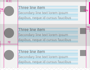
| textAppearanceLarge | textColorPrimary | 22sp |
| textAppearanceMedium | textColorSecondary | 18sp |
| textAppearanceSmall | textColorTerary | 14sp |
| titleTextAppearance | textColorPrimary | 20sp |
| subTitleTextAppearance | textColorPrimary | 16sp |
Color
| color | comment |
|---|---|
| colorPrimary | 状态栏,导航栏背景色(5.0及以上) |
| colorPrimaryDark | statusbar背景色 |
| colorAccent | tab标记色 |
| colorControlNormal | EditText,CheckBox 正常状态下颜色、ActionBar中更多图标(竖着三点)的颜色 |
| colorControlActive | EditText,CheckBox … 激活状态时的颜色 |
| colorControlHighlight | 点击,获焦时的背景色 |
| colorButtonNormal | Button 默认时的颜色 |
| selectableItemBackground | 可点击项的背景(如:ListView item) |
| selectableItemBackgroundBorderless | 可点击项的背景,主要用在ActionBar中 |
Other
appcompat-v7
- 在v7中把Android:Theme的声明和View级别关联,表明Theme不在是整体的主题,也可以是某一部分的主题。但android:Theme的定义放在某一部分的style中定义是无效的.
- 重写了一些基本控件的样式,比如buttonStyle,若想要重写button样式,则前面不能加android:字样
- 默认actionBar与Toolbar样式
Toolbar:
<declare-styleable name="Toolbar">
<attr name="titleTextAppearance" format="reference"/>
<attr name="subtitleTextAppearance" format="reference"/>
<attr name="title"/>
<attr name="subtitle"/>
<attr name="android:gravity"/>
<attr name="titleMargins" format="dimension"/>
<attr name="titleMarginStart" format="dimension"/>
<attr name="titleMarginEnd" format="dimension"/>
<attr name="titleMarginTop" format="dimension"/>
<attr name="titleMarginBottom" format="dimension"/>
<attr name="contentInsetStart"/>
<attr name="contentInsetEnd"/>
<attr name="contentInsetLeft"/>
<attr name="contentInsetRight"/>
<attr name="maxButtonHeight" format="dimension"/>
<attr name="collapseIcon" format="reference"/>
<attr name="collapseContentDescription" format="string"/>
<attr name="popupTheme"/>
<attr name="navigationIcon" format="reference"/>
<attr name="navigationContentDescription" format="string"/>
<attr name="android:minHeight"/>
</declare-styleable>
actionbar:
<declare-styleable name="ActionBar">
<attr name="navigationMode">
<enum name="normal" value="0"/>
<enum name="listMode" value="1"/>
<enum name="tabMode" value="2"/>
</attr>
<attr name="displayOptions">
<flag name="none" value="0"/>
<flag name="useLogo" value="0x1"/>
<flag name="showHome" value="0x2"/>
<flag name="homeAsUp" value="0x4"/>
<flag name="showTitle" value="0x8"/>
<flag name="showCustom" value="0x10"/>
<flag name="disableHome" value="0x20"/>
</attr>
<attr name="title"/>
<attr name="subtitle" format="string"/>
<attr name="titleTextStyle" format="reference"/>
<attr name="subtitleTextStyle" format="reference"/>
<attr name="icon" format="reference"/>
<attr name="logo" format="reference"/>
<attr name="divider" format="reference"/>
<attr name="background" format="reference"/>
<attr name="backgroundStacked" format="reference|color"/>
<attr name="backgroundSplit" format="reference|color"/>
<attr name="customNavigationLayout" format="reference"/>
<attr name="height"/>
<attr name="homeLayout" format="reference"/>
<attr name="progressBarStyle" format="reference"/>
<attr name="indeterminateProgressStyle" format="reference"/>
<attr name="progressBarPadding" format="dimension"/>
<attr name="homeAsUpIndicator"/>
<attr name="itemPadding" format="dimension"/>
<attr name="hideOnContentScroll" format="boolean"/>
<attr name="contentInsetStart" format="dimension"/>
<attr name="contentInsetEnd" format="dimension"/>
<attr name="contentInsetLeft" format="dimension"/>
<attr name="contentInsetRight" format="dimension"/>
<attr name="elevation" format="dimension"/>
<attr name="popupTheme" format="reference"/>
</declare-styleable>
通过两者对比可以发现Toolbar的属性定义要比actionBar的属性定义要简单很多,虽然actionBar中有很多过时的属性。属性对比可以明显的发现在titleBar的展示上,actionBar与toolBar的样式有明显的区别,不可以通用,这也解释了为什么我们在编码中用toolbar代替actionBar时,theme各种不对路。但二者都有popupTheme属性,则说明在菜单展示样式上,两者是可以通用的。
由于actionBar是android默认的实现,主题样式也是按照actionBar的样式实现的。所有当使用Toolbar为ActionBar时,默认的主题样式会有冲突,此时必须指定Toolbar的样式。
Widget
- android.support.v4.widget.DrawerLayout:
注意:抽屉view在content view之前也可以正常显示,但无法正常收到touch事件 结构如下
<DrawerLayout>
    <抽屉View />
    <ContentView />
</DrawerLayout>


 扫一扫
扫一扫
 418
418

 被折叠的 条评论
为什么被折叠?
被折叠的 条评论
为什么被折叠?
 到【灌水乐园】发言


