


1. 图片效果
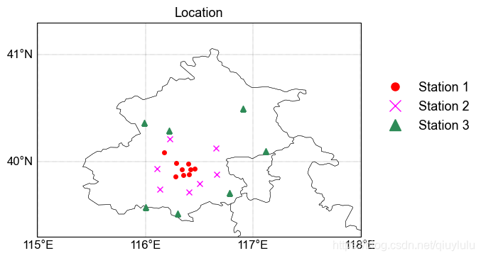
北京市大气环境监测站点示意图,如图所示,包含了三类站点的位置,每一类站点用不同颜色标记,并给出legend。
2. 代码解析
2.1 导入库
用到的画图库主要是cartopy和matplotlib,然后还有常用的pandas和numpy来读取和对数据做一些简单处理。也指定了图片默认的字体和字号。
import matplotlib as mpl
import matplotlib.pyplot as plt
import cartopy.crs as ccrs
import matplotlib.ticker as mticker
from cartopy.mpl.gridliner import LONGITUDE_FORMATTER, LATITUDE_FORMATTER
import pandas as pd
import numpy as np

mpl.rcParams["font.family"] = 'Arial'  #默认字体类型
mpl.rcParams["mathtext.fontset"] = 'cm' #数学文字字体
mpl.rcParams["font.size"] = 13
2.2 读取数据
所有的数据存在一个excel里面,然后根据不同的标签分成了3类,urban, suburban和rural
station=pd.read_excel('latlon.xlsx')
station_urban=station.loc[:,['东四','天坛','官园','万寿西宫','奥体中心','农展馆','万柳','北部新区','丰台花园']]
station_suburban=station.loc[:,['房山','大兴','亦庄','通州','顺义','昌平','门头沟',]]
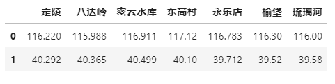
station_rural=station.loc[:,['定陵','八达岭','密云水库','东高村','永乐店','榆垡','琉璃河']]
每一个dataframe大概是以下这种方式存储,第一行lon, 第二行lat。当然,这不是固定的,根据自己的需求来。
3.3 建立画布,绘制地图
这一步在前一篇博文地图绘制里面已经介绍,就不重复了。
proj = ccrs.PlateCarree()
fig = plt.figure(figsize=(6,4), dpi=100)  # 创建画布
ax = fig.subplots(1, 1, subplot_kw={'projection': proj})  # 创建子图
extent=[115,118,39.3,41.3]##经纬度范围
ax.set_extent(extent)
with open('C:/Users/qiuyu/.local/share/cartopy/shapefiles/natural_earth/physical/CN-border-La.dat') as src:
    context = src.read()
    blocks = [cnt for cnt in context.split('>') if len(cnt) > 0]
    borders = [np.fromstring(block, dtype=float, sep=' ') for block in blocks]
for line in borders:
    ax.plot(line[0::2], line[1::2], '-', color='k',lw=0.3, transform=ccrs.Geodetic())
3.4 添加经纬度
学习了一段时间的cartopy,目前认为最大的缺点就是经纬度添加实在是不如NCL方便。不过看帖子说最新版本的cartopy好像解决了这个问题。不过,这里我还是用matplotlib的笨方法来的。
#add lon and lat
gl=ax.gridlines(draw_labels=True,linestyle=":",linewidth=0.3, x_inline=False, y_inline=False,color='k')
gl.top_labels=False #关闭上部经纬标签
gl.right_labels=False
gl.xformatter = LONGITUDE_FORMATTER #使横坐标转化为经纬度格式
gl.yformatter = LATITUDE_FORMATTER
gl.xlocator=mticker.FixedLocator(np.arange(114,120,1))
gl.ylocator=mticker.FixedLocator(np.arange(38,43,1))
gl.xlabel_style={'size':12}#修改经纬度字体大小
gl.ylabel_style={'size':12}
ax.set_extent([114.99,118.01,39.3,41.3],crs=ccrs.PlateCarree())
3.5 画图打点
画图还是用的matplotlib里最简单的pyplot, 给定lon,lat来对应传统认知的x, y,最重要的是一定要添加transform=ccrs.Geodetic()来进行转换。可以对不同的分类选用不同的marker和颜色。
ax.plot(station_urban.iloc[0,:],station_urban.iloc[1,:], 'o', markersize=4, color='red',label='Station 1', transform=ccrs.Geodetic())
ax.plot(station_suburban.iloc[0,:],station_suburban.iloc[1,:], 'x', markersize=6, color='magenta',label='Station 2', transform=ccrs.Geodetic())
ax.plot(station_rural.iloc[0,:],station_rural.iloc[1,:], '^', markersize=6, color='seagreen',label='Station 3', transform=ccrs.Geodetic())
3.6 添加标题和legend
legend的位置,marker和文字的距离都是可以调节的,根据自己的需求来。当然,如果记不住参数的意思,去matplotlib的官网查询就一目了然啦。
#add title
ax.set_title('Location',fontsize=13)
#add legend
ax.legend(loc='upper right', bbox_to_anchor=(1.35, 0.75), borderaxespad=0,frameon=False,markerscale=2)
3.7 图片输出
如果存在图片输出不完整的情况,请一定要加上bbox_inches = 'tight’这个参数,就一下子都解决了。
plt.savefig('station.png',bbox_inches = 'tight')
plt.show()
3. 代码完整版
import matplotlib as mpl
import matplotlib.pyplot as plt
import cartopy.crs as ccrs
import matplotlib.ticker as mticker
from cartopy.mpl.gridliner import LONGITUDE_FORMATTER, LATITUDE_FORMATTER
import pandas as pd
import numpy as np

mpl.rcParams["font.family"] = 'Arial'  #默认字体类型
mpl.rcParams["mathtext.fontset"] = 'cm' #数学文字字体
mpl.rcParams["font.size"] = 13

station=pd.read_excel('latlon.xlsx')
station_urban=station.loc[:,['东四','天坛','官园','万寿西宫','奥体中心','农展馆','万柳','北部新区','丰台花园']]
station_suburban=station.loc[:,['房山','大兴','亦庄','通州','顺义','昌平','门头沟',]]
station_rural=station.loc[:,['定陵','八达岭','密云水库','东高村','永乐店','榆垡','琉璃河']]

proj = ccrs.PlateCarree()
fig = plt.figure(figsize=(6,4), dpi=100)  # 创建画布
ax = fig.subplots(1, 1, subplot_kw={'projection': proj})  # 创建子图
extent=[115,118,39.3,41.3]##经纬度范围
ax.set_extent(extent)
with open('C:/Users/qiuyu/.local/share/cartopy/shapefiles/natural_earth/physical/CN-border-La.dat') as src:
    context = src.read()
    blocks = [cnt for cnt in context.split('>') if len(cnt) > 0]
    borders = [np.fromstring(block, dtype=float, sep=' ') for block in blocks]
for line in borders:
    ax.plot(line[0::2], line[1::2], '-', color='k',lw=0.3, transform=ccrs.Geodetic())
#add lon and lat
gl=ax.gridlines(draw_labels=True,linestyle=":",linewidth=0.3, x_inline=False, y_inline=False,color='k')
gl.top_labels=False #关闭上部经纬标签
gl.right_labels=False
gl.xformatter = LONGITUDE_FORMATTER #使横坐标转化为经纬度格式
gl.yformatter = LATITUDE_FORMATTER
gl.xlocator=mticker.FixedLocator(np.arange(114,120,1))
gl.ylocator=mticker.FixedLocator(np.arange(38,43,1))
gl.xlabel_style={'size':12}#修改经纬度字体大小
gl.ylabel_style={'size':12}
ax.set_extent([114.99,118.01,39.3,41.3],crs=ccrs.PlateCarree())

ax.plot(station_urban.iloc[0,:],station_urban.iloc[1,:], 'o', markersize=4, color='red',label='Station 1', transform=ccrs.Geodetic())
ax.plot(station_suburban.iloc[0,:],station_suburban.iloc[1,:], 'x', markersize=6, color='magenta',label='Station 2', transform=ccrs.Geodetic())
ax.plot(station_rural.iloc[0,:],station_rural.iloc[1,:], '^', markersize=6, color='seagreen',label='Station 3', transform=ccrs.Geodetic())

#add title
ax.set_title('Location',fontsize=13)
#add legend
ax.legend(loc='upper right', bbox_to_anchor=(1.35, 0.75), borderaxespad=0,frameon=False,markerscale=2)

plt.savefig('station.png',bbox_inches = 'tight')
plt.show()


 2263
2263


 被折叠的 条评论
为什么被折叠?
被折叠的 条评论
为什么被折叠?
 到【灌水乐园】发言


