


- 声明属性
为了方便使用,可以直接在xml资源文件中定义圆角和反光,需要声明属性,首先在res\values中定义attrs.xml
<?xml version="1.0" encoding="utf-8"?>
<resources>
    <declare-styleable name="CustomButton">
        <!-- 是否反光 -->
        <attr name="reflectLight" format="boolean"/>
        <!-- 背景 -->
        <attr name="borderWidth" format="dimension"/>
        <attr name="borderColor" format="color"/>
        <attr name="radius" format="dimension"/>
        <attr name="bgColor" format="color"/>
    </declare-styleable>
</resources>
这里的CustomButton是下面创建的
- 重写AppCompatTextView
话不多说直接上代码
import android.content.Context;
import android.content.res.TypedArray;
import android.graphics.Canvas;
import android.graphics.Color;
import android.graphics.Paint;
import android.graphics.RectF;
import android.graphics.drawable.GradientDrawable;
import android.util.AttributeSet;

import androidx.annotation.ColorInt;
import androidx.annotation.NonNull;
import androidx.annotation.Nullable;
import androidx.appcompat.widget.AppCompatTextView;

import com.cycoding.cyvideo.R;

/**
 * @author Tomas
 */
public class CustomButton extends AppCompatTextView {

    private boolean reflectLight = false;
    private int borderWidth = 0;
    private int borderColor = Color.WHITE;
    private int radius = 0;
    private int bgColor = Color.WHITE;

    private Paint mPaint;


    public CustomButton(@NonNull Context context) {
        this(context, null);
    }

    public CustomButton(@NonNull Context context, @Nullable AttributeSet attrs) {
        this(context, attrs, 0);
    }

    public CustomButton(@NonNull Context context, @Nullable AttributeSet attrs, int defStyleAttr) {
        super(context, attrs, defStyleAttr);

        if (attrs != null) {
            TypedArray attrArray = getContext().obtainStyledAttributes(attrs, R.styleable.CustomButton);
            reflectLight = attrArray.getBoolean(R.styleable.CustomButton_reflectLight, reflectLight);
            borderWidth = attrArray.getDimensionPixelSize(R.styleable.CustomButton_borderWidth, borderWidth);
            borderColor = attrArray.getColor(R.styleable.CustomButton_borderColor, borderColor);
            radius = attrArray.getDimensionPixelSize(R.styleable.CustomButton_radius, radius);
            bgColor = attrArray.getColor(R.styleable.CustomButton_bgColor, bgColor);
            attrArray.recycle();

            // 背景
            GradientDrawable gd = new GradientDrawable();
            gd.setColor(bgColor);
            gd.setCornerRadius(radius);
            if (borderWidth > 0) {
                gd.setStroke(borderWidth, borderColor);
            }
            this.setBackground(gd);
        }
    }

    public void setBackgroundColor(@ColorInt int color) {
        GradientDrawable gd = (GradientDrawable) getBackground();
        gd.setColor(color);
    }

    @Override
    protected void onMeasure(int widthMeasureSpec, int heightMeasureSpec) {
        super.onMeasure(widthMeasureSpec, heightMeasureSpec);

    }

    @Override
    protected void dispatchDraw(Canvas canvas) {
        super.dispatchDraw(canvas);

        if (reflectLight) {
            int r = getMeasuredHeight() / 12;
            int l = getMeasuredWidth() / 5;
            if (r > 0 && l > 0) {
                mPaint = getPaint();
                mPaint.setColor(Color.WHITE);
                mPaint.setAntiAlias(true);
                mPaint.setStyle(Paint.Style.FILL);
                canvas.drawCircle(2 * r, 2 * r,r,mPaint);
                canvas.drawRoundRect(new RectF(4 * r, r, l + 4 * r, 3 * r), r, r, mPaint);
            }
        }
    }
}
这里的l代表后面圆角矩形的长度和圆角值,同时因为矩形和原型等宽,所以r也是圆的半径。(然后具体的l和r是占多少比例的长宽自己去代码中调节,当然也可以通过多声明一个属性来标识)
- 调用方式
            <com.cycoding.common.base.view.CustomButton
                android:id="@+id/tvLogin"
                android:layout_width="160pt"
                android:layout_height="42pt"
                android:gravity="center"
                android:text="@string/login"
                android:textColor="#FFFFFF"
                android:textSize="18pt"
                app:bgColor="@color/pink"
                app:radius="6pt"
                app:reflectLight="true" />
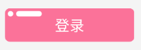
可以看到这里写了背景颜色和圆角,reflectLight设置为true表示让按钮具有反光效果
- 效果
这是关于自定义View的初次尝试,也并没有用到复杂的东西,写的不好见谅。


 6099
6099


 被折叠的 条评论
为什么被折叠?
被折叠的 条评论
为什么被折叠?
 到【灌水乐园】发言


