


文章目录
Flutter Scaffold脚手架
概述
Scaffold可以称为脚手架,一般通过它搭建页面的基本结构。一个页面可以理解为三个部分组成:标题栏、内容主题页面、底部导航栏,当然还包括其他元素抽屉菜单、悬浮按钮等。
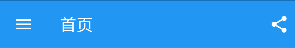
AppBar 顶部导航栏
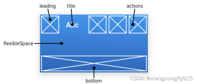
leading:通常设置返回键。
		- 如果未设置leading,但设置了Drawer则会显示Drawer图标。
		- 如果未设置leading,也没设置Drawer,有前一个路由,则会显示BackButton。

automaticallyImplyLeading:当leading为null时,是否使用默认的leading按钮。

title:AppBar标题。

centerTitle:标题是否居中。

actions:导航栏右侧菜单。

backgroundColor:标题栏颜色。
Scaffold(
    //顶部导航栏
    appBar: buildAppBar(),
),

buildAppBar() {
    return AppBar(
        //页面标题
        title: Text(widget.title),
        //标题居中
        centerTitle: true,
        actions: [
            IconButton(icon: const Icon(Icons.share), onPressed: () {}),
        ],
    );
}

appBar: AppBar(
    title: Text("第二页"),
    centerTitle: true,
    actions: [
        IconButton(icon: const Icon(Icons.add), onPressed: () {}),
        IconButton(icon: const Icon(Icons.delete), onPressed: () {}),
    ],
)
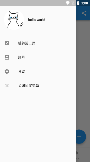
Drawer 抽屉菜单
Scaffold(
    //抽屉菜单
    drawer: buildDrawer(),
),

buildDrawer() {
    return Drawer(
        child: MediaQuery.removePadding(
            context: context,
            // removeTop: true, //删除
            child: Column(
                crossAxisAlignment: CrossAxisAlignment.start,
                children: [
                    Padding(
                        padding: const EdgeInsets.only(top: 38),
                        child: Row(
                            children: [
                                Padding(
                                    padding: EdgeInsets.symmetric(horizontal: 16),
                                    child: ClipOval(
                                        child: Image.asset(
                                            "images/logo.png",
                                            width: 80,
                                        ),
                                    ),
                                ),
                                Text(
                                    "hello world",
                                    style: TextStyle(fontWeight: FontWeight.bold),
                                ),
                            ],
                        ),
                    ),
                    Expanded(
                        child: ListView(
                            children: [
                                ListTile(
                                    leading: Icon(Icons.looks_two),
                                    title: Text("跳转第二页"),
                                    onTap: () {
                                        Navigator.push(
                                            context,
                                            MaterialPageRoute(builder: (context) {
                                                return TwoPage();
                                            }),
                                        );
                                    },
                                ),
                                ListTile(
                                    leading: Icon(Icons.account_box),
                                    title: Text("账号"),
                                ),
                                ListTile(
                                    leading: Icon(Icons.settings),
                                    title: Text("设置"),
                                ),
                                ListTile(
                                    leading: Icon(Icons.close),
                                    title: Text("关闭抽屉菜单"),
                                    onTap: () {
                                        Scaffold.of(context).openEndDrawer();
                                    },
                                ),
                            ],
                        ),
                    ),
                ],
            ),
        ),
    );
}
BottomNavigationBar 底部导航栏
基本属性
items:导航栏的item设置。

currentIndex:默认第几个item。

type:导航栏的item样式。
		- BottomNavigationBarType.fixed:固定。
		- BottomNavigationBarType.shifting:移动。需要设置selectedItemColor和 unselectedItemColor属性。

selectedItemColor:item选中颜色。

unselectedItemColor:item未选中颜色。

onTap:点击事件。
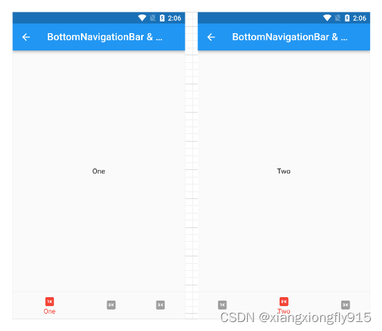
页面切换方式一:BottomNavigationBar & PageView
int _index = 1;
List<Widget> pages = const [OnePage(), TwoPage(), ThreePage()];

class NavigationBarPage1 extends StatefulWidget {
    const NavigationBarPage1({Key? key}) : super(key: key);

    @override
    State<StatefulWidget> createState() {
        return _NavigationBarPage1State();
    }
}

class _NavigationBarPage1State extends State<NavigationBarPage1> {
    final PageController _controller = PageController(
        initialPage: _index,
    );

    @override
    void dispose() {
        _controller.dispose();
        super.dispose();
    }

    @override
    Widget build(BuildContext context) {
        return Scaffold(
            appBar: AppBar(title: const Text("BottomNavigationBar & PageView")),
            body: PageView(
                children: pages,
                controller: _controller,
                onPageChanged: (index) {
                    setState(() {
                        _index = index;
                    });
                },
                // physics: const NeverScrollableScrollPhysics(), //禁止滑动
            ),
            bottomNavigationBar: BottomNavigationBar(
                currentIndex: _index,
                items: const [
                    BottomNavigationBarItem(icon: Icon(Icons.one_k), label: "One"),
                    BottomNavigationBarItem(icon: Icon(Icons.two_k), label: "Two"),
                    BottomNavigationBarItem(icon: Icon(Icons.three_k), label: "Three"),
                ],
                type: BottomNavigationBarType.shifting,
                selectedItemColor: Colors.red,
                unselectedItemColor: Colors.grey,
                onTap: (index) {
                    _controller.jumpToPage(index);
                    setState(() {
                        _index = index;
                    });
                },
            ),
        );
    }
}
页面切换方式二:BottomNavigationBar & IndexedStack
这种方式会全部初始化。
class NavigationBarPage2 extends StatefulWidget {
  const NavigationBarPage2({Key? key}) : super(key: key);

  @override
  State<StatefulWidget> createState() {
    return _NavigationBarPage1State2();
  }
}

class _NavigationBarPage1State2 extends State<NavigationBarPage2> {
  @override
  Widget build(BuildContext context) {
    return Scaffold(
      appBar: AppBar(title: const Text("BottomNavigationBar & IndexedStack")),
      body: IndexedStack(
        children: pages,
        index: _index,
      ),
      bottomNavigationBar: BottomNavigationBar(
        currentIndex: _index,
        items: const [
          BottomNavigationBarItem(icon: Icon(Icons.one_k), label: "One"),
          BottomNavigationBarItem(icon: Icon(Icons.two_k), label: "Two"),
          BottomNavigationBarItem(icon: Icon(Icons.three_k), label: "Three"),
        ],
        onTap: (index) {
          setState(() {
            _index = index;
          });
        },
      ),
    );
  }
}
页面切换方式三:直接设置Widget
class NavigationBarPage3 extends StatefulWidget {
    const NavigationBarPage3({Key? key}) : super(key: key);

    @override
    State<StatefulWidget> createState() {
        return _NavigationBarPage1State3();
    }
}

class _NavigationBarPage1State3 extends State<NavigationBarPage3> {
    Widget _currentPage = pages[_index];

    @override
    Widget build(BuildContext context) {
        return Scaffold(
            appBar: AppBar(title: const Text("BottomNavigationBar3")),
            body: _currentPage,
            bottomNavigationBar: BottomNavigationBar(
                currentIndex: _index,
                items: const [
                    BottomNavigationBarItem(icon: Icon(Icons.one_k), label: "One"),
                    BottomNavigationBarItem(icon: Icon(Icons.two_k), label: "Two"),
                    BottomNavigationBarItem(icon: Icon(Icons.three_k), label: "Three"),
                ],
                onTap: (index) {
                    setState(() {
                        _index = index;
                        _currentPage = pages[_index];
                    });
                },
            ),
        );
    }
}
FloatingActionButton 浮动按钮
floatingActionButton:定义一个浮动按钮。

floatingActionButtonLocation:设置浮动位置。
简单使用
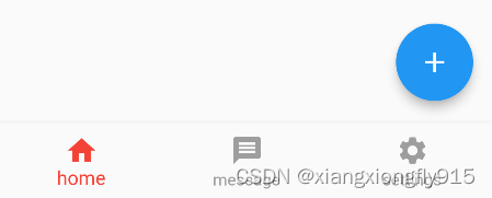
floatingActionButtonLocation: FloatingActionButtonLocation.endFloat,
floatingActionButton: FloatingActionButton(
    child: const Icon(Icons.add),
    onPressed: () {},
),
FloatingActionButton & BottomAppBar
这样组合使用可以在BottomAppBar中生成凹行样式。
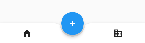
bottomNavigationBar: BottomAppBar(
    color: Colors.white,
    shape: const CircularNotchedRectangle(),
    child: Row(
        children: [
            IconButton(icon: const Icon(Icons.home), onPressed: () {}),
            IconButton(icon: const Icon(Icons.business), onPressed: () {}),
        ],
        mainAxisAlignment: MainAxisAlignment.spaceAround,
    ),
),

floatingActionButtonLocation: FloatingActionButtonLocation.centerDocked,
floatingActionButton: FloatingActionButton(
    child: const Icon(Icons.add),
    onPressed: () {},
),


 296
296


 被折叠的 条评论
为什么被折叠?
被折叠的 条评论
为什么被折叠?
 到【灌水乐园】发言


