


在使用QML进行开发的时候,经常会遇到需要自己进行定义控件的情况,
举个例子,譬如说我们在使用ApplicationWindow的时候会遇到系统自带的一些最大化,最小化按钮值类的情况.这些默认的情况,但是这些可能并不适合每一个人. 因为不同的开发者都有自己不同的喜好.
今天我zaiApplicationWindow控件的基础上重新封装了一个适合 自己的控件.
好吧,我们先直接上源码,之后再简单介绍下这个控件的使用方法
AbstractWindow.qml:
import QtQuick 2.9
import QtQuick.Controls 1.3
import QtQuick.Controls.Styles 1.3
ApplicationWindow{
id:abstractWindow
visible: true
width: 985
height: 680
minimumWidth: 100
minimumHeight: 60
signal clicked()
flags: Qt.FramelessWindowHint | Qt.WindowSystemMenuHint| Qt.WindowMinimizeButtonHint| Qt.Window
property color absWindowColor: "#0000cc"
property real absToolBarHeight: 50
property real absFootBarHeight: 80
readonly property int close:-1
readonly property int showMinmized : 1
readonly property int showNormal : 2
readonly property int showMaxmized : 3
readonly property int showFullScreen : 4
property int showState: 0
onShowStateChanged: {
if(showState === 0){
var e;
try{
abstractWindow.close();
// window.destroy(10);
}catch(e){
console.debug(abstractWindow,"destroy has some error",e);
}
}
}
onWindowStateChanged: {
switch(windowState)
{
case 0x00000000:
showState = 0;
break;
case 0x00000001:
showState = showMinmized;
break;
case 0x00000002:
showState = showMaxmized;
break;
case 0x00000004:
showState = showFullScreen;
}
}
property Component absContent
property alias absContectControl: __absContentLoader.item
Loader{
id:__absContentLoader
anchors.fill: parent
sourceComponent: absContent ? absContent : null
}
style: ApplicationWindowStyle{
background: Rectangle{
color: abstractWindow.color
border.width: 1
border.color:absWindowColor
}
}
property alias absToolControl: __absToolLoader.item
property Component absToolBar
toolBar: Rectangle{
id:absTitleBar
width: parent.width
height: absToolBarHeight
MouseArea {
// 鼠标拖拽窗口移动
id:__absTitlebarArea;
anchors.fill: parent
property point previousPosition
onPressed: previousPosition = Qt.point(mouseX, mouseY);
onPositionChanged: {
if (pressedButtons == Qt.LeftButton) {
var dx = mouseX - previousPosition.x;
var dy = mouseY - previousPosition.y;
abstractWindow.x = abstractWindow.x + dx;
abstractWindow.y = abstractWindow.y + dy;
}
}
}
Loader{
id:__absToolLoader
anchors.fill: parent
sourceComponent: absToolBar ? absToolBar : null
}
}
property alias absFooterControl: __absFootBarLoader.item
property Component absFootBar
statusBar: Rectangle{
id:absStatusBar
width: parent.width
height: absFootBarHeight
Loader{
id : __absFootBarLoader
anchors.fill : parent
sourceComponent : absFootBar ? absFootBar : null
}
}
}
使用方法:
AbstractWindow{
id:root
absToolBar:Rectangle{
color: "red"
IconButton{
anchors.right: parent.right
anchors.rightMargin: 15
anchors.top:parent.top
anchors.topMargin: 15
iconImage: Resource.close
onClicked: {
Qt.quit()
}
}
}
absContent:Rectangle{
color: "gray"
}
absFootBar:Rectangle{
color: "lightblue"
}
}
运行情况:
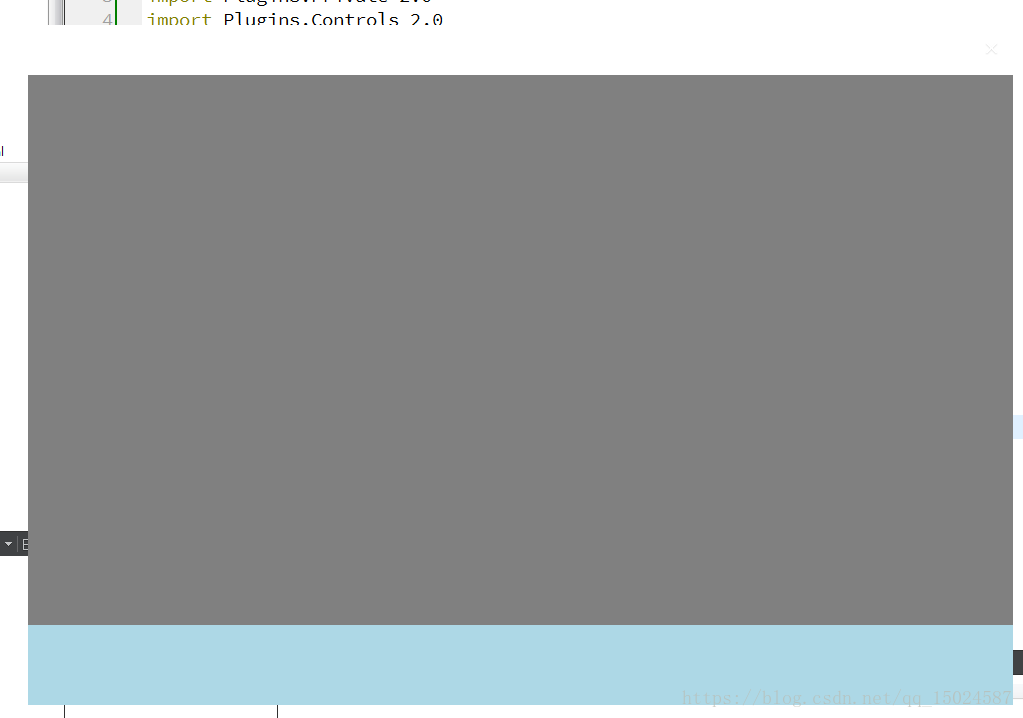
其实也是很简单的情况,就是将整个主界面分成上中下三个区域. 每个区域都是一个组件.这个应该属于个人定制. 不同的开发者可以根据自己的需求进行修改


 1万+
1万+


 被折叠的 条评论
为什么被折叠?
被折叠的 条评论
为什么被折叠?
 到【灌水乐园】发言


