


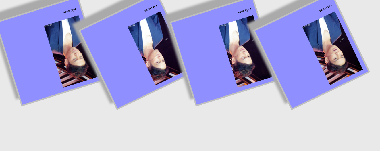
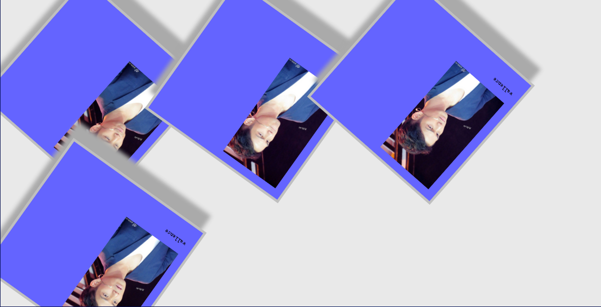
我们可以通过动画的形式,自动的让相册运动,我们叫动画。
动画首先设定一个模式@keyframes
@keyframes myfirst
{
0% {background: red;}
100% {background: yellow;}
}
当在 @keyframes 中创建动画,请把它捆绑到某个选择器,否则不会产生动画效果,animation
div
{
animation: myfirst 5s;
-moz-animation: myfirst 5s; /* Firefox */
-webkit-animation: myfirst 5s;  /* Safari 和 Chrome */
-o-animation: myfirst 5s;   /* Opera */
}
更多的时候,我们还可以设定动画是否周期播放,逆向还是顺向,是否暂停,播放次数,是否延时,一个周期的时间。
div
{
animation-name: myfirst;
animation-duration: 5s;
animation-timing-function: linear;
animation-delay: 2s;
animation-iteration-count: infinite;
animation-direction: alternate;
animation-play-state: running;
现在我们给相册添加动画,让它在没有鼠标移动的情况下,执行动画
代码
1.html
<!doctype html>
 <html>
  <head>
   <meta charset="utf-8">
   <link href="D:/test/css/css.css" rel="stylesheet" type="text/css">
   <title></title>
  </head>
 <body>
   <div class="polaroid rotate_left">

     <img src="D:/test/images/1.jpg" witdh="300px" height="300px"/>
   <p class="caption">wallence</p>
   </div>
   <div class="polaroid rotate_right">
      <img src="D:/test/images/2.jpg" witdh="300px" height="300px"/>
      <p class="caption">wallence</p>
   </div>
   <div class="polaroid rotate_left">
    <img src="D:/test/images/3.jpg" witdh="300px" height="300px"/>
      <p class="caption">wallence</p>
   </div>
   <div class="polaroid rotate_right">
    <img src="D:/test/images/4.jpg" witdh="300px" height="300px"/>
      <p class="caption">wallence</p>
   </div>

 </body>
</html>
2.css
body{
    margin:30px;
    background-color: #e9e9e9;
}
@keyframes myFirst{
    0% {}
100%{width:410px;
padding:30px 30px 30px 30px;
border:10px solid #BFBFBF;
background-color:blue;
/* Add box-shadow */
box-shadow:20px 50px 20px #aaaaaa;
transform:rotate(360deg);
-moz-transform:rotate(360deg); /* Firefox 4 */
-webkit-transform:rotate(360deg); /* Safari and Chrome */
-o-transform:rotate(360deg); /* Opera */}
}
@-moz-keyframes myFirst{0% {}
100%{width:410px;
padding:30px 30px 30px 30px;
border:10px solid #BFBFBF;
background-color:blue;
/* Add box-shadow */
box-shadow:20px 50px 20px #aaaaaa;
transform:rotate(360deg);
-moz-transform:rotate(360deg); /* Firefox 4 */
-webkit-transform:rotate(360deg); /* Safari and Chrome */
-o-transform:rotate(360deg); /* Opera */}}
@-webkit-keyframes myFirst{
    0% {}
100%{
    width:410px;
padding:30px 30px 30px 30px;
border:10px solid #BFBFBF;
background-color:blue;
/* Add box-shadow */
box-shadow:20px 50px 20px #aaaaaa;
transform:rotate(360deg);
-moz-transform:rotate(360deg); /* Firefox 4 */
-webkit-transform:rotate(360deg); /* Safari and Chrome */
-o-transform:rotate(360deg);
}
}

div.polaroid
{
animation: myFirst 5s;
-moz-animation: myFirst 5s; /* Firefox */
-webkit-animation: myFirst 5s;  /* Safari 和 Chrome */
-o-animation: myFirst 5s;   /* Opera */
width:310px;
padding:10px 10px 20px 10px;
border:4px solid #BFBFBF;
background-color:white;
/* Add box-shadow */
box-shadow:10px 30px 10px #aaaaaa;
transition:width 2s, height 2s,transform 2s,background-color 2s;
-moz-transition:width 2s, height 2s, background-color 2s,-moz-transform 2s; /* Firefox 4 */
-webkit-transition:width 2s, height 2s, background-color 2s,-webkit-transform 2s; /* Safari and Chrome */
-o-transition:width 2s, height 2s,background-color 2s, -o-transform 2s; /* Opera */
}
div.polaroid:hover{
width:410px;
padding:30px 30px 30px 30px;
border:10px solid #BFBFBF;
background-color:blue;
/* Add box-shadow */
box-shadow:20px 50px 20px #aaaaaa;
transform:rotate(360deg);
-moz-transform:rotate(360deg); /* Firefox 4 */
-webkit-transform:rotate(360deg); /* Safari and Chrome */
-o-transform:rotate(360deg); /* Opera */

}
div.rotate_left{
float:left;
transform:rotate(7deg);
-ms-transform:rotate(7deg); /* IE 9 */
}
div.rotate_right{
float:left;
transform:rotate(-8deg);
-ms-transform:rotate(-8deg); /* IE 9 */
}
caption{
    float:right;
    font-style:oblique;
}


 2441
2441


 被折叠的 条评论
为什么被折叠?
被折叠的 条评论
为什么被折叠?
 到【灌水乐园】发言


