


之前使用的UI框架,无论是Element UI/Plus 还是 Ant design,其中Dialog组件中的结构和样式都难以修改,无论是使用less、deep还是其他方法,对其组件中css的修改都不生效(不确定是否有其他解决方法),所以我就自己简单封装了一个Dialog组件,只是简单实现了遮蔽层以及Dialog外框,内在具体实现,例如Header、Main、Footer的css和其他内容全部交给程序员决定。
以下是Dialog组件代码
<template>
  <teleport to="body" v-if="visible">
    <div class="box">
      <div class="dialog">

        <slot name="header">
          <div class="header">
            <template v-if="title">
              {{title}}
            </template>

            <!-- 下面这行代码是关闭按钮的icon图标,即形似 X 的图标,以下代码来自于Element Plus Icon库,若没有引入Element Plus Icon库,建议相应进行修改 -->
            <el-icon class="closeIcon"
                     @click.stop="closeDialog"
                     color="grey">
             <Close />

            </el-icon>
          </div>
        </slot>

        <!--default slot-->
        <slot ></slot>

        <slot name="footer">

        </slot>
      </div>
    </div>
  </teleport>
</template>

<script>
export default {
  name: "Dialog",
  props:{
    visible:{
      type:Boolean,
      required:true
    },
    height:{
      type:String,
      required: false,
      default:'400px'
    },
    width:{
      type:String,
      required:false,
      default: '500px'
    },
    title:{
      type:String,
      required:false
    }
  },
  setup(pros,context){
    //关闭Dialog
    const closeDialog=()=>{
     context.emit('update:visible',false);
    };
    return{
      closeDialog
    }
  }
}
</script>

<style scoped>
.box{
  position: absolute;
  top: 0;
  bottom: 0;
  left: 0;
  right: 0;
  background-color:rgba(0,0,0,0.5);
}
.dialog{
  position: absolute;
  left: 50%;
  top:50%;
  transform: translate(-50%,-50%);
  height: v-bind(height);
  width: v-bind(width);
  background-color: white;
}
.header{
  --height: 50px;
  height: var(--height);
  background-color: #ced6e0;
  line-height: var(--height);
  font-size:22px;
  letter-spacing: 10px;
  text-align: center;
  box-shadow: 0 2px 10px 0 rgb(0 0 0 / 10%);
}
.closeIcon{
  position: absolute;
  right: 6px;
  top: 6px;
  cursor: pointer;
}
</style>
以上代码使用了Vue3的
teleport标签,用于之间将teleport标签中的html结构将指定body标签中。
使用了visible属性控制Dialog的存在与消亡,剩余的title属性控制组件标题,不写则不显示标题,height和width分别控制组件高度和宽度,不写则使用默认值,这两个值都是String类型,使用500px、50vh、50em等单位长度都能成功赋值
组件的使用方式:
<Dialog v-model:visible="visible" > </Dialog>
使用v-model:visible使父子组件双向绑定visible属性的值,在Vue2中,则是v-model:asyn写法
在 <Dialog v-model:visible="visible" > </Dialog>内编写html结构要点:
<template v-slot:header > Here is header </template>
代码中编写组件Header内容,包括标题和关闭图标都需要自己编写,如果不使用header插槽,则使用默认的样式结构<template v-slot:default> Here is default </template>
代码中编写组件的主体内容,可以省略这段代码直接写在外层<template v-slot:footer> Here is footer </template>
代码中编写组件的尾部内容,主要是编写确定和取消按钮
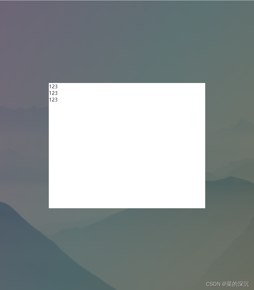
测试代码一
<template>
  <Dialog v-model:visible="visible" >
    <template v-slot:header>
      <div>
        123
      </div>
    </template>

    <template v-slot:default>
      <div>
        123
      </div>
    </template>

    <template v-slot:footer>
      <div>
        123
      </div>
    </template>

  </Dialog>
</template>

<script>
import Dialog from "@/components/Dialog";
import {ref} from "vue";

export default {
  name: "Test",
  components: {Dialog},
  setup(){
    const visible=ref(true);
    return{
      visible
    }
  }
}
</script>

<style scoped>

</style>
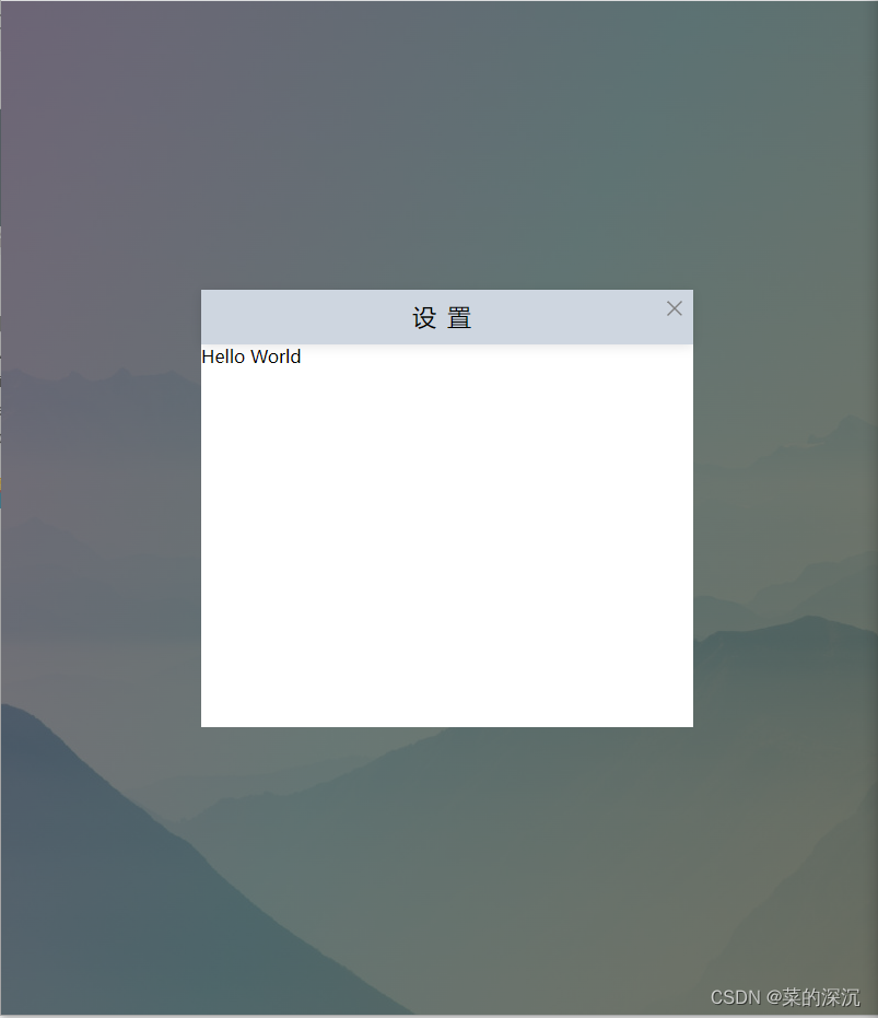
测试代码二
  <Dialog v-model:visible="visible" title="设置" height="400px" width="450px">
    Hello World
  </Dialog>
以上代码仅仅是简单的封装,若是想向外暴露控制更多的样式,请自行动态绑定class或者使用v-bind()动态赋予样式属性值。


 636
636


 被折叠的 条评论
为什么被折叠?
被折叠的 条评论
为什么被折叠?
 到【灌水乐园】发言


