


常用控件
一、TextView(文本框)
用于显示文本的一个控件。
文本的字体尺寸单位为 sp。
sp: scaled pixels(放大像素)主要用于字体显示。
一、常用属性
| 属性名 | 作用 |
|---|---|
| android:id | 可以在Java代码中通过findViewById()的方法获取到该对象,然后进行相关属性的设置 |
| android:layout_width | 组件的宽度 |
| android:layout_height | 组件的高度 |
| android:gravity | 设置控件中内容的对齐方向,TextView中是文字,ImageView中是图片等等 |
| android:text | 设置显示的文本内容,一般我们是把字符串写到string.xml文件中,然后通过@String/xxx取得对应的字符串内容的 |
| android:textColor | 设置字体颜色,同上,通过colors.xml资源来引用 |
| android:textStyle | 设置字体风格,三个可选值:normal(无效果),bold(加粗),italic(斜体) |
| android:textSize | 字体大小,单位一般是用sp |
| android:background | 控件的背景颜色,可以理解为填充整个控件的颜色,可以是图片 |
| android:autoLink | 识别链接类型 (web, email, phone ,map ,none, all) |
二、实例
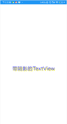
1、带阴影的TextView
| 属性名 | 作用 |
|---|---|
| android:shadowColor | 设置阴影颜色,需要与shadowRadius一起使用 |
| android:shadowRadius | 设置阴影的模糊程度 |
| android:shadowDx | 设置阴影在水平方向的偏移 |
| android:shadowDy | 设置阴影在竖直方向的偏移 |
效果:
代码:
<TextView
        android:layout_width="wrap_content"
        android:layout_height="wrap_content"
        android:layout_centerInParent="true"
        android:shadowColor="#F9F900"
        android:shadowDx="10.0"
        android:shadowDy="10.0"
        android:shadowRadius="3.0"
        android:text="带阴影的TextView"
        android:textColor="#4A4AFF"
        android:textSize="30sp" />
2、带边框的TextView
1)实现原理:
编写一个ShapeDrawable的资源文件!然后TextView将 background 设置为这个drawable资源即可。
2)ShapeDrawable的资源文件
- 这个是设置背景颜色的
- 这个是设置边框的粗细,以及边框颜色的
- <padding androidLbottom = “xdp”…> 这个是设置边距的
- <corners android:topLeftRadius=“10px”…> 这个是设置圆角的
- <gradient> 这个是设置渐变色的,可选属性有:
startColor:起始颜色
endColor:结束颜色
centerColor:中间颜色
angle:方向角度,等于0时,从左到右,然后逆时针方向转,当angle = 90度时从下往上
type:设置渐变的类型
编写矩形边框的Drawable:
    <?xml version="1.0" encoding="utf-8"?>
<shape xmlns:android="http://schemas.android.com/apk/res/android">

    <stroke
        android:width="2px"
        android:color="@color/black" />

    <!-- 设置一个黑色边框 -->
    <stroke
        android:width="2px"
        android:color="#000000" />
    <!-- 渐变 -->
    <gradient
        android:angle="270"
        android:endColor="#C0C0C0"
        android:startColor="#FCD209" />
    <!-- 设置一下边距,让空间大一点 -->
    <padding
        android:bottom="5dp"
        android:left="5dp"
        android:right="5dp"
        android:top="5dp" />

</shape>
编写圆角矩形边框的Drawable:
<?xml version="1.0" encoding="utf-8"?>
<shape xmlns:android="http://schemas.android.com/apk/res/android">
    <!-- 设置透明背景色 -->
    <solid android:color="#87CEEB" />

    <!-- 设置一个黑色边框 -->
    <stroke
        android:width="2px"
        android:color="#000000" />
    <!-- 设置四个圆角的半径 -->
    <corners
        android:bottomLeftRadius="50px"
        android:bottomRightRadius="50px"
        android:topLeftRadius="50px"
        android:topRightRadius="50px" />
    <!-- 设置一下边距,让空间大一点 -->
    <padding
        android:bottom="5dp"
        android:left="5dp"
        android:right="5dp"
        android:top="5dp" />
</shape>
将TextView的blackground属性设置成上面这两个Drawable:
<LinearLayout xmlns:android="http://schemas.android.com/apk/res/android"
    xmlns:tools="http://schemas.android.com/tools"
    android:layout_width="match_parent"
    android:layout_height="match_parent"
    android:background="#FFFFFF"
    android:gravity="center"
    android:orientation="vertical"
    tools:context=".MainActivity">

    <TextView
        android:id="@+id/txtOne"
        android:layout_width="200dp"
        android:layout_height="64dp"
        android:textSize="18sp"
        android:gravity="center"
        android:background="@drawable/txt_rectborder"
        android:text="矩形边框的TextView" />

    <TextView
        android:id="@+id/txtTwo"
        android:layout_width="200dp"
        android:layout_height="64dp"
        android:layout_marginTop="10dp"
        android:textSize="18sp"
        android:gravity="center"
        android:background="@drawable/txt_radiuborder"
        android:text="圆角边框的TextView" />


</LinearLayout>
效果图:

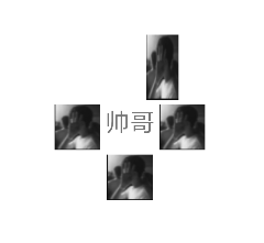
3、带图片(drawableXxx)的TextView
基本用法
设置图片的核心其实就是:drawableXxx;可以设置四个方向的图片:drawableTop(上),drawableButtom(下),drawableLeft(左),drawableRight(右) 另外,你也可以使用drawablePadding来设置图片与文字间的间距
效果图:

代码
<RelativeLayout xmlns:android="http://schemas.android.com/apk/res/android"
    xmlns:tools="http://schemas.android.com/tools"
    android:layout_width="match_parent"
    android:layout_height="match_parent"
    tools:context=".MainActivity" >

    <TextView
        android:layout_width="wrap_content"
        android:layout_height="wrap_content"
        android:layout_centerInParent="true"
        android:textSize="28sp"
        android:drawableLeft="@drawable/img"
        android:drawableTop="@drawable/img"
        android:drawableRight="@drawable/img"
        android:drawableBottom="@drawable/img"
        android:drawablePadding="5dp"
        android:text="帅哥" />

</RelativeLayout>
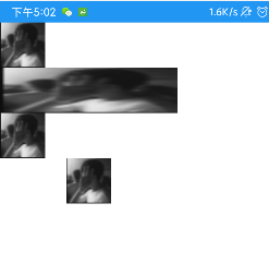
一些问题:
可能你会发现,我们这样设置的drawable并不能自行设置大小,在XML是无法直接设置的; 所以我们需要在Java代码中来进行一个修改!
示例代码如下:
public class MainActivity extends Activity {
    private TextView txtZQD;

    @Override
    protected void onCreate(Bundle savedInstanceState) {
        super.onCreate(savedInstanceState);
        setContentView(R.layout.activity_main);
        txtZQD = (TextView) findViewById(R.id.txtZQD);
        //获得四个不同方向上的图片资源,数组元素依次是:左上右下的图片
        Drawable[] drawable = txtZQD.getCompoundDrawables();
        //数组下标0~3,依次是:左上右下
        //调用setBounds设置左上右下坐标点
        //比如这里设置了代表的是:
        //        长是:从离文字最左边开始100dp处到200dp处
        //        宽是:从文字上方0dp处往上延伸200dp
        drawable[1].setBounds(100, 0, 200, 200);
        //为TextView重新设置drawable数组
        txtZQD.setCompoundDrawables(drawable[0], drawable[1], drawable[2],
                drawable[3]);
        //没有图片可以用null代替!
        //另外,从上面看出也可以直接在Java代码中调用setCompoundDrawables为TextView设置图片
    }
}
效果:
4、使用autoLink属性识别链接类型
当文字中出现了URL,E-Mail,电话号码,地图的时候,可以通过设置autoLink属性;当点击对应部分的文字,即可跳转至某默认APP。
| 属性名 | 作用 |
|---|---|
| android:autoLink | 识别链接类型 (web, email, phone ,map ,none, all) |
- all就是全部都包含,自动识别协议头。
二、EditText(输入框)
一、常用属性
EditText 输入框
- 集成与TextView, 也继承其属性。
EditText 特有属性
| 属姓名 | 说明 |
|---|---|
| android:hint | 默认提示文本 |
| android:textColorHint | 默认提示文本的颜色 |
| android:selectAllOnFocus | 布尔值。获得焦点后全选组件内所有文本内容 |
| android:inputType | 对输入的数据进行限制 |
| android:minLines | 设置最小行数 |
| android:maxLines | 设置最大行数。当输入内容超过maxline,文字会自动向上滚动 |
| android:singleLine | 只允许单行输入,而且不会滚动 |
| android:textScaleX | 设置字与字的水平间隔 |
| android:textScaleY | 设置字与字的垂直间隔 |
| android:capitalize | sentences:仅第一个字母大写 ;words:每一个单词首字母大写,用空格区分单词;characters:每一个英文字母都大写 |
限制EditText输入类型
文本类型,多为大写、小写和数字符号
    android:inputType="none"//输入普通字符
    android:inputType="text"//输入普通字符
    android:inputType="textCapCharacters"//输入普通字符
    android:inputType="textCapWords"//单词首字母大小
    android:inputType="textCapSentences"//仅第一个字母大小
    android:inputType="textAutoCorrect"//前两个自动完成
    android:inputType="textAutoComplete"//前两个自动完成
    android:inputType="textMultiLine"//多行输入
    android:inputType="textImeMultiLine"//输入法多行(不一定支持)
    android:inputType="textNoSuggestions"//不提示
    android:inputType="textUri"//URI格式
    android:inputType="textEmailAddress"//电子邮件地址格式
    android:inputType="textEmailSubject"//邮件主题格式
    android:inputType="textShortMessage"//短消息格式
    android:inputType="textLongMessage"//长消息格式
    android:inputType="textPersonName"//人名格式
    android:inputType="textPostalAddress"//邮政格式
    android:inputType="textPassword"//密码格式
    android:inputType="textVisiblePassword"//密码可见格式
    android:inputType="textWebEditText"//作为网页表单的文本格式
    android:inputType="textFilter"//文本筛选格式
    android:inputType="textPhonetic"//拼音输入格式
数值类型
   android:inputType="number"//数字格式
   android:inputType="numberSigned"//有符号数字格式
   android:inputType="numberDecimal"//可以带小数点的浮点格式
   android:inputType="phone"//拨号键盘
   android:inputType="datetime"//日期+时间格式
   android:inputType="date"//日期键盘
   android:inputType="time"//时间键盘
设置EditText获得焦点,同时弹出小键盘
edit.requestFocus(); //请求获取焦点
edit.clearFocus(); //清除焦点
低版本的系统直接requestFocus就会自动弹出小键盘
稍微高一点的版本则需要我们手动地去弹键盘
第一种:
InputMethodManager imm = (InputMethodManager) getSystemService(Context.INPUT_METHOD_SERVICE);
imm.toggleSoftInput(0, InputMethodManager.HIDE_NOT_ALWAYS);
第二种 :
InputMethodManager imm = (InputMethodManager) getSystemService(Context.INPUT_METHOD_SERVICE);
imm.showSoftInput(view,InputMethodManager.SHOW_FORCED);
imm.hideSoftInputFromWindow(view.getWindowToken(), 0); //强制隐藏键盘
EditText光标位置的控制
setSelection();
//一个参数的是设置光标位置的
//两个参数的是设置起始位置与结束位置,中间部分即部分选中
三、Button(按钮)与ImageButton(图像按钮)
一、常用属性
Button 控件继承 TextView ,拥有 TextView 的属性。
实际开发中对于Button的设置,无非是对按钮的几个状态做相应的操作,比如:按钮按下的时候用一种颜色,弹起又一种颜色,或者按钮不可用时一种颜色!这些无非是通过 StateListDrawable这种Drawable资源来实现,即编写一个drawable的资源文件。
StateListDrawable
StateListDrawable 是Drawable资源的一种,可以根据不同的状态,设置不同的图片效果,关键节点 < selector > ,我们只需要将Button的 background 属性设置为该drawable资源即可轻松实现,按下按钮时不同的按钮颜色或背景!
StateListDrawable的属性
| 属性名 | 说明 |
|---|---|
| drawable | 引用的Drawable位图,我们可以把他放到最前面,就表示组件的正常状态 |
| state_focused | 是否获得焦点 |
| state_window_focused | 是否获得窗口焦点 |
| state_enabled | 控件是否可用 |
| state_checkable | 控件可否被勾选 |
| state_checked | 控件是否被勾选 |
| state_selected | 控件是否被选择,针对有滚轮的情况 |
| state_pressed | 控件是否被按下 |
| state_active | 控件是否处于活动状态 |
| state_single | 控件包含多个子控件时,确定是否只显示一个子控件 |
| state_first | 控件包含多个子控件时,确定第一个子控件是否处于显示状态 |
| state_middle | 控件包含多个子控件时,确定中间一个子控件是否处于显示状态 |
| state_last | 控件包含多个子控件时,确定最后一个子控件是否处于显示状态 |
按钮的按下效果
btn_bg1.xml:
<?xml version="1.0" encoding="utf-8"?>
<selector xmlns:android="http://schemas.android.com/apk/res/android">
    <!--按钮可用,且被按下-->
    <item android:drawable="@color/color1" android:state_pressed="true" />
    <!--按钮不可用-->
    <item android:drawable="@color/color2" android:state_enabled="false" />
    <!--按钮可用,未按下-->
    <item android:drawable="@color/color3" />
</selector>
activity_main.xml:
<?xml version="1.0" encoding="utf-8"?>
<LinearLayout xmlns:android="http://schemas.android.com/apk/res/android"
    android:layout_width="match_parent"
    android:layout_height="match_parent"
    android:orientation="vertical"
    android:paddingTop="50dp">

    <Button
        android:id="@+id/btnOne"
        android:layout_width="match_parent"
        android:layout_height="64dp"
        android:background="@drawable/btn_bg1"
        android:text="按钮"
        android:textColor="#ffffff"
        android:textSize="20sp"
        android:textStyle="bold" />

    <Button
        android:id="@+id/btnTwo"
        android:layout_width="match_parent"
        android:layout_height="64dp"
        android:text="按钮不可用"
        android:textColor="#000000"
        android:textSize="20sp"
        android:textStyle="bold" />
</LinearLayout>
public class MainActivity extends Activity {
	private Button btnOne,btnTwo;
	@Override
	protected void onCreate(Bundle savedInstanceState) {
	super.onCreate(savedInstanceState);
	setContentView(R.layout.activity_main);
	btnOne = (Button) findViewById(R.id.btnOne);
	btnTwo = (Button) findViewById(R.id.btnTwo);
	btnTwo.setOnClickListener(v -> {
            if (btnTwo.getText().toString().equals("按钮不可用")) {
                btnOne.setEnabled(false);
                btnTwo.setText("按钮可用");
            } else {
                btnOne.setEnabled(true);
                btnTwo.setText("按钮不可用");
            }
        });
    }
}
四、ImageView(图像视图)
用来显示图像的一个View或者说控件
一、src属性和background属性的区别
ImageView有两个可以设置图片的属性,分别是:src和background
常识:
①background通常指的都是背景,而src指的是内容
②当使用src填入图片时,是按照图片大小直接填充,并不会进行拉伸
而使用background填入图片,则是会根据ImageView给定的宽度来进行拉伸
代码:
<LinearLayout xmlns:android="http://schemas.android.com/apk/res/android"
    xmlns:tools="http://schemas.android.com/tools"
    android:id="@+id/LinearLayout1"
    android:layout_width="match_parent"
    android:layout_height="match_parent"
    android:orientation="vertical"
    tools:context=".MainActivity" >

    <ImageView
        android:layout_width="wrap_content"
        android:layout_height="wrap_content"
        android:background="@drawable/img" />

    <ImageView
        android:layout_width="200dp"
        android:layout_height="wrap_content"
        android:background="@drawable/img" />

    <ImageView
        android:layout_width="wrap_content"
        android:layout_height="wrap_content"
        android:src="@drawable/img" />

    <ImageView
        android:layout_width="200dp"
        android:layout_height="wrap_content"
        android:src="@drawable/img" />

</LinearLayout>
效果图:
二、Java代码中设置blackground和src属性
前景(对应src属性):setImageDrawable();
背景(对应background属性):setBackgroundDrawable();
三、scaleType 属性 android:scaleType
android:scaleType用于设置显示的图片如何缩放或者移动以适应ImageView的大小
Java代码中可以通过imageView.setScaleType(ImageView.ScaleType.CENTER);来设置,可选 值如下:
fitXY:对图像的横向与纵向进行独立缩放,使得该图片完全适应ImageView,但是图片的横纵比可能会发生改变
fitStart:保持纵横比缩放图片,直到较长的边与Image的编程相等,缩放完成后将图片放在 ImageView的左上角
fitCenter:同上,缩放后放于中间;
fitEnd:同上,缩放后放于右下角;
center:保持原图的大小,显示在ImageView的中心。当原图的size大于ImageView的size, 超过部分裁剪处理
centerCrop:保持横纵比缩放图片,直到完全覆盖ImageView,可能会出现图片的显示不完全
centerInside:保持横纵比缩放图片,直到ImageView能够完全地显示图片
matrix:默认值,不改变原图的大小,从ImageView的左上角开始绘制原图,原图超过 ImageView的部分作裁剪处理
五、RadioButton(单选按钮)&Checkbox(复选框)
一、基本用法与事件处理
1、RadioButton(单选按钮)
RadioButton只能够选中一个,所以我们需要把RadioButton放到RadioGroup按钮组中,从而实现单选功能!
另外我们可以为外层RadioGroup设置orientation属性改变RadioButton的排列方式,是竖直还是水平。
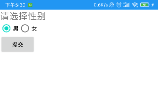
代码:
<LinearLayout xmlns:android="http://schemas.android.com/apk/res/android"
    xmlns:tools="http://schemas.android.com/tools"
    android:id="@+id/LinearLayout1"
    android:layout_width="match_parent"
    android:layout_height="match_parent"
    android:orientation="vertical"
    tools:context=".MainActivity" >

    <TextView
        android:layout_width="wrap_content"
        android:layout_height="wrap_content"
        android:text="请选择性别"
        android:textSize="23dp"
        />

    <RadioGroup
        android:id="@+id/radioGroup"
        android:layout_width="wrap_content"
        android:layout_height="wrap_content"
        android:orientation="horizontal">

        <RadioButton
            android:id="@+id/btnMan"
            android:layout_width="wrap_content"
            android:layout_height="wrap_content"
            android:text="男"
            android:checked="true"/>

        <RadioButton
            android:id="@+id/btnWoman"
            android:layout_width="wrap_content"
            android:layout_height="wrap_content"
            android:text="女"/>
    </RadioGroup>

    <Button
        android:id="@+id/btnpost"
        android:layout_width="wrap_content"
        android:layout_height="wrap_content"
        android:text="提交"/>

</LinearLayout>
效果图:
获得选中的值
第一种是为 RadioButton 设置一个事件监听器setOnCheckChangeListener
RadioGroup radgroup = (RadioGroup) findViewById(R.id.radioGroup);
        //第一种获得单选按钮值的方法
        // 为radioGroup设置一个监听器:setOnCheckedChanged()
        radgroup.setOnCheckedChangeListener((group, checkedId) -> {
            RadioButton radbtn = (RadioButton) findViewById(checkedId);
            Toast.makeText(getApplicationContext(), "按钮组值发生改变,你选了" + radbtn.getText(), Toast.LENGTH_LONG).show();
        });
切记,要为每个 RadioButton 添加一个id,不然单选功能不会生效!
第二种方法是通过单击其他按钮获取选中单选按钮的值,当然我们也可以直接获取。
Button btnchange = (Button) findViewById(R.id.btnpost);
        RadioGroup radgroup = (RadioGroup) findViewById(R.id.radioGroup);
        //为radioGroup设置一个监听器:setOnCheckedChanged()
        btnchange.setOnClickListener(v -> {
            for (int i = 0; i < radgroup.getChildCount(); i++) {
                RadioButton rd = (RadioButton) radgroup.getChildAt(i);
                if (rd.isChecked()) {
                    Toast.makeText(getApplicationContext(), "点击提交按 钮,获取你选择的是:" + rd.getText(), Toast.LENGTH_LONG).show();
                    break;
                }
            }
        });
- getChildCount( )获得按钮组中的单选按钮的数目;
- getChinldAt(i):根据索引值获取我们的单选按钮;
- isChecked( ):判断按钮是否选中;
2、CheckBox (复选框)
复选框,即可以同时选中多个选项,
获得选中的值
1.为每个CheckBox添加事件:setOnCheckedChangeListener
2.弄一个按钮,在点击后,对每个checkbox进行判断:isChecked();
代码:
public class MainActivity extends AppCompatActivity implements View.OnClickListener,CompoundButton.OnCheckedChangeListener{

    private CheckBox cb_one;
    private CheckBox cb_two;
    private CheckBox cb_three;
    private Button btn_send;

    @Override
    protected void onCreate(Bundle savedInstanceState) {
        super.onCreate(savedInstanceState);
        setContentView(R.layout.activity_main);

        cb_one = (CheckBox) findViewById(R.id.cb_one);
        cb_two = (CheckBox) findViewById(R.id.cb_two);
        cb_three = (CheckBox) findViewById(R.id.cb_three);
        btn_send = (Button) findViewById(R.id.btn_send);

        cb_one.setOnCheckedChangeListener(this);
        cb_two.setOnCheckedChangeListener(this);
        cb_three.setOnCheckedChangeListener(this);
        btn_send.setOnClickListener(this);

    }

    @Override
    public void onCheckedChanged(CompoundButton compoundButton, boolean b) {
       if(compoundButton.isChecked()) Toast.makeText(this,compoundButton.getText().toString(),Toast.LENGTH_SHORT).show();
    }

    @Override
    public void onClick(View view) {
        String choose = "";
        if(cb_one.isChecked())choose += cb_one.getText().toString() + "";
        if(cb_two.isChecked())choose += cb_two.getText().toString() + "";
        if(cb_three.isChecked())choose += cb_three.getText().toString() + "";
        Toast.makeText(this,choose,Toast.LENGTH_SHORT).show();
    }
}
二、自定义点击效果
drawable:
<?xml version="1.0" encoding="utf-8"?>
<selector xmlns:android="http://schemas.android.com/apk/res/android">
    <item
        android:state_enabled="true"
        android:state_checked="true"
        android:drawable="@mipmap/ic_checkbox_checked"/>
    <item
        android:state_enabled="true"
        android:state_checked="false"
        android:drawable="@mipmap/ic_checkbox_normal" />
</selector>
写好后,有两种方法设置
①android:button属性设置为上述的selctor
android:button="@drawable/rad_btn_selctor"
②在style中定义一个属性,然后通过android style属性设置,先往style添加下述代码:
    <style name="MyCheckBox" parent="@android:style/Widget.CompoundButton.CheckBox">
        <item name="android:button">@drawable/rad_btn_selctor</item>
    </style>
然后布局那里:
style="@style/MyCheckBox"
三、改变文字与选择框的相对位置
第一步:android:button=“@null”
第二步:android:drawableTop=“@android:drawable/btn_radio”
可以把drawableXxx替换成自己喜欢的效果!
四、修改文字与选择框的距离
1.在XML代码中控制: 使用android:paddingXxx = “xxx” 来控制距离
2.在Java代码中,稍微好一点,动态计算paddingLeft!
六、开关按钮ToggleButton和开关Switch
一、核心属性
1、ToggleButton(开关按钮)
| 属性名 | 说明 |
|---|---|
| android:disabledAlpha | 设置按钮在禁用时的透明度 |
| android:textOff | 按钮没有被选中时显示的文字 |
| android:textOn | 按钮被选中时显示的文字 |
2、Switch(开关)
| 属性名 | 说明 |
|---|---|
| android:showText | boolean;设置on/off的时候是否显示文字 |
| android:splitTrack | boolean;是否设置一个间隙,让滑块与底部图片分隔 |
| android:switchMinWidth | 设置开关的最小宽度 |
| android:switchPadding | 设置滑块内文字的间隔 |
| android:switchTextAppearance | 设置开关的文字外观 |
| android:textOff | 按钮没有被选中时显示的文字 |
| android:textOn | 按钮被选中时显示的文字 |
| android:textStyle | 文字风格,normal(无效果),bold(加粗),italic(斜体)等 |
| android:track | 底部的图片 |
| android:thumb | 滑块的图片 |
| android:typeface | 设置字体,默认支持这三种:sans, serif, monospace;除此以外还可以使用 其他字体文件(*.ttf) |
关于android:typeface设置(*.ttf)
首先要将字体文件保存在assets/fonts/目录下,不过需要在Java代码中设置:
Typeface typeFace =Typeface.createFromAsset(getAssets(),“fonts/HandmadeTypewriter.ttf”);
textView.setTypeface(typeFace);
七、ProgressBar(进度条)
一、常用属性
| 属性 | 说明 |
|---|---|
| android:max | 进度条的最大值 |
| android:progress | 进度条已完成进度值 |
| android:progressDrawable | 设置轨道对应的Drawable对象 |
| android:indeterminate | 如果设置成true,则进度条不精确显示进度 |
| android:indeterminateDrawable | 设置不显示进度的进度条的Drawable对象 |
| android:indeterminateDuration | 设置不精确显示进度的持续时间 |
| android:secondaryProgress | 二级进度条,类似于视频播放的一条是当前播放进度,一条是缓冲进度,前者通过progress属性进行设置! |
对应的Java中可调用下述方法
| 属性 | 说明 |
|---|---|
| getMax() | 返回这个进度条的范围的上限 |
| getProgress() | 返回进度 |
| getSecondaryProgress() | 返回次要进度 |
| incrementProgressBy(int diff) | 指定增加的进度 |
| isIndeterminate() | 指示进度条是否在不确定模式下 |
| setIndeterminate(boolean indeterminate) | 设置是否在不确定模式下 |
八、SeekBar(拖动条)
一、基本用法
| 属性 | 说明 |
|---|---|
| android:max | 滑动条的最大值 |
| android:progress | 滑动条的当前值 |
| android:secondaryProgress | 二级滑动条的进度 |
| android:thumb | 滑块的drawable |
二、事件
SeekBar.OnSeekBarChangeListener监听:
| 属性 | 说明 |
|---|---|
| onProgressChanged | 进度发生改变时会触发 |
| onStartTrackingTouch | 按住SeekBar时会触发 |
| onStopTrackingTouch | 放开SeekBar时触发 |
九、RatingBar(星级评分条)
一、基本属性
| 属性 | 说明 |
|---|---|
| android:isIndicator | 是否用作指示,用户无法更改,默认false |
| android:numStars | 显示多少个星星,必须为整数 |
| android:rating | 默认评分值,必须为浮点数 |
| android:stepSize | 评分每次增加的值,必须为浮点数 |
两种样式:
style=“?android:attr/ratingBarStyleSmall”
style=“?android:attr/ratingBarStyleIndicator”
二、事件
为RatingBar设置OnRatingBarChangeListener事件,然后重写下onRatingChanged()方法
十、ScrollView(滚动条)
一、分类
ScrollView 竖直滚动条
HorizontalScrollView 水平滚动条
二、滚动到底部
fullScroll()方法:
scrollView.fullScroll(ScrollView.FOCUS_DOWN);滚动到底部
scrollView.fullScroll(ScrollView.FOCUS_UP);滚动到顶部
scrollTo()参数依次为x,y滚到对应的x,y位置
三、设置滚动的滑块图片
垂直方向滑块:android:scrollbarThumbVertical
水平方向滑块:android:scrollbarThumbHorizontal
四、隐藏滑块
两种方法:
1.XML中:android:scrollbars=“none”
2.Java代码设置:scrollview.setVerticalScrollBarEnabled(false);
五、设置滚动速度
继承ScrollView,然后重写一个 public void fling (int velocityY)的方法:
@Override
public void fling(int velocityY) {
	//速度变为原来的一半
	super.fling(velocityY / 2);
}
十一、Date & Time组件
一、TextClock(文本时钟)
TextClock是在Android 4.2(API 17)后推出的用来替代DigitalClock的一个控件!
TextClock可以以字符串格式显示当前的日期和时间,因此推荐在Android 4.2以后使用 TextClock。
这个控件推荐在24进制的android系统中使用,TextClock提供了两种不同的格式, 一种是在24
进制中显示时间和日期,另一种是在12进制中显示时间和日期。大部分人喜欢默认的设置。
另外他给我们提供了下面这些方法,对应的还有get方法:
| 属性 | 方法 | 说明 |
|---|---|---|
| android:format12Hour | setFormat12Hour(CharSequence) | 设置12时制的格式 |
| android:format24Hour | setFormat24Hour(CharSequence) | 设置24时制的格式 |
| android:timeZone | setTimeZone(String) | 设置时区 |
| 常用的写法 |
<TextClock
        android:layout_width="wrap_content"
        android:layout_height="wrap_content"
        android:format12Hour="MM/dd/yy h:mmaa"/>
    <TextClock
        android:layout_width="wrap_content"
        android:layout_height="wrap_content"
        android:format12Hour="MMM dd, yyyy h:mmaa"/>
    <TextClock
        android:layout_width="wrap_content"
        android:layout_height="wrap_content"
        android:format12Hour="MMMM dd, yyyy h:mmaa"/>
    <TextClock
        android:layout_width="wrap_content"
        android:layout_height="wrap_content"
        android:format12Hour="E, MMMM dd, yyyy h:mmaa"/>
    <TextClock
        android:layout_width="wrap_content"
        android:layout_height="wrap_content"
        android:format12Hour="EEEE, MMMM dd, yyyy h:mmaa"/>
    <TextClock
        android:layout_width="wrap_content"
        android:layout_height="wrap_content"
        android:format12Hour="Noteworthy day: 'M/d/yy"/>
效果图

二、AnalogClock(模拟时钟)
| 属性 | 说明 |
|---|---|
| android:dial | 表背景图片 |
| android:hand_hour | 表时针图片 |
| android:hand_minute | 分时针图片 |
三、Chronometer(计时器)
| Java操作 | 说明 |
|---|---|
| chronometer.start() | 开始计时 |
| chronometer.stop() | 停止计时 |
| chronometer.setBase(SystemClock.elapsedRealtime()); | 复位 |
| chronometer.setFormat(“Time:%s”) | 更改时间显示格式 |
四、DatePicker(日期选择器)
| 属性 | 说明 |
|---|---|
| android:calendarTextColor | 日历列表的文本的颜色 |
| android:calendarViewShown | 是否显示日历视图 |
| android:datePickerMode | 组件外观,可选值:spinner,calendar |
| android:dayOfWeekBackground | 顶部星期几的背景颜色 |
| android:dayOfWeekTextAppearance | 顶部星期几的文字颜色 |
| android:endYear | 去年(内容)比如2010 |
| android:firstDayOfWeek | 设置日历列表以星期几开头 |
| android:headerBackground | 整个头部的背景颜色 |
| android:headerDayOfMonthTextAppearance | 头部日期字体的颜色 |
| android:headerMonthTextAppearance | 头部月份的字体颜色 |
| android:headerYearTextAppearance | 头部年的字体颜色 |
| android:maxDate | 最大日期显示在这个日历视图mm / dd / yyyy格式 |
| android:minDate | 最小日期显示在这个日历视图mm / dd / yyyy格式 |
| android:spinnersShown | 是否显示spinner |
| android:startYear | 设置第一年(内容),比如19940年 |
| android:yearListItemTextAppearance | 列表的文本出现在列表中 |
| android:yearListSelectorColor | 年列表选择的颜色 |
监听事件: DatePicker.OnDateChangedListener
五、TimePicker(时间选择器)
监听事件:TimePicker.OnTimeChangedListener
六、CalendarView(日历视图)
| 属性 | 说明 |
|---|---|
| android:firstDayOfWeek | 设置一个星期的第一天 |
| android:maxDate | 最大的日期显示在这个日历视图mm / dd / yyyy格式 |
| android:minDate | 最小的日期显示在这个日历视图mm / dd / yyyy格式 |
| android:weekDayTextAppearance | 工作日的文本出现在日历标题缩写 |
监听事件:CalendarView.OnDateChangeListener
ㅤㅤㅤ
ㅤㅤㅤ
ㅤㅤㅤ
ㅤㅤㅤ
ㅤㅤㅤ
ㅤㅤㅤ
越到后边逐渐烦躁了……整理的啥也不是


 1126
1126


 被折叠的 条评论
为什么被折叠?
被折叠的 条评论
为什么被折叠?
 到【灌水乐园】发言


