


Android开发 UI布局
一、LinearLayout(线性布局)
一、常用属性
| 属性名称 | 属性含义 |
|---|---|
| android:orientation | 布局中组件的布局方式,horizontal (水平),vertical (垂直) |
| android:gravity | 控制组件所包含的子元素的对齐方式,可多个组合,如(left|buttom) |
| android:layout_gravity | 控制该组件在父容器里的对齐方式 |
| android:layout_width | 布局的宽度,通常不直接写数字,用wrap_content(组件实际大小),fill_parent(填满父级)或者match_parent(与父级相匹配) |
| android:layout_height | 布局的高度,参数同上 |
| android:id | 为组件设置一个资源id,在java中文件可以通过findViewById(Id)找到该组件 |
| android:background | 为该组件设置一个背景图片,或者直接用图片覆盖 |
二、Weight (权重)
该属性用来按比例划分区域
1、最简单的用法:等比例划分
如图:
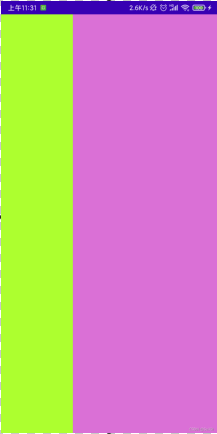
实现的代码:
<LinearLayout xmlns:android="http://schemas.android.com/apk/res/android"
    xmlns:tools="http://schemas.android.com/tools"
    android:id="@+id/LinearLayout1"
    android:layout_width="match_parent"
    android:layout_height="match_parent"
    android:orientation="horizontal"
    android:baselineAligned="false">

    <LinearLayout
        android:layout_width="0dp"
        android:layout_height="fill_parent"
        android:background="#ADFF2F"
        android:layout_weight="1"/>

    <LinearLayout
        android:layout_width="0dp"
        android:layout_height="fill_parent"
        android:background="#DA70D6"
        android:layout_weight="2"/>

</LinearLayout>
2、weight属性详解:
1)wrap_content 直接按比例
如图:
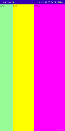
实现代码:
<LinearLayout xmlns:android="http://schemas.android.com/apk/res/android"
    xmlns:tools="http://schemas.android.com/tools"
    android:id="@+id/LinearLayout1"
    android:layout_width="match_parent"
    android:layout_height="match_parent"
    android:orientation="horizontal" >

    <TextView
        android:layout_weight="1"
        android:layout_width="wrap_content"
        android:layout_height="fill_parent"
        android:text="one"
        android:background="#98FB98"
     />
     <TextView
        android:layout_weight="2"
        android:layout_width="wrap_content"
        android:layout_height="fill_parent"
        android:text="two"
        android:background="#FFFF00"
     />
     <TextView
        android:layout_weight="3"
        android:layout_width="wrap_content"
        android:layout_height="fill_parent"
        android:text="three"
        android:background="#FF00FF"
     />

</LinearLayout>
2)match_parent(fill_parent) 则需要计算
如下代码:
<LinearLayout xmlns:android="http://schemas.android.com/apk/res/android"
    xmlns:tools="http://schemas.android.com/tools"
    android:id="@+id/LinearLayout1"
    android:layout_width="match_parent"
    android:layout_height="match_parent" >

    <TextView
        android:layout_weight="1"
        android:layout_width="fill_parent"
        android:layout_height="fill_parent"
        android:text="one"
        android:background="#98FB98"/>
     <TextView
        android:layout_weight="2"
        android:layout_width="fill_parent"
        android:layout_height="fill_parent"
        android:text="two"
        android:background="#FFFF00"/>
     <TextView
        android:layout_weight="3"
        android:layout_width="fill_parent"
        android:layout_height="fill_parent"
        android:text="three"
        android:background="#FF00FF"/>

</LinearLayout>
效果图:
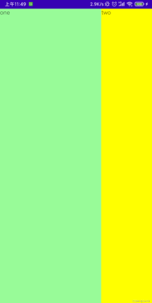
效果却是 2 : 1 : 0,原因:
1、三个都是“充满父级”,但父级只有一个,三个就需要三个父级,所以导致差两个父级,所缺少的部分就需要所有组件共同分担,但又要遵守“先到先得”的原则。
2、根据权重weight, 大家每个占的比例是1 : 2 : 3,所以承担的损失就得按比例来分,各承担6份中得1/2/3;所以依次比例是1/6,2/6,3/6。
3、按照先到先得原则,依次划分:
one 承担损失:2 * (1/6) = 1/3 所得面积:1 - 1/3 = 2/3
two 承担损失:2 * (2/6) = 2/3 所得面积:1 - 2/3 = 1/3
three 承担损失:2 * (3/6) = 1 所得面积:1 - 1 = 0
所以最终三个所得面积:2 : 1 : 0
3、为LinearLayout设置分割线
1) 直接在布局中添加一个view,这个view的作用仅仅是显示出一条线
<View
    android:layout_width="match_parent"
    android:layout_height="1px"
    android:background="#000000" />
这个是水平方向上的黑线,当然你也可以改成其他颜色,或者使用图片

2)使用LinearLayout的一个divider属性,直接为LinearLayout设置分割线
这里就需要你自己准备一张线的图片了
1)android:divider设置作为分割线的图片
2)android:showDividers设置分割线的位置,none(无),beginning(开始),end(结束),middle(每两个组件间)
3)dividerPadding设置分割线的Padding
使用示例:
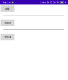
实现代码:
<LinearLayout xmlns:android="http://schemas.android.com/apk/res/android"
    xmlns:tools="http://schemas.android.com/tools"
    android:id="@+id/LinearLayout1"
    android:layout_width="match_parent"
    android:layout_height="match_parent"
    android:divider="@drawable/ktv_line_div"
    android:orientation="vertical"
    android:showDividers="middle"
    android:dividerPadding="10dp"
    tools:context=".MainActivity" >

    <Button
        android:layout_width="wrap_content"
        android:layout_height="wrap_content"
        android:text="按钮1" />

    <Button
        android:layout_width="wrap_content"
        android:layout_height="wrap_content"
        android:text="按钮2" />

    <Button
        android:layout_width="wrap_content"
        android:layout_height="wrap_content"
        android:text="按钮3" />

</LinearLayout>
二、RelativeLayout(相对布局)
一、基本属性
| 属性名称 | 属性含义 |
|---|---|
| android:gravity | 设置容器内组件的对齐方式 |
| android:ignoreGravity | 设置了该属性为true的组件,将不受gravity属性的影响 |
二、相对父容器定位
| 属性名称 | 属性含义 |
|---|---|
| android:layout_alignParentLeft | 父容器内左对齐 |
| android:layout_alignParentRight | 父容器内右对齐 |
| android:layout_alignParentTop | 父容器内顶部对齐 |
| android:layout_alignParentBottom | 父容器内底部对齐 |
| android:layout_centerHorizontal | 父容器内水平对齐 |
| android:layout_centerVertical | 父容器内垂直居中 |
| android:layout_conterInParent | 父容器内中心居中 |
| 父容器定位属性示意图 | |
 |
三、相对兄弟组件定位
所谓的兄弟组件就是处于同一层次容器的组件
| 属性名称 | 属性含义 |
|---|---|
| android:layout_toLeftOf | 参考指定组件的左边 |
| android:layout_toRightOf | 参开指定组件的右边 |
| android:layout_above | 参考指定组件的上方 |
| android:layout_below | 参考指定组件的下方 |
| android:layout_alignTop | 对齐指定组件的上边界 |
| android:layout_alignBottom | 对齐指定组件的下边界 |
| android:layout_alignLeft | 对齐指定组件的左边界 |
| android:layout_alignRight | 对齐指定组件的右边界 |
四、margin与padding
关于margin与padding,了解过H5的第一印象便是外边距与内边距,这里再简单解释区分一下它俩。
margin代表的是偏移,针对的是组件外相对父元素的偏移距离。
padding代表的是填充,针对的是组件内对内部空间的填充。
| 属性名称 | 属性含义 |
|---|---|
| android:layout_marginBottom | 离父组件底边缘的距离 |
| android:layout_marginLeft | 离父组件左边缘的距离 |
| android:layout_marginRight | 离父组件右边缘的距离 |
| android:layout_marginTop | 离父组件上边缘的距离 |
| android:layout_paddingBottom | 往组件内底边缘填充距离 |
| android:layout_paddingLeft | 往组件内左边缘填充距离 |
| android:layout_paddingRight | 往组件内右边缘填充距离 |
| android:layout_paddingTop | 往组件内右边缘填充距离 |
三、TableLayout(表格布局)
一、关于TableLayout
相信学过HTML的朋友都知道,我们可以通过< table >< tr >< td >就可以生成一个HTML的表格,
而Android中也允许我们使用表格行与列的方式来排列组件,这便是TableLayout!
但却不像Android 4.0后引入的GridLayout(网格)布局一样,直接就可以设置多少行与多少列!
一般建议使用GridLayout,其相对于TableLayout有更高的灵活度和更好的效果。
关于TableLayout与GridLayout的区别,在GridLayout后做详细区分。
二、如何确定行数与列数
①如果直接往TableLayout中添加组件,那么这个组件将占满一行!
②如果想一行上有多个组件,就要添加一个TableRow的容器,把组件都丢到里面!
③TableRow中的组件个数决定了该行有多少列,而列的宽度由该列中最宽的单元格决定
④TableRow的layout_width属性,默认是fill_parent的,设置成其他的值也不会生效!!! 但layout_height默认是wrapten_content的,可以自己设置大小!
⑤整个表格布局的宽度取决于父容器的宽度(占满父容器)
⑥一个tablerow占一行,一个单独的组件也占一行!多少列则是看tableRow中的组件个数,组件最多的就是TableLayout的列数
三、常用属性
| 属性名称 | 属性含义 |
|---|---|
| android:collapseColumns | 设置需要被隐藏的列的序号 |
| android:shrinkColumns | 设置允许被收缩的列的列序号 |
| android:stretchColumns | 设置运行被拉伸的列的列序号 |
| android:layout_column | 设置跳过指定列的序号 |
| android:layout_span | 设置合并指定数量的列,既该组件占指定数量单元格 |
以上这三个属性的列号都是从0开始算的,比如shrinkColunmns = “2”,对应的是第三列!
可以设置多个,用逗号隔开比如"0,2",如果是所有列都生效,则用"*"号即可
使用实例
1、collapseColumns(隐藏列)
在TableRow中定义5个按钮后,接着在最外层的TableLayout中添加以下属性: android:collapseColumns = “0,2”,就是隐藏第一与第三列,代码如下:
<TableLayout xmlns:android="http://schemas.android.com/apk/res/android"
    xmlns:tools="http://schemas.android.com/tools"
    android:id="@+id/TableLayout2"
    android:layout_width="fill_parent"
    android:layout_height="wrap_content"
    android:collapseColumns="0,2" >

    <TableRow>
        <Button
            android:layout_width="wrap_content"
            android:layout_height="wrap_content"
            android:text="one" />

        <Button
            android:layout_width="wrap_content"
            android:layout_height="wrap_content"
            android:text="two" />

        <Button
            android:layout_width="wrap_content"
            android:layout_height="wrap_content"
            android:text="three" />

        <Button
            android:layout_width="wrap_content"
            android:layout_height="wrap_content"
            android:text="four" />

        <Button
            android:layout_width="wrap_content"
            android:layout_height="wrap_content"
            android:text="five" />
    </TableRow>
</TableLayout>
效果

2、stretchColumns(拉伸列)
在TableLayout中设置了四个按钮,接着在最外层的TableLayout中添加以下属性: android:stretchColumns = “1”
设置第二列为可拉伸列,让该列填满这一行所有的剩余空间,代码如下:
<TableLayout xmlns:android="http://schemas.android.com/apk/res/android"
    xmlns:tools="http://schemas.android.com/tools"
    android:id="@+id/TableLayout2"
    android:layout_width="fill_parent"
    android:layout_height="wrap_content"
    android:stretchColumns="1" >

    <TableRow>

        <Button
            android:layout_width="wrap_content"
            android:layout_height="wrap_content"
            android:text="one" />

        <Button
            android:layout_width="wrap_content"
            android:layout_height="wrap_content"
            android:text="two" />

        <Button
            android:layout_width="wrap_content"
            android:layout_height="wrap_content"
            android:text="three" />

        <Button
            android:layout_width="wrap_content"
            android:layout_height="wrap_content"
            android:text="four" />
    </TableRow>
</TableLayout>
效果图:

3、shrinkColumns(收缩列)
设置了5个按钮(整体宽度超过屏宽),在最外层的TableLayout中添加以下属性: android:shrinkColumns = “1”
设置第二个列为可收缩列,代码如下:
<TableLayout xmlns:android="http://schemas.android.com/apk/res/android"
    xmlns:tools="http://schemas.android.com/tools"
    android:id="@+id/TableLayout2"
    android:layout_width="fill_parent"
    android:layout_height="wrap_content"
    android:shrinkColumns="1" >

    <TableRow>

        <Button
            android:layout_width="wrap_content"
            android:layout_height="wrap_content"
            android:text="one" />

        <Button
            android:layout_width="wrap_content"
            android:layout_height="wrap_content"
            android:text="two" />

        <Button
            android:layout_width="wrap_content"
            android:layout_height="wrap_content"
            android:text="three" />

        <Button
            android:layout_width="wrap_content"
            android:layout_height="wrap_content"
            android:text="four" />

        <Button
            android:layout_width="wrap_content"
            android:layout_height="wrap_content"
            android:text="five" />
    </TableRow>
</TableLayout>
效果图:

4、???This TableRow layout or its TableLayout parent is unnecessary
在使用这个这TableLayout的TableRow的时候会遇到这个警告:

但程序还是可以运行的,不过看到警告就不爽的话!解决这个警告的方法:只要TableLayout里面有2个或以上的TableRow就可以了!
四、GridLayout(网格布局)
一、设置排版对齐
| 属性名称 | 属性含义 |
|---|---|
| android:orientation | 设置排列方式,vertical(竖直,默认)或者horizontal(水平) |
| android:layout_fravity | 设置对齐方式,center,left,right,bottom,可同时使用两种(“bottom|left”) |
二、设置行列
| 属性名称 | 属性含义 |
|---|---|
| android:rowCount | 设置行数 |
| android:columnCount | 设置列数 |
三、设置组件所在行列
| 属性名称 | 属性含义 |
|---|---|
| 注意: | 从0开始计算 |
| android:layout_row | 设置组件位于第几行 |
| android:layout_cloumn | 设置组件位于第几列 |
四、设置组件横跨行列
| 属性名称 | 属性含义 |
|---|---|
| android:layout_rowSpan | 纵向跨行数 |
| android:layout_cloumnSpan | 横向跨列数 |
五、关于TableLayout 和 GridLayout 的区别
1、TableLayout
- 继承LinearLayout
- 不需要明确的申明包含多少行多少列
- 通过添加 TableRow / 其他组件,来控制表格的行数和列数
- 单元格设置格式有3种:Shrinkable(可收缩),Stretchable(可拉伸),Collapsed(隐藏的)
2、GridLayout
- Android4.0之后新加的布局管理器
- 能够把整个容器划分为rows*columns的网格,每个网格可以放置一个组件
- 可以设置一个组件横跨多少列或者纵跨多少行
- 当单元格大小大于组件大小时,可以通过设置layout_grativity属性值,设置组件在单元格里的位置
- 通过设置layout_columnWeight/layout_rowWeight属性值,可以设置各个组件的大小比例
3、总结
1、TableLayout可以通过设置layout_margin参数做出隔行隔列的效果,GridLayout不仅可以通过layout_margin,还可以利用rowSpan/columnSpan合并单元格以及设置layout_grativity来达成效果。这第二种方法的效果更好。
2、TableLayout不能跨行跨列,不灵活,GridLayout能够更好实现隔行/隔列效果也是因为这个特点。
3、不能同时向水平和垂直方向做控件的对齐
TableLayout继承了LinearLayout,因此只能向一个方向做控件的对齐。
五、FrameLayout(帧布局)
最简单的一种布局,没有任何定位方式,当我们往里面添加控件的时候,会默认把他们放到这块区域的左上角,帧布局的大小由控件中最大的子控件决定,如果控件的大小一样大的话,那么同一时刻就只能看到最上面的那个组件,后续添加的控件会覆盖前一个。
| 属性名称 | 属性含义 |
|---|---|
| android:foreground | 设置改帧布局容器的前景图像,永远处于帧布局最上面,直接面对用户的图像,就是不会被覆盖的图片。 |
| android:foregroundGravity | 设置前景图像显示的位置 |
六、AbsoluteLayout(绝对布局)
不常用。
一、四大控制属性(单位都是dp)
1、控制大小
| 属性名称 | 属性含义 |
|---|---|
| android:layout_width | 组件宽度 |
| android:layout_height | 组件高度 |
2、控制位置
| 属性名称 | 属性含义 |
|---|---|
| android:layout_x | 设置组件的X坐标 |
| android:layout_y | 设置组件的Y坐标 |


 8705
8705


 被折叠的 条评论
为什么被折叠?
被折叠的 条评论
为什么被折叠?
 到【灌水乐园】发言


