


 本文详细描述了如何使用树形数据结构和CSS(如flex和calc)实现网页布局的动态适应性,包括使用before和after伪元素创建线条效果,以展示一个多层级的响应式设计过程。
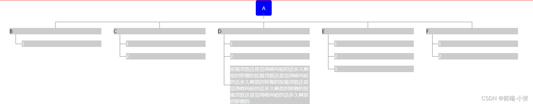
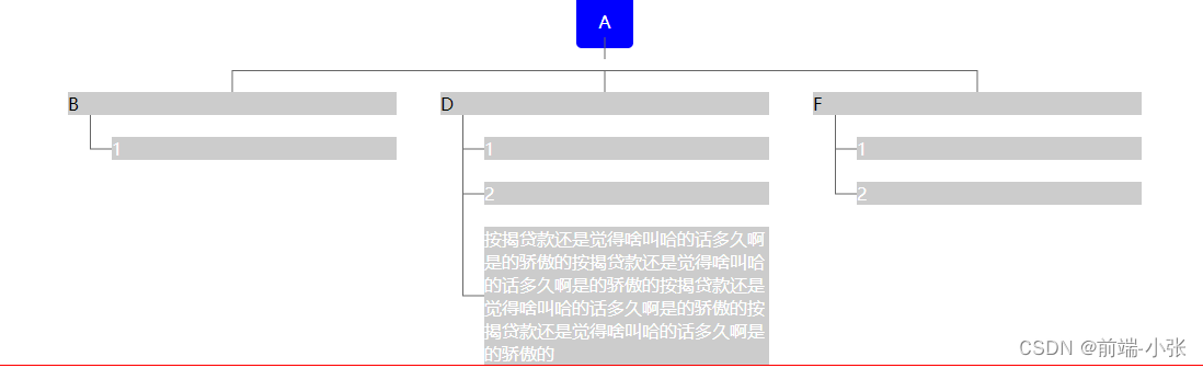
效果图
考虑点:
实现布局的一个大致思路,不能写死,动态适配,数据结构合理性
1.数据存储方式(树结构)
2.动态布局,线条实现方式(flex+calc+before+after)
代码实现:
<!DOCTYPE html>
<html lang="en">
	<head>
		<meta charset="UTF-8">
		<meta name="viewport" content="width=device-width, initial-scale=1.0">
		<title>布局分享</title>
	</head>
	<body>
		<style>
			.tree {
				border: 1px solid #f00;
				display: flex;
				flex-wrap: wrap;
				flex-direction: column;
				align-items: center;
			}

			.oneTree {
				width: 100%;
				position: relative;
				display: flex;
				flex-direction: column;
				justify-content: center;
				align-items: center;
			}

			.oneTitle {
				background: #00f;
				border-radius: 5px;
				color: #FFF;
				height: 40px;
				display: flex;
				justify-content: center;
				align-items: center;
				padding: 5px 20px;
			}

			.oneTitle::before {
				content: "";
				display: block;
				height: 20px;
				width: 1px;
				background: #666;
				position: absolute;
				left: 50%;
				transform: translateX(-50%);
				top: 40px;
			}

			.twoTree {
				width: 100%;
				display: flex;
				padding-top: 40px;
				justify-content: center;
				align-items: flex-start;
			}

			.twoItem {
				position: relative;
				margin: 0 20px;
			}

			.twoItem .twoTitle {
				background: #CCC;
				width: 300px;
			}

			.twoTree .twoTitle::before {
				content: "";
				display: block;
				height: 20px;
				width: 1px;
				background: #666;
				position: absolute;
				left: 50%;
				transform: translateX(-50%);
				top: -20px;
			}

			.twoItem:not(:last-child)::after {
				content: "";
				display: block;
				height: 1px;
				width: calc(100% + 40px);
				background: #666;
				position: absolute;
				left: 50%;
				top: -20px;
			}

			.threeTree {
				width: 100%;
				display: flex;
				flex-direction: column;
				justify-content: center;
				align-items: center;
			}

			.threeeItem {
				background: #ccc;
				color: #FFF;
				width: calc(300px - 40px);
				margin-top: 20px;
				margin-left: 40px;
				position: relative;
				c
			}

			.threeeItem::before {
				content: "";
				display: block;
				height: 1px;
				width: 20px;
				background: #666;
				position: absolute;
				top: 50%;
				transform: translateY(-50%);
				left: -20px;
			}

			.threeeItem:not(:last-child)::after {
				content: "";
				display: block;
				height: calc(100% + 20px);
				width: 1px;
				background: #666;
				position: absolute;
				top: -20px;
				left: -20px;
			}

			.threeeItem:last-child::after {
				content: "";
				display: block;
				height: calc(50% + 20px);
				width: 1px;
				background: #666;
				position: absolute;
				top: -20px;
				left: -20px;
			}
		</style>
		<div class="tree">
			<div class="oneTree">
				<div class="oneTitle">A</div>
				<div class="twoTree">
					<div class="twoItem">
						<div class="twoTitle">B</div>
						<div class="threeTree">
							<div class="threeeItem">
								1
							</div>

						</div>
					</div>
					<!-- <div class="twoItem">
						<div class="twoTitle">C</div>
						<div class="threeTree">
							<div class="threeeItem">
								1
							</div>
							<div class="threeeItem">
								2
							</div>

						</div>
					</div> -->
					<div class="twoItem">
						<div class="twoTitle">D</div>
						<div class="threeTree">
							<div class="threeeItem">
								1
							</div>
							<div class="threeeItem">
								2
							</div>
							<div class="threeeItem">
								按揭贷款还是觉得啥叫哈的话多久啊是的骄傲的按揭贷款还是觉得啥叫哈的话多久啊是的骄傲的按揭贷款还是觉得啥叫哈的话多久啊是的骄傲的按揭贷款还是觉得啥叫哈的话多久啊是的骄傲的
							</div>
						</div>
					</div>
					<!-- <div class="twoItem">
						<div class="twoTitle">E</div>
						<div class="threeTree">
							<div class="threeeItem">
								1
							</div>
							<div class="threeeItem">
								2
							</div>
							<div class="threeeItem">
								3
							</div>
						</div>
					</div> -->
					<div class="twoItem">
						<div class="twoTitle">F</div>
						<div class="threeTree">
							<div class="threeeItem">
								1
							</div>
							<div class="threeeItem">
								2
							</div>

						</div>
					</div>
				</div>
			</div>

		</div>
	</body>
</html>


 扫一扫
扫一扫


 7177
7177

 被折叠的 条评论
为什么被折叠?
被折叠的 条评论
为什么被折叠?
 到【灌水乐园】发言


