


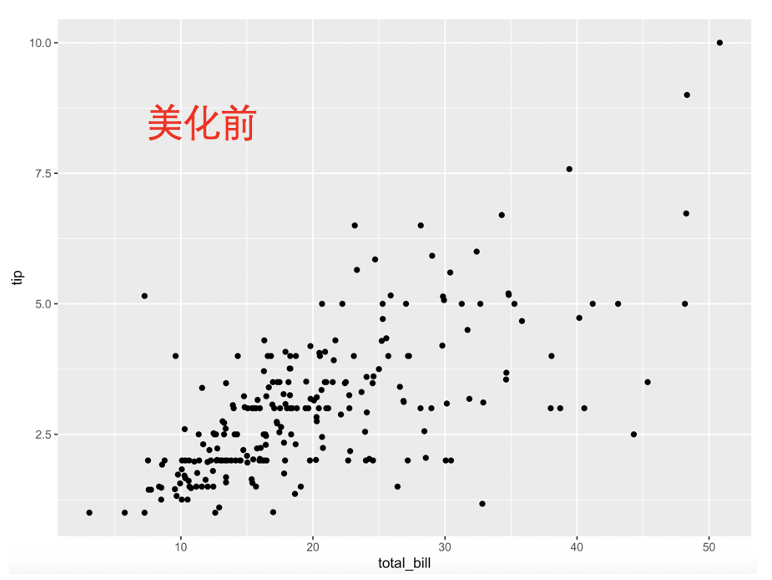
众所周知ggplot2的默认出图很丑,今天就以一个散点图为例,浅浅的说一下如何一步步美化。
关键修改见代码中的中文注释!
第1步、默认出图
ggplot(
  tips_data, # 指定数据集
  aes(
    x = total_bill, # 指定x轴变量
    y = tip # 指定y轴变量
  )
) +
  geom_point() # 绘制散点图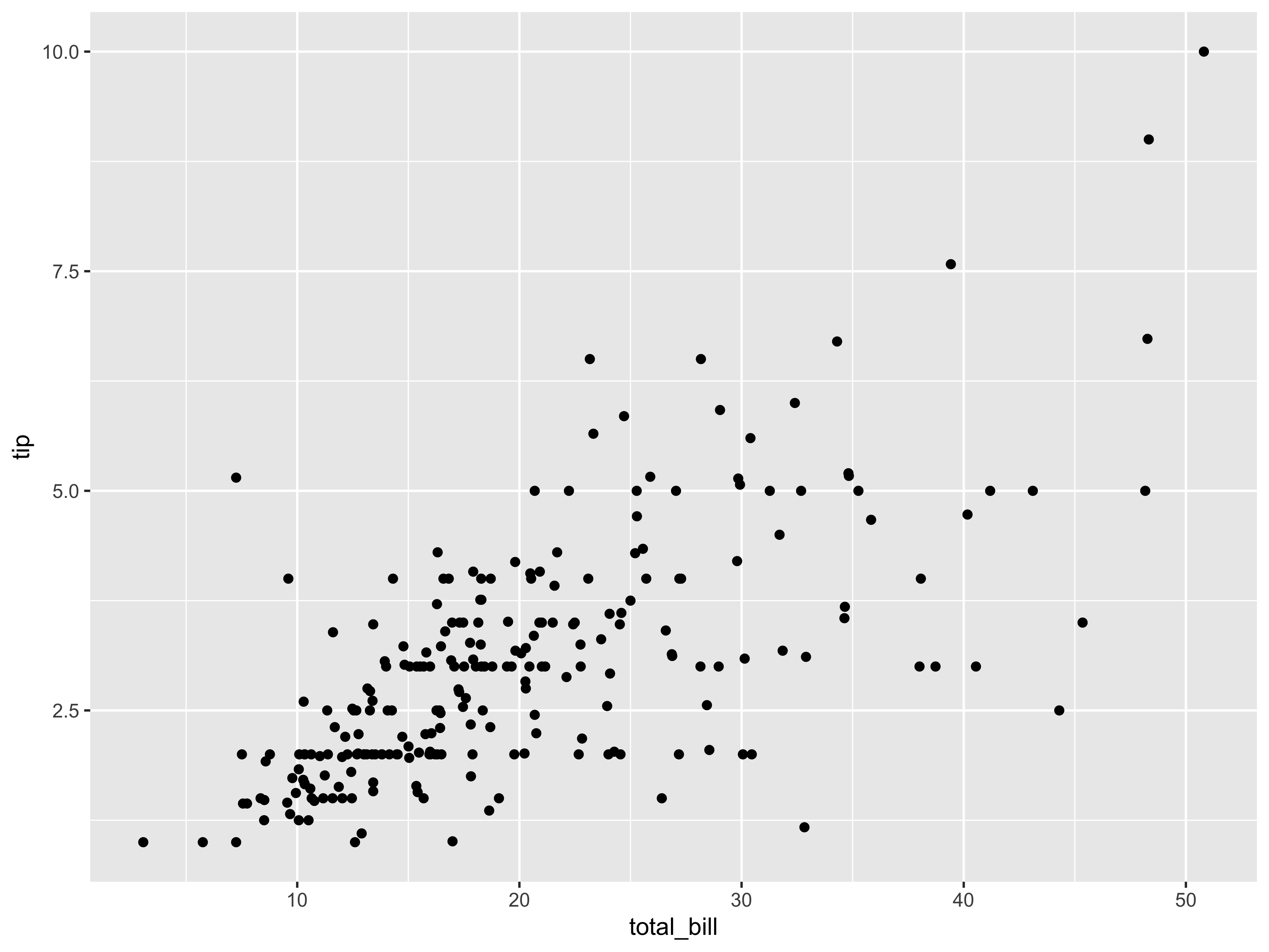
第2步、指定shape
ggplot(
  tips_data,
  aes(
    x = total_bill,
    y = tip,
    shape = sex # 按照性别指定不同的shape
  )
) +
geom_point() 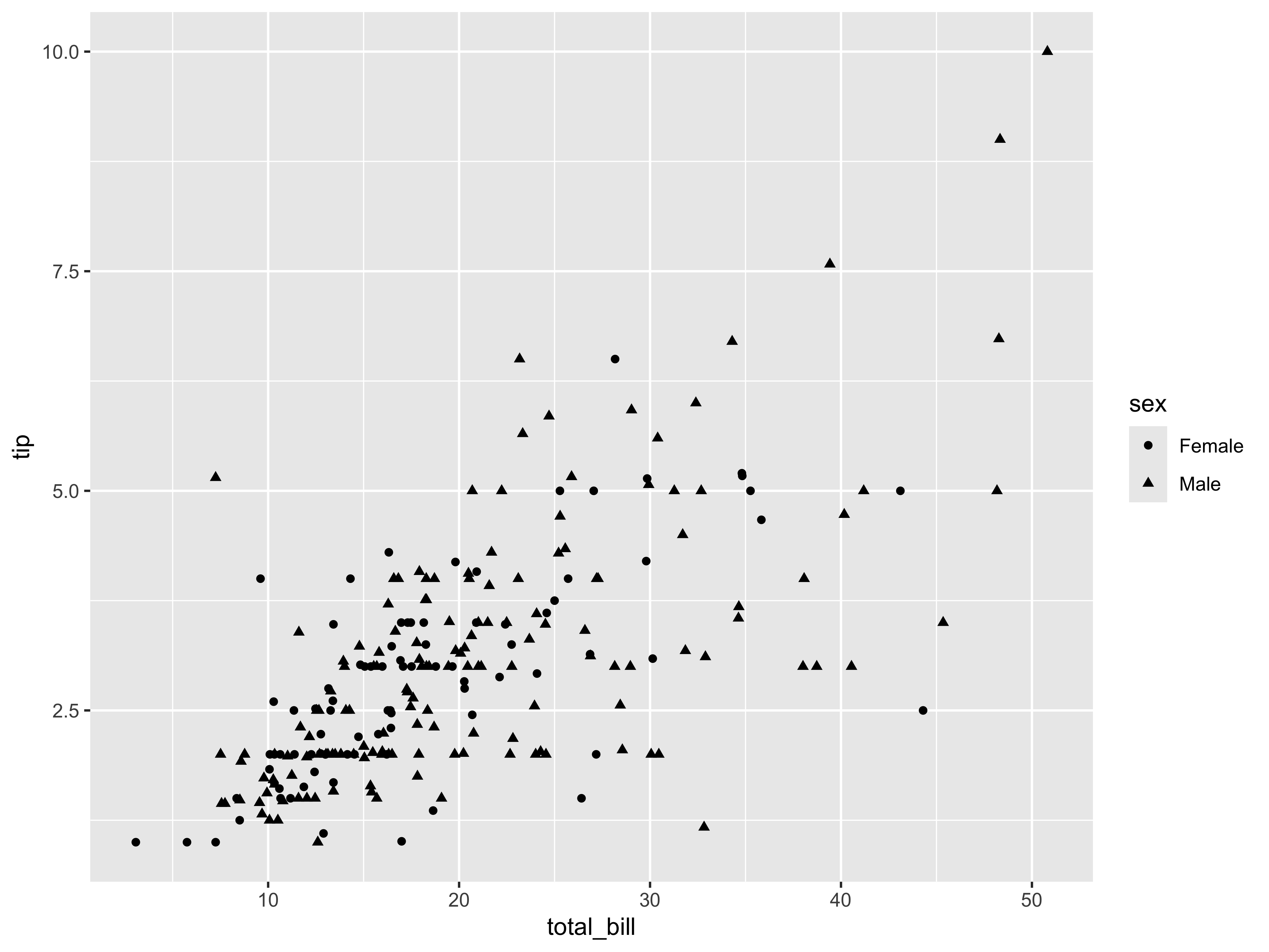
ggplot(
  tips_data,
  aes(
    x = total_bill,
    y = tip,
    shape = sex
  )
) +
  geom_point() +
  scale_shape_manual(values = c(21, 24)) # 个性化shape的形状为空圆和空三角
第3步、指定颜色
ggplot(
  tips_data,
  aes(
    x = total_bill,
    y = tip,
    shape = sex,
    fill = sex # 按照性别sex为点上色
  )
) +
  geom_point() +
  scale_shape_manual(values = c(21, 24))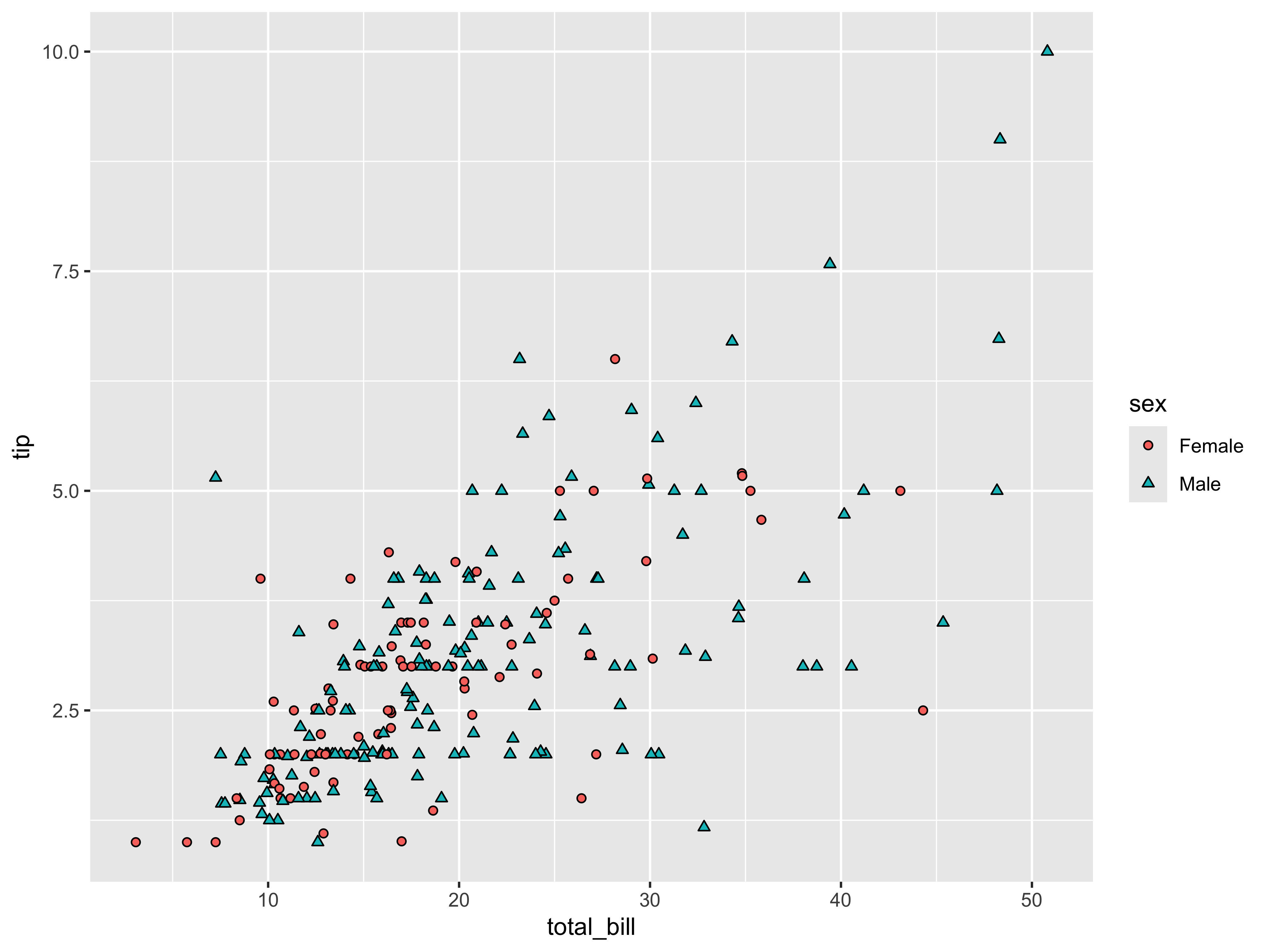
ggplot(
  tips_data,
  aes(
    x = total_bill,
    y = tip,
    shape = sex,
    fill = sex
  )
) +
  geom_point() +
  scale_shape_manual(values = c(21, 24)) +
  scale_fill_manual(values = custom_colors1) #自定义颜色
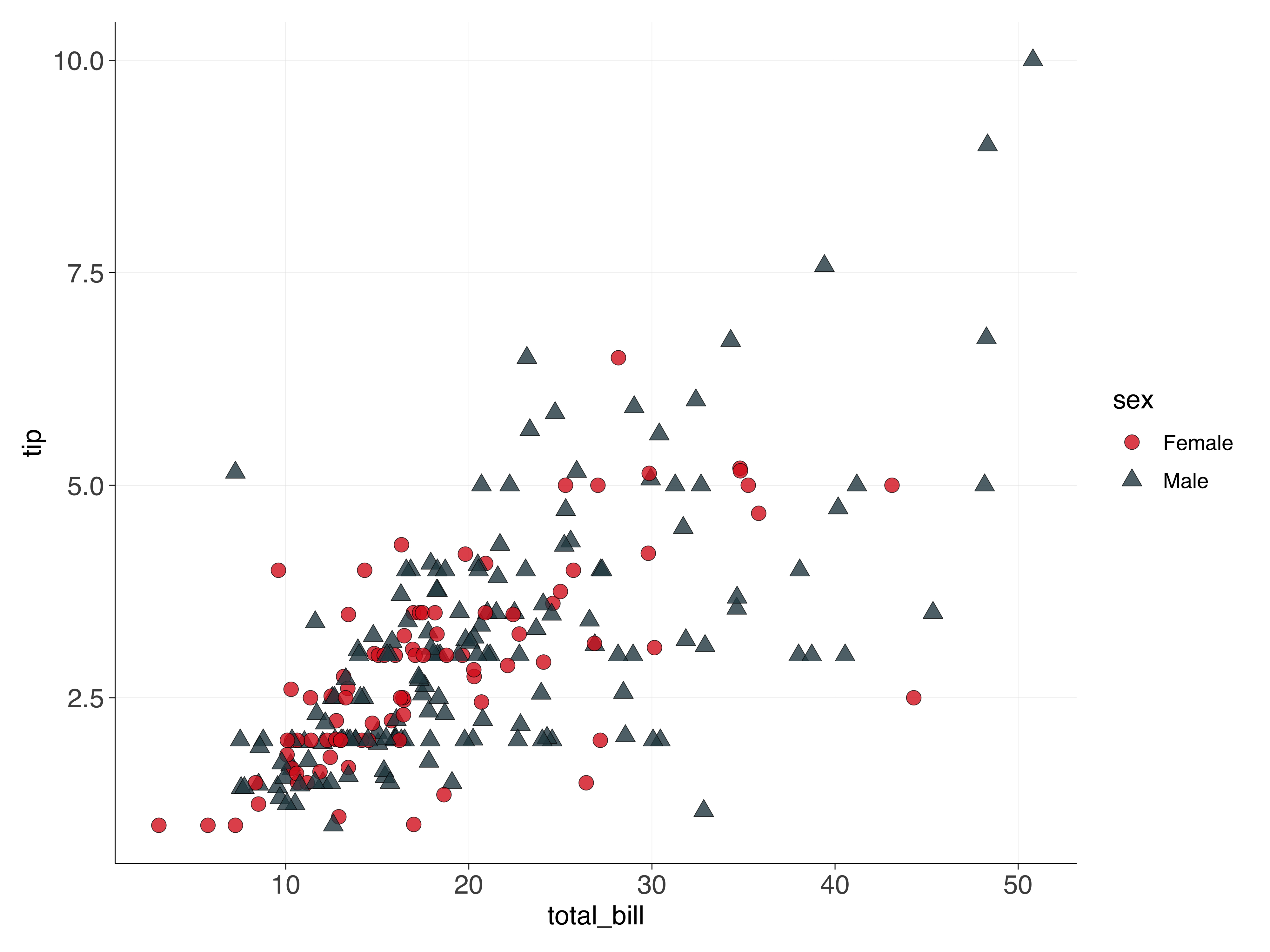
第4步、美化点
ggplot(
  tips_data,
  aes(
    x = total_bill,
    y = tip,
    shape = sex,
    fill = sex
  )
) +
  geom_point(
    alpha = 0.8, # 设置点的透明度
    size = 3, # 设置点的大小
    stroke = 0.2 # 设置点边框的粗细
  ) +
  scale_shape_manual(values = c(21, 24)) +
  scale_fill_manual(values = custom_colors1)
ggplot(
  tips_data,
  aes(
    x = total_bill,
    y = tip,
    shape = sex,
    fill = sex
  )
) +
  geom_point(
    alpha = 0.8,
    size = 3,
    stroke = 0.2
  ) +
  scale_shape_manual(values = c(21, 24)) +
  scale_fill_manual(values = custom_colors1) +
  scale_color_manual(values = c("black", "black")) # 给点边框加上颜色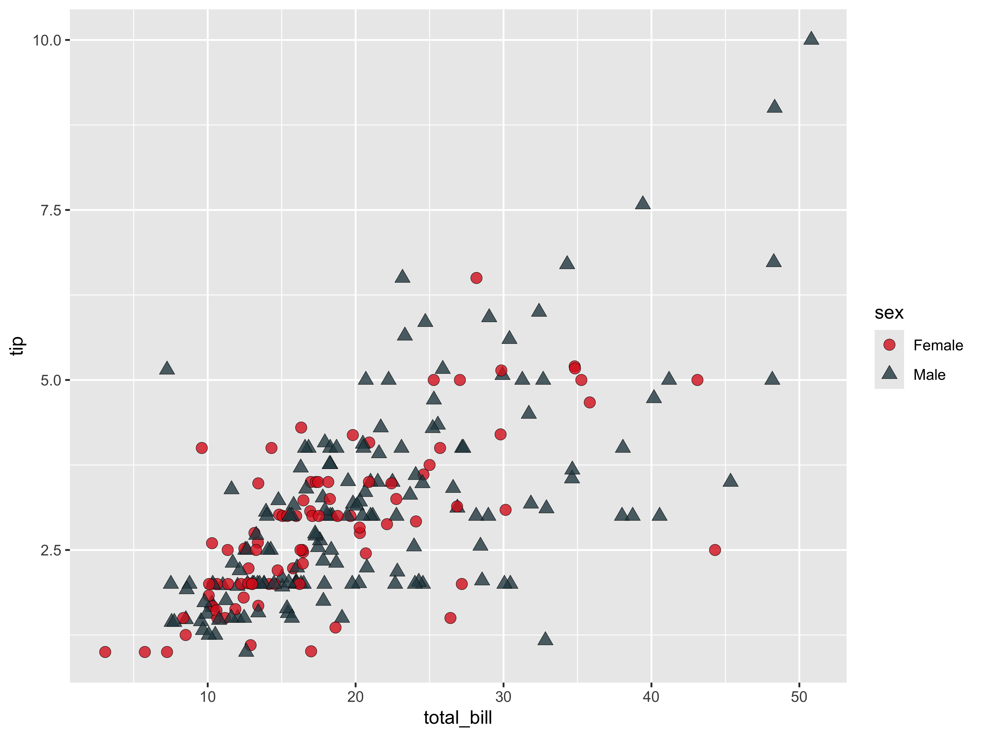
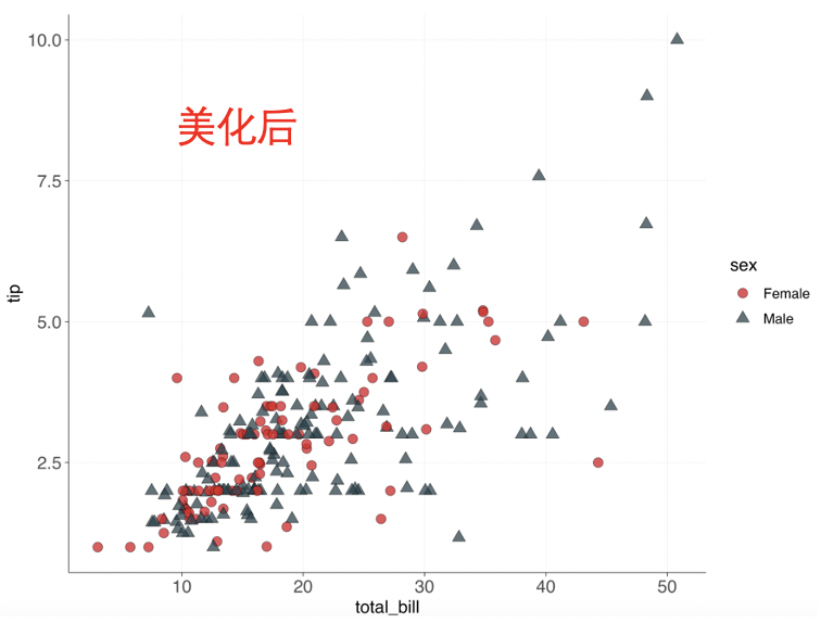
第5步、最后的美化
ggplot(
  tips_data,
  aes(
    x = total_bill,
    y = tip,
    shape = sex,
    fill = sex
  )
) +
  geom_point(
    alpha = 0.8,
    size = 3,
    stroke = 0.2
  ) +
  scale_shape_manual(values = c(21, 24)) +
  scale_fill_manual(values = custom_colors1) +
  scale_color_manual(values = c("black", "black")) +
  theme(
    text = element_text(family = "Helvetica", size = 12), # 字体为Helvetica,字号为12
    axis.title = element_text(size = 12), # 坐标轴标题大小
    axis.text = element_text(size = 12), # 坐标轴刻度大小
    axis.line = element_line(linewidth = 0.2, color = "black"), # 坐标轴线条
    axis.ticks = element_line(linewidth = 0.2, color = "black"), # 坐标轴刻度线
    panel.background = element_blank(), # 去除背景
    panel.grid.major = element_line(color = "gray90", linewidth = 0.1), # 主网格线
    panel.grid.minor = element_blank(), # 次网格线
    plot.title = element_text(size = 14, hjust = 0.5), # 标题居中
    plot.margin = margin(10, 10, 10, 10) # 图形边距
  )
数据集
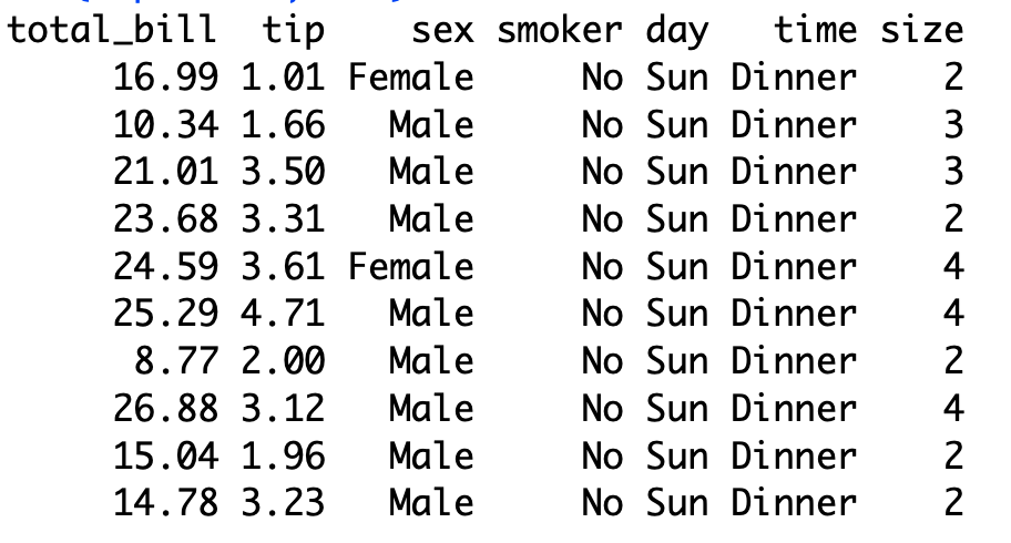
本次使用的tips数据,包含7列,
每列详细介绍
- total_bill:总消费金额(美元)
- tip:小费金额(美元)
- sex:顾客的性别(Male / Female)
- smoker:顾客是否吸烟(Yes / No)
- day:用餐的星期几(Thur, Fri, Sat, Sun)
- time:用餐时间(Lunch / Dinner)
- size:就餐人数


 被折叠的 条评论
为什么被折叠?
被折叠的 条评论
为什么被折叠?
 到【灌水乐园】发言


