


效果图
🌟【定制化开发服务,让您的项目领先一步】🌟
如有需求,直接私信留下您的联系方式。谢谢。
我的邮箱:2351598671@qq.com
以下是一个带有详细注释的 ECharts 堆叠折线图 示例代码。
完整代码
<!DOCTYPE html>
<html lang="en">
<head>
  <meta charset="UTF-8">
  <meta name="viewport" content="width=device-width, initial-scale=1.0">
  <title>ECharts 堆叠折线图 - 详细注释</title>
  <!-- 引入 ECharts -->
  <script src="https://cdn.jsdelivr.net/npm/echarts@5.4.2/dist/echarts.min.js"></script>
  <style>
    body {
      font-family: Arial, sans-serif;
      background-color: #f0f2f5;
      margin: 0;
      padding: 20px;
    }
    #chart {
      width: 100%;
      height: 500px;
      background: #fff;
      border-radius: 8px;
      box-shadow: 0 2px 8px rgba(0, 0, 0, 0.1);
    }
  </style>
</head>
<body>
  <div id="chart"></div>

  <script>
    // 初始化 ECharts 实例
    const chart = echarts.init(document.getElementById('chart'));

    // 基础数据
    const xAxisData = ['1月', '2月', '3月', '4月', '5月', '6月', '7月'];
    const seriesData1 = [120, 132, 101, 134, 90, 230, 210]; // 系列1数据
    const seriesData2 = [220, 182, 191, 234, 290, 330, 310]; // 系列2数据
    const seriesData3 = [150, 232, 201, 154, 190, 330, 410]; // 系列3数据

    // 配置项
    const option = {
      // 标题
      title: {
        text: '堆叠折线图示例', // 图表标题
        left: 'center', // 标题居中
        textStyle: {
          color: '#333', // 标题颜色
          fontSize: 18 // 标题字体大小
        }
      },
      // 提示框
      tooltip: {
        trigger: 'axis', // 触发类型,axis 表示坐标轴触发
        axisPointer: {
          type: 'line' // 指示器类型,line 表示直线指示器
        }
      },
      // 图例
      legend: {
        data: ['系列1', '系列2', '系列3'], // 图例数据
        bottom: 10, // 图例位置,距离底部 10px
        textStyle: {
          color: '#666' // 图例文字颜色
        }
      },
      // 网格
      grid: {
        left: '10%', // 左边距
        right: '10%', // 右边距
        bottom: '15%', // 下边距
        containLabel: true // 包含坐标轴标签
      },
      // X 轴
      xAxis: {
        type: 'category', // 类目轴
        boundaryGap: false, // 坐标轴两边留白策略
        data: xAxisData, // X 轴数据
        axisLabel: {
          color: '#666', // X 轴标签颜色
          fontSize: 12 // X 轴标签字体大小
        },
        axisLine: {
          lineStyle: {
            color: '#ccc' // X 轴线颜色
          }
        }
      },
      // Y 轴
      yAxis: {
        type: 'value', // 数值轴
        axisLabel: {
          color: '#666', // Y 轴标签颜色
          fontSize: 12 // Y 轴标签字体大小
        },
        axisLine: {
          lineStyle: {
            color: '#ccc' // Y 轴线颜色
          }
        },
        splitLine: {
          lineStyle: {
            color: '#eee' // Y 轴分割线颜色
          }
        }
      },
      // 系列数据
      series: [
        {
          name: '系列1', // 系列名称
          type: 'line', // 折线图
          stack: '总量', // 堆叠组名,相同组名的系列会堆叠在一起
          data: seriesData1, // 系列数据
          smooth: true, // 平滑曲线
          lineStyle: {
            color: '#5470c6', // 折线颜色
            width: 2 // 折线宽度
          },
          itemStyle: {
            color: '#5470c6' // 数据点颜色
          },
          areaStyle: {
            color: 'rgba(84, 112, 198, 0.2)' // 区域填充颜色
          }
        },
        {
          name: '系列2', // 系列名称
          type: 'line', // 折线图
          stack: '总量', // 堆叠组名
          data: seriesData2, // 系列数据
          smooth: true, // 平滑曲线
          lineStyle: {
            color: '#91cc75', // 折线颜色
            width: 2 // 折线宽度
          },
          itemStyle: {
            color: '#91cc75' // 数据点颜色
          },
          areaStyle: {
            color: 'rgba(145, 204, 117, 0.2)' // 区域填充颜色
          }
        },
        {
          name: '系列3', // 系列名称
          type: 'line', // 折线图
          stack: '总量', // 堆叠组名
          data: seriesData3, // 系列数据
          smooth: true, // 平滑曲线
          lineStyle: {
            color: '#ee6666', // 折线颜色
            width: 2 // 折线宽度
          },
          itemStyle: {
            color: '#ee6666' // 数据点颜色
          },
          areaStyle: {
            color: 'rgba(238, 102, 102, 0.2)' // 区域填充颜色
          }
        }
      ]
    };

    // 设置配置项并渲染图表
    chart.setOption(option);
  </script>
</body>
</html>
代码说明
1. 基础配置
- 标题:设置图表标题,居中显示。
- 提示框:配置鼠标悬停时的提示框样式。
- 图例:配置图例的位置和样式。
- 网格:设置图表的边距和背景。
2. X 轴
- 类型:类目轴(
category),用于显示月份数据。 - 标签样式:设置标签颜色和字体大小。
- 轴线样式:设置轴线颜色。
3. Y 轴
- 类型:数值轴(
value),用于显示数值数据。 - 标签样式:设置标签颜色和字体大小。
- 轴线样式:设置轴线颜色。
- 分割线样式:设置分割线颜色。
4. 系列数据
- 堆叠:通过
stack属性将多个系列堆叠在一起。 - 平滑曲线:通过
smooth属性使折线平滑。 - 线条样式:设置折线颜色和宽度。
- 数据点样式:设置数据点颜色。
- 区域填充:通过
areaStyle属性为折线图添加区域填充效果。
运行方式
- 将上述代码保存为一个 HTML 文件(如
index.html)。 - 直接在浏览器中打开该文件即可预览。
预览效果
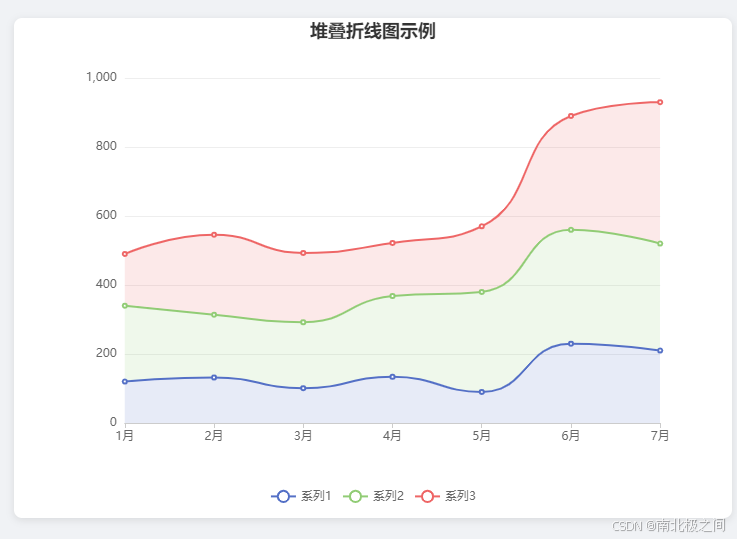
- 堆叠折线图:展示多个系列的数据,并且每个系列的数据会叠加在前一个系列之上。
- 平滑曲线:折线图呈现平滑效果。
- 区域填充:每个系列的区域填充颜色不同,增强视觉效果。
- 图例:显示每个系列的名称,支持点击隐藏/显示系列。


 457
457

 被折叠的 条评论
为什么被折叠?
被折叠的 条评论
为什么被折叠?
 到【灌水乐园】发言


