


1.一个简单的折线图
# 从matplotlib导入pyplot
from matplotlib import pyplot as plt
# squares是要绘制的数据
squares = [1, 4, 9, 16, 25]
# 下面的函数plt.plot将数据绘制到二维坐标系下。
# 如果只提供一个维度的数据例如squares,会被认为是Y坐标。
# 默认的横坐标是 [ i for i in range(len(squares)) ]
plt.plot(squares)
# 显示绘制的曲线图
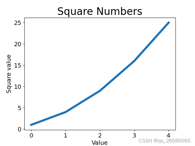
plt.show()运行上面的脚本,会在一个窗口中看到下图

2.设置线的粗线,图的标题,X/Y轴标签, 坐标轴刻度大小
from matplotlib import pyplot as plt


squares = [1, 4, 9, 16, 25]

# 参数linewidth:设置线的粗细
plt.plot(squares, linewidth=5)

# 折线图的标题
plt.title("Square Numbers", fontsize=24)

# 折线图的横轴标签
plt.xlabel("Value", fontsize=14)
# 折线图的纵轴标签
plt.ylabel("Square value", fontsize=14)

# 刻度标记大小
plt.tick_params(axis="both", labelsize=14)
plt.show()
运行结果
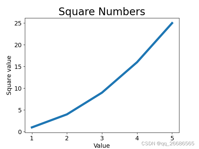
3.修改默认的横坐标数据
上面的折线图使用了默认的X坐标值,导致起始点对应的横坐标是0,纵坐标是1,不太合理(0的平方并不是1),接下来通过指定正确的横纵坐标值,来绘制正确的折线图。
from matplotlib import pyplot as plt

input_values = [1, 2, 3, 4, 5]
squares = [1, 4, 9, 16, 25]

# 这里分别传入参数X轴 Y轴数据
plt.plot(input_values, squares, linewidth=5)


plt.title("Square Numbers", fontsize=24)
plt.xlabel("Value", fontsize=14)
plt.ylabel("Square value", fontsize=14)
plt.tick_params(axis="both", labelsize=14)

plt.show()运行结果,折线的起点横坐标是从1开始的
4.填充两条折线图之间的部分
plt.plot(dates, highs, c='red', alpha=0.5)
plt.plot(dates, lows, c='blue', alpha=0.5)
# dates代表X轴数值 highs, lows分别是两条折线的Y轴数值
plt.fill_between(dates, highs, lows, facecolor='blue', alpha=0.1)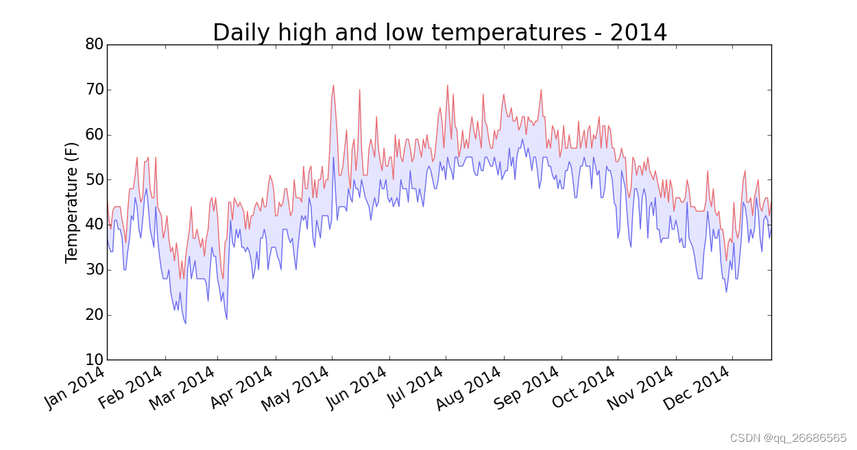


 1545
1545


 被折叠的 条评论
为什么被折叠?
被折叠的 条评论
为什么被折叠?
 到【灌水乐园】发言


